How to Export Data from LinkedIn Analytics to Excel [2025]
Master the ideal LinkedIn post size for images, videos, and carousels. Our complete guide ensures your content looks professional and boosts engagement.
Think of your LinkedIn content like a professional handshake. A post with wonky dimensions is like a weak, limp grip—it just feels off, quietly undermines your credibility, and leaves a poor first impression.
To make sure your content looks sharp on any device, the ideal LinkedIn post size for a shared image is 1200 x 627 pixels. Nail that, and you're already ahead of the game.
Why LinkedIn Post Size Is Your Secret Weapon
Getting your post dimensions right isn't just about ticking a technical box; it’s a genuine strategic advantage. It's the difference between wearing an off-the-rack suit and a bespoke one. Both get the job done, but only the tailored version truly commands attention, fits flawlessly, and screams professionalism. The same goes for your content on LinkedIn.
When your visuals are sized correctly, they do three critical things for you:
They Stop the Scroll: In a feed crammed with updates, a crisp, perfectly framed image or video is an instant attention-grabber. It’s what makes someone pause instead of scrolling right past.
They Build Authority: Polished, well-presented content sends a subtle but powerful message. It shows you care about the details, which reinforces your credibility and expertise without you having to say a word.
They’re Optimised for Mobile: Over half of all engagement on LinkedIn happens on a phone. Properly sized posts guarantee a smooth viewing experience, free from awkward crops or blurry, pixelated visuals.
Making a Strong First Impression
This focus on presentation is especially vital in growing professional markets. Germany, for instance, is projected to hit 23.1 million LinkedIn users by August 2025. When you consider that a massive 57% of LinkedIn content impressions worldwide now come from mobile devices, you realise just how crucial it is to get your post size right. It’s your best shot at making a powerful first impression on this massive and expanding audience.
You can dig into more stats about LinkedIn's growth in Germany at Napoleoncat.
A poorly sized image is a missed opportunity. It tells your network that the details don’t matter, but in the professional world, details are everything. Your content's presentation is a direct reflection of your personal brand.
Ultimately, mastering the correct dimensions sends a clear signal to your audience and the LinkedIn algorithm that your content is high-quality and deserves to be seen.
If you want to ensure your content always looks its best and performs well, exploring some good social media content templates can be a real time-saver. It’s the first step in turning your profile from a simple page into a powerful tool for hitting your professional goals.
Mastering LinkedIn Image Dimensions
Getting your LinkedIn image dimensions right is probably the single most effective way to make sure your content looks sharp and grabs attention. Think of it like tailoring a suit; the right fit makes all the difference, screaming competence and an eye for detail. A poorly sized image can lead to awkward crops, blurry visuals, and a message that just falls flat.
The absolute cornerstone of your visual strategy should be the standard shared image post. For this, the sweet spot is 1200 x 627 pixels, which works out to a 1.91:1 aspect ratio. This size is perfectly optimised to look fantastic in the feed on both desktop and mobile. It gives your content the best chance to make an impact without crucial parts getting chopped off.
This infographic really drives home why these details are so important for your professional presence.
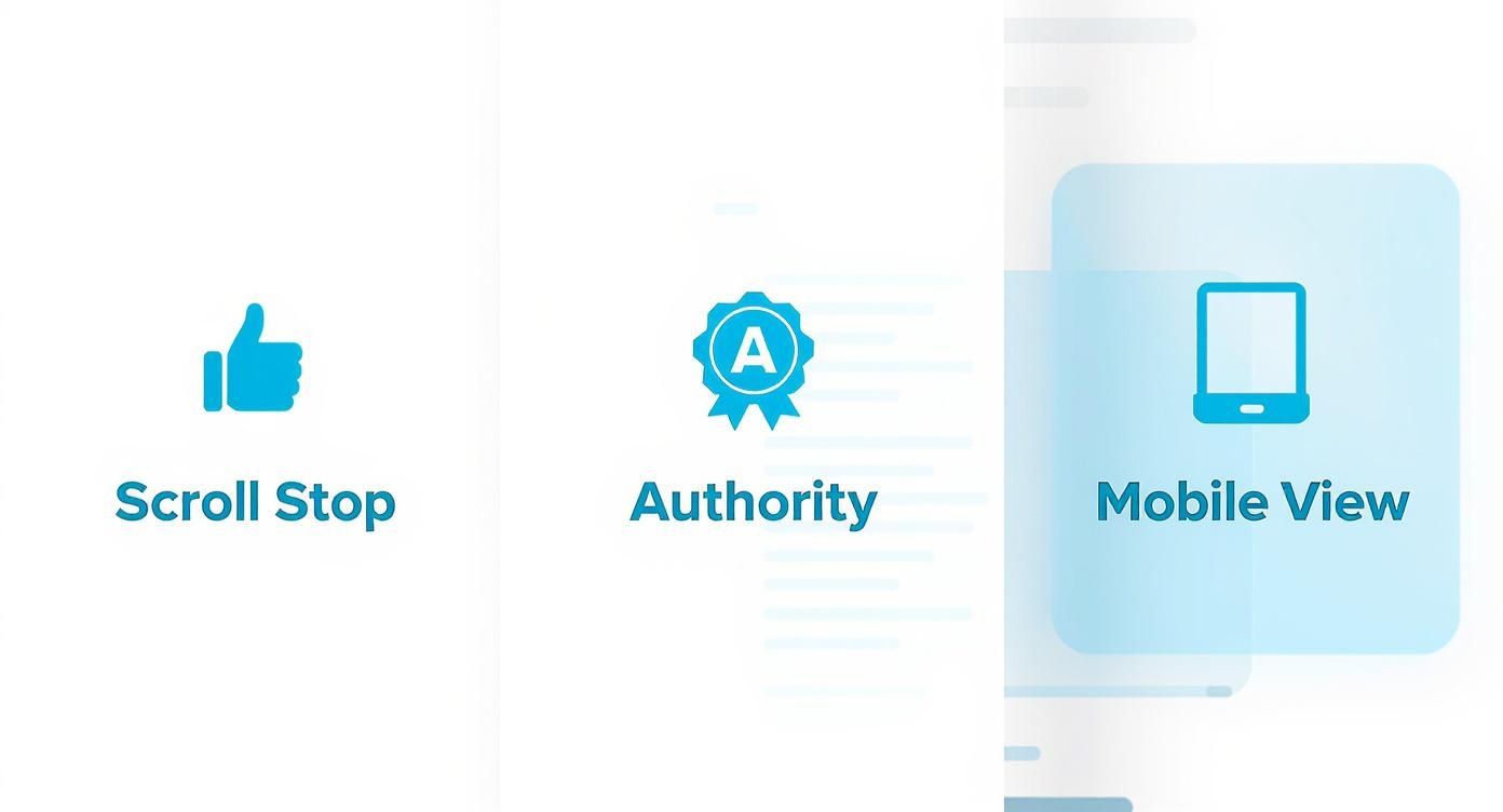
As you can see, correctly sized images are designed to stop the scroll, build your authority, and guarantee you look polished, especially on mobile devices where most people will see your content.
Dimensions for Personal and Company Pages
Beyond individual posts, your profile and company page visuals are your digital storefront. Getting these right is non-negotiable if you want to establish credibility.
Personal Profile Picture: Stick to 400 x 400 pixels. This ensures your headshot is crisp and clear in search results, comments, and connection requests.
Personal Banner/Cover Photo: Use 1584 x 396 pixels. This wide canvas is your space to showcase your brand or expertise. Just remember to keep vital info near the centre, so it doesn’t get obscured on different devices.
Company Logo: The standard size here is 300 x 300 pixels. It's a small but mighty image that represents your brand across the entire platform.
Company Cover Image: This one is a bit different from the personal banner, coming in at 1128 x 191 pixels.
For a deeper dive, you can explore our complete guide on all types of LinkedIn post images size, which covers everything from single posts to carousels.
To make things even easier, here's a quick reference table with all the essential image sizes in one place. Keep this handy, and you'll never have to second-guess your visuals again.
LinkedIn Image Size Quick Reference Guide
A summary of the recommended dimensions, aspect ratios, and file formats for various LinkedIn image types to ensure optimal display.
Image Type | Recommended Dimensions (Pixels) | Aspect Ratio | Supported File Formats |
|---|---|---|---|
Personal Profile Picture | 400 x 400 | 1:1 | JPG, PNG, GIF |
Personal Banner/Cover | 1584 x 396 | 4:1 | JPG, PNG, GIF |
Company Logo | 300 x 300 | 1:1 | JPG, PNG, GIF |
Company Cover Image | 1128 x 191 | 5.9:1 | JPG, PNG, GIF |
Shared Image Post | 1200 x 627 | 1.91:1 | JPG, PNG, GIF |
Link Preview Image | 1200 x 627 | 1.91:1 | JPG, PNG, GIF |
Carousel Post (Square) | 1080 x 1080 or 1200 x 1200 | 1:1 | JPG, PNG |
This table covers the most common image types you'll be working with, giving you a straightforward guide to follow for a professional look every time.
Mastering Different Post Types
LinkedIn’s a versatile platform, and you're not just limited to single images. When you share a link, for example, the platform automatically pulls in a preview thumbnail. Sometimes it gets it right, and other times... not so much.
The optimal size for a link preview image is 1200 x 627 pixels. If the auto-generated image isn't suitable, you can upload a custom one with these dimensions to maintain control over your post's visual narrative.
Taking that extra step prevents those unattractive, poorly cropped thumbnails that can seriously weaken your post's click-through potential.
The same logic applies to multi-image posts. While LinkedIn will arrange them into a neat little grid for you, using a consistent aspect ratio makes everything look much cleaner and more organised. The square format (1200 x 1200 pixels) is particularly effective here. It takes up more vertical real estate in the mobile feed, making your post that much harder to ignore.
By mastering these specific dimensions, you ensure every single visual you share is perfectly framed to capture attention and communicate professionalism.
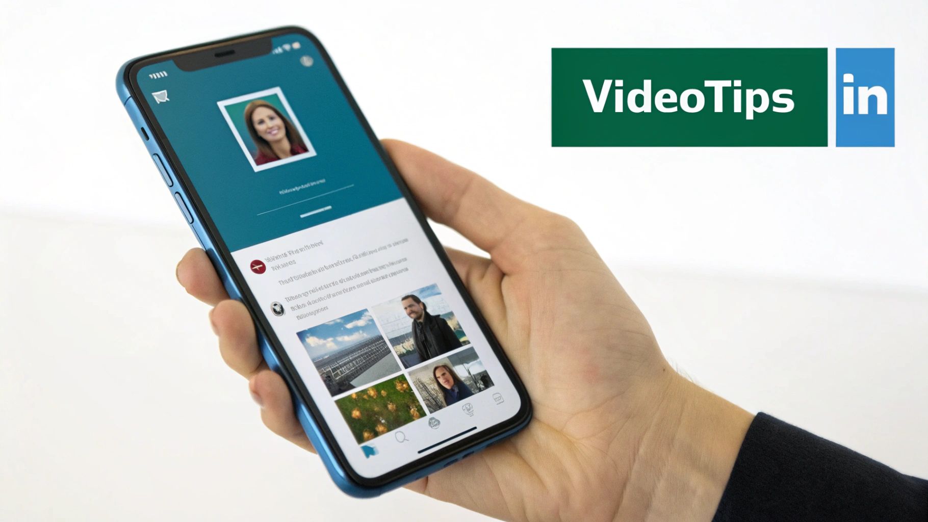
Optimising Video for Maximum Impact
While a perfectly sized image makes you look sharp and professional, video is where you can really stop the scroll and drive some serious engagement on LinkedIn. Video isn't just an "extra" anymore; it's a powerhouse for telling stories, building your authority, and connecting with people on a much more human level. Nailing the technical details is the first step to making sure your message lands perfectly.
First off, let's talk about the basic specs for your LinkedIn video posts. LinkedIn is pretty generous here, allowing a video file size of up to 5GB, which is more than enough room for high-quality footage. The platform plays nice with all the usual formats like MP4, AVI, and MOV, so uploading from most cameras or editing software is a breeze.
You can upload native videos that are as short as 3 seconds or as long as 10 minutes. But honestly, the sweet spot for grabbing and holding attention is way shorter, usually under two minutes. Professionals are busy people, so you've got to deliver value fast.
Choosing the Right Aspect Ratio
Beyond the file size and length, the most critical decision you'll make is your video's aspect ratio. Think of it as the shape of your video's canvas. That traditional widescreen (16:9) format looks great on YouTube, but it’s a total flop in the vertical world of the LinkedIn mobile feed.
Instead, you need to be thinking in these formats:
Square (1:1): A resolution of 1080 x 1080 pixels is your go-to. Square videos physically take up way more screen space on a phone than widescreen ones, making them much harder to just scroll past.
Vertical (9:16 or 4:5): Vertical video, like 1080 x 1920 pixels, is built for that full-screen mobile experience. It's totally immersive and matches how we all naturally hold our phones.
Don't underestimate how much this choice matters. LinkedIn video posts can pull in up to 5 times more engagement than plain text posts, a global trend that's also reflected in Germany's growing appetite for video content. With a massive 57% of all LinkedIn impressions happening on mobile, optimising for square or vertical is non-negotiable, especially if you want to reach that core 25-34 year old demographic.
Best Practices for Video Content
Getting the technical side right is only half the battle. To really make an impact, you need to play by the unwritten rules of the LinkedIn feed.
Here's the thing: most people are scrolling with the sound off. If your video needs audio to make any sense, you've already lost a huge chunk of your audience. Subtitles aren't a nice-to-have; they are absolutely essential.
Here are three tips that are completely non-negotiable:
Add Subtitles: Always burn captions directly into your video file. This makes sure your message gets across whether someone is in a noisy office or on their commute with the sound off.
Hook Them in 3 Seconds: The first few seconds are everything. You need a strong visual hook, a provocative question, or a surprising stat to instantly stop the scroll and give them a reason to stick around.
Deliver Value Immediately: Don't make people wait for the good stuff. Professionals on LinkedIn value their time, so get straight to the point. Whether it's a quick tip, a key insight, or a powerful story, make it clear what they'll get out of watching right from the start.
If you want a full walkthrough of the upload process itself, check out our step-by-step guide on how to post a video on LinkedIn.
Crafting Your Text for Readability and Reach
A perfectly sized visual is a great starting point, but it's the words you pair it with that truly make a connection. LinkedIn gives you a generous 3,000-character limit for your posts, but the secret to real engagement isn't about using every last one. Think of it as a maximum budget, not a target to hit. The real magic happens when you’re concise.
The biggest challenge is grabbing someone's attention in the first couple of lines. You’ve seen it: LinkedIn’s feed strategically hides longer text behind a “...see more” link. Your entire mission is to make that initial snippet so compelling that clicking it feels like a reflex. This is where most posts either win or lose.
Structuring Text for Maximum Readability
Let's be honest, professionals on LinkedIn are scrolling fast. They aren’t reading dense paragraphs; they're scanning for value. To get your message across, you have to write for the scanner, not the reader. Think of it as creating little signposts that guide their eyes through your content.
A few simple formatting tricks can completely change the game:
Use Extremely Short Paragraphs: Stick to just one or two sentences per paragraph. This creates valuable white space, making your text feel less intimidating and way easier to digest.
Leverage Bullet Points: When you're listing steps, features, or key takeaways, break them out into bulleted or numbered lists. It's a universally understood format that people can scan in a heartbeat.
Guide the Eye with Emojis: Used sparingly, a few relevant emojis can inject some personality and act as visual cues, drawing attention to your most important points.
Getting these little details right is what separates content that gets read from content that gets ignored. For a deeper dive, check out our full guide on formatting LinkedIn posts for better engagement.
The Art of the Opening Hook
Your first sentence is the most valuable piece of real estate you have. It has to be a powerful hook that stops the scroll and sparks curiosity. Maybe it’s a bold statement, a relatable problem, or a surprising statistic. No matter the post type, learning how to create compelling introductions that instantly grab attention is absolutely critical for getting that all-important "...see more" click.
Your opening line isn’t just the start of your post—it’s the advertisement for the rest of your post. Make it count.
When people click to read more, it signals to the LinkedIn algorithm that your content is valuable, which in turn helps it reach a wider audience. Well-structured text doesn't just work for humans; it plays nicely with what the platform wants to promote.
Using Advanced Post Formats Like Carousels
Once you're comfortable with the basics of images and videos, it's time to level up. LinkedIn has a couple of powerhouse formats that are perfect for telling a deeper story and stamping your authority all over your niche. I'm talking about Carousels (what LinkedIn calls Document Posts) and good old-fashioned long-form Articles.
These are the formats you turn to when you need to break down a complex idea, share some juicy data, or just really flex your expertise.
Carousels, in particular, are a fantastic way to hook your audience and keep them swiping. Think of it as a mini-presentation or a slideshow that lives right inside the feed. Instead of just one static image, you can walk your followers through a story, a step-by-step guide, or a handful of key takeaways. It's an absolutely brilliant way to repurpose content from a PDF or a slide deck.
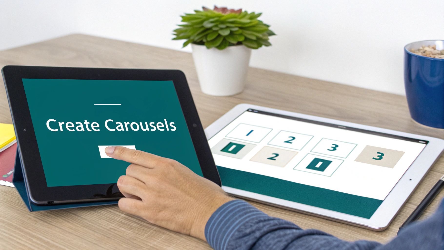
Crafting the Perfect Carousel
To get a carousel right, the dimensions of your slides are everything. The name of the game is clarity—each slide needs to be crisp and dead simple to read, especially on a phone where people are swiping with their thumb.
You’ve got two main options that work like a charm:
Square (1:1): The go-to dimension here is 1080 x 1080 pixels. This size dominates the mobile feed, making your post pretty hard to scroll past.
Vertical (4:5): For a taller look, aim for 1080 x 1350 pixels. This gives you even more screen real estate to play with, perfect for more detailed visuals or text.
Here's the secret sauce: a carousel's real power is its ability to hold someone's attention. Getting them to swipe is a huge win. It jacks up the "dwell time" on your post, which is a big, flashing green light to the LinkedIn algorithm that your content is valuable.
Treat your carousel like a mini-story with a beginning, middle, and end. Kick things off with a killer title slide that grabs them by the collar. Follow that up with your main points, spread across a few slides. And always, always finish with a clear call-to-action on the last slide. If you want to go deeper on creating interactive content, check out our guide on the LinkedIn carousel post format.
When to Use LinkedIn Articles
Now, for those moments when even a carousel feels too restrictive, you have LinkedIn Articles. This is where you can truly plant your flag as a thought leader. It's your personal blog on the platform, a permanent home for in-depth analysis, industry critiques, or detailed case studies.
The single most important visual for an Article is its header image. You'll want to use an image that is 1920 x 1080 pixels. That's a widescreen 16:9 aspect ratio, and it ensures your article looks sharp and professional, both in the feed and at the top of the article itself. A powerful, relevant header is your best shot at getting someone to stop scrolling and click through to read your masterpiece.
To make it easier to decide which format fits your idea, here’s a quick breakdown of how these advanced formats stack up against each other.
Advanced LinkedIn Post Format Specifications
Post Format | Recommended Dimensions | Best For | Key Tip |
|---|---|---|---|
Carousel (Document Post) | 1080x1080px (Square) or 1080x1350px (Vertical) | Step-by-step guides, data storytelling, repurposing slide decks, listicles. | Use a compelling title slide and a clear call-to-action on the final slide to guide your reader. |
Article | 1920x1080px (Header Image) | In-depth analysis, thought leadership, detailed case studies, company news. | A strong, high-quality header image is crucial for getting that initial click from the feed. |
Ultimately, both Carousels and Articles are about giving more value. They signal to your network that you're not just posting, you're teaching, sharing, and leading the conversation.
Common Post Size Mistakes and How to Fix Them
Getting your LinkedIn post sizes right can feel like navigating a minefield, but here’s the good news: most people make the same few mistakes over and over. Once you know what they are, you can easily avoid them and keep your content looking sharp and professional every time.
One of the biggest culprits is simply uploading a low-resolution image. We’ve all been tempted to grab a small, slightly blurry photo, hoping LinkedIn’s magic will fix it. It won’t. You’ll always end up with a pixelated mess. The fix is simple: always start with a high-quality image that’s at least the recommended 1200 x 627 pixels for a standard post.
Another classic slip-up is forgetting about the mobile view, especially with your company page banner. A banner that looks fantastic stretched across a wide desktop monitor often gets horribly cropped on a phone screen. The trick is to design your 1584 x 396 pixel banner with a "safe zone" in the centre, keeping your logo and any critical text away from the edges.
Mismatched Aspect Ratios and Platform Myths
Taking content from another platform and dumping it straight onto LinkedIn without a second thought is a guaranteed way to look sloppy. That slick 9:16 Instagram Story image? On LinkedIn, it will be butchered by awkward cropping. The LinkedIn feed plays best with square (1:1) or landscape (1.91:1) formats.
Believing that what works on one social platform will work on all is a costly myth. Each network has its own visual language; LinkedIn's is professional and clean, and your post sizes must reflect that.
It's the same story with video. Uploading a standard widescreen (16:9) video often leaves you with those distracting black bars on either side when viewed on a phone. Don't let your masterpiece get sandwiched like that. A quick edit to a square (1:1) or vertical (4:5) aspect ratio solves the problem instantly. Your video will take up more screen real estate, grabbing more attention and looking like it was made for the platform—because it was.
Your Top Questions About LinkedIn Sizes, Answered
Figuring out the exact specs for LinkedIn posts can feel a bit like guesswork, but it doesn’t have to be. Let's clear up some of the most common questions so your content always looks sharp and professional.
What Is the Best LinkedIn Post Size for Mobile Viewing?
When you’re thinking mobile-first (and you should be), your go-to formats are square (1:1 aspect ratio) or a taller vertical (4:5 aspect ratio). It's all about screen real estate—these shapes dominate a phone's screen, making them impossible to ignore as people scroll.
A great starting point is 1080 x 1080 pixels for either images or videos. It’s a powerful, mobile-friendly choice that grabs attention instantly.
Can I Edit an Image After Posting It?
Unfortunately, no. Once a post is live on LinkedIn, the image and its dimensions are locked in. You can’t go back and tweak the cropping or swap it out.
This is exactly why double-checking your post before you hit publish is so important. A quick preview on both a desktop and mobile view can save you from that sinking feeling of seeing your carefully crafted image awkwardly cut off.
There's no "edit" button for images on a live LinkedIn post, so getting the size right the first time isn't just a good idea—it's a must. A quick preview saves you from the cringe of a badly cropped visual that cheapens your whole message.
Does LinkedIn Compress Media Files?
Yes, it absolutely does. Like all social media platforms, LinkedIn compresses the images and videos you upload to make sure they load quickly for everyone. It’s a standard part of how the internet works.
To fight back against noticeable quality loss, always upload a high-resolution file that’s already sized to their recommended dimensions. When you give LinkedIn’s algorithm a high-quality source file to work with, the final compressed version that your audience sees will be much crisper and clearer.
Ready to create perfectly sized, engaging content without the guesswork? Postline.ai uses AI to help you write, format, and schedule standout LinkedIn posts in minutes. Discover how Postline.ai can elevate your LinkedIn strategy.
CREATE YOUR POSTS WITH POSTLINE.AI
More reach. More followers. More business.
👉 Try Postline.ai for free
Author

Christoph Gaschler

Christoph is the CEO of Mind Nexus and Co-Founder of postline.ai. He is a serial entrepreneur, keynote speaker and former Dentsu executive. Christoph worked in marketing for more than 15 years, serving clients such as Disney and Mastercard. Today he is developing AI marketing software for agencies and brands and is involved in several SaaS projects.
Related posts

Every LinkedIn post generator - Full Comparison
You want to grow on LinkedIn and need a little help from AI. There are many tools out there promising quick results. We tested the Top 10 LinkedIn post generators to see which actually can make a difference.

How to Export Data from LinkedIn Analytics to Excel [2025]
Discover how to export data from LinkedIn Analytics to Excel to gain valuable insights, streamline lead generation, and enhance data-driven decision-making. This guide covers step-by-step instructions, tools, and tips to help you analyze LinkedIn data efficiently and grow your business.

How to Message Recruiters to Connect on LinkedIn
In this guide you will learn how to reach out to a recruiter on LinkedIn. This is a step by step guide to prepare you to connect with recruiters and increase to chances of landing that new job. You will also find LinkedIn message examples and valuable insights below.