Formatting LinkedIn Posts: Top Strategies to Boost Engagement
Learn proven tips for formatting LinkedIn posts. Boost your reach and engagement with these expert-approved strategies for better content.

Why Your LinkedIn Formatting Makes or Breaks Everything
Let’s be real, nobody reads walls of text on LinkedIn. I’ve learned that the hard way. Even killer content gets buried if it looks messy. Formatting your LinkedIn posts isn’t just about prettying things up—it’s about making your message accessible and engaging in a busy feed. Think of it like this: you wouldn’t wear pajamas to a networking event, would you?
Your LinkedIn posts deserve the same respect.
The Algorithm Rewards Readability
The LinkedIn algorithm loves content that keeps users hooked. Visually appealing posts with clear structure – headings, bullet points, short paragraphs – perform better. They tell the algorithm that the content is digestible, which encourages people to stop scrolling and read. That initial engagement is gold for boosting visibility. So, you’re not just formatting for your audience, you’re formatting for the algorithm too.
Grab Attention in the First Three Seconds
Imagine scrolling through LinkedIn. A giant block of text appears. Do you stop? Probably not. Now imagine a post with a catchy opening line, followed by easily scannable text. Way more tempting, right?
Those first few seconds are your chance to capture attention. Effective formatting uses visual cues to pull readers in. For example, I started using bold text to highlight key takeaways in my posts and saw a real uptick in engagement. People are time-pressed. Formatting helps them quickly see the value you offer.
Plus, the type of visual you use makes a difference. Multi-image posts (carousels) average a 6.6% engagement rate, outperforming single images and text-only posts. Visual storytelling is king on LinkedIn. Want more stats? Check out these LinkedIn insights.
Mobile-First is Essential
Most people are on LinkedIn via their phones. Long paragraphs are a nightmare on mobile. Headings, bullet points, and short paragraphs are your best friends. Design your LinkedIn posts like a billboard—clear, concise, and high-impact. This not only improves the mobile experience, but it also makes your posts more effective overall. Wider reach and better engagement? Yes, please.
Crafting Opening Lines That Stop the Scroll Dead
This screenshot shows a typical LinkedIn feed overflowing with content. Think about it – those first few lines of each post? They’re everything. They decide whether someone scrolls right past or stops to actually read what you have to say. Your opening lines are your first impression, and often your only one.
Creating LinkedIn posts is kind of like making a movie trailer. You need to hook your audience instantly, but without giving away the whole story. That’s where the “hook” comes in. A great hook sparks interest and promises something valuable, making people want to invest their time in reading more.
The Anatomy of a Killer Hook
Want to grab attention? Start with a thought-provoking question. This gets people thinking and considering their own perspective right away. For example, instead of starting with something generic like, “I’m excited to share…”, try asking, “Have you ever wondered why some LinkedIn posts take off while others just flop?”
Another good trick? Conversational openings. They build a connection and feel more authentic. Think about it: would you rather hear from a friend giving advice, or a faceless company broadcasting a message? Instead of “Here are five tips…”, try “I learned this the hard way, and I want to save you the trouble…”. This draws the reader in and feels more personal. Need some extra help with your posts? Check out our guide on crafting compelling LinkedIn posts.
Mastering LinkedIn’s Preview System
Here’s the deal: LinkedIn only shows the first two to three lines of your post before that pesky “see more” link shows up. This means your opening needs to be short, sweet, and pack a punch. Think of it as prime real estate – every word, every character counts. Make sure your most important points fit within this preview window.
But don’t just cram keywords in there. Use strategic line breaks. This creates visual interest and makes people want to click “see more.” It’s like a cliffhanger – you’ve got to leave them wanting more. Try ending a line with a bold statement or an incomplete thought to pique their curiosity.
Finally, avoid obvious clickbait. While you want to create intrigue, you also need to maintain credibility. Authenticity is huge on LinkedIn, and misleading openings will erode trust fast. Instead, focus on genuine value and making real connections with your audience through compelling, honest content.
Choosing Content Formats That Multiply Your Reach
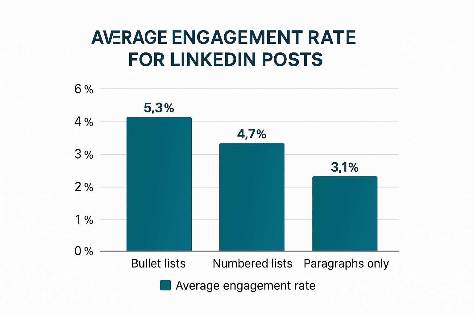
This infographic gives you a quick visual on average engagement rates for different LinkedIn post formats. Notice how bullet points just crush it compared to dense paragraphs or even numbered lists? This tells you something important: people on LinkedIn are scanners. They want information fast.
What I’ve learned from playing around with different post types on my own profile is that not all content performs equally. Sometimes, a simple image resonates powerfully, while other times, a carousel post goes absolutely viral. Knowing the strengths of each format is how you really start to make an impact.
Beyond the Basics: Exploring LinkedIn’s Content Arsenal
One interesting development is the growing popularity of carousel and document posts. These formats are seriously effective at grabbing attention and getting conversations going. I recently came across some research pointing to these as having some of the highest engagement rates among emerging trends for 2025. Discover more insights on LinkedIn content trends here. I think it’s because they offer a richer experience compared to static images or text updates.
Think about it: carousels let you tell a story across several visuals, building anticipation with each slide. Documents give you a space to share deeper insights. But just using these formats isn’t the magic bullet. You need to use them well. In my experience, carousels work best when each slide contributes to a larger narrative. For documents, clear headings, short paragraphs, and visuals are essential to keep readers hooked.
Let’s take a look at how different LinkedIn content formats stack up against each other:
LinkedIn Content Format Performance Comparison: Comparing engagement rates, reach potential, and use cases for different LinkedIn post formats
| Content Type | Average Engagement Rate | Best Use Case | Time Investment | Reach Potential |
|---|---|---|---|---|
| Text Post | Moderate (dependent on hooks and formatting) | Sharing quick tips, opinions, and asking questions | Low | Moderate |
| Image Post | Moderate to High | Showcasing visuals, data representations, quotes | Low to Moderate | Moderate to High |
| Video Post | High (especially short-form video) | Sharing personal insights, demonstrating expertise, behind-the-scenes content | Moderate to High | High |
| Carousel Post | Very High | Storytelling, presenting multiple ideas, step-by-step guides | High | Very High |
| Document Post | High | Sharing in-depth articles, reports, presentations | High | Moderate to High |
This table highlights the trade-offs between different content formats. While carousels offer high engagement, they require more time to create. Text posts are quicker to produce but need strong hooks and formatting to perform well. Choosing the right format depends on your specific goals.
Video: A Different Beast Altogether
Video on LinkedIn has its own unique dynamics. Short, engaging videos tend to do really well in the feed, while longer, more detailed videos can find a home in articles. The big thing is to optimize for mobile. Think vertical video, captions, and eye-catching visuals in the first few seconds. I’ve also noticed that genuine, less-polished videos often perform better than highly produced ones. LinkedIn is all about authentic connection, so let your personality shine through.
Choosing the right format really boils down to knowing your audience and what you’re trying to achieve. Quick tips? Thought leadership? Showcasing your work? Each goal needs a slightly different approach. Experiment with different formats, see what sticks, and then double down on what resonates with your audience.
Building Post Structure That Keeps People Reading

The difference between a LinkedIn post that gets a quick glance and one that gets saved often boils down to structure. I’ve seen this happen time and time again—even insightful content gets lost if it’s a wall of text. Think of your LinkedIn post like a building: a solid foundation (your structure) is crucial.
White Space: Your Secret Weapon
White space is a reader’s best friend. It’s not wasted space! Strategic use of white space makes your content less overwhelming by giving the eye a place to rest. This means short paragraphs (ideally 2-3 sentences max), headings, and bullet points to break up the text. Trust me, you’ll be surprised how much more inviting your posts will look.
The Power of Natural Stopping Points
Imagine reading a long article with no breaks. Exhausting, right? The same applies to LinkedIn posts. Build in natural stopping points. This might be a thought-provoking question, a bold statement, or even a well-placed emoji. These “micro-breaks” encourage readers to pause and reflect, keeping them engaged.
This all ties into mobile optimization, which is essential because most people scroll LinkedIn on their phones. Long paragraphs look daunting on a small screen. Short, punchy sentences are the way to go.
Storytelling That Works on LinkedIn
LinkedIn is a professional platform, so tell stories that provide value and build genuine connections. Layer your content to cater to both skimmers and deep readers. Use headings and bullet points to highlight key takeaways for those in a hurry, then provide more detailed insights within the paragraphs for those who want to dive deeper. For more practical tips, check out our best practices guide.
Advanced Techniques for Maximum Impact
Want to take things up a notch? Try pattern interrupts. These unexpected elements grab attention and re-engage readers. It could be a formatting change, a surprising statistic, or a relevant anecdote. Just use them strategically, not randomly.
Another tip: strategic cliffhangers. This isn’t about ending every post with “stay tuned,” but about sparking curiosity and encouraging interaction. Try posing a question at the end of your post to invite comments and discussion.
These structural choices can dramatically impact your results. They determine whether your content builds relationships or fades into the background. Invest time in structuring your posts, and watch your LinkedIn engagement soar.
Making Your Content Scannable Without Looking Spammy
Grabbing attention on LinkedIn is a tough game. It’s not enough to have great content; it needs to be easily digestible. Think scannable. But here’s the catch: there’s a delicate balance between easy-to-read and downright spammy. I’ve seen countless posts that overdo the formatting, ending up looking more desperate than professional.
Typography: Dressing Your Words for Success
Typography is like the outfit your LinkedIn posts wear. You want it to be professional and inviting, not a loud, distracting mess. Bold text is your friend, but use it wisely. Highlight key takeaways, interesting stats, or important terms the first time they appear. This helps readers quickly get the gist without wading through walls of text.
Line spacing is another subtle but important element. Too much, and your post looks disjointed. Too little, and it becomes an intimidating block. Strive for a natural flow, like the rhythm of a good conversation.
Emojis: A Dash of Personality, Not a Whole Bottle
Emojis can inject some personality, but overuse can wreck your credibility faster than you can say “connect.” I tend to use them sparingly – maybe to punch up a point or add a touch of humor. Treat them like seasoning: a little enhances, a lot overwhelms.
Character Counts and Paragraph Lengths: Mobile-First Mindset
There’s a lot of debate about ideal character counts and paragraph lengths. Honestly, I think the most important thing is mobile readability. Most people scroll through LinkedIn on their phones, so short paragraphs (two to three sentences max) are your best bet. For headlines, I try to keep them concise enough to fit within LinkedIn’s preview – those first two lines are prime real estate. Want to dive deeper into maximizing your reach? Check out this post on the best time to post on LinkedIn.
Accessibility: Open Doors to a Wider Audience
Accessibility often gets overlooked, and that’s a shame. By using clear fonts, good contrast, and alt text for images, you make your content available to everyone, including people with disabilities. It’s not just good practice – it’s about expanding your potential audience.
To help you quickly format your posts for readability and engagement, I’ve put together some handy guidelines:
LinkedIn Post Readability Guidelines: Optimal formatting specifications for maximum readability and engagement on LinkedIn
| Element | Recommended Length | Mobile Consideration | Impact on Engagement |
|---|---|---|---|
| Paragraphs | 2-3 sentences | Keep them short for easy scrolling | Increased readability |
| Headlines | Fit within preview window | Capture attention quickly | Higher click-through rate |
| Bullet Points | Use for lists and key takeaways | Easy to scan on mobile | Improved comprehension |
| Emojis | Sparingly (3-5 max) | Can enhance or detract | Boosts engagement (when used strategically) |
Formatting is about making your message accessible and digestible. It’s not about tricks; it’s about clarity and connection. Aim for effortless consumption and maximum value delivery.
Advanced Formatting Techniques That Set You Apart
Want to seriously up your LinkedIn game? Strategically formatting your LinkedIn posts is crucial. It’s not just about making things look pretty; it’s about grabbing attention, making your posts easy to read, and ultimately, getting people to interact. Let me share some advanced techniques that can truly transform your LinkedIn presence.
Hidden Formatting Gems and Creative Structuring
LinkedIn has a few hidden formatting tricks. For example, did you know you can use Unicode characters like bullet points (●) or arrows (→)? They add visual interest and structure to your posts. I’ve noticed these small tweaks make a big difference, especially when people are reading on their phones. Play around with different symbols and see what looks best with your content.
When you’re sharing more complex info, try mixing up your formatting styles. Bolding key takeaways, italicizing quotes, and using numbered lists for step-by-step instructions creates a clear structure. It’s like designing a webpage—you want to guide the reader’s eye smoothly through the information.
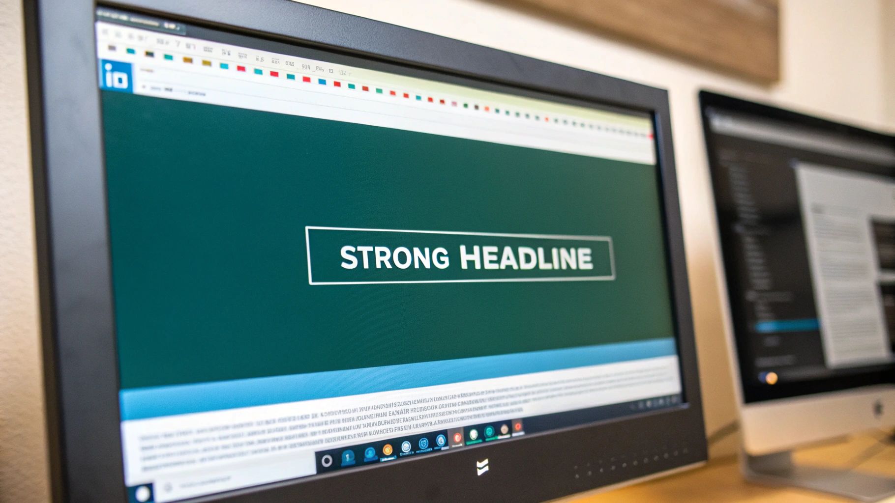
This screenshot from LinkedIn’s own marketing solutions page shows how they use visuals and clear formatting to promote their services. Notice the short headlines, bullet points, and the way they use white space. They’re definitely walking the walk here. This just reinforces the importance of a professional look, even for ads. It’s a reminder that even LinkedIn itself knows the power of clear, concise, and visually engaging content.
Industry-Specific Strategies and Personal Branding
Formatting isn’t a one-size-fits-all thing. In a technical field, detailed explanations and code snippets need specific formatting for clarity. In creative industries, you might have more visual flexibility. The trick is to adapt your formatting to your content and audience.
Keeping your personal brand consistent is also super important. While you should adjust your formatting for different topics, some things—like your tone and how you use visuals—should stay the same across all your posts. This helps people recognize you and builds your professional identity.
Emerging Trends and Algorithm Awareness
LinkedIn’s algorithm is always changing. Staying up-to-date on formatting trends—like the growing popularity of carousel posts—can give you an edge. Pay attention to what successful creators are doing, and don’t be afraid to experiment.
Also, watch out for common formatting mistakes that can hurt your reach. Overusing emojis, writing huge blocks of text, or forgetting about mobile optimization can all negatively affect how many people see your posts. Experimenting is good, but always make sure your posts are easy to read and understand. These advanced formatting techniques aren’t just about making your posts look good; they’re about making a real impact and turning engagement into opportunities. Try new things, but always keep your audience and that ever-shifting algorithm in mind.
Your Complete Formatting Toolkit and Action Plan
Alright, let’s ditch the theory and get down to brass tacks. How can you actually use these formatting tips without turning every LinkedIn post into a day-long project? I’ve got a few tricks up my sleeve that work for me, and I’m happy to share. Think of this as practical advice from a friend in the trenches, not some generic how-to guide.
Templates for Every Professional Goal
Whether you’re dropping industry knowledge, building your reputation as a thought leader, or simply showcasing your work, having a few go-to templates will save you a ton of time. Personally, I use one template for sharing articles, another for quick thoughts, and a third for celebrating milestones. These frameworks keep my formatting consistent while giving me the flexibility to adapt to different content.
Here’s a simple example you can steal:
- Hook: Grab attention with a question or a strong statement.
- Context: Briefly set the stage and explain the topic.
- Key Takeaway: Highlight the main point you want readers to remember.
- Call to Action: Encourage engagement (comments, shares, follows).
This basic structure is surprisingly versatile. You can easily tweak it. For instance, when I’m sharing an article, I’ll add a quick summary before the call to action. Looking for more in-depth advice? Check out this piece on developing a robust LinkedIn content strategy.
Troubleshooting Underperforming Posts
Let’s be real, not every post is going to go viral. If a post falls flat, don’t freak out. Just analyze it. Did the hook miss the mark? Was the formatting a mess? Were the key takeaways buried? Tweak it and try again. I’ve seen small changes make a huge difference.
Time-Saving Workflows and Tools
Efficiency is your best friend on LinkedIn. I use tools like Postline.ai to streamline my workflow. It’s like having an AI assistant that’s a LinkedIn whiz. It helps with everything from brainstorming content ideas to formatting and scheduling posts. This frees up my time to focus on the bigger picture – my overall LinkedIn strategy.
Scaling Your Formatting as You Grow
As your LinkedIn presence expands, so should your formatting approach. Keep track of what resonates with your audience and what doesn’t. Then, adjust accordingly. Don’t be afraid to experiment with new formats and techniques. It’s all about finding a sweet spot between consistent branding and keeping things fresh. This whole system is about turning your LinkedIn content from a tedious chore into a powerful tool for professional growth. Ready to level up your LinkedIn game? Check out Postline.ai and start creating content that stands out.

Run every client pipeline in one place
Give each LinkedIn profile its own voice, calendar, approval flow, and analytics. Start in minutes.
Start free trial