The Ultimate Guide to LinkedIn Share Image Size
Master the correct LinkedIn share image size for every post. Our guide covers dimensions, aspect ratios, and best practices for maximum engagement.
When you’re sharing content on LinkedIn, getting the visuals right is half the battle. For the best, most consistent results, your go-to LinkedIn share image size should be 1200 x 627 pixels. This is the sweet spot for link previews and standard landscape posts.
Sticking to this dimension means your image will look sharp and professional on both desktop and mobile feeds, preventing any awkward cropping that could ruin your carefully crafted message.
Your Quick Reference Guide to LinkedIn Image Sizes
Nothing kills a professional post faster than a blurry, stretched, or poorly cropped image. Getting the dimensions right isn’t just a technical detail; it’s fundamental to how your brand is perceived on LinkedIn. The right specs ensure your content is presented cleanly, grabbing attention for all the right reasons.
Think of this guide as your essential toolkit. It’s built for busy professionals who need accurate information without the fluff. Here’s a quick look at the most important dimensions for your profile, posts, and banners.
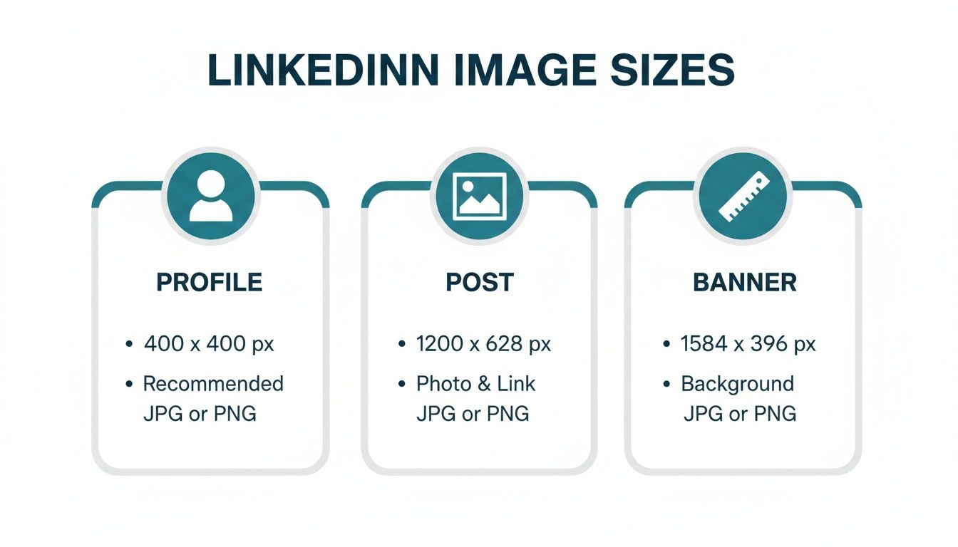
As you can see, each element—from your profile picture to the background banner—has its own unique set of requirements designed for its specific role on the platform.
LinkedIn Image Size Cheat Sheet
Here’s a quick-reference table summarising the most common image specs you’ll need. It’s a great starting point for making sure your visuals are always optimised.
| Image Type | Recommended Dimensions (Pixels) | Aspect Ratio | Max File Size |
|---|---|---|---|
| Personal Profile Picture | 400 x 400 | 1:1 | 8 MB |
| Personal Background Banner | 1584 x 396 | 4:1 | 8 MB |
| Company Logo | 400 x 400 | 1:1 | 4 MB |
| Company Cover Image | 1128 x 191 | 5.9:1 | 4 MB |
| Shared Link Preview | 1200 x 627 | 1.91:1 | 5 MB |
| Single Image Post (Square) | 1200 x 1200 | 1:1 | 5 MB |
| Single Image Post (Portrait) | 1080 x 1350 | 4:5 | 5 MB |
Bookmark this table, but remember that LinkedIn’s algorithm and display rules can be nuanced.
For a deeper dive into how LinkedIn handles different formats, our guide on the perfect image size for LinkedIn posts offers more detailed insights and strategies.
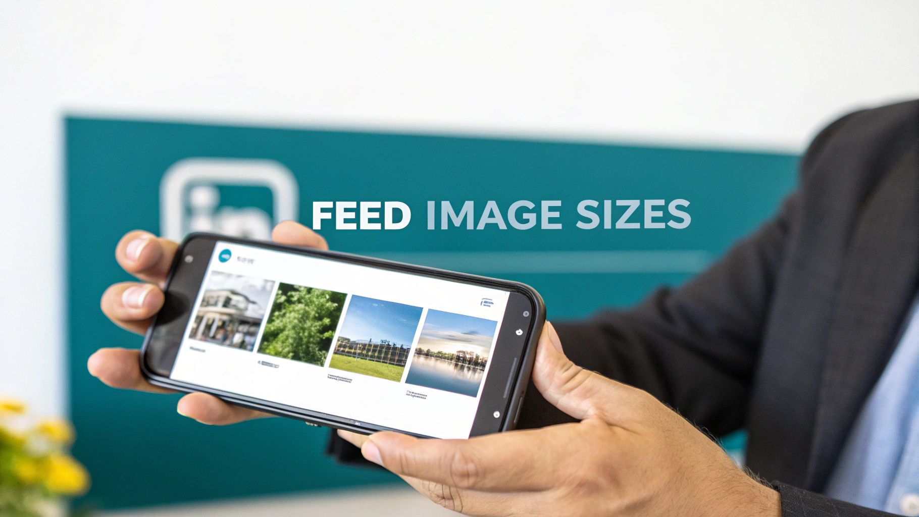
Getting Images Right for Your Personal Feed
When you share an image on your personal LinkedIn feed, the format you choose isn’t just a technical detail—it’s a strategic decision. You’ve got three main choices: landscape, square, and vertical. Each one tells a slightly different story and grabs attention in its own way.
Getting this right has a direct impact on how people see your post. A wide, detailed infographic, for instance, really needs a landscape layout to be legible. On the other hand, if you’re posting a powerful headshot or a bold announcement, a taller format that fills up a mobile screen will stop scrollers in their tracks.
Which Image Format Should You Use?
The best linkedin share image size really depends on what you’re trying to achieve with your post. Think about your content’s purpose first, then pick the format that serves it best.
- Landscape (1200 x 627 pixels): This is the classic, safe bet. It’s perfect for detailed visuals like data charts or event photos where you need the horizontal space.
- Square (1080 x 1080 pixels): A great mobile-first option. It looks clean, balanced, and modern in the feed and works exceptionally well for personal branding shots or simple graphics.
- Vertical (e.g., 1080 x 1350 pixels): This is your power move for mobile. It takes up the most screen real estate, making your post impossible to just scroll past. Use it for high-impact content you really want people to notice.
The old industry standard, the landscape format at 1200 x 627 pixels (which is a 1.91:1 aspect ratio), is still a fantastic choice for ensuring your image displays properly everywhere, without any awkward cropping on desktop or mobile.
This level of precision is especially important for audiences that value professionalism, like in Germany, where there are around 20 million people on LinkedIn. For them, a perfectly formatted image signals attention to detail. Tools like Postline.ai can help automate this, but understanding the basics is key. You can also see more on social media image trends on dreikon.de.
At the end of the day, the best way to know what works is to experiment. Try posting different formats and keep an eye on your analytics. See what your network responds to. To dive deeper, check out our complete guide to LinkedIn post images size and start fine-tuning your approach.
Getting Link Previews and Article Images Just Right
When you share a link on LinkedIn, that little preview image does a lot of heavy lifting. It’s often the first thing people see, and it can make the difference between someone scrolling past or stopping to click.
For link previews, the magic number is 1200 x 627 pixels. This isn’t just a suggestion; it’s the key to making your image look sharp and professional on both desktop and mobile. This size works out to a 1.91:1 aspect ratio, which prevents any awkward or unflattering cropping.
This preview image is pulled automatically from your website using Open Graph (OG) tags, specifically the og:image tag. When you set a featured image in a CMS like WordPress, you’re essentially telling LinkedIn which visual to grab.
Fixing a Faulty Link Preview
We’ve all been there: you share a link, and an old, irrelevant, or just plain wrong image shows up. It’s a common headache caused by LinkedIn’s caching system, which stores an older version of your link’s data for a while.
The fix is surprisingly simple. Just use LinkedIn’s own Post Inspector tool. Paste your URL into it, and the inspector will force LinkedIn to fetch the latest data from your page, including the correct og:image. This simple refresh ensures your preview looks exactly how you want it to.
If you want to dig deeper into optimising every part of your shared links, our complete guide on the LinkedIn link preview card has you covered. Taking that extra minute to double-check your preview can make a huge difference to your engagement.
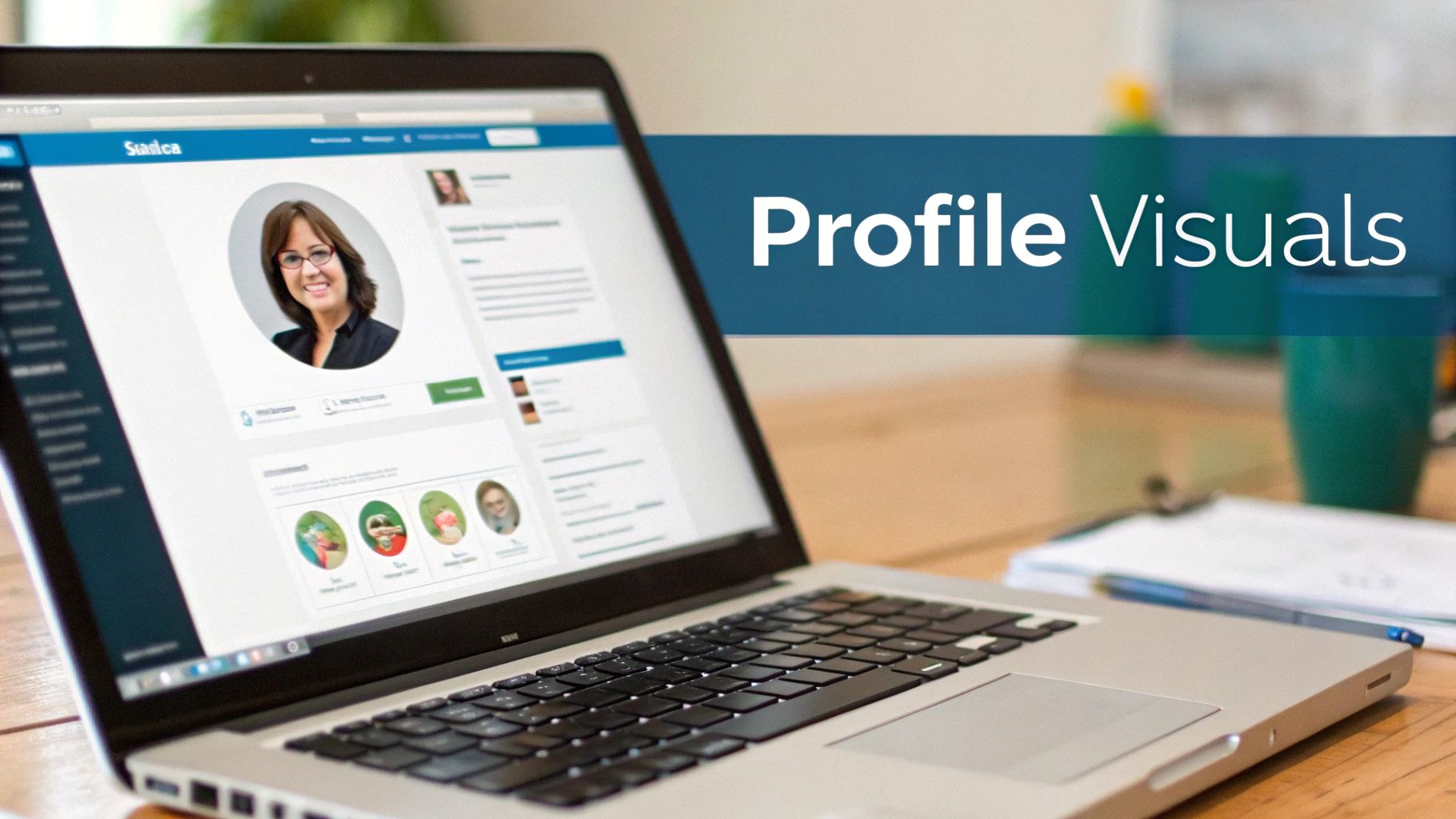
Perfecting Your Personal Profile Visuals
Your LinkedIn profile is your digital handshake, and the visuals are the first thing people notice. Getting your profile picture and background banner right is absolutely critical because they team up to create that all-important first impression. Don’t treat them as an afterthought.
Aim for a profile picture that’s 400 x 400 pixels. LinkedIn will crop this into a circle, so a good rule of thumb is to keep your face centred with plenty of space around the edges. This simple step prevents your head from being awkwardly cut off. For a deeper dive, these essential AI-Powered LinkedIn Profile Picture Tips offer some excellent pointers.
Your Profile Picture and Banner
It’s hard to overstate the impact of a great headshot. In fact, research shows that profiles with professional photos receive 14 times more views. With the number of LinkedIn users in Germany hitting 20 million by September 2024, a crisp, professional image is non-negotiable if you want to stand out and build credibility.
Your background banner is the other half of the equation. The ideal size here is 1584 x 396 pixels. A key thing to remember is that your circular profile picture will sit on top of the banner on the left-hand side. Because of this, you’ll want to place any crucial text or logos towards the centre and right to make sure they’re not obscured on desktop or mobile.
If you’re looking for some creative inspiration on how to make the most of that space, check out our guide on the 10 best LinkedIn banner ideas. It’s packed with examples to help you build a banner that truly reflects who you are professionally.
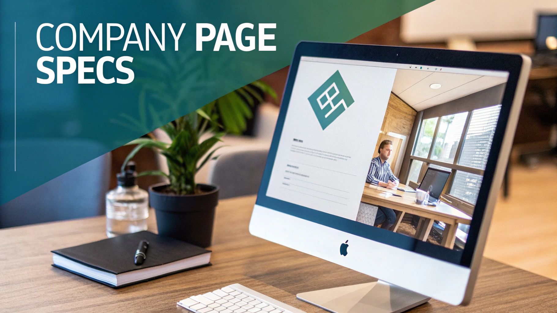
Essential Image Specs for Company Pages
Think of your LinkedIn Company Page as your brand’s digital headquarters. The visuals you use are the first thing visitors see, making them absolutely critical for building trust and looking professional. Getting these core assets right isn’t just a suggestion; it’s the foundation of a strong presence.
From the little logo that follows your posts everywhere to the big banner that welcomes visitors, each image has a job to do. Nailing the dimensions for these key pieces ensures everything looks sharp and intentional.
Core Company Page Dimensions
Your page’s visual identity really boils down to two main images. You’ll want to make sure they’re high-quality and designed to fit perfectly.
- Company Logo: The sweet spot here is 400 x 400 pixels. Keep in mind, LinkedIn will crop this square image into a circle, so make sure your logo looks good in that shape. This is the icon that shows up next to your updates and in search results.
- Cover Image: Aim for 1128 x 191 pixels. This is your biggest piece of visual real estate on the page, so make it count. It’s the perfect place to show off your brand’s personality, a new campaign, or your core message.
Life Tab and Custom Modules
If your company has the ‘Life’ tab enabled, you have a fantastic opportunity to showcase your culture and attract top talent. This section is all about giving potential hires a real peek behind the curtain.
From my experience, a well-put-together ‘Life’ tab can be a game-changer for recruitment. The visuals here should feel authentic and tell a story, offering a genuine glimpse into what it’s like to work with you.
For the ‘Life’ tab, the main image should be 1128 x 376 pixels. If you’re using custom modules within the tab, those images need to be 502 x 282 pixels. These are great for highlighting specific company values or sharing employee testimonials. Just remember to keep any important text or logos centred, as the edges can sometimes get cropped on different devices, especially on mobile.
Getting the Technical Details Right: Image Optimisation
Getting your image dimensions sorted is only half the battle. If you really want your visuals to pop on LinkedIn, you need to pay attention to the technical details. Nailing these specs ensures your images load quickly and look sharp, preventing a great design from ending up fuzzy or distorted in the feed.
First things first, let’s talk file types. It’s a simple choice but an important one. If your image is a photograph with lots of colour and detail, JPG is your best bet. It balances quality with a smaller file size, which is perfect for the web. On the other hand, if you’re working with graphics that include text, logos, or illustrations with sharp lines, always go for PNG. It keeps those edges crisp and avoids any ugly compression artefacts.
Key Export Settings
When you’re ready to save your image from a design tool like Photoshop or Canva, don’t just hit ‘export’. Take a moment to check these crucial settings:
- Colour Profile: Make sure you’ve selected sRGB. This is the standard for the web, and it guarantees your colours will look the same for everyone, no matter what browser or device they’re using.
- File Size: LinkedIn has its limits. Aim to keep your images under 5 MB for posts to prevent them from loading slowly or being rejected.
- Resolution: For screen viewing, a resolution of 72 pixels per inch (PPI) is all you need. Anything higher just adds to the file size without any visible benefit.
If you need a quick way to get your images in line with these specs without losing quality, there are plenty of free image resizing tools available.
Of course, some platforms can automate this for you. For example, Postline.ai’s media library is designed to handle this behind the scenes. You can upload, manage, and attach perfectly optimised images directly to your scheduled posts, taking all the technical guesswork out of the equation.
Got Questions About LinkedIn Images? We’ve Got Answers
Getting your head around LinkedIn’s image requirements can be a bit of a headache, but cracking a few common problems will make all the difference. When you get these details right, your content looks sharp, professional, and gets the attention it deserves.
One of the most common complaints I hear is about blurry or pixelated images. This almost always boils down to two culprits: either the original image was too small, or it was compressed too much. Always, always start with a high-quality source file and export it at the recommended size, like 1200 x 627 pixels for a shared link image. If it still looks fuzzy after uploading, check the file size – you need to keep it under the 5 MB limit for posts.
Sorting Out Common Image Glitches
Here’s another one that drives people mad: you share a link, but LinkedIn pulls up an old or completely wrong preview image. Don’t worry, this isn’t your fault; it’s a simple caching issue. The fix is to use LinkedIn’s own Post Inspector tool. Just pop your URL in there, and it forces LinkedIn to refresh its cache and grab the correct, up-to-date image you’ve set.
And what about mobile? This is a big one. To really stand out on a phone screen, you need to think vertically. Square (1:1) and vertical (4:5) images are your best bet. They command so much more screen space than a standard landscape photo, literally stopping people in their tracks as they scroll through their feed.
This attention to visual detail is crucial everywhere, but it’s especially true for professionals in discerning markets like Germany, which saw its LinkedIn user base grow to 20 million by September 2024. From what I’ve seen, German users value quality and professionalism, so a polished visual isn’t just nice to have—it’s essential for making a real impact. If you’re curious, you can dig into more stats about LinkedIn’s growth in Germany on NapoleonCat.
At the end of the day, mastering LinkedIn’s image sizes is all about taking control of your brand’s story and ensuring every post makes a fantastic first impression.
Turn your ideas into polished, perfectly formatted content with Postline.ai. Our AI-powered tools help you write, schedule, and optimise your LinkedIn posts in minutes, so you can focus on what matters most. Start creating standout content with Postline.ai today!

Run every client pipeline in one place
Give each LinkedIn profile its own voice, calendar, approval flow, and analytics. Start in minutes.
Start free trial