Image Size for LinkedIn Posts: The Complete Guide
Learn the optimal image size for LinkedIn posts. Get the right dimensions and specs to boost engagement and create professional content.
When you’re creating a post for LinkedIn, your best bet for a standard square image is 1200 x 1200 pixels. If you’re sharing a link and want the preview image to look its best, stick to 1200 x 627 pixels. Hitting these dimensions makes sure your visuals are crisp and professional, avoiding any weird cropping issues on either desktop or mobile.
Your Quick Guide to LinkedIn Image Sizes
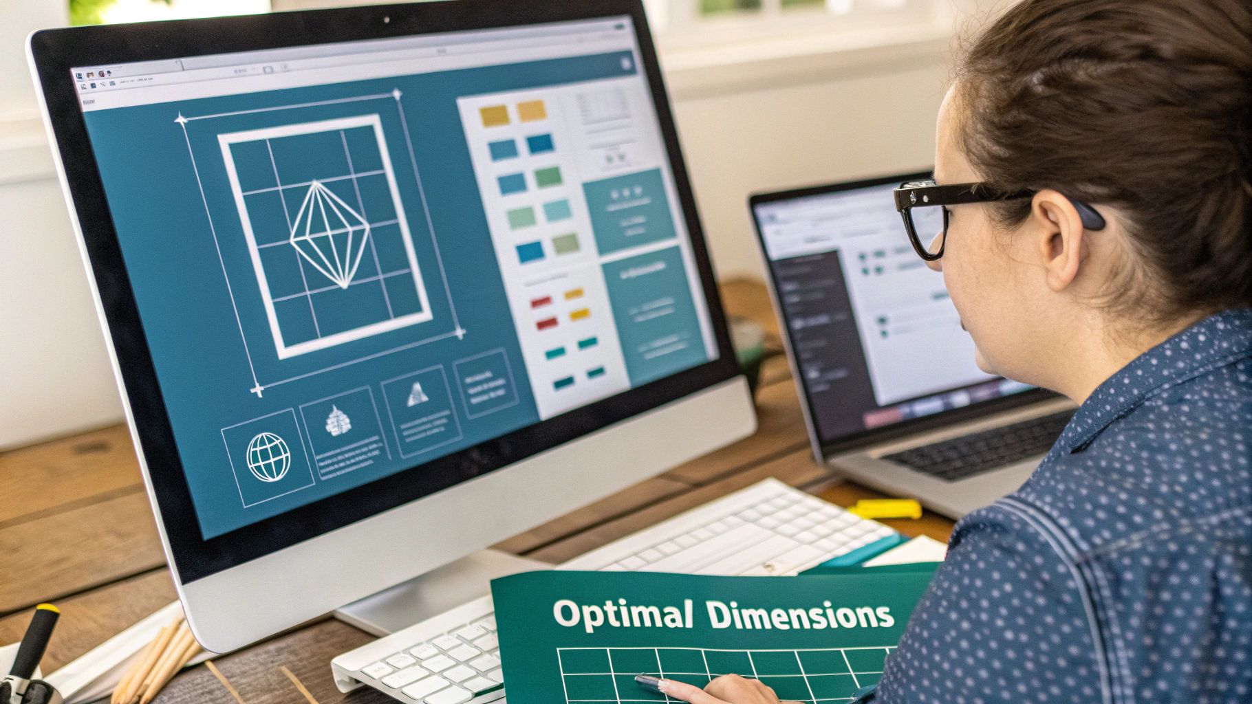
Getting your image sizes right on LinkedIn is one of the simplest yet most effective things you can do to boost your content’s impact. When your visuals are formatted correctly, they grab attention, look professional, and ensure your message doesn’t get awkwardly cut off. On the flip side, an image that’s blurry or poorly cropped can damage your credibility before anyone even reads a word you’ve written.
Think of this guide as your go-to reference for all the essential LinkedIn image specs. Whether you’re sprucing up your profile, sharing a new article, or putting together a multi-image post, using the right dimensions is key.
Essential Dimensions for Top Performance
As of 2025, the platform’s sweet spots for images are pretty clear. For a standard square post, aim for 1200 x 1200 pixels (1:1 aspect ratio). For images that accompany a link, the ideal size is 1200 x 627 pixels (1.91:1 aspect ratio).
LinkedIn also plays nicely with other formats, including:
- Portrait Images: 1080 x 1350 pixels (4:5 aspect ratio) are great for mobile viewing.
- Carousel Posts: Each individual image card can be up to 1200 x 1200 pixels.
- Profile Picture: Keep it sharp at 400 x 400 pixels.
- Background Banner: The recommended size is 1584 x 396 pixels.
The image below gives a great visual breakdown of the recommended dimensions for a standard post and highlights just how much of a difference the right size can make for engagement.
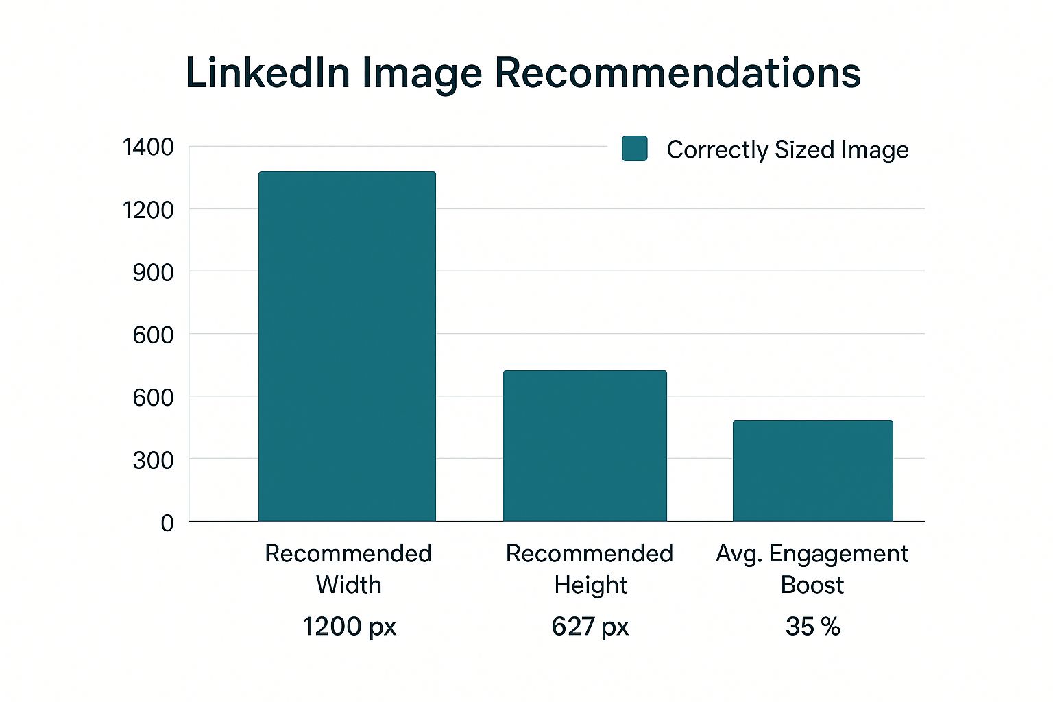
As you can see, sticking to that 1200 x 627 pixel guideline for link posts can directly lead to a big bump in audience interaction.
To help you keep track, here’s a quick cheat sheet with the most important specs.
LinkedIn Image Size Cheat Sheet
This table provides a quick summary of the most common image dimensions, aspect ratios, and file size limits for various LinkedIn content types.
| Image Type | Recommended Dimensions (Pixels) | Aspect Ratio | Max File Size |
|---|---|---|---|
| Profile Picture | 400 x 400 | 1:1 | 8MB |
| Background Banner | 1584 x 396 | 4:1 | 8MB |
| Square Post Image | 1200 x 1200 | 1:1 | 5MB |
| Link Preview Image | 1200 x 627 | 1.91:1 | 5MB |
| Portrait Post Image | 1080 x 1350 | 4:5 | 5MB |
| Carousel Card Image | 1200 x 1200 | 1:1 | 10MB |
Keep this table handy to make sure every visual you upload is perfectly optimized for the platform.
For an even deeper dive into all the visual requirements, this complete reference guide to LinkedIn Post Dimensions has all the details you could possibly need. It’s an excellent resource to bookmark.
Why Getting Your LinkedIn Image Sizes Right Matters
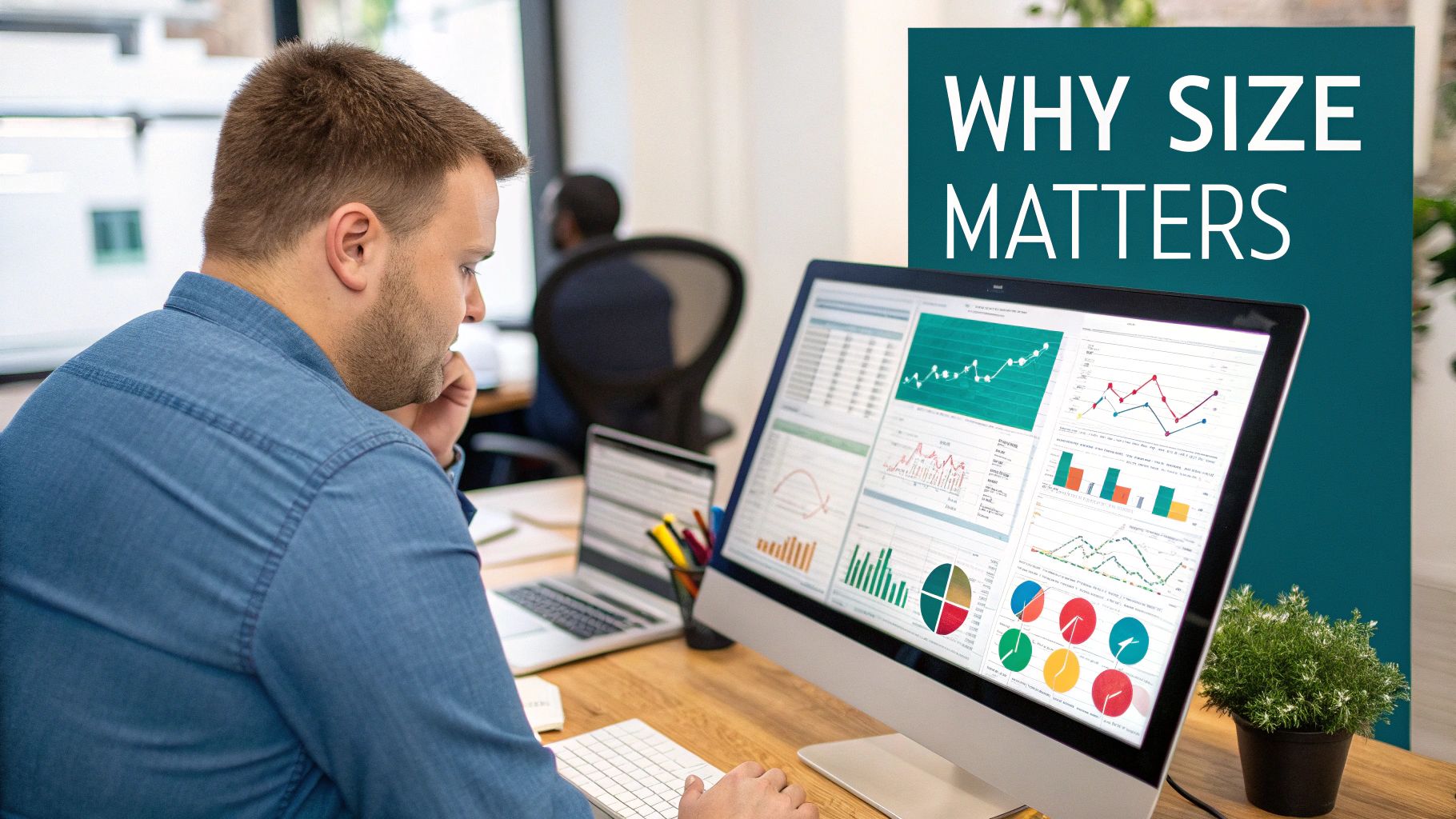
Let’s be honest, nailing the correct image dimensions for LinkedIn feels like just another technical box to tick. But in reality, it’s one of the most strategic moves you can make to boost your content’s performance. When an image fits perfectly, it instantly tells your audience you’re professional and you pay attention to the details.
On the flip side, getting it wrong can sabotage your message before anyone even reads it. If you upload a funky-sized visual, LinkedIn’s algorithm will try to force it into place by compressing or cropping it. The result? You end up with a blurry, pixelated mess, or worse, your main point gets chopped right off the screen. It’s an instant credibility killer that makes people scroll on by.
Making an Impact and Playing Nice with the Algorithm
Think about how fast you scroll through your own LinkedIn feed. You have a fraction of a second to grab someone’s attention, and your visuals are doing the heavy lifting. Using the recommended dimensions ensures your images look sharp, clear, and take up as much screen space as possible without any weird distortion. This is a game-changer on mobile, where most people are browsing anyway.
Beyond just looking good, properly sized images can actually get a little boost from the platform itself. LinkedIn’s algorithm is designed to promote a positive user experience. Content that loads quickly and displays correctly—like posts with optimized images—is seen as higher quality, which can help its initial visibility. You’re essentially giving your post the best possible start.
The Direct Line from Image Size to Engagement
The connection between visual quality and engagement isn’t just a theory; you can see it in the metrics. A crisp, well-composed image is simply more likely to get likes, comments, and shares. It’s a simple human response to something that looks good.
Here’s how proper sizing directly impacts your results:
- Better Clarity: Your message, whether it’s text on a graphic or the subject of a photo, is instantly understood without any distortion.
- Stronger Brand Image: Every time you post a high-quality visual, you reinforce that your brand is polished, professional, and trustworthy.
- Increased Dwell Time: An eye-catching image literally stops the scroll. That extra moment a user spends on your post signals to the algorithm that your content is valuable.
Spending a few extra minutes to get your image size for LinkedIn posts perfect is a small task with a massive payoff. Once you’ve captured that initial attention with great visuals, you can focus on turning it into real interaction. For deeper strategies on this, be sure to read our guide on how to increase LinkedIn engagement.
Optimizing Your Personal Profile Images
Think of your LinkedIn profile as your professional handshake in the digital world. People form an impression in just a few seconds, and the first things they see are your profile picture and background banner. These two visuals work as a team to introduce you, so getting the details right is critical for looking credible and professional.
These aren’t just decorative elements; they’re your personal branding in action. A sharp, professional photo builds immediate trust, and a thoughtfully designed banner can tell people exactly what you’re all about at a single glance. Let’s dive into the specs and best practices for making them work for you.
Mastering Your Profile Picture
Your profile picture is arguably the most important image you’ll upload. It’s the visual signature that follows you everywhere on the platform—next to your posts, your comments, and in every message you send.
Because LinkedIn crops it into a circle, you have to be mindful of framing. The last thing you want is for part of your face to get cut off. Keep the main subject—you!—centered.
- Recommended Dimensions: 400 x 400 pixels (a perfect 1:1 square).
- File Types: JPG, PNG, or GIF.
- Maximum File Size: 8MB.
Here’s a pro tip: while 400 x 400 pixels is the official recommendation, I always suggest uploading a larger, high-resolution square image, like 800 x 800 pixels. LinkedIn compresses images, and starting with a bigger file helps ensure the final result looks crisp and clear. A clean background and a friendly expression go a long way in making you seem approachable.
Designing a Standout Background Banner
The background banner, or cover photo, is the biggest piece of visual real estate on your entire profile. This is your chance to really stand out and communicate your brand, showcase your expertise, or even include a call to action. It’s your personal billboard—use it wisely!
The official dimensions are 1584 x 396 pixels, which is a wide 4:1 aspect ratio. The file size can be up to 8MB.
Now, here’s where it gets a little tricky. Your profile picture covers up part of the banner. On a desktop, it’s on the lower left; on mobile, it can shift toward the center. To avoid any awkward overlap, always place essential text, logos, or contact information in the upper-right area of your banner. This “safe zone” ensures your key message is always visible, no matter the device.
If you’re looking for some great examples to get your own ideas flowing, check out these 10 best LinkedIn banner ideas. A great banner works in harmony with your profile picture to create a polished, compelling first impression that makes people want to scroll down and learn more.
Perfecting Your Company Page Visuals
Think of your LinkedIn Company Page as your brand’s digital front door. It’s often the first place potential clients, partners, and future employees look to get a feel for who you are. Just like you wouldn’t want a messy reception area, the visuals on your page—from your logo to the main banner—are crucial for making a strong, professional first impression.
These images aren’t just for decoration; they’re a core part of your brand’s story on LinkedIn. A sharp, clear logo and a thoughtful cover image work in tandem to create a polished look that instantly communicates what your company is all about. Let’s get into the nitty-gritty of the exact dimensions you need.
Company Logo and Cover Image Specifications
Your company logo is your most important brand asset on LinkedIn. It shows up everywhere—in search results, on your employees’ profiles, and next to every update you post. The cover image, on the other hand, is the large banner at the top of your page that sets the visual tone.
- Company Logo Size: The sweet spot is 300 x 300 pixels. This perfect square ensures your logo looks crisp and clear no matter where it appears on the platform.
- Company Cover Image Size: You’ll want to use 1128 x 191 pixels. This wide, panoramic space is your billboard—use it to show off your brand’s personality, a new product, or your amazing team.
Don’t just slap any photo into your cover image slot. Use that space strategically. It’s a fantastic spot to announce a big launch, celebrate a company milestone, or even include a call to action. To keep your brand looking sharp and consistent, especially on a professional hub like LinkedIn, it can be a huge help to use pre-sized social media design templates.
Dimensions for the Life Tab and Custom Modules
If you’re focused on recruiting, the ‘Life’ tab is your secret weapon. This is where you can pull back the curtain and give potential hires an authentic look at your company culture, making your organization an attractive place to work.
A thoughtfully designed ‘Life’ tab can make a huge difference in your recruiting. It turns a standard corporate page into a compelling story about your people, your values, and what it’s really like to work with you.
To make sure this section looks its best, stick to these dimensions:
- Life Tab Main Image: 1128 x 376 pixels. This is the big, welcoming hero image at the top.
- Life Tab Custom Modules: 502 x 282 pixels. These are great for smaller, focused images that can highlight things like company values or employee testimonials.
- Life Tab Company Photos: 900 x 600 pixels. Perfect for a gallery of candid shots showing your team in action and capturing the office vibe.
By getting the image sizes right across your entire Company Page, you guarantee every visitor has a professional and visually engaging experience. This kind of attention to detail goes a long way in building trust and encouraging people to connect more deeply with your brand.
Mastering Shared Post Image Dimensions
This is where the rubber meets the road for your day-to-day content strategy. Shared posts are the lifeblood of your LinkedIn presence, and the image you attach is your best shot at stopping the scroll. Getting the image size for LinkedIn posts right is what makes your content look polished and professional.
Thankfully, LinkedIn gives you some flexibility, supporting a few different orientations for single-image posts. Each one has its own strategic advantage, depending on what you’re posting and what you want to achieve. Knowing the difference helps you make smarter design choices that really grab people’s attention.
Choosing Your Image Format
When you upload a single image to a LinkedIn post, you’ve got three main choices. Each one fits the feed a little differently, especially when you compare how it looks on a phone versus a desktop computer.
-
Square (1:1 Aspect Ratio): The go-to dimension here is 1200 x 1200 pixels. This is probably the safest and most versatile format, looking sharp and balanced on pretty much any device.
-
Landscape (1.91:1 Aspect Ratio): For this one, you’ll want to use 1200 x 627 pixels. This classic wide format is perfect for things like panoramic shots, event photos, or any graphic with a distinctly horizontal flow.
-
Vertical (4:5 Aspect Ratio): The ideal size is 1080 x 1350 pixels. This is a powerhouse choice for any mobile-first strategy. Why? Because it takes up more vertical screen space on a phone, making people pause just a little bit longer on your post.
The rise of mobile browsing has made vertical images a secret weapon for many creators. A post using the 1080 x 1350 pixels dimension can really dominate the screen on a phone, giving you a serious edge in a busy feed. By picking the right format, you get to control that first impression.
Demystifying Link Preview Images
Ever share a link and notice LinkedIn pulls in an image, title, and description automatically? That’s the link preview, and the thumbnail it generates is just as crucial as a regular post image. It’s the visual hook that entices people to click.
For these previews, the ideal image size is 1200 x 627 pixels, which is a 1.91:1 aspect ratio. If the website you’re linking to doesn’t have an image set up for this size, LinkedIn might grab something else and crop it awkwardly—or worse, show no image at all. This can tank your click-through rate.
The trick to getting the right image to show up is to set the Open Graph (OG) tags correctly in your webpage’s HTML. Specifically, the og:image tag tells social platforms like LinkedIn exactly which visual to pull. You can learn more about how to perfect your LinkedIn link preview card to drive more traffic. It’s a small technical step that gives you complete control, ensuring your shared links always look crisp and intentional.
How to Create High-Impact Carousel Posts
Carousel posts, which you might also see called “document posts,” are one of the most powerful storytelling tools you have on LinkedIn. Instead of just one image, they let you walk your audience through a series of slides. This makes them perfect for breaking down complicated ideas, sharing data in a digestible way, or telling a brand story that unfolds with each click.
When you create one, you’re actually just uploading a PDF. LinkedIn then cleverly converts that document into the swipeable carousel format that shows up in the feed. This is a brilliant way to get people to spend more time with your content, since they’re actively clicking to see what’s next.
Ideal Dimensions for Carousel Slides
The number one rule for a good-looking carousel is consistency. Every single slide needs to be the exact same size to give users a smooth, professional swiping experience. You’ve got two great, mobile-friendly choices here.
- Square (1:1 Aspect Ratio): My go-to recommendation is 1080 x 1080 pixels. This format is clean, balanced, and just works perfectly on both desktop and mobile.
- Vertical (4:5 Aspect Ratio): If you really want to grab attention on mobile, go with 1080 x 1350 pixels. This taller format takes up more of the screen, making it a natural scroll-stopper.
Whichever orientation you pick, just be sure to stick with it for the entire document. Mixing and matching different slide sizes will look jarring and unprofessional.
Think of a great carousel as a mini-presentation. Your first slide has one job: to be a “thumb-stopper” with a hooky headline. The slides that follow should use visual cues—like arrows or graphics that bleed onto the next slide—to keep people swiping.
Technical Requirements and Best Practices
Before hitting that upload button, double-check that your file meets LinkedIn’s technical rules. This will save you a headache later.
- File Type: Your multi-page design absolutely must be saved as a PDF. No other formats will work for this feature.
- File Size: The PDF needs to be under 100MB and can’t be longer than 300 pages.
To make your carousel truly effective, design it with a clear story in mind. Use big, easy-to-read fonts, crisp visuals, and don’t be afraid of white space. Always wrap it up with a strong call-to-action on the last slide to tell your audience what you want them to do next.
For a deeper dive into the strategy behind this, check out our complete guide on creating an effective LinkedIn carousel post that really gets results.
Common Image Mistakes and How to Fix Them
Even when you nail the perfect dimensions, a few simple mistakes can still sabotage your visuals. Knowing what these common pitfalls are—and how to sidestep them—is the final piece of the puzzle for mastering the right image size for LinkedIn posts. This is what separates amateur content from a polished, professional feed.
One of the most common errors I see is people using low-resolution images. Nothing screams “unprofessional” faster than a grainy or pixelated graphic. It instantly detracts from your message and cheapens your brand’s appearance. Always, always start with a high-quality source file and export it at the recommended size to prevent any blurriness.
Another huge oversight is forgetting about the mobile experience. With over 60% of LinkedIn traffic now coming from mobile devices, what looks fantastic on your desktop monitor can fall apart on a small screen. Text can become illegible, or worse, important parts of your image might get cropped out entirely.
Quick Fixes for Common Problems
To keep your visuals looking sharp and professional, here are a few simple solutions I rely on for these frequent issues:
-
Blurry Images: Always start with a larger source image and scale it down. Never, ever stretch a small image to make it bigger—that’s a guaranteed recipe for pixelation. For graphics that include text or logos, I recommend using the PNG format for maximum clarity.
-
Awkward Cropping: You have to test your images before you hit “post.” I pay extra close attention to profile banners and any vertical video or image posts, since the cropping can vary wildly between desktop and mobile. A good rule of thumb is to keep critical information, like text or your logo, safely away from the edges.
I can’t stress this enough: always preview your post on both a mobile device and a desktop computer before publishing. This five-second check can save you from an embarrassing design flaw that undermines your credibility.
By sidestepping these common mistakes, you can be confident that every single image you share on LinkedIn is optimized to make the right impact.
Common Questions (and Expert Answers) About LinkedIn Images
Getting your images just right on LinkedIn can feel a bit tricky sometimes. I’ve been there. Here are some quick answers to the most common questions I get, designed to help you nail your visuals every single time.
What Happens If My Image Has the Wrong Aspect Ratio?
If you upload an image with an aspect ratio LinkedIn doesn’t like, the platform will take matters into its own hands and crop it for you. More often than not, this automatic crop is a disaster. It can awkwardly slice off important parts of your image or leave your main subject completely off-center.
Imagine you spent time creating a beautiful, wide panoramic shot. LinkedIn might just chop it into a 1:1 square, completely ruining the composition. To avoid this, always stick to the recommended ratios—like 1:1 for square images or 1.91:1 for horizontal ones—to keep full creative control.
How Can I Stop LinkedIn from Making My Images Blurry?
Ah, the dreaded compression blur. LinkedIn compresses images to help the feed load faster, but this can sometimes make your crisp graphics look a little soft. The best defense is a good offense: start with a high-quality image and save it in the exact dimensions you need before you upload.
Here’s a pro-tip I swear by: try saving your graphics as PNG files instead of JPGs. I’ve found that PNGs, especially for images with sharp lines or text, tend to hold up much better and stay clearer after LinkedIn applies its compression.
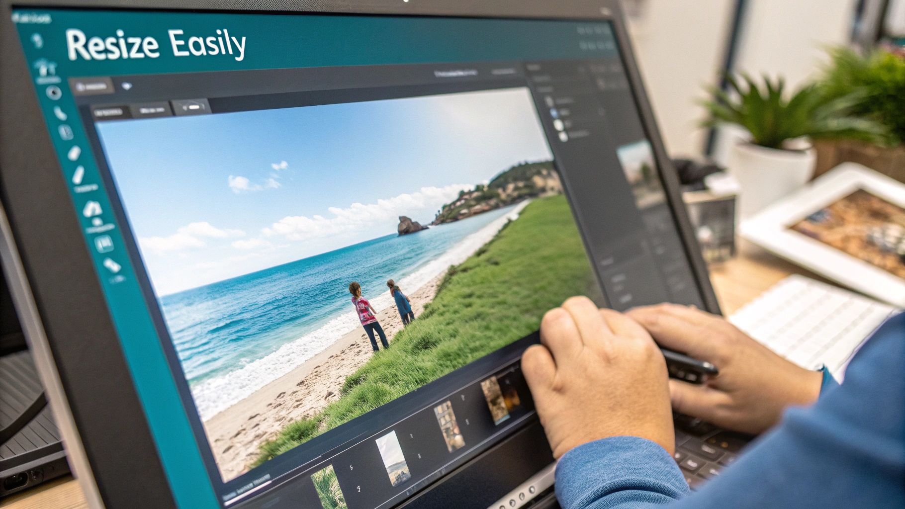
What Are the Best Free Tools for Resizing Images?
You definitely don’t need to splurge on fancy software to get your images ready for LinkedIn. There are some fantastic free tools out there that get the job done perfectly.
- Canva: This is my go-to for pretty much everything. It’s incredibly easy to use and even has pre-sized LinkedIn templates ready to go.
- Adobe Express: A great, streamlined option from Adobe that makes resizing quick and painless.
- Photopea: If you’re comfortable with something a bit more advanced, this is a free, browser-based editor that feels a lot like Photoshop.
Using one of these, you can easily plug in the exact dimensions you need, like 1200 x 1200 pixels, and know your image will look perfect.
Are the Image Sizes for LinkedIn Articles Different?
Yes, they are! This is a common point of confusion. LinkedIn Articles, which are their long-form blog post format, have their own set of rules.
The main image at the top of an article—often called the “hero” or feature image—needs to be 1200 x 644 pixels. This wider, more cinematic format is specifically designed to create an engaging header for your written content, setting it apart from a standard feed post.

Run every client pipeline in one place
Give each LinkedIn profile its own voice, calendar, approval flow, and analytics. Start in minutes.
Start free trial