The Ultimate LinkedIn Posts Size Guide for Maximum Impact
Master the correct LinkedIn posts size with our complete guide. Get the latest image dimensions, video specs, and text limits to maximize your engagement.
When it comes to posting on LinkedIn, size really does matter. For a standard image post, you’ll want to aim for 1200 x 627 pixels for a classic landscape view or 1080 x 1080 pixels if you’re going for a square format. Sticking to these dimensions is the easiest way to make sure your visuals look sharp and professional, preventing any awkward cropping that can sabotage your message in a busy feed.
Your Quick Reference for LinkedIn Post Dimensions
Getting your LinkedIn post sizes right is one of those foundational things you just can’t skip. It’s what makes your content look polished and professional. Think about it: millions of professionals are scrolling their feeds every day. A wonky, poorly formatted image or video can instantly make your brand look amateur, undermining your message before anyone even reads it.
This section is your go-to cheat-sheet for all the critical specs. Whether you’re sharing a single killer image, a quick video update, or a detailed multi-page document, knowing the optimal dimensions, aspect ratios, and file size limits is non-negotiable. Get them wrong, and you risk pixelated images, strangely cropped thumbnails, or frustrating upload errors—all of which kill your engagement.
For a quick visual breakdown, this infographic covers the most popular formats at a glance.
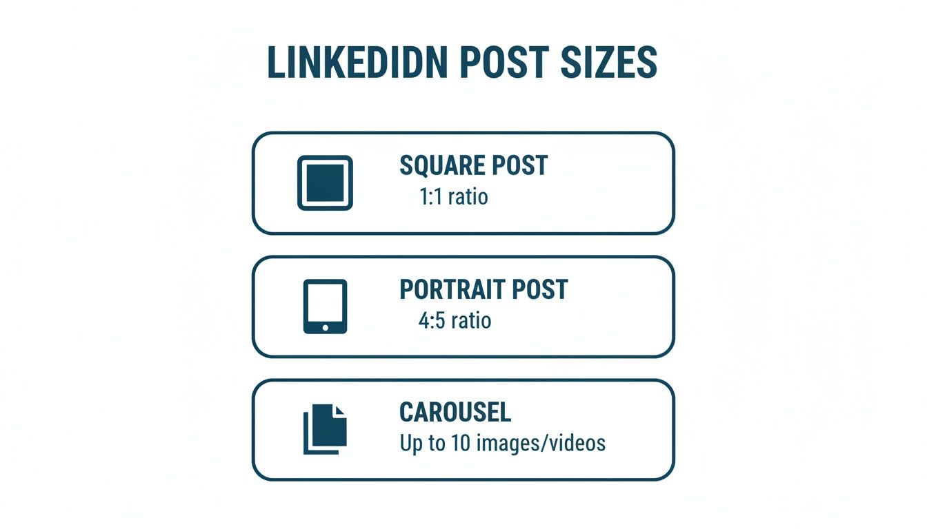
As you can see, portrait and square formats are incredibly effective. They simply take up more screen real estate, which is a massive advantage for grabbing attention, especially on mobile.
LinkedIn Post Size Quick Reference
Here’s a handy table to keep all the essential numbers in one place. Bookmark this page so you can quickly reference it whenever you’re creating content.
| Content Type | Recommended Dimensions (pixels) | Aspect Ratio | Max File Size |
|---|---|---|---|
| Single Image (Square) | 1080 x 1080 | 1:1 | 5 MB |
| Single Image (Portrait) | 1080 x 1350 | 4:5 | 5 MB |
| Single Image (Landscape) | 1200 x 627 | 1.91:1 | 5 MB |
| Native Video | 256 x 144 (min) to 4096 x 2304 (max) | 1:2.4 to 2.4:1 | 5 GB |
| Carousel Post (Image/Video) | 1080 x 1080 (Square) or 1080 x 1350 (Portrait) | 1:1 or 4:5 | 10 MB (Image) / 5 GB (Video) |
| Document Post (PDF/PPT) | 1240 x 1754 (A4 recommended) | 1.41:1 (Portrait) | 100 MB |
Getting these specs right from the start saves a ton of headaches later and ensures your content always looks its best.
Why Sizing Matters in a Growing Market
The need for this kind of precision is even more critical when you look at active markets like Germany, where the user base shot up by 20% in the last year alone, adding 3 million new profiles. With over 1,200 posts hitting the global LinkedIn feed every minute, flawless execution is what makes you stand out from the noise.
If you want to dive deeper into how visual dimensions affect performance on other platforms, check out this complete guide to aspect ratio for social media. Remember, properly sized content doesn’t just look better—it’s also favoured by LinkedIn’s algorithm, helping you reach a bigger slice of this ever-expanding audience.
Getting Your LinkedIn Image Dimensions and Best Practices Spot On
Posting an eye-catching image on LinkedIn involves more than just picking a good photo. To really make an impact, you need to understand the platform’s specific dimensions. Getting the image size right makes your content look professional, stops any weird cropping, and grabs attention in a busy, fast-scrolling feed.
Whether it’s a quick update or a big announcement, nailing the dimensions is the first, crucial step to making sure your post performs as well as it can.
There are three main image orientations you’ll be working with, and each one is suited for different kinds of content. The one you pick will change how your post looks on both desktop and mobile, which has a direct effect on how people engage with it.
Key Image Post Dimensions
To keep your visuals looking sharp and perfectly framed every time, stick to these standard LinkedIn image post sizes:
- Square (1:1 Aspect Ratio): The go-to dimension here is 1080 x 1080 pixels. This format is incredibly versatile. It creates a balanced look that works beautifully on both mobile and desktop, making it a super reliable choice for most of your image posts.
- Portrait (4:5 Aspect Ratio): You’ll want to aim for 1080 x 1350 pixels. This vertical format is a powerhouse on mobile devices. Why? Because it takes up more screen space, making it much harder for someone to just scroll past.
- Landscape (1.91:1 Aspect Ratio): The ideal size is 1200 x 627 pixels. This is the more traditional, wider format, and it’s best used for things like linked article previews or any shot where you need that horizontal presentation.
Choosing the right format really comes down to what you’re trying to achieve. A portrait image, for example, is perfect if you know most of your audience is on mobile. A square image is great for consistent branding across all devices. For a deeper dive, check out our complete guide on the ideal LinkedIn post image size, which is packed with more insights and examples.
Best Practices for High-Quality Images
It’s not just about the dimensions, though. A few other technical bits and pieces can really lift the quality of your image posts and make them look polished.
First off, always, always use high-resolution images to avoid that dreaded pixelated look. LinkedIn compresses images when you upload them, so starting with a crisp, clear source file is a must. The platform supports both JPG and PNG file formats, but be sure to keep your file size under the 5 MB limit to avoid any upload headaches.
Pro Tip: If you’re designing images with text on them, try to keep the most important information toward the centre. Think of it as a “safe zone.” This prevents crucial text or your company logo from getting awkwardly chopped off in feed previews, which can be especially aggressive on mobile.
Finally, make it a habit to preview your post before you hit publish. Something that looks perfect on your big desktop monitor might look completely different on a smaller mobile screen. A quick check can save you from any nasty surprises with cropping or formatting, ensuring your audience sees your content exactly the way you planned. By mastering these specs and practices, you’re setting every visual you share on LinkedIn up for success.
Getting Your LinkedIn Video Post Specifications Right
It’s no secret that video is one of the most powerful ways to grab attention on LinkedIn. It just works. A well-produced video can stop the scroll and engage your audience far more effectively than a static post. But to get the most out of your video content, you need to nail the technical specs.
Getting the dimensions, file size, and format right from the start is absolutely crucial. It’s the difference between a crisp, professional-looking video and one that’s awkwardly cropped, blurry, or just won’t upload at all. Let’s make sure your message comes across perfectly.
Video Dimensions and Aspect Ratios
LinkedIn is pretty flexible with video sizes, but the feed is definitely optimised for certain aspect ratios. Choosing the right one ensures your video looks great and fits the screen perfectly, whether someone is watching on their desktop or scrolling on their phone.
- Landscape (16:9): This is your classic, wide-format video. It’s perfect for things like interviews, webinars, or detailed presentations. Aim for a resolution of 1920 x 1080 pixels.
- Square (1:1): A real powerhouse format for the mobile feed. Square videos take up a lot of screen real estate, which makes them hard to ignore. Use 1080 x 1080 pixels for the sharpest look.
- Vertical (9:16): Built for the way we use our phones. This is the go-to for mobile-first content like quick tips, behind-the-scenes clips, or story-style videos. The best dimension here is 1080 x 1920 pixels.
So, which should you choose? It really comes down to your content. If you’re sharing in-depth tutorials, landscape is a solid choice. For quick, attention-grabbing posts, square and vertical formats are tough to beat.
Technical File Requirements
Beyond just the size and shape, your video file itself has to meet a few technical rules to upload smoothly. These specs are all about ensuring your video is compatible with LinkedIn’s platform and plays back without a hitch.
The only accepted file format is MP4 – it’s the universal standard, so you shouldn’t have any trouble creating one. When it comes to file size for native video uploads, you have a range between 75 KB and a hefty 5 GB. That’s a massive ceiling, giving you plenty of room to upload high-quality, longer videos without having to compress them into oblivion.
Key Insight: LinkedIn lets you upload native videos up to 10 minutes long (or 30 minutes for ads), but don’t feel you need to use all that time. Our own data consistently shows that videos under 90 seconds get the best engagement. Hook them early and keep it concise.
Best Practices for Video Engagement
Getting the technicals right is step one. Step two is making sure people actually watch your video. A few simple best practices can make all the difference.
First, create a compelling custom thumbnail. This is the very first thing people will see, and it needs to be enticing enough to make them hit play. Don’t leave it to chance.
Next, add captions. This is non-negotiable. So many people watch videos on LinkedIn with the sound off, and without captions, your message is completely lost. Finally, make sure the first three to five seconds of your video are a powerful hook designed to stop scrollers in their tracks. For a more detailed guide, check out our complete walkthrough on how to post a video on LinkedIn.
Navigating Carousel and Document Post Requirements
Carousel posts, also known as document posts, are absolute powerhouses for sharing deep insights, telling a story, or walking through a portfolio. At their core, they are the same thing: you upload a multi-page document (like a PDF or PowerPoint), and users can swipe right through it in their feed.
These formats are brilliant because they hold a user’s attention far longer than a single image. They’re perfect for breaking down complex ideas into simple, digestible slides. But to make them look professional and seamless, you’ve got to nail the specs.
Ideal Dimensions and Aspect Ratios
For a carousel to look polished, every slide needs to be consistent. Sticking to one set of dimensions for the entire document prevents any weird, jarring resizing as people swipe through your content.
- Square (1:1 Aspect Ratio): The go-to and most versatile choice is 1080 x 1080 pixels. It looks great on both desktop and mobile, giving you a nice, balanced canvas.
- Portrait (4:5 Aspect Ratio): If you’re designing with mobile viewers in mind, go for 1080 x 1350 pixels. This taller format takes up more vertical screen space on phones, making your post much harder to scroll past.
While you technically can mix different sizes, I strongly recommend against it. Keeping the dimensions the same from the first slide to the last creates a much smoother and more professional experience.
File Specifications and Limits
Nothing is more frustrating than a failed upload. To avoid that headache, you need to stick to LinkedIn’s technical limits for document posts. The good news is they’re pretty generous, so you can pack in plenty of rich, detailed content.
LinkedIn accepts a handful of common file types, which makes it easy to repurpose presentations or guides you already have.
- Supported Formats: You can upload PDF, PPT, PPTX, DOC, and DOCX files.
- Maximum File Size: Keep your file under 100 MB.
- Maximum Page Count: You can go all the way up to 300 pages or slides in one document.
Strategic Tip: Just because you can upload 300 pages doesn’t mean you should. The most effective carousels are tight and focused, usually landing somewhere between 5 and 15 slides. The goal is to deliver value quickly, not to publish a novel.
Best Practices for Creating Engaging Carousels
A great carousel isn’t just a slide deck; it’s a visual story. Your first slide needs to be a showstopper—it should grab attention immediately and make it crystal clear what the topic is and why someone should care.
From there, each slide should build on the last, using a smart mix of text, images, and graphics to keep things interesting. And always, always end with a clear call-to-action (CTA) on your final slide. Ask a question to get comments rolling, prompt people to follow your page, or direct them to your website.
To get a better feel for how to structure your content for maximum impact, check out our in-depth guide on creating the perfect LinkedIn carousel post. Once you get the hang of these requirements, document posts can easily become a cornerstone of your content strategy.
Understanding LinkedIn Character and Text Limits
Your visuals might grab their attention, but it’s the words you write that will hold it. The text that goes with your LinkedIn posts is just as crucial for getting people to stop scrolling, understand your point, and jump into the conversation.
But here’s the thing: every single text field on LinkedIn has its own rules. Knowing these limits isn’t just about following guidelines; it’s about crafting a message that lands perfectly without getting awkwardly cut off. Mastering the character counts means you can be strategic, putting the most powerful part of your message upfront to make sure it’s seen. This is a massive part of optimising your overall linkedin posts size and impact.
LinkedIn Text and Character Limits
To keep your copy punchy and effective, you need to know the specific limits for different types of content on the platform. Think of them less as restrictions and more as creative guardrails that guide how you should approach everything from a quick update to a detailed article.
Here’s a quick-reference table breaking down the most common limits you’ll run into.
| Element | Character Limit | Best Practice Tip |
|---|---|---|
| Standard Post | 3,000 characters | Get your most important information into the first 2-3 lines. You need to hook readers immediately to get them past the ‘see more’ cut. |
| Article Headline | 700 characters | You’ve got tons of space, but keep it under 100 characters for better readability and to avoid it being cut off in previews. |
| Comment | 1,250 characters | Use this generous limit to leave thoughtful, detailed responses. It’s a chance to add real value, not just a quick “great post!” |
| Profile Headline | 220 characters | Pack this with keywords about your role, expertise, and value. This is prime real estate for showing up in search results. |
Knowing these numbers is step one. Step two is learning how to use that space to make every single character work towards your goals.
Strategies for Effective Post Copy
Just staying inside the character limit isn’t going to cut it; your text has to be genuinely compelling. The biggest hurdle you face is the infamous “see more” button, which hides most of your post after about 210 characters on desktop. This makes your opening lines absolutely mission-critical.
Key Insight: Your first two sentences are your sales pitch. They have to spark curiosity or make a bold claim that makes someone need to click and see the rest. If you fail here, the other 2,790 characters you wrote might as well not exist.
For longer posts that go beyond that initial preview, use formatting to your advantage. Nobody wants to read a giant wall of text. Break it up with:
- Short paragraphs: Stick to one or two sentences each. This creates white space and makes it much easier on the eyes.
- Bullet points or numbered lists: These are perfect for making complex information scannable and easy to digest.
- A few strategic emojis: A well-placed emoji can add a bit of personality and draw the eye to key points without looking unprofessional.
When you combine a killer hook with clean, readable formatting, you give your audience every reason to not only see your message but to stick around and actually engage with it.
How Post Volume and Account Size Impact Reach
It’s easy to get bogged down in the technical details of the perfect linkedin posts size, but what about your posting frequency? How often you should post is a common question, and the answer isn’t a simple one-size-fits-all number. It’s tied directly to the size of your audience and what you’re trying to achieve.
Think of it this way: for smaller accounts, the main goal is to build a consistent presence and show up regularly. For larger, more established accounts, a higher volume of posts can help them dominate their followers’ feeds and maximise their reach. This is especially true in fast-growing professional markets like Germany.
Finding Your Posting Cadence
So, what’s the sweet spot? A recent analysis of over 1.58 million posts gives us a pretty clear picture of how posting patterns change with follower count.
Tiny accounts (0-500 followers) tend to post just under once per day. At this stage, it’s all about quality over quantity to build that crucial initial following. As they grow into the 500-2,000 follower range, the volume picks up to about 1-2 posts daily while they figure out which content formats resonate best.
Medium-sized accounts (2,000-10,000 followers) hit a comfortable rhythm at around 2-3 posts per day, which helps them establish a reliable and consistent presence. Once you hit the big leagues with 10,000-50,000 followers, the frequency often jumps to 3-4 posts daily to capitalise on that hard-earned authority. And for the huge accounts with over 50,000 followers? They’re often posting 4+ times per day, using sheer volume to stay top-of-mind.
You can dive deeper into the numbers in this breakdown of daily posts by account size.
Strategic Implementation and Tools
This data provides a solid roadmap for your content plan. If you’re just starting out, concentrate on one high-quality post each day. As your audience grows, you can start to gradually increase your output to match the benchmarks for your account size. Remember, while volume can influence reach, mastering strategies for increasing social media engagement is what will truly maximise the impact of every post.
Key Takeaway: Consistency beats sheer volume every time, especially when you’re starting out. The algorithm rewards regular activity, so find a sustainable pace you can stick to. Never sacrifice quality just to hit a daily post quota.
This is where tools like Postline.ai can be a lifesaver. They allow you to plan and schedule your content in advance, making it much easier to maintain the ideal posting frequency for your account size without the daily grind. They also give you insights into how volume affects key metrics. To learn more, check out our guide on what impressions on LinkedIn really mean for your growth.
Common Mistakes to Avoid With LinkedIn Post Sizes
Getting your LinkedIn post dimensions wrong is a surefire way to kill your content’s credibility before anyone even reads it. It instantly makes your brand look unprofessional, and a few common, completely avoidable slip-ups are usually the culprit.
One of the most frequent mistakes I see is uploading low-resolution images. When a picture is smaller than LinkedIn’s recommended dimensions, the platform stretches it to fit the feed. The result? A blurry, pixelated mess that makes even the most brilliant post look like it was thrown together in a hurry.
Another classic error is ignoring aspect ratios, particularly how they translate to mobile. That landscape image that looks fantastic on your big desktop monitor can get awkwardly cropped on a phone, chopping off essential details or completely wrecking the visual composition you spent time on.
Disregarding Device-Specific Rendering
It’s a huge oversight to not check how your content looks on different devices. What seems perfect on a desktop can be a total disaster in the LinkedIn mobile app, which is where a massive chunk of your audience will see it.
- The Mistake: You design a wide, landscape-style image and place key text or logos near the far left and right edges.
- The Problem: The mobile preview often crops the sides, slicing your message in half. An event announcement might lose the date, a call-to-action might lose the phone number. Your post becomes useless.
- The Fix: Always keep your most important visual elements—text, logos, faces—inside a central “safe zone.” Before you hit publish, give it a quick check on your own phone or use a preview tool. It takes seconds and can save your post from flopping.
Key Takeaway: The majority of LinkedIn users are scrolling on their phones. Optimising for a mobile-first experience isn’t just a nice-to-have; it’s absolutely essential if you want to maximise your reach and impact.
Overlooking File and Length Limits
Those technical specs for file sizes and video lengths aren’t just gentle suggestions—they’re hard limits. If you try uploading a video that’s over the 5 GB maximum or a PDF that’s bigger than 100 MB, you’re just going to get a frustrating upload error. It’s a waste of time that can throw your whole content schedule off track.
In the same vein, people often ignore video length best practices. Sure, LinkedIn lets you upload a native video that’s up to 10 minutes long, but viewer attention spans are notoriously short.
- The Mistake: Posting a long, meandering 8-minute video with no clear hook in the first few seconds.
- The Problem: Engagement plummets after the first few moments. People will scroll right past before you ever get to your main point.
- The Fix: Keep your videos tight and lead with the most valuable info. Aim for under 90 seconds and make absolutely sure the first three seconds are compelling enough to stop the scroll.
By steering clear of these common pitfalls, you can make sure your content looks polished, professional, and ready to perform every single time.
Frequently Asked Questions About LinkedIn Post Sizes
So you’re trying to nail down all the different specs for your LinkedIn content, and a few questions keep popping up. It happens to everyone. This section gives you quick, straightforward answers to the most common queries we see about getting your LinkedIn posts sized just right. Think of it as your go-to for troubleshooting your content strategy.
We’ve pulled together the questions that trip up professionals the most when they’re trying to polish their visual game on the platform. Each answer is short and to the point, giving you practical advice you can use immediately.
How Can I Avoid Image Cropping on Mobile?
Nothing’s worse than a perfectly good image getting awkwardly cropped on mobile. To dodge this, your best bet is to use a portrait aspect ratio of 4:5 (that’s 1080 x 1350 pixels). This vertical layout fills up more of the screen on phones, making sure your whole image is visible without anyone needing to tap on it.
A square 1:1 aspect ratio (1080 x 1080 pixels) is another safe option that plays nicely across all devices. The real trick is to keep your key visual elements—like text or a focal point—smack in the centre, inside a “safe zone.” This keeps them away from the edges where cropping is most likely to happen in the feed.
Can I Post Vertical Videos on LinkedIn?
Yes, you absolutely can, and you should be. LinkedIn fully supports the 9:16 aspect ratio (1080 x 1920 pixels), which is tailor-made for how people consume content on their phones.
When you upload a vertical video, it takes over the entire screen on mobile, creating a much more immersive experience that’s brilliant for grabbing and holding someone’s attention. Just one pro tip: always add captions. A huge number of users watch videos with the sound off.
Key Reminder: LinkedIn is pretty flexible with video formats, but here’s the bottom line: vertical and square videos consistently crush traditional landscape videos in mobile engagement. Why? Because they simply command more visual real estate on the screen.
Why Does My PDF Look Blurry?
If you’ve uploaded a PDF as a document post and it looks fuzzy, low resolution is almost always the culprit. Even though LinkedIn accepts different document sizes, it still compresses the file during processing, and that can really knock down the quality.
To keep things looking sharp, create your document at a high resolution from the start. A standard A4 size (1240 x 1754 pixels) saved with high-quality export settings is a solid baseline. Also, make sure any images inside your PDF are high-resolution, too—they’re usually the first things to get pixelated after you upload.
Ready to create perfectly sized, engaging LinkedIn posts in minutes? Postline.ai uses AI to help you write, format, and schedule content that sounds just like you, but better. Stop guessing and start growing your audience today. Learn more about Postline.ai.

Run every client pipeline in one place
Give each LinkedIn profile its own voice, calendar, approval flow, and analytics. Start in minutes.
Start free trial