How to Export Data from LinkedIn Analytics to Excel [2025]
Master the correct LinkedIn posting image size for every format. This guide covers single images, carousels, and links to maximize your professional impact.
If you want your LinkedIn posts to look sharp and professional, getting the image size right is non-negotiable. While 1200 x 627 pixels is the go-to recommendation for shared images and link previews in a landscape format, don't forget about mobile. For grabbing attention in the mobile feed, a vertical image with a 4:5 aspect ratio often performs much better.
Guessing your image dimensions can lead to awkward cropping and completely kill the impact of your post. This guide cuts through the confusion, giving you the exact specs you need for the most common post types on LinkedIn.
Quick Reference Guide to LinkedIn Image Sizes
Let's dive straight into the numbers. This is your cheat sheet for the key dimensions you'll need for standard posts, shared links, and videos.
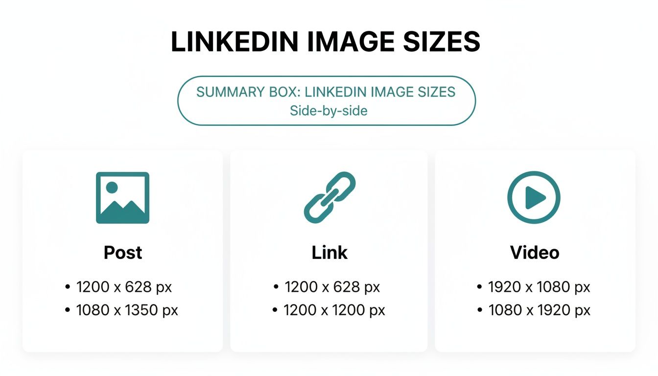
As the infographic shows, while different formats have unique requirements, a 1200-pixel width is a pretty reliable standard to aim for across the board.
For a quick summary of the most important formats, here’s a handy table.
LinkedIn Image Size Cheat Sheet
Image Type | Recommended Dimensions (Pixels) | Supported Aspect Ratio |
|---|---|---|
Shared Image (Desktop) | 1200 x 627 | 1.91:1 |
Shared Image (Mobile) | 1200 x 1500 | 4:5 |
Link Preview Image | 1200 x 627 | 1.91:1 |
Carousel Post (Square) | 1080 x 1080 | 1:1 |
Carousel Post (Vertical) | 1080 x 1350 | 4:5 |
Keep this table bookmarked for easy access whenever you're creating new content.
Key Dimensions for Posts
In the German market, where LinkedIn boasts over 21 million professionals, optimising your post images is especially important. Research on German company pages revealed that images sized at 1200×627 pixels received a massive 34% more impressions than those that weren't optimised. It’s a small detail that makes a big difference.
If you’re using AI to help create content, knowing these specs is even more critical. It ensures that any visuals generated by your tools are perfectly formatted for the platform. For a rundown of what's out there, you might want to check out this list of the 12 Best AI Content Creation Tools for 2025.
For a complete breakdown of every format, have a look at our full guide on the best overall https://postline.ai/blog/2/image-size-for-linkedin-posts.
Mastering Your Professional Profile Images
On LinkedIn, your profile picture and background banner are your digital handshake. They’re the very first thing recruiters, potential clients, and colleagues see, making them absolutely critical for crafting a polished, credible first impression. Think of them as the cornerstones of your personal brand on the platform.
These two images don't work in isolation; they team up to tell your professional story in a single glance. Your profile picture gives a face to the name, making you relatable. Your banner, on the other hand, provides the all-important context—what you do, who you work for, or what you're passionate about. Nailing these is a simple but incredibly powerful move.
Profile Picture Dimensions and Best Practices
Your LinkedIn profile photo is your most recognisable asset online. It’s what people will remember. Crucially, LinkedIn displays it as a circle, so you absolutely have to compose your shot with that crop in mind.
Recommended Dimensions: A sharp 400 x 400 pixels is the recommended size to aim for.
File Type: Stick to high-quality JPG or PNG files for the best results.
File Size: Make sure your file is under 8 MB, or LinkedIn will reject the upload.
For professionals based in Germany, a top-notch profile picture isn't just a nice-to-have; it's essential. Profiles with a professional photo get a staggering 14 times more views. What's more, using a crisp 400x400 pixel image can bump up your connection acceptance rate by as much as 31%. You can dive deeper into the data by checking out Hootsuite's research on social media image practices.
Background Banner Optimisation
Your background banner—that wide image at the top of your profile—is prime real estate for personal branding. Don't waste it! Use this space to flash your expertise, promote your company, or share a key professional message.
The ideal linkedin posting image size for a personal profile banner is 1584 x 396 pixels. One critical thing to remember is that your circular profile picture will overlap the bottom-left corner. So, keep any important text or logos away from that area to make sure they're visible on both desktop and mobile. A thoughtfully designed banner adds valuable context that your headshot can't convey on its own. If you need some inspiration, have a look at our guide to the 10 best LinkedIn banner ideas to really make your profile pop.
Optimising Single Image Posts for Maximum Reach
Single image posts are the bread and butter of a solid LinkedIn strategy. Think of them as your go-to tool for sharing insights, company news, and brand visuals. To make sure they actually stop people from scrolling, you need to get the linkedin posting image size right for each orientation. It's not just about aesthetics; each format has its own strategic advantage in the feed.
You’ve got three main choices for single images: square, vertical, and landscape. The best one really depends on what you’re posting and, crucially, how you want people to see it. This is especially true on mobile, where every pixel of screen space counts.
Recommended Dimensions for Each Format
To avoid your beautiful visuals getting awkwardly chopped off, it’s best to stick to these recommended dimensions. Each aspect ratio is designed for a specific viewing experience, so it pays to get them right from the start.
Square (1:1 Aspect Ratio): The sweet spot here is 1080 x 1080 pixels. This is a super versatile format that looks clean and balanced on both desktop and mobile. No surprises, just a solid presentation.
Vertical (4:5 Aspect Ratio): You’ll want to aim for 1200 x 1500 pixels. This format is an absolute beast on mobile. It takes up the most vertical space in the feed, making it practically impossible to ignore.
Landscape (1.91:1 Aspect Ratio): The ideal size is 1200 x 627 pixels. This is a more traditional format that’s better suited for desktop viewing. It’s perfect for wide-angle photographs or graphics with a panoramic feel.
If you want to make the biggest impact, prioritise the vertical 4:5 format. Since most people are scrolling LinkedIn on their phones, this orientation makes your post as large and immersive as possible, which can seriously boost its visibility.
Technical Specifications and Best Practices
Getting the dimensions right is half the battle. To make sure your images load quickly and look sharp, you also need to pay attention to the technical details. File size and type should always be on your pre-upload checklist.
And if your designs include text overlays, knowing the ins and outs of prompting AI for images with specific text can be a game-changer for creating truly impactful LinkedIn visuals.
Before you hit 'post', run through these final checks:
File Type: Use PNG for any graphics that have text and logos—it keeps them crisp. For photos, JPG is your best bet.
File Size: Keep your image under 5 MB. This prevents any upload headaches and ensures it loads quickly for everyone, no matter their connection speed.
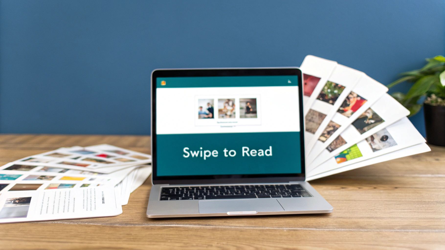
Creating High-Impact LinkedIn Carousel Posts
Carousel posts are easily one of the most engaging formats you can use on LinkedIn. They let you turn a standard update into an interactive, multi-page story. It’s the perfect way to break down a complex idea, show off a portfolio, or walk your audience through a narrative, one slide at a time. This makes them absolute gold for educational content and brand storytelling.
Unlike a simple image post, a carousel works by uploading a document—usually a PDF. LinkedIn then cleverly displays it as a series of swipeable cards. Nailing the dimensions here is absolutely critical for a smooth user experience. You want your text and visuals to flow perfectly from one slide to the next, without any awkward or jarring cut-offs.
Carousel Dimensions and Format Options
You’ve got two main choices for your carousel card dimensions, and each one comes with its own strategic perks. The one you pick will shape how your content gets seen, especially on mobile.
Square (1:1 Aspect Ratio): The go-to size is 1080 x 1080 pixels. This format gives you a clean, consistent look on both desktop and mobile feeds. It's a really solid, reliable choice for straightforward and balanced designs.
Vertical (4:5 Aspect Ratio): To really make an impact on mobile, go with 1080 x 1350 pixels. This taller format takes up more screen real estate on smartphones, which is fantastic for grabbing and holding someone's attention as they scroll.
No matter which dimensions you go for, consistency is everything. Every single slide in your document must be the exact same size to avoid any weird display glitches.
Pro Tip: Never underestimate the power of a compelling cover slide. That first card is your hook—it has to be visually striking and make it crystal clear why someone should bother swiping through the rest of your content.
Technical File Specifications
To get a smooth upload and the best possible display quality, you need to play by LinkedIn's rules for document posts.
Your final file needs to be a PDF, PPT, PPTX, DOC, or DOCX. Honestly, just export your design as a PDF. It’s by far the most reliable option for preserving your fonts, images, and layouts just the way you intended. Keep the total file size under 100 MB and the page count below 300 pages.
If you want to go deeper and really master this format, check out our complete guide to creating a standout LinkedIn carousel post. It'll help you perfect the art of storytelling, from that crucial first slide right through to your final call-to-action.
Getting Your Link Preview Images Just Right
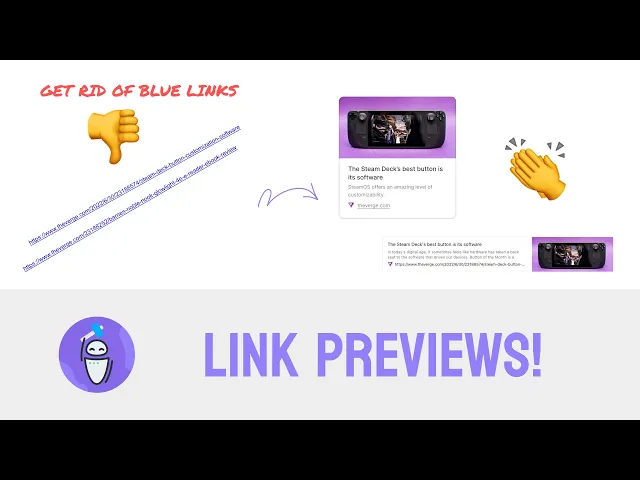
Whenever you share a link on LinkedIn, the platform automatically generates a preview card, pulling in a title, a short description, and an image. That image is often the first thing people see and can make or break whether they click through.
A sharp, relevant visual grabs attention and builds trust. On the flip side, a blurry, poorly cropped, or completely missing image can make your entire post look amateurish. You're trying to build credibility, and leaving this crucial element to chance is a recipe for losing out on valuable clicks and engagement.
The Ideal Link Preview Image Size
To make sure your image looks professional and avoids any weird cropping, you need to stick to LinkedIn's preferred dimensions.
Recommended Dimensions: The gold standard is 1200 x 627 pixels.
Aspect Ratio: This works out to a clean 1.91:1 aspect ratio.
Minimum Width: Whatever you do, don't go below 200 pixels in width. If you do, LinkedIn might just decide not to show an image at all.
Nailing the 1200 x 627 pixel size ensures your image is crisp and fully displayed on both desktop and mobile, giving everyone who sees your post a consistent, high-quality experience.
How to Control Your Preview Image
So, how do you take charge and tell LinkedIn which image to use? The answer lies in your website’s HTML, specifically with Open Graph (OG) meta tags. The og:image tag is the instruction that tells social media platforms exactly which visual to grab when someone shares a link from that page.
If you’re comfortable with code, you or your developer can add this line to the
<head>section of your webpage:<meta property="og:image" content="https://yourwebsite.com/images/your-image.jpg" />.
Using a CMS like WordPress? It's much simpler. Popular plugins like Yoast SEO give you an easy-to-use field where you can upload a "featured image" that automatically sets the og:image tag for you. For a complete walkthrough, you can learn more about optimising your LinkedIn link preview card.
Sometimes LinkedIn holds onto an old image even after you've updated it. It’s a caching issue, and it's annoying, but there’s a quick fix. Just use LinkedIn’s official Post Inspector tool. Paste your URL into it, and it will force LinkedIn to clear its cache and fetch the latest version of your page, including your brand-new preview image.
Company Page and Ad Image Specifications
Think of your company's LinkedIn page as its digital front door. It’s where first impressions are made, so sharp, consistent branding isn't just nice to have—it's everything. Unlike a personal profile, this space speaks for your whole organisation, meaning every pixel plays a part in building trust and credibility.
Nailing the image specs for your page and any ads you run is crucial for looking professional. This guide breaks down all the key image types for Company Pages and ads. From your core branding assets to the visuals powering your campaigns, each has its own set of rules. Follow these, and your brand will look polished on every single device your audience uses.
Core Company Page Images
Your logo and cover image are the cornerstones of your LinkedIn presence. They’re the first things people see, so they need to instantly communicate who you are.
Company Logo: The sweet spot is 300 x 300 pixels. This square logo pops up in search results and right next to your posts, so it has to be crystal clear, even when small.
Cover Image (Banner): You'll want to use 1128 x 191 pixels. This wide, panoramic space is your canvas—perfect for showing off your brand’s personality or highlighting a key marketing message.
Company Page vs. Personal Profile Image Dimensions
It's easy to get the specs for Company Pages and Personal Profiles mixed up, but their dimensions are quite different. This quick table lays out the key distinctions so you can get the right assets for the right place.
Image Asset | Personal Profile Dimensions | Company Page Dimensions |
|---|---|---|
Profile Photo/Logo | 400 x 400 pixels | 300 x 300 pixels |
Cover Photo/Banner | 1584 x 396 pixels | 1128 x 191 pixels |
As you can see, personal profiles get a bit more real estate, especially for the cover photo. Company Pages, on the other hand, use more compact, streamlined dimensions that fit neatly into the professional layout.
Essential LinkedIn Ad Image Sizes
When you're putting money behind your content, getting the visuals right becomes even more important. LinkedIn Ads have their own rulebook to make sure your creative looks its best and performs well.
The single-image sponsored content ad is the most common format you'll see scrolling through the feed.
For single image ads, 1200 x 627 pixels is the recommended linkedin posting image size. This works out to a 1.91:1 aspect ratio, which is perfect for landscape orientation and ensures your ad looks sharp without any weird cropping on desktop.
But what about carousel ads? For those, you're telling a story across multiple slides. The dimensions change to a 1080 x 1080 pixel square format for each individual card. Keeping each image square is vital for a smooth, seamless swiping experience for the user.
Frequently Asked Questions
Even when you follow a guide to the letter, LinkedIn has its own quirks. It’s not uncommon to run into weird issues with images that just don't look right. This section tackles the most common questions and problems we see, giving you quick fixes to get your visual content looking sharp.
Getting the linkedin posting image size right is usually the first thing to check, but sometimes other little details are the culprit.
Why Does My LinkedIn Image Look Blurry Or Pixelated?
Blurry images on LinkedIn almost always come down to two things: you've either uploaded a picture that’s too small, or LinkedIn’s compression has been a bit too aggressive. The platform compresses every image to keep the feed loading quickly for everyone.
If you upload a small image, say 600x600 pixels, LinkedIn has to stretch it to fill the designated space in the feed. That stretching is what causes the fuzziness and pixelation you see. To dodge this, always start with a high-resolution image at the recommended size—1080x1080 pixels for a standard square post is a safe bet. For graphics with crisp lines or text, try exporting as a high-quality PNG instead of a JPEG. It can sometimes make a world of difference in preserving detail.
What Is the Best Image Size for Mobile LinkedIn Users?
When it comes to mobile, you want to claim as much screen real estate as possible. That’s where vertical images with a 4:5 aspect ratio really shine. We recommend sizing your image at 1200x1500 pixels for the best results.
This taller format fills up more of the screen on a phone, grabbing attention far more effectively as people scroll. Square (1:1) images are still great and perform well, but that vertical 4:5 format just has an undeniable edge in a mobile-first world. Just be sure to keep your most important text and visual elements near the centre so they don't get awkwardly cropped on different devices.
It's worth remembering that the vast majority of LinkedIn users are scrolling on their phones. Optimising for mobile isn't just a nice-to-have anymore—it’s absolutely critical for getting your posts seen and engaged with.
How Can I Update the Preview Image When I Share a Link?
This is a classic problem. You share a link, and LinkedIn pulls an ancient, totally wrong preview image. The fix is usually a caching issue, and you can sort it out using LinkedIn's own Post Inspector tool.
First, you need to make sure the og:image meta tag in your website's HTML is pointing to the correct, updated image URL. Once you’ve confirmed that on your site, head over to the Post Inspector. Paste your link into the tool and click 'Inspect'. This action forces LinkedIn to clear its cache for that URL and fetch the fresh information, including your new preview image. Once you see the right image pop up in the inspector, you’re good to go—any new post with that link will now show the correct preview.
Ready to create standout LinkedIn posts without the hassle of manual formatting and scheduling? Postline.ai combines powerful AI writing with real-time research to help you turn ideas into engaging content in minutes. Schedule a full week of perfectly optimised posts and grow your professional presence effortlessly. Discover how Postline.ai can elevate your LinkedIn strategy today.
CREATE YOUR POSTS WITH POSTLINE.AI
More reach. More followers. More business.
👉 Try Postline.ai for free
Author

Christoph Gaschler

Christoph is the CEO of Mind Nexus and Co-Founder of postline.ai. He is a serial entrepreneur, keynote speaker and former Dentsu executive. Christoph worked in marketing for more than 15 years, serving clients such as Disney and Mastercard. Today he is developing AI marketing software for agencies and brands and is involved in several SaaS projects.
Related posts

Every LinkedIn post generator - Full Comparison
You want to grow on LinkedIn and need a little help from AI. There are many tools out there promising quick results. We tested the Top 10 LinkedIn post generators to see which actually can make a difference.

How to Export Data from LinkedIn Analytics to Excel [2025]
Discover how to export data from LinkedIn Analytics to Excel to gain valuable insights, streamline lead generation, and enhance data-driven decision-making. This guide covers step-by-step instructions, tools, and tips to help you analyze LinkedIn data efficiently and grow your business.

How to Message Recruiters to Connect on LinkedIn
In this guide you will learn how to reach out to a recruiter on LinkedIn. This is a step by step guide to prepare you to connect with recruiters and increase to chances of landing that new job. You will also find LinkedIn message examples and valuable insights below.