Your Guide to LinkedIn Post Sizes
Master current LinkedIn post sizes with our guide. Get the correct image, video, and carousel dimensions to boost engagement and professional presence.
Let’s get straight to it. For a standard LinkedIn post, the ideal image size is 1200 x 627 pixels. This hits the sweet spot with a 1.91:1 aspect ratio, ensuring your shared links and single images look sharp on both desktop and mobile without any weird cropping. If you’re going for a square post, 1080 x 1080 pixels is your best bet.
Your Ultimate LinkedIn Post Sizes Cheatsheet
Nailing the right dimensions for your content is one of those small details that makes a massive difference in how you’re perceived professionally. Before we jump into the nitty-gritty of each post type, it’s worth getting a feel for the core LinkedIn platform and how it handles visuals across its network. Getting the sizes right means your profile pictures, company banners, and shared content will always look crisp and professional, no matter the device.
Think of this section as your quick-reference guide. To make things even easier, here’s a handy table summarising the most critical LinkedIn sizes you’ll need.
LinkedIn Post and Image Size Cheat Sheet
| Asset Type | Recommended Dimensions (Pixels) | Supported Aspect Ratio | Key Notes |
|---|---|---|---|
| Single Image Post (Horizontal) | 1200 x 627 | 1.91:1 | The standard for shared links. Prevents cropping. |
| Single Image Post (Square) | 1080 x 1080 | 1:1 | Perfect for mobile-first viewing. |
| Single Image Post (Vertical) | 1080 x 1350 | 4:5 | Takes up more screen space on mobile feeds. |
| Multi-Image Post (Square) | 1080 x 1080 | 1:1 | All images are cropped to a square in the feed. |
| Multi-Image Post (Vertical) | 1080 x 1350 | 2:3 or 3:4 | First image sets the orientation for the rest. |
| Video Post | 256x144 to 4096x2304 | 1:2.4 to 2.4:1 | 1920x1080 (16:9) is a safe bet. Max length 10 min. |
| Document/Carousel Post | 1080 x 1080 (Square) or 1080 x 1350 (Vertical) | 1:1, 4:5, 9:16 | PDF format is required. Max 300 pages. |
| Profile Photo | 400 x 400 | 1:1 | Displays as a circle. Keep key elements centred. |
| Personal Profile Banner | 1584 x 396 | 4:1 | Be mindful of how your profile photo overlaps. |
| Company Page Logo | 300 x 300 | 1:1 | Displays as a square. |
| Company Page Banner | 1128 x 191 | 5.9:1 | A wide, narrow space. Keep it simple. |
| Character Limit: Post | 3,000 characters | N/A | Keep it concise; use “See more” strategically. |
| Character Limit: Article Headline | 100 characters | N/A | Grab attention quickly. |
| Character Limit: Company Update | 700 characters | N/A | Shorter than personal posts. Be direct. |
This table should get you started, but remember that each format has its own quirks and best practices.
The visual below breaks down the main content formats you’ll be working with.
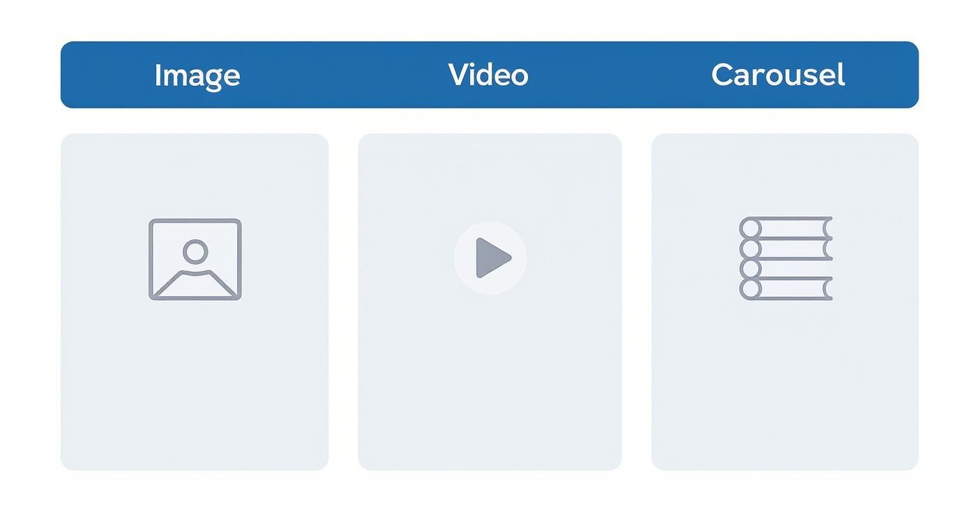
As you can see, you have three primary tools in your visual toolkit: static images, engaging videos, and informative carousels (documents). Each serves a unique purpose, from grabbing immediate attention with a powerful image to telling a comprehensive story with a multi-page document.
Use this cheatsheet as your go-to reference, and dive into the detailed sections that follow for more in-depth specs and pro tips for every single asset type.
Optimising Your Profile and Company Page Images
First impressions on LinkedIn are sealed in seconds. That makes your profile and company page visuals some of your most critical assets. Think of these images as your digital storefront—getting the dimensions spot-on is non-negotiable for projecting professionalism and brand consistency, whether someone’s viewing your page on a huge desktop monitor or a tiny mobile screen.
Your profile picture and company logo are by far the most visible images you have. They show up next to every single post, comment, and search result you appear in. For a personal profile photo, you’ll want to upload an image at 400 x 400 pixels. For a company page logo, the recommendation is 300 x 300 pixels. Since both display as circles, make sure your face or logo is perfectly centred to avoid any awkward cropping.
Mastering Your Banner Images
Banners give you a much larger canvas to broadcast your personal brand or company identity. But their wide, skinny dimensions and overlapping elements mean you have to design them thoughtfully.
- Personal Profile Banner: The ideal size here is 1584 x 396 pixels, which works out to a 4:1 aspect ratio. Just remember that your profile picture will cover up the bottom-left corner on desktop, so keep any important text or design elements clear of that area.
- Company Page Cover Image: This banner is a bit different, coming in at 1128 x 191 pixels. Its main job is to reinforce your brand identity at a glance. Simplicity is your best friend here; trying to cram in too much text will just make it unreadable on smaller screens. If you need some creative fuel, check out our guide on the 10 best LinkedIn banner ideas.
A quick pro tip: Always use a high-quality PNG file for banners that include text or logos. It’ll keep everything looking sharp. For photographic banners, a well-compressed JPG is totally fine and helps keep the file size manageable. Speaking of which, the maximum file size for all of these images is 8MB.
Nailing these assets is especially crucial in competitive professional circles. For example, Germany’s LinkedIn user base shot up by roughly 16.7% between early 2024 and early 2025, topping 21 million users. In a crowded space like that, a crisp, well-designed profile is one of the easiest ways to stand out. You can dive deeper into German LinkedIn user trends on Datareportal.
Mastering Dimensions for Image and Carousel Posts
Visuals are your frontline tool for stopping the scroll on a busy LinkedIn feed. Getting the right linkedin post sizes for your images and carousels ensures your content shows up exactly as you planned. It prevents those awkward crops that can hide key information and seriously weaken your message.
When you’re posting a single image, you’ve got a few options that perform quite differently. The old standard, especially for shared links, is a horizontal image at 1200 x 627 pixels, which gives you a 1.91:1 aspect ratio. But honestly, for standalone image posts, formats that take up more vertical screen real estate tend to capture far more attention.
Pro Tip: For maximum impact in the mobile feed, always prioritise square or vertical images. A square 1:1 ratio (1080 x 1080 pixels) or a vertical 4:5 ratio (1080 x 1350 pixels) will occupy more of the user’s screen, making your post much harder to ignore.
Unlocking the Power of Multi-Image and Carousel Posts
Multi-image posts are fantastic for showcasing multiple products, highlighting different event speakers, or telling a story in sequence. When you upload a few images at once, LinkedIn automatically arranges them into a collage. The key thing to remember here is that all images in a multi-image post get cropped to a 1:1 square aspect ratio in the feed preview.
- Two Images: Displayed side-by-side, each cropped to a vertical rectangle.
- Three Images: The first image appears larger on the left, with two smaller images stacked neatly on the right.
- Four or More Images: Displayed as a simple square grid.
For a more controlled narrative, document posts—what everyone calls carousels—are an exceptional choice. They let users swipe through a series of pages, which is perfect for tutorials, data presentations, and detailed storytelling.
The best way to craft these is by using a dedicated design for each slide. You can learn way more about that in our detailed guide on creating a LinkedIn carousel post.
Technical Specifications for Carousel Posts
To make sure your document uploads correctly and looks professional, you have to stick to these critical specs. Following these guidelines prevents frustrating upload errors and guarantees a smooth viewing experience for your audience.
- Recommended Dimensions: 1080 x 1080 pixels (1:1 square) or 1080 x 1350 pixels (4:5 vertical). Keeping a consistent size across all pages is your best bet.
- File Type: You must save your document as a PDF. You can also use PPT, PPTX, DOC, or DOCX, but PDF offers the most reliable formatting.
- File Size Limit: The maximum file size is 100 MB.
- Page Limit: You can include up to 300 pages in a single document.
By mastering these dimensions and technical requirements, you ensure your visual content—whether it’s a single powerful image or a detailed carousel—is perfectly optimised to engage and inform your professional network.
A Complete Guide to LinkedIn Video Specifications
Video is a beast when it comes to engagement on LinkedIn, but you have to get the technical details spot-on. A poorly cropped or blurry video can seriously dent your professional image, so it’s worth taking a moment to nail the right linkedin post sizes and specs before uploading.
LinkedIn is surprisingly flexible, supporting a massive range of video resolutions. You can go as low as 256x144 pixels or as high as a stunning 4096x2304 pixels. That covers everything from standard HD right up to 4K.
Understanding Video Aspect Ratios
The platform accepts a wide array of aspect ratios, from a cinematic 2.4:1 all the way to a vertical 1:2.4. The key is to remember that certain formats just perform better in the feed because they take up more screen real estate, especially on mobile.
- Landscape (16:9): This is your classic widescreen format, perfect for more cinematic content or videos you’re repurposing from places like YouTube. Think 1920x1080 pixels.
- Square (1:1): A solid choice for mobile-first viewing. A square video at 1080x1080 pixels really grabs attention as people scroll through their feed.
- Vertical (4:5 or 9:16): Vertical video is the undisputed king of mobile engagement. A 4:5 ratio (1080x1350 pixels) is a great, safe option, while a full 9:16 ratio (1080x1920 pixels) delivers that immersive, Stories-like experience.
If you want a more detailed walkthrough of the upload process itself, check out our complete guide on how to post a video on LinkedIn.
Crucial File and Length Constraints
Beyond the dimensions, you’ve got to play by LinkedIn’s rules on file size and duration. Sticking to these limits prevents annoying upload errors and ensures a smooth playback experience for everyone.
Your video file needs to be at least 75 KB but no larger than 200 MB. For native video posts, the length has to be a minimum of 3 seconds and can’t go over 10 minutes. This gives you plenty of room for anything from quick updates to in-depth tutorials.
Best Practice: A huge number of people on LinkedIn watch videos with the sound off. Always burn captions directly into your video or upload a separate SRT file. This makes your content accessible and ensures your message actually gets across, even in silence. Remember, you’ve got about three seconds to hook someone before they scroll on by. Make them count.
Optimising Text and Character Counts for Readability
Visuals might be what stops the scroll, but it’s the text that sparks conversations and drives action. Getting your LinkedIn post sizes right for images is half the battle; the other half is mastering the platform’s character limits to craft a message that’s both clear and compelling. Every text field on LinkedIn is there for a reason, and each comes with its own length constraint.
A standard post gives you a generous 3,000-character limit. But here’s a pro tip: just because you can use all that space doesn’t mean you should. The real skill is finding the sweet spot between providing depth and maintaining readability. Keep in mind that on mobile, your post gets cut off after about 210 characters, hiding the rest behind a “…see more” link. Those first few lines have to work hard to earn that click.
To give you a quick reference, here’s a rundown of the character limits you’ll encounter across LinkedIn. Knowing these numbers helps ensure your message never gets awkwardly cut short.
LinkedIn Character Count Limits
| Element | Maximum Characters | Optimization Tip |
|---|---|---|
| Main Post Body | 3,000 | Hook readers in the first 210 characters before the “see more” link. The most engaging posts are often 900-1,200 characters long. |
| Article Headline | 100 | Be clear, concise, and keyword-rich to grab attention in the feed. |
| Comments | 1,250 | Ample space for thoughtful replies that add value to the conversation. |
| Company Update | 700 | Be direct. This is much shorter than a personal post, so get straight to the point. |
| Personal Profile Headline | 220 | This is your professional tagline. Make it descriptive and impactful, showcasing your value proposition. |
Sticking to these limits is a great start, but the best-performing content often follows unwritten rules, too. Data shows that the most engaging posts typically land between 900 to 1,200 characters, which works out to about 140 to 200 words. What’s more, posts that use short, punchy sentences—fewer than 12 words—tend to see around 20% better engagement. This trend towards clear, value-packed content is especially strong among professional audiences in Germany, who prefer substance over fluff. For a deeper dive, you can check out more LinkedIn post statistics on authoredup.com.
Quick Tip: To make longer text easier on the eyes, break it up. Use short paragraphs, bullet points, and numbered lists to introduce plenty of white space. A well-placed emoji can also add a touch of personality and direct the reader’s gaze, but don’t overdo it—you still want to maintain a professional tone.
Getting your text right is just as crucial as getting your visuals pixel-perfect. For more advice on structuring your posts for maximum impact, you might find our guide on formatting LinkedIn posts useful. When you combine perfectly sized media with thoughtfully crafted text, you create a message that’s not just seen, but remembered.
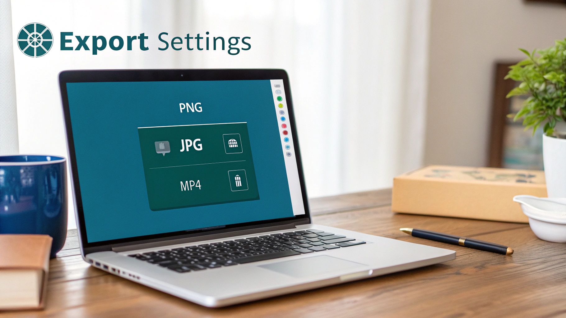
Essential Tools and Export Settings for Perfect Posts
Getting your linkedin post sizes right is half the battle; the other half is exporting your visuals correctly. I’ve seen it happen countless times: a perfectly designed image looks blurry or pixelated on the feed simply because the export settings were off. It instantly undermines the quality and impact you were going for.
Thankfully, modern design tools like Canva and Figma have made this part of the process much more straightforward. Most of them come with pre-sized templates for social media formats, or you can just plug in the custom dimensions from this guide. And if you’re looking to really dial in your workflow, exploring a range of essential content creation tools can make a world of difference.
Choosing the Right Export Settings
Once your design is polished and ready to go, the export dialogue box is where you make it shine. Your choices here will determine the final quality and file size of your asset, so it pays to get it right.
Here are the best practices I stick to:
- For images with text, logos, or sharp lines: Always, always export as a PNG. This format uses lossless compression, which is a fancy way of saying it keeps every detail crisp and avoids those fuzzy little artefacts that often appear around text in other formats.
- For photographic images: Go with JPG to get a great balance of quality and a smaller file size. You can usually tweak the compression level here—I find a setting between 70-90% is the sweet spot.
- Resolution: Export at the exact resolution you designed in (e.g., 1080 x 1080 pixels). Whatever you do, don’t try to upscale a smaller image. It’s a guaranteed recipe for pixelation.
These small technical details are what separate the pros from the amateurs, especially in competitive markets. With LinkedIn’s European user base continuing to grow, creators in places like Germany need to produce crystal-clear content that respects their audience’s attention. Nailing your export settings is a simple way to ensure every post you publish looks sharp and professional.
Common Questions About LinkedIn Post Sizes
Getting the hang of LinkedIn’s various image and video specs can be a bit of a headache. If you’ve ever uploaded a picture only to find it blurry or awkwardly cropped, you’re not alone. Let’s walk through some of the most common questions to help you troubleshoot and get your content looking sharp every time.
Nailing these details is the first step to making sure your content actually performs and grabs the right kind of attention.
Why Does My LinkedIn Cover Photo Look Blurry?
A blurry cover photo almost always comes down to one of two culprits: file compression or using an image that’s simply too small. LinkedIn wants a banner that’s precisely 1584 x 396 pixels. If you upload something smaller, the platform has to stretch it to fill the space, which causes that fuzzy, pixelated look we all want to avoid.
To get around this, always start with a high-resolution image that matches those exact dimensions. Also, keep an eye on the file size—it needs to be under 8MB. A good pro-tip is to export graphics with text or logos as a PNG file. It does a much better job of preserving sharpness compared to a JPG.
What Is the Best Image Size for Mobile Viewing?
When it comes to mobile, it’s all about maximising that vertical screen space. Standard landscape images are fine, but they just don’t have the same stopping power on a feed built for endless scrolling.
For the best results on mobile, these are your go-to formats:
- Square (1:1 aspect ratio): A 1080 x 1080 pixel image is a safe bet. It’s perfectly balanced and looks fantastic on both mobile and desktop feeds.
- Vertical (4:5 aspect ratio): To really own the screen, go with a vertical image at 1080 x 1350 pixels. This format is a scroll-stopper and gives your visual content the attention it deserves.
Can I Edit an Image After Posting It on LinkedIn?
Unfortunately, no. Once a post is live on LinkedIn, the image, video, or document attached to it is locked in. This is a hard-and-fast rule on the platform. If you catch a typo in your visual or just decide you want to swap it out, your only move is to delete the entire post and start over.
Crucial Takeaway: Always, always hit that preview button and give your visuals a final once-over before you publish. A quick check can save you the pain of deleting and re-uploading, making sure your post makes the right impact from the get-go.

Run every client pipeline in one place
Give each LinkedIn profile its own voice, calendar, approval flow, and analytics. Start in minutes.
Start free trial