The Ultimate Guide to linkedin images sizes: Profiles, Covers, and Posts
Master your LinkedIn presence with precise linkedin images sizes for profiles, banners, posts, and ads—boost engagement with photos that pop.
Getting your LinkedIn image sizes right is key to looking professional. As a quick rule of thumb, your standard posts should be 1200 x 627 pixels, your personal profile picture 400 x 400 pixels, and that all-important personal cover photo needs to be 1584 x 396 pixels. Nailing these core dimensions from the start prevents that awkward, unprofessional cropping and makes sure your content looks sharp, no matter the device.
Why Do LinkedIn Image Dimensions Actually Matter?
Look, optimising your visuals is about more than just ticking a technical box; it’s a massive part of your professional branding. When your images are blurry, stretched, or badly cropped, they can instantly damage your credibility. It just looks sloppy.
On a network that runs on first impressions, a polished visual presence is absolutely essential. It’s what grabs attention and starts building trust with connections, potential clients, and recruiters before they’ve even read a word. This guide is designed to be your go-to reference for all the critical LinkedIn image dimensions, so your visuals are perfectly formatted, every single time.
Here’s what getting it right helps you achieve:
- Dodge Common Mistakes: You’ll learn how to stop your images from looking pixelated and avoid those weird crops that often happen on mobile.
- Boost Your Engagement: Let’s be honest, properly sized images are just more eye-catching and can give your post interactions a serious lift.
- Keep Your Brand Consistent: Having a clear set of visual standards helps build a cohesive and instantly recognisable brand identity right across the platform.
The infographic below gives you a quick visual summary of the most important sizes for your personal profile and posts.
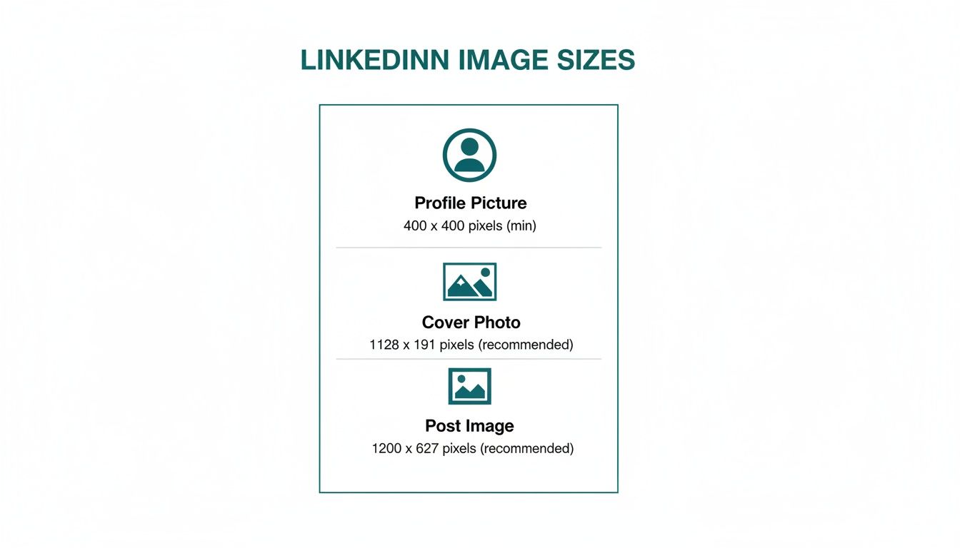
If you can master just these three core sizes, you’ve already built a solid foundation for a strong visual presence. For a deeper dive, you can learn more about the ideal image size for LinkedIn posts in our dedicated article.
Getting Your Personal Profile Images Right
Think of your LinkedIn profile as your digital handshake. It’s the first impression you make on recruiters, potential clients, and colleagues, and the images you choose are a massive part of that. Nailing the correct sizes for your profile photo and background cover isn’t just a technical detail—it’s the bedrock of a professional online presence.
People form an opinion in a split second, so a blurry, stretched, or poorly cropped photo can immediately damage your credibility. To look professional, you need pixel-perfect images.
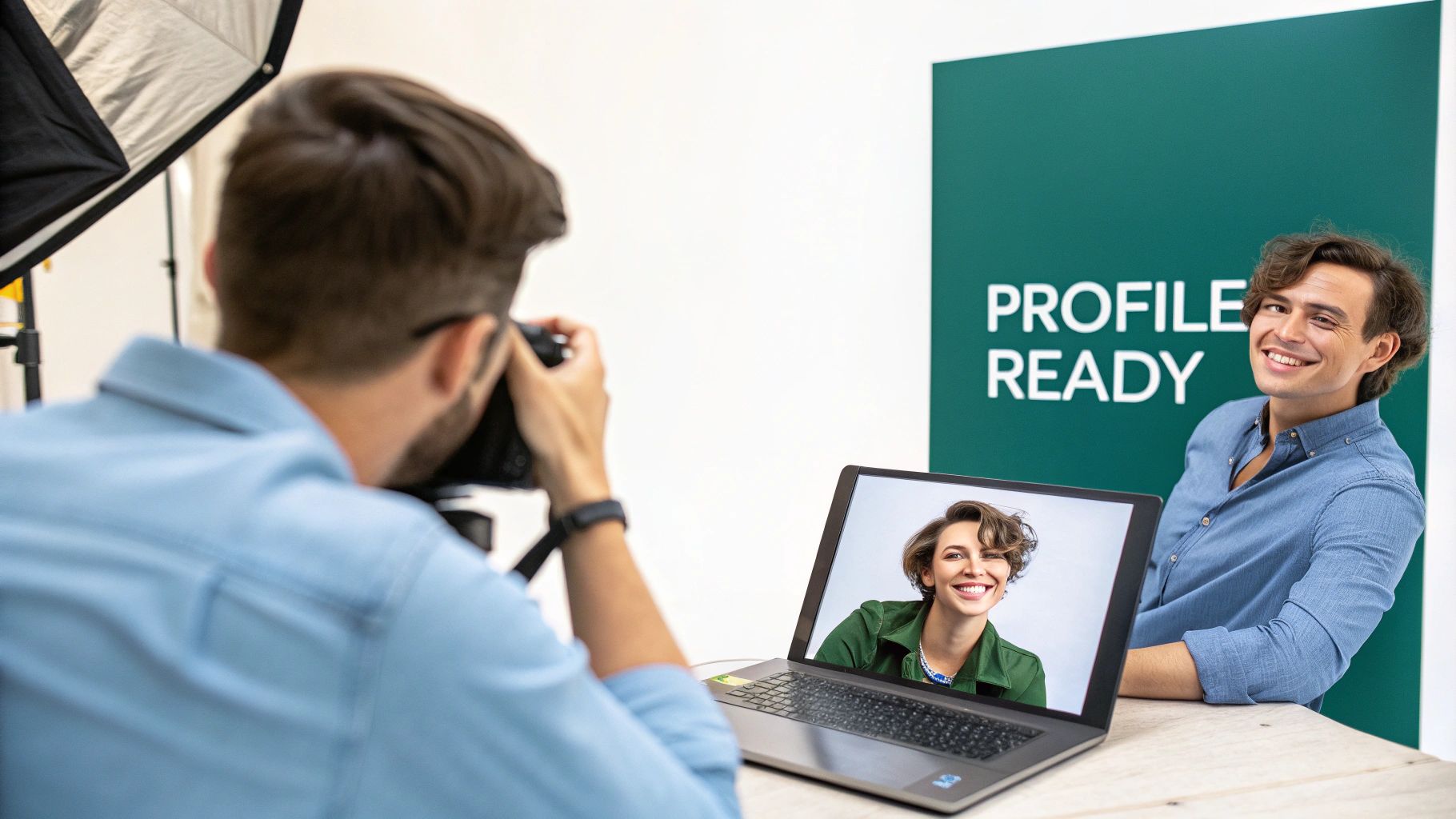
Your Profile Photo
This is your visual signature on LinkedIn. It shows up everywhere: in search results, when you comment, in connection requests, and next to every post you make. It absolutely has to be sharp.
- Recommended Dimensions: 400 x 400 pixels (a perfect 1:1 square).
- Minimum Size: You can go as low as 268 x 268 pixels, but I’d strongly advise against it. Always upload at least 400 x 400 to avoid any fuzziness.
- File Type: JPG or PNG.
- Max File Size: 8 MB.
For the best results, use a clear, high-quality headshot. Your face should take up about 60% of the frame, and a simple, non-distracting background helps you stand out. If you’re struggling to get the right shot, you might find our guide on the best AI LinkedIn photo generators helpful for creating a professional-looking headshot.
Your Cover Photo
Often called the background banner, your cover photo is a huge piece of visual real estate. It’s a fantastic chance to tell a bigger story about who you are and what you do.
- Recommended Dimensions: 1584 x 396 pixels (a wide 4:1 aspect ratio).
- File Type: JPG or PNG.
- Max File Size: 8 MB.
Please don’t just leave this blank or drop in a generic stock photo. Use this space strategically to show off your expertise, highlight a key project, or convey your company’s mission. Getting this right is crucial, especially as the platform grows. For instance, in Germany alone, LinkedIn’s audience is set to hit 34.3 percent of all adults. You can dig into more stats like this on the Hootsuite blog.
Critical Tip: Always check how your profile looks on a mobile phone. Your profile picture covers different parts of the banner on desktop versus mobile, and the mobile view crops the sides more aggressively. Keep any important text, logos, or contact details well within a central “safe zone” to make sure they’re always visible.
Mastering Company Page Visuals
Your LinkedIn Company Page is your brand’s digital storefront. Getting the visuals right isn’t just about looking good; it’s fundamental to building a professional identity that pulls in clients, partners, and the best talent. The two elements that demand the most attention are your company logo and cover image, each with its own set of rules for looking sharp.
These visuals are the face of your company across the entire platform. Making sure they’re crisp, clear, and correctly sized is non-negotiable for brand recognition and credibility.
Company Logo and Cover Image
Think of your company logo as your brand’s avatar on LinkedIn. It shows up in search results, on your employees’ profiles, and next to every single post you make. Your cover image, in contrast, is the big banner at the top—a broad canvas for telling your brand’s story, showing off your culture, or promoting a new campaign.
- Company Logo: The sweet spot here is 300 x 300 pixels. This perfect square ensures your logo stays clear and recognisable, no matter where it pops up.
- Company Cover Image: Aim for a dimension of 1128 x 191 pixels. It’s a wide, thin banner, so you’ll need to design it carefully to prevent important details from getting cut off on different screens.
That cover image is prime real estate. Use it to announce a product launch, feature your team, or just drive home your company’s core message. If you’re feeling a bit stuck for ideas, we’ve put together a great resource on the 10 best LinkedIn banner ideas in another article.
Maximising the Life Tab
A seriously underused feature is the ‘Life’ tab. This section is specifically designed to give potential recruits a real look into your company culture, and it supports custom modules and unique visuals that break the standard page mould.
Key Insight: The ‘Life’ tab is your chance to build an authentic employer brand. The right visuals here can be the deciding factor for a candidate choosing to apply.
The main image for the Life tab should be 1128 x 376 pixels, giving you a much taller canvas to play with than the main cover photo. On top of that, you can add custom modules that support images at 900 x 600 pixels. Nailing these specific LinkedIn images sizes lets you build a rich, engaging narrative about what it’s really like to work for your organisation, helping you stand out when you’re hunting for top talent.
Crafting Post Images That Stop the Scroll
Once your profile is sorted, the images you share in the feed are what really grab people’s attention and spark conversations. Think of every post as a chance to make someone pause their endless scrolling. Getting the LinkedIn image sizes right is the first, and most crucial, step. If you get it wrong, your brilliant message can easily get lost in a blurry, poorly cropped visual.
For a standard shared image or the thumbnail for a link you’re sharing, the magic number is 1200 x 627 pixels. This 1.91:1 aspect ratio is the go-to because it looks sharp and professional on both desktop and mobile, so you don’t have to worry about awkward cropping. It’s the safest bet for a consistently clean look.
As you can see, visuals are everything on mobile, where you have just a split second to catch someone’s eye and make them stop.
Playing with Different Post Formats
While the 1.91:1 ratio is a reliable workhorse, it’s not your only option. Depending on your goal, especially if you’re trying to appeal to the ever-growing mobile audience, different formats can work even better.
- Square Images (1:1): A square image, ideally at 1080 x 1080 pixels, takes up more vertical real estate in the mobile feed. This extra space makes it much harder to ignore. It’s a fantastic format for things like bold quotes, eye-catching infographics, or strong product photos.
- Vertical Images (Portrait): You don’t see these as often for single-image posts, but a portrait orientation like 627 x 1200 pixels can really stand out. This format is perfect for showcasing detailed visuals like a long infographic or a step-by-step guide where a top-to-bottom flow just makes sense.
Telling Bigger Stories with Carousels
When you need to tell a more complex story, a carousel post is your best friend. This format lets you walk your audience through a narrative, highlight a range of products, or break down a complicated idea into easy-to-digest visual slides. Carousels are true engagement magnets on LinkedIn.
For the best results, make each image in your carousel a square (1080 x 1080 pixels). This ensures a smooth, consistent swiping experience. You can mix and match different sizes, but sticking to a uniform square format looks far more polished and professional. If you want some great ideas on putting one together, have a look at our guide on creating a high-impact LinkedIn carousel post.
In the competitive German market, where LinkedIn boasts 24.0 million members, standout visuals are a massive advantage. Native uploads almost always perform better than posts with external links, and since you can add up to 20 images per post, you have plenty of room to tell richer stories.
Pro Tip: Always aim to keep your image file sizes under 8MB. LinkedIn can handle bigger files, but smaller ones load instantly. This improves the user experience and means people are less likely to scroll past while waiting for your image to appear. As a rule of thumb, use JPEGs for photos and PNGs for graphics with text to keep everything looking crisp and clear.
Sizes for LinkedIn Articles, Events, and Adverts
To really get the most out of LinkedIn, you need to think beyond just the standard feed posts. Formats like Articles, Events, and Ads have their own unique visual real estate, and getting the image dimensions right for these is key. When you nail these specific LinkedIn image sizes, your content looks far more professional and does a much better job of driving actions, whether that’s getting clicks, event registrations, or ad conversions.
Article and Event Images
When you publish a LinkedIn Article, that hero image at the top is your billboard. It’s the very first thing people see and your best shot at grabbing their attention in a busy feed.
- Article Hero Image: The ideal size here is 1200 x 644 pixels. This gives you a great-looking, clickable preview that pulls people into reading your full piece.
In the same way, your LinkedIn Event page depends heavily on its banner to look credible and build excitement. A sharp, well-designed banner can make a real difference in how many people decide to sign up.
- Event Banner Image: Go with 1776 x 444 pixels. This wide, panoramic format is perfect for showing off event branding, featuring key speakers, or highlighting the most important details at a glance.
Key Dimensions for Adverts
Advertising on LinkedIn is all about precision. Each ad format has a specific job to do, and using the correct image sizes is absolutely critical for your campaign to perform well. For some broader context on how visual specs translate across different platforms, this guide on mastering ideal social media ad sizes offers some really useful, transferable insights.
Here are the most common ad specs you’ll need:
- Single Image Ads: Use 1200 x 627 pixels for these. This creates a standard sponsored post that fits right into the feed with a 1.91:1 aspect ratio.
- Carousel Ads: For these, each individual card needs to be 1080 x 1080 pixels. Sticking to this 1:1 square ratio ensures a smooth, clean experience as users swipe through your slides.
Key Takeaway: For high-stakes content like Articles, Events, and Ads, using the correct image dimensions isn’t just a suggestion—it’s essential. These visuals directly impact clicks, sign-ups, and conversions, so getting them pixel-perfect should be a core part of your LinkedIn strategy.
Common Image Problems and How to Fix Them
Even when you’ve nailed all the official LinkedIn image sizes, things can still go sideways. You spend time creating the perfect graphic, only to see it turn into a blurry, awkwardly cropped mess once it’s live. Let’s walk through some of the most common pitfalls so you can make sure your visuals always look sharp and professional.
One of the biggest culprits is blurriness, which often plagues profile pictures and logos. This almost always happens because the original image you uploaded was too small. LinkedIn compresses every single image, and if the starting file is already low-resolution, that compression just magnifies the flaws, leaving it looking fuzzy. A simple rule of thumb: always upload an image that’s larger than the final display size. For that 400 x 400 pixel profile photo, start with a file that’s at least 800 x 800 pixels. You’ll get a much crisper result.
Unexpected Cropping and Safe Zones
Another major headache is when LinkedIn crops your images in ways you didn’t anticipate. Your cover photo is the prime offender here. It might look fantastic on your desktop, showing the full 1584 x 396 pixel banner, but then you check it on your phone and key parts are cut off by the mobile app’s interface.
This is where designing within a “safe zone” becomes critical. Think of it as an invisible box in the centre of your banner. Any crucial elements—your tagline, logo, or key visual focal points—must live inside this area. This guarantees your core message remains intact, regardless of whether someone is viewing your profile on a widescreen monitor or a small phone.
Key Insight: Never just hit “save” and walk away. Always pull out your phone and check your profile and company pages after uploading a new image. What looks great on desktop can be a disaster on mobile, so that final check is non-negotiable.
Choosing the Right File Format
The file format you save your image in plays a huge role in both quality and loading speed. Picking the wrong one can lead to poor quality or a file so large it takes forever to appear, which is a big turn-off for viewers.
Here’s a quick guide to making the right choice:
- Use JPG for Photos: When you’re dealing with a photograph that has a wide range of colours and subtle gradients, JPG is your best bet. It strikes an excellent balance between visual quality and a reasonably small file size.
- Use PNG for Graphics: For anything with sharp lines, text, or solid blocks of colour, like a logo or an infographic, PNG is far superior. It avoids the fuzzy compression artefacts that JPGs can create around text and, crucially, it supports transparency.
Troubleshooting Common Image Issues
Sometimes, even when you think you’ve done everything right, a problem pops up. This quick troubleshooting table covers the most frequent issues and how to get them sorted.
| Common Problem | Likely Cause | How to Fix It |
|---|---|---|
| Blurry or pixelated images | Uploading a low-resolution image that gets degraded further by LinkedIn’s compression. | Export your image at least 2x the recommended dimensions (e.g., use an 800x800 pixel source file for a 400x400 pixel profile photo). |
| Key info is cut off on mobile | The design doesn’t account for the mobile “safe zone,” where the profile picture and other UI elements overlap the cover photo. | Keep all text, logos, and critical visuals centred within the middle portion of your cover photo, away from the edges. |
| Colours look dull or distorted | Using the wrong colour profile (e.g., CMYK instead of sRGB) or aggressive compression settings. | Always export your images in the sRGB colour profile, which is the standard for web. If using a JPG, don’t set the quality below 70-80%. |
| Text on an image looks fuzzy | Saving a graphic with sharp text as a low-quality JPG. JPG compression is not kind to crisp lines. | For any image containing text or logos, save it as a PNG file. This format preserves sharp edges perfectly. |
| Image fails to upload | The file is too large (over 8MB) or is in an unsupported format (like a TIFF or WEBP). | Check your file size. Re-export the image as a web-optimised JPG or PNG to reduce its size below the 8MB limit. |
By keeping these common issues in mind, you can fine-tune your visuals and ensure your LinkedIn presence is always polished, professional, and effective.
Tools and Resources for Perfect LinkedIn Images
Knowing the correct LinkedIn image sizes is the first step, but creating perfectly optimised visuals that actually look good is another challenge entirely. The good news? You don’t need to be a seasoned designer to get it right. Plenty of great tools can help you handle everything from initial design to final upload.
Many platforms come with pre-sized templates built specifically for LinkedIn, which takes all the guesswork out of getting the dimensions right. If you want to streamline your workflow without breaking the bank, exploring some free graphic design software is a brilliant move. These often have simple, drag-and-drop interfaces that make professional-looking design accessible to anyone.
Quick Resizing and Compression Tips
What if you already have an image you love, but it’s the wrong size or the file is massive? A huge file can slow down loading times, which is a bad experience for anyone scrolling through their feed. Before you hit upload, run through these two essential steps:
- Resize it first: Use a simple online image resizer to get your picture to the exact dimensions you need, like 1200 x 627 pixels for a standard post. Don’t just rely on LinkedIn to crop it for you.
- Then, compress it: After resizing, drag the image into a compression tool. This shrinks the file size (helping you stay under the 8MB limit) without any noticeable drop in quality. It’s a crucial step for ensuring your posts load quickly and look sharp.
Don’t Forget Alt Text
One of the most powerful and frequently overlooked resources at your disposal is alt text. This is simply a short, written description of an image that you can add right before you post. It serves two incredibly important functions:
Key Insight: Writing descriptive alt text makes your content accessible to visually impaired users who rely on screen readers. It also gives search engines crucial context, which can improve your post’s discoverability and SEO value on the platform.
Taking just a few extra seconds to write thoughtful alt text is a simple habit that makes your content more inclusive and can genuinely expand your reach. In a competitive market like Germany, where LinkedIn’s ad audience is projected to hit 24.0 million by late 2025, every small advantage helps you connect with more people. You can dig into more insights on LinkedIn’s growth in Germany from DataReportal.
Frequently Asked Questions About LinkedIn Image Sizes
Getting your visuals right on LinkedIn can sometimes feel like a puzzle. This section tackles the most common head-scratchers I hear about image sizes, giving you straightforward answers to get your content looking sharp and professional.
Why Does My Cover Photo Look Cropped on Mobile?
This is a classic problem. Your cover photo gets cut off on mobile because LinkedIn uses a completely different, much narrower aspect ratio for smartphone screens. The full image you upload for desktop is 1584 x 396 pixels, but a good chunk of the sides simply vanishes on a phone.
The trick is to keep all the important stuff—like your logo, tagline, or headshot—within a central ‘safe zone’. Think of it as an invisible frame roughly 1096 pixels wide in the middle of your image. Anything outside of that is at risk of being cropped. Always, always check your new cover photo on your own phone before calling it a day.
Should I Use JPG or PNG for My LinkedIn Posts?
The best file format really boils down to what’s in the image itself. Here’s a simple rule I stick to: use JPG for photos. It’s brilliant at handling complex images with lots of colours and gradients, giving you a good balance of quality and a smaller file size that loads quickly.
On the other hand, for any graphic that includes text, logos, or shapes with hard edges, PNG is your best bet. It keeps lines and text incredibly crisp and supports transparency, which is a lifesaver. Using a JPG for text-heavy graphics can often result in fuzzy, pixelated edges that just look unprofessional.
Pro Tip: If you want your posts to look polished, sharp text is non-negotiable. Using PNG for any graphic with words is the simplest way to maintain clarity and make your message stand out in the feed.
What Is the Best Image Size for Maximum Engagement?
For a single image in a post, LinkedIn’s official recommendation is 1200 x 627 pixels, which works out to a 1.91:1 aspect ratio. This landscape format is designed to look good on both desktop and mobile feeds without any weird cropping.
That said, square images at 1080 x 1080 pixels (1:1) are hugely popular for a reason—they perform incredibly well. They take up more vertical space in the mobile feed, which can really help grab attention as people scroll. I’d suggest testing both formats to see which one your audience responds to better.
How Can I Prevent My Profile Picture from Being Blurry?
If you’re battling a blurry profile picture, the single most effective fix is to upload an image that’s much larger than the 400 x 400 pixel minimum. I recommend starting with a high-quality photo that’s at least 800 x 800 pixels.
When you give LinkedIn a larger, high-resolution file, its compression algorithm has more data to work with. This results in a much sharper, clearer final image after it’s been resized. Of course, make sure the original photo is well-lit and your face is in sharp focus to begin with.
Ready to create perfectly crafted LinkedIn posts without the hassle? Postline.ai uses AI to help you brainstorm ideas, write engaging content, and schedule everything in minutes, so you can focus on growing your network. Transform your LinkedIn presence today.
Run every client pipeline in one place
Give each LinkedIn profile its own voice, calendar, approval flow, and analytics. Start in minutes.
Start free trial