Your Guide to the Perfect LinkedIn Header Format
Master the LinkedIn header format with our guide. Get the exact dimensions, design tips, and best practices to create a banner that gets you noticed.
Your LinkedIn header format needs to be exactly 1584 x 396 pixels. Think of this as your professional billboard—getting the dimensions right with a 4:1 aspect ratio is the first step to making a sharp first impression. Keep the file size under 8MB, and you’re golden.
Why Your LinkedIn Header Format Is Your Professional Billboard
That header image is prime real estate. It’s the biggest, boldest visual people see when they land on your profile. A pixelated, badly cropped, or generic banner is an immediate red flag—it just screams a lack of attention to detail.
On the flip side, a crisp, well-designed header communicates professionalism and strategic thinking before anyone even gets to your bio. It’s a powerful visual handshake.
In a crowded market, this stuff matters more than ever. Take Germany, where LinkedIn is expected to hit 23.5 million users by September 2025. That’s a huge chunk of the population. In a sea of profiles, a perfectly formatted header is one of the easiest ways to stand out, especially when you consider that profiles with images get way more views.
Mastering the Technical Details
Getting the tech specs right is non-negotiable. It’s the foundation for your entire visual brand on the platform. Before you even think about design, lock these numbers down.
To make it easy, here’s a quick reference table with everything you need.
LinkedIn Header Format At a Glance
| Specification | Recommendation | Why It Matters |
|---|---|---|
| Dimensions | 1584 x 396 pixels | Ensures your image fits the designated space perfectly without weird cropping or stretching. |
| Aspect Ratio | 4:1 | Keeps your design from looking distorted or squashed, maintaining its intended composition. |
| File Size | Under 8MB | A smaller file size helps your profile load quickly, which is crucial for user experience. |
| File Types | JPG or PNG | PNG is best for graphics and text to keep them sharp. JPG works great for photos. |
Nailing these simple rules ensures your header looks polished on any device, from a wide desktop monitor to a tiny mobile screen. It’s a simple technical check that separates the amateurs from the pros.
This technical precision is your first, easiest win. It sets the stage for a strong digital presence and ensures your personal brand is presented with clarity and impact from the get-go.
For more strategies on building an effective online presence, check out our guide on mastering your LinkedIn personal branding. Getting the format right is just the beginning.
Designing a Header That Tells Your Professional Story
Okay, with the technical specs out of the way, we can get to the fun part. Your LinkedIn header is so much more than just a correctly sized image; it’s your digital billboard. It’s your chance to visually shout your professional brand and what you’re all about in the three seconds you have to grab someone’s attention.
A great header doesn’t just fill empty space—it tells a story. Think about what you want a visitor to know about you instantly. Are you a data analyst who brings order to chaos? A creative marketer who launches vibrant campaigns? A sales leader who crushes targets? Your header should reflect that identity through a deliberate choice of imagery, colours, and text.
For instance, a software developer might go for a clean, minimalist design with a subtle code snippet or a logo of their favourite tech stack. On the flip side, a graphic designer’s header could be a vibrant showcase of their best work. The goal is to create an immediate, gut-level connection between what people see and who you are professionally.
Choosing Your Visual Elements
The visuals you pick are the foundation of your header’s story. Don’t just grab something that looks nice; choose elements that mean something. This is where you can start to inject your personality and professional flair into the standard LinkedIn header format.
Here are a few ideas to get you started:
- Your Workspace: A clean, organised shot of your desk or office can communicate professionalism and offer a small peek into your work life.
- Tools of the Trade: Are you a photographer? Feature a camera. A writer? Maybe a stylised shot of a well-loved notebook. This signals your craft in a heartbeat.
- Abstract Graphics: Use colours and shapes that align with your personal or company brand. A tech pro might use blues and greys, while a creative might opt for something much more dynamic.
- Your Work in Action: Show yourself speaking at a conference, collaborating with your team, or deep in concentration on a project. This adds a layer of authenticity and social proof that’s hard to beat.
Your header is a massive piece of your professional narrative and absolutely critical for any solid B2B marketing effort on the platform. To get a better sense of how this one image fits into the bigger picture, check out a complete guide to B2B LinkedIn marketing. It really helps connect the dots.
Crafting a Powerful Tagline
While a picture is worth a thousand words, a few well-chosen ones can provide essential clarity and focus. Your header is the perfect spot for a short, punchy tagline that nails down exactly what you do. This isn’t your full job title; it’s your value proposition.
A strong tagline answers the question: “What problem do you solve for whom?” It should be concise, clear, and laser-focused on the benefit you provide to others.
For example, instead of just “Marketing Manager,” try something like “Building Revenue Engines for B2B Tech Startups.” See the difference? It’s far more descriptive and immediately tells visitors your niche and your impact. It transforms your header from a simple background into a strategic messaging tool.
Keep your tagline to no more than 7-10 words. Remember, it has to be easily readable on both massive desktop monitors and tiny mobile screens. Use a clear, legible font that contrasts well with your background image. For a masterclass in how others are nailing this, check out these 10 best LinkedIn banner ideas to see how powerful a great tagline can be.
How to Create and Upload Your Header
Alright, you’ve got the design principles down. Now it’s time for the fun part: bringing your header to life. Creating and uploading your banner is pretty straightforward, and with the right tools, you can knock out a professional-looking design in minutes.
I always recommend starting with an accessible design platform like Canva. They have pre-sized templates that completely remove the guesswork. If you’re starting from scratch, just create a new design with custom dimensions: 1584 x 396 pixels. Nailing this from the get-go means you won’t have to deal with any weird stretching or quality loss later.
Once you have your blank canvas, start layering in your visuals, colours, and that killer tagline you came up with. The golden rule here is to keep it clean. A cluttered, busy background just makes your text impossible to read and pulls focus from your actual message.
Designing for Mobile First
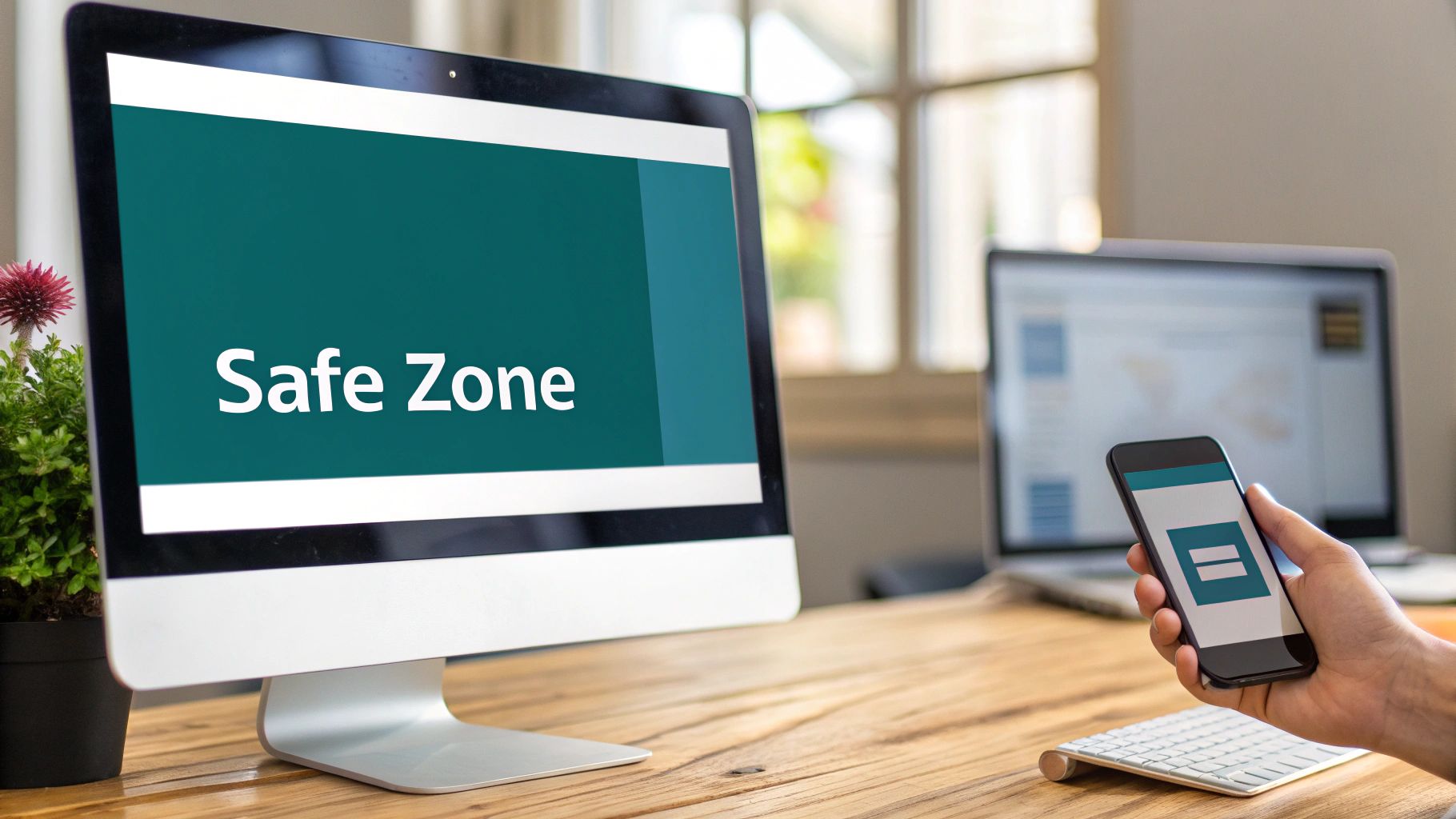
Here’s a mistake I see all the time: a header that looks incredible on a desktop monitor but completely falls apart on a phone. With so many people scrolling through LinkedIn on their mobiles, optimising for that small screen isn’t just a “nice-to-have”—it’s absolutely essential.
Your profile picture sits in a different spot on mobile compared to desktop, and it will cover up parts of your header. The trick is to keep all your mission-critical info—your name, tagline, logo, whatever is most important—smack in the centre “safe zone” of the banner. This ensures nothing important gets awkwardly cropped or hidden behind your photo, no matter how someone is viewing your profile.
This simple flowchart really breaks down the process into three easy-to-follow stages.
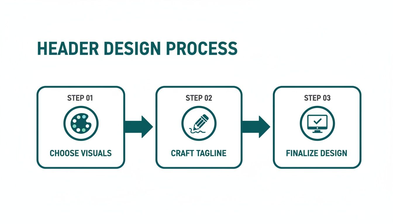
It’s a great reminder that a strong header begins with smart visual choices, gets its punch from a clear tagline, and is polished off with technical precision.
The Upload and Adjustment Process
Once you’re happy with your design, it’s time to get it on your profile. My advice? Save the final file as a PNG. It keeps text and graphics looking super crisp. If your header is purely a photograph, a JPG will work just fine.
Ready to go live? Here’s how:
- First, head over to your LinkedIn profile page.
- Click the little pencil icon on your main intro card to pop into edit mode.
- You’ll see another pencil icon on the header section itself. Click that and choose “Upload photo.”
- Grab your saved header image from your computer, and you’re almost there.
After you upload, LinkedIn gives you some basic tools to tweak the image. You can drag it to reposition, zoom in or out, and even apply a few simple filters. Take a second here to make sure everything lines up just right.
Pay extra attention to how your profile picture and header play together. You’re aiming for a seamless, cohesive look where every element supports the others, rather than fighting for attention.
When it looks perfect, hit “Apply,” and your new header is officially live. Since you’re already sprucing up your profile, now is a great time to also check the ideal image size for LinkedIn posts. Keeping all your visuals consistent and professional makes a huge difference.
Avoiding Common Header Design Mistakes
I’ve seen it happen countless times. A professional spends hours crafting what they think is the perfect LinkedIn header on their desktop, only for it to look like a complete mess on a mobile phone. This is easily the most common pitfall, and it completely undermines all that hard work.
The trick is to get familiar with the “safe zone.” This is the central strip of your header that stays visible no matter what device someone is using. It’s the prime real estate that won’t get covered up by your profile picture or other bits of the LinkedIn interface that shift around. Any critical info—your name, a snappy tagline, or your company logo—absolutely has to live in this central corridor.
Think of your 1584 x 396 pixel banner like a stage. On a desktop, you see the whole thing. But on mobile, your profile picture slides in from the left, blocking a chunk of the view. By keeping your main message centre stage, you guarantee everyone sees it.
Beyond Just Mobile Optimisation
Nailing the safe zone is a huge win, but there are a few other classic blunders that can trip you up and weaken your professional image. These often feel like small details, but they make a big difference in how credible and polished your profile looks.
Let’s walk through some of these frequent missteps and, more importantly, how to sidestep them.
-
Low-Resolution Imagery: Nothing screams “I don’t pay attention to detail” like a pixelated, blurry header image. It’s an instant credibility killer. Always, always start with a high-quality photo or graphic. You want it to look sharp and clean when it’s uploaded.
-
Information Overload: It’s so tempting to cram every award, skill, and contact method into your header. Don’t do it. A cluttered banner is a chaotic banner. It’s overwhelming and makes people tune out before they’ve even registered your message. Focus on one core idea.
-
Poor Colour Contrast: If people can’t read your text, it might as well not be there. Light grey text on a pale blue background? Forget it. Use an online contrast checker to make sure your text is legible for everyone, including people with visual impairments.
A Quick Guide to a Flawless Header
Your LinkedIn header isn’t just decoration; it’s a vital piece of your personal marketing. For professionals in Germany, where LinkedIn’s advertising reach hit 24.9% of the population in early 2025, a polished header is a non-negotiable tool for networking and finding leads. That audience grew by 3.0 million users in just over a year, which shows just how powerful the platform is. You can dig into more of Germany’s digital trends on datareportal.com.
To make sure your header is working for you, let’s look at some common slip-ups and the simple fixes that make all the difference.
Common Header Mistakes vs Best Practices
I’ve seen these mistakes derail otherwise great profiles. The good news is they are all easily avoidable once you know what to look for. This table breaks down the most frequent errors I see and gives you a clear path to getting it right.
| Common Mistake | Why It’s a Problem | How to Fix It |
|---|---|---|
| Ignoring the Safe Zone | Your core message gets chopped off on mobile, making your profile look unprofessional and broken. | Keep all essential text and logos firmly planted in the central part of your banner. |
| Using Pixelated Images | It instantly makes your profile look amateurish and suggests a lack of professional care. | Always use high-resolution images (at least 1584px wide) and save them as a PNG for the best clarity. |
| Too Much Text | A wall of text is overwhelming. Visitors won’t know where to look, and your main point gets lost. | Stick to one powerful tagline. Aim for no more than 7-10 words that pack a punch. |
| Bad Colour Choices | Illegible text can’t communicate your value and makes your profile inaccessible to some users. | Pick a background and font colour with high contrast. When in doubt, black and white is a classic for a reason. |
Getting these details right is what separates a basic profile from a compelling one. It’s a small change that sends a big signal.
By consciously avoiding these common errors, you elevate your profile from simply “complete” to “compelling.” A well-designed header is a silent signal of your professionalism, attention to detail, and strategic thinking. It’s a small detail that makes a massive difference in how you are perceived.
Advanced Strategies for a High-Impact Header
Think of your header as more than just a background image. It’s prime real estate. Getting the format right is your starting point, but what you put on that canvas can actively build your authority and nudge visitors to take specific actions.
Your header needs a job to do. Instead of just slapping your company logo up there, why not add a subtle but clear call-to-action (CTA)? This could be a short URL to your portfolio, an arrow pointing down towards the link in your bio, or even a simple prompt like “Download my latest report.”
By adding a CTA, you’re guiding people to the next logical step. You’re turning a passive profile view into a real engagement opportunity and transforming curious onlookers into potential leads or followers.
Turning Your Header into a Promotional Tool
Your professional life is always evolving, so your header should, too. When you align your banner with your current goals, it becomes a seriously powerful marketing tool.
Launching a book? Speaking at a webinar? Just won a major industry award? Your header is the perfect spot to shout about it. This approach keeps your profile feeling fresh and relevant, showing everyone that you’re an active and engaged professional in your field.
A few ideas to get you started:
- Promote an Event: Add the event title, date, and a short link.
- Showcase an Achievement: Feature a photo of you accepting an award or a graphic celebrating a big milestone.
- Launch a Product: Use visuals of your new book cover or a sneak peek of your software interface.
This dynamic strategy ensures your header always reflects what’s most important to you right now. It works brilliantly with a sharp, optimised headline to create a one-two punch of professional branding. For a deeper dive, check out these powerful LinkedIn headline tips.
Ensuring Brand Consistency and Quality
For a truly professional look, you want your brand elements to be consistent everywhere. That means making sure your colours look the same on every screen. Diving into topics like mastering color management can be a game-changer here. This level of detail screams professionalism.
A great header works in tandem with the rest of your profile. It doesn’t just fill space—it introduces your professional story, highlights your current focus, and tells visitors exactly what you want them to do next. It’s the ultimate conversation starter.
Got Questions About Your LinkedIn Header? We’ve Got Answers.
Even with all the specs laid out, a few questions always seem to pop up when people are putting the final touches on their LinkedIn header. Let’s clear the air and tackle some of the most common ones I hear all the time.
First up, the classic file type debate: JPG or PNG? While LinkedIn accepts both, the best choice really boils down to what your design looks like. If your header is basically a photograph, a high-quality JPG will do the job perfectly.
But, if you’ve got text, your logo, or any sharp graphic elements in there, PNG is definitely the way to go. It keeps those lines super crisp and avoids any of that fuzzy, compressed look you sometimes get with JPGs.
Another big question is how often you should actually change your banner. There’s no magic number here, but the key is to stop thinking of it as a static background. Treat it like a living, breathing part of your professional brand.
When’s a Good Time to Update Your Header?
Think of your header as a quick visual status update for your career. Hitting a big professional milestone is the perfect excuse for a refresh.
You should definitely consider a change when you:
- Land a new role. This is probably the most important time. It’s your chance to visually align yourself with your new company or the focus of your new position.
- Kick off a major project or launch a product. Why not use that prime real estate to build a little buzz and curiosity around what you’re working on?
- Are actively on the job hunt. A tailored header that speaks to the industry or specific roles you’re after can make an instant, powerful impression on recruiters.
Keeping your header current is a subtle but strong signal that you’re active and engaged in your career. It shows you’re paying attention.
Your header shouldn’t be a “set it and forget it” thing. A timely update is a simple way to show your network you’re evolving and actively steering your professional story.
Finally, people often ask about animations. Can you drop a GIF in your header? The short answer is, unfortunately, no. LinkedIn doesn’t support animated GIFs or videos for personal profile headers right now.
But just because you can’t have a moving background doesn’t mean your header has to feel flat. You can still create a really dynamic feel with strong visuals, bold colours, and a tagline that packs a punch. The goal is to grab attention, and a well-designed static image can absolutely do that.
Ready to create standout content for your newly optimised profile? Postline.ai is your AI-powered assistant for writing, improving, and scheduling LinkedIn posts faster than ever. Turn your ideas into engaging content that grows your audience and builds your professional brand. Discover how it works at https://postline.ai.

Run every client pipeline in one place
Give each LinkedIn profile its own voice, calendar, approval flow, and analytics. Start in minutes.
Start free trial