How to Export Data from LinkedIn Analytics to Excel [2025]
Get the definitive linkedin posts image size guide with exact dimensions for profiles, posts, company pages and ads. Boost engagement with perfect visuals.
When you're creating a post, the magic numbers for your linkedin posts image size are 1200 x 627 pixels. Sticking to this gives you that clean 1.91:1 aspect ratio. It’s the sweet spot that makes your images look sharp and professional across both desktop and mobile, without any weird cropping.
Understanding LinkedIn Visual Guidelines
Let's be honest, first impressions matter, and on LinkedIn, that often comes down to your visuals. When you upload an image that's the wrong size, it can end up looking stretched, blurry, or worse, with key information chopped off. It just looks unprofessional and can seriously weaken your message.
Getting the visuals right means your content has a much better chance of standing out and performing well in the feed.
Take a look at a standard LinkedIn feed. The posts with properly sized images just pop.
See how that landscape image fills the space? It’s eye-catching and works perfectly with the text beside it. That’s the 1200 x 627 pixel size in action. It's the go-to dimension that German social media marketing pros recommend for a polished presentation, especially since so much of LinkedIn's traffic now comes from mobile devices.
And if you're juggling multiple platforms, keeping track of all the different dimensions can be a headache. This complete guide to social media image sizes is a fantastic resource to bookmark.
Why Correct LinkedIn Image Size Matters And How To Avoid Mistakes
Getting your linkedin posts image size right is about more than just checking a box on a technical to-do list; it’s a critical piece of making a strong first impression. When you upload an image that doesn't fit LinkedIn's specs, the platform automatically crops or compresses it to make it work. The result? Often blurry, pixelated, or awkwardly framed visuals that completely undermine your message and make your content look amateurish.
A perfectly sized image, on the other hand, shows up crisp and clear whether someone's viewing it on a huge desktop monitor or a small mobile screen. That visual consistency is exactly what you need to build brand recognition and credibility. Plus, the platform’s algorithm tends to favour well-formatted content, which can give your posts a little extra visibility. Properly sized images also load faster, which is a small but vital detail for keeping people's attention.
Common Mistakes To Steer Clear Of
To keep your professional presence looking sharp, you'll want to avoid a few common slip-ups. Uploading low-resolution photos is probably the biggest offender—they just turn into a blurry mess when LinkedIn scales them up. Another frequent issue is ignoring the aspect ratio, which is how you end up with important parts of your image getting chopped off.
Here are a few other missteps I see all the time:
Placing text too close to the edges: This is a classic mistake. That information can easily disappear when the image is cropped for different screen sizes.
Using the wrong file format: LinkedIn supports JPG, PNG, and GIF, but choosing the right one for the job matters. A PNG is usually best for logos and graphics with sharp lines to prevent quality loss.
Forgetting about mobile: Always take a second to preview how your image will look on a phone. The vast majority of users will see your content there, so it has to look good.
By sidestepping these common pitfalls, you can seriously boost the impact of your content. To get a better sense of how all these details fit together, it’s worth learning more about how impressions on LinkedIn are tied to the quality of your posts.
Personal Profile Image Size Reference
Think of your personal LinkedIn profile as your digital handshake. Those first visual elements—your photo and banner—make a massive first impression, signalling your professionalism before anyone reads a single word. Getting these images sized correctly isn't just a technical detail; it's a fundamental part of your personal brand.
Unlike a company page, your profile is all about you. The images you choose should tell a story, reflecting your personality and expertise to create a brand identity that sticks.
Profile Picture Specifications
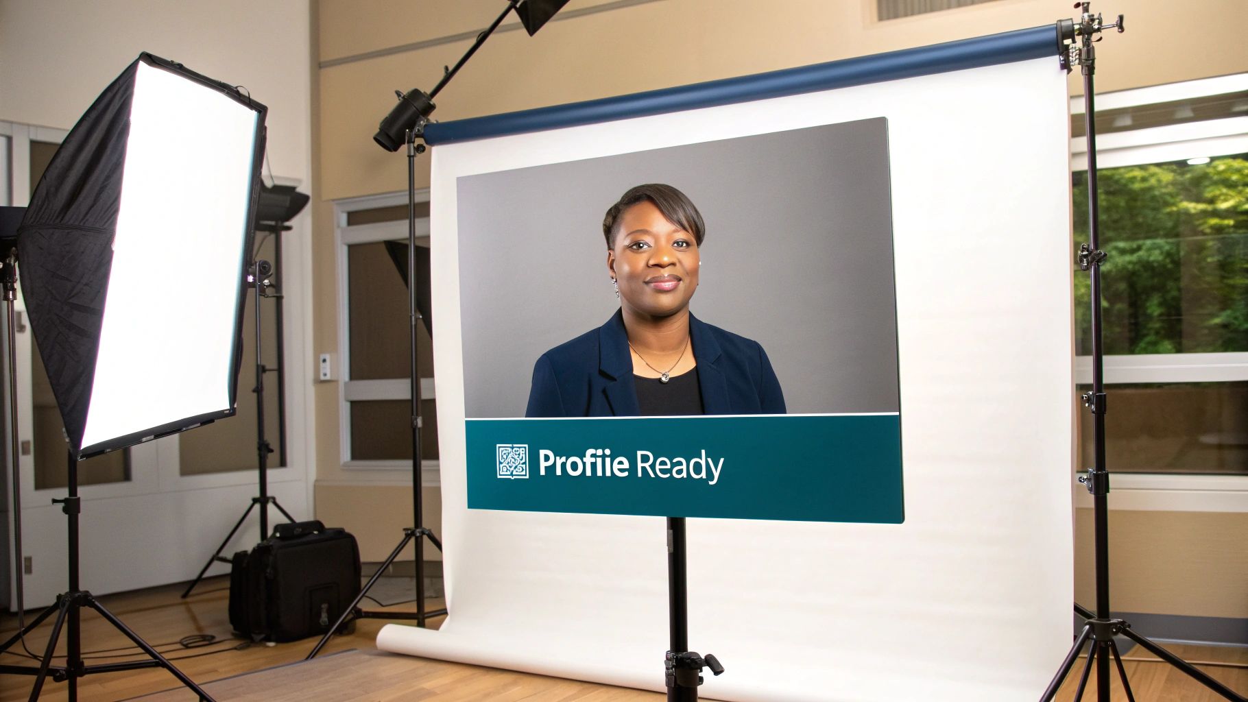
Your profile picture is easily your most important brand asset on LinkedIn. It follows you everywhere—popping up in search results, next to your comments, and in every connection request. Crystal clear quality is non-negotiable.
Recommended Size: 400 x 400 pixels
File Formats: JPG or PNG
Maximum File Size: 8 MB
You can't go wrong with a high-resolution headshot set against a clean, uncluttered background. Good lighting is key, and make sure your face is centred to avoid any awkward cropping by the platform. A professional photo really can make a big difference in how many people view your profile. If you're looking for a little help, checking out the best AI LinkedIn photo generators can give you some great, polished options without needing a full photoshoot.
Background Banner Specifications
That big space at the top of your profile? That's your background banner (or cover photo), and it's prime real estate for telling your professional story. Don't waste it.
Pro Tip: Your banner is the perfect spot to reinforce your personal brand. You could feature a powerful quote, highlight a key achievement, or use an image that speaks to your industry.
Recommended Size: 1584 x 396 pixels
File Formats: JPG or PNG
Maximum File Size: 8 MB
Just one crucial thing to remember: your profile picture will cover up the bottom-left portion of the banner. So, when you're designing it, make sure to keep any important text or visuals away from that corner. Position them more towards the centre or right side to ensure they’re fully visible on any device.
Company Page Image Size Reference
Think of your company's LinkedIn page as its digital storefront. First impressions count, and getting your visuals spot-on is crucial for looking credible and professional. Every image here needs to scream your brand, from the logo right through to the cover banner. Getting the LinkedIn posts image size standards right for your page is what makes your brand look polished, not clumsy.
These images are the very first thing potential clients, partners, and future employees will see. When they're optimised, it's not just about avoiding weird cropping; it’s about making sure your brand’s message and values come across loud and clear.
Logo And Cover Photo Specifications
Your logo and cover photo are the two heavy hitters on your page. They need to be crisp, clear, and instantly recognisable. No exceptions.
Company Logo: The sweet spot here is 400 x 400 pixels. This little square shows up everywhere – in search results, next to all your posts, and on every comment you make.
Company Cover Photo: Go for a landscape image sized at 1128 x 191 pixels. This banner is prime real estate for showing off your company’s mission, a new campaign, or just a bit of brand personality.
Quick heads-up: Cover photos look different on desktop versus mobile. Always, and I mean always, check your design on both to make sure nothing important gets chopped off.
Life Tab Image Sizes
The "Life" tab is a fantastic space to pull back the curtain on your company culture and reel in top talent. This is where high-quality, authentic visuals really shine.
Main Image: 1128 x 376 pixels
Company Photos: 900 x 600 pixels
Forget stock photos. These images should be the real deal, showing off your team, your workspace, and what it’s actually like to be part of your company. Used well, these visuals can seriously boost interest from the exact people you want to hire.
A Quick Guide to LinkedIn Post Image Sizes
Getting your LinkedIn posts image size right is one of those small details that makes a huge difference. If you’ve ever uploaded a picture only to have LinkedIn crop it in a weird way, you know what I mean. The right dimensions ensure your visuals look crisp and professional on every device, keeping your message clear and impactful.
It’s not just about avoiding bad crops, though. The size and shape of your image can directly affect how people engage with it. A wide, landscape image is perfect for showing off a detailed infographic, whereas a square or vertical format can dominate the screen on a mobile phone, instantly grabbing attention. Knowing which to use and when is a key part of a solid content strategy.
Single Image Posts and Link Previews
When you're sharing a single image or a link that pulls in a preview, you've got a few solid options. Each one is tailored for a slightly different purpose, but landscape is generally the go-to.
Landscape (1.91:1 ratio): The sweet spot here is 1200 x 627 pixels. This is the standard for most link preview images and works beautifully for general image posts. It gives you plenty of space and looks great on both desktop and mobile.
Square (1:1 ratio): Go with 1080 x 1080 pixels. This format is a beast on mobile feeds because it takes up more of the screen. If you want to stop the scroll, square is a great choice.
Vertical (4:5 ratio): For this, you’ll want 1080 x 1350 pixels. Vertical images are designed for a mobile-first world, making them perfect for portraits or product shots that need a bit more height.
For a quick visual breakdown of the most important image specs for a Company Page, this infographic is super helpful.
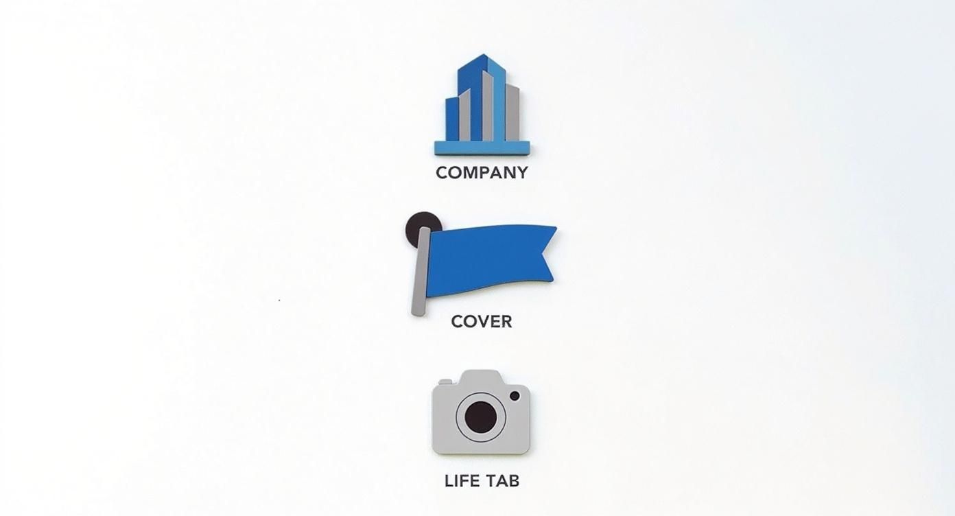
As you can see, the logo, cover photo, and Life Tab each have their own specific dimensions. It really drives home the point that one size definitely does not fit all on LinkedIn.
Multi-Image Carousel Posts
Carousel posts are one of my favourite ways to tell a story or break down a complex topic. They let you walk your audience through multiple points in one interactive post. For these to work well, consistency is everything.
You want each slide to flow seamlessly into the next as people swipe. That’s why the industry standard is a square format.
Every image or video in your carousel should be 1080 x 1080 pixels, which is a perfect 1:1 aspect ratio. You can add anywhere from two to ten cards, giving you a flexible canvas to work with. If you're looking to really master this format, our deep dive on creating a LinkedIn carousel post is packed with more advanced tips.
A Quick Reference for LinkedIn Ad Image Sizes
When you're putting money behind your content, precision is everything. Unlike your everyday organic posts, LinkedIn ads have to meet strict specs to look their best and grab your audience’s attention. Getting the linkedin posts image size right is the first step to making sure your ad spend actually delivers a return.
Every ad format has its own set of rules, whether you're running a single sponsored image or a multi-card carousel. If you get the size wrong, you risk your visuals looking blurry or, even worse, having crucial parts of your message chopped off. That's a surefire way to waste your budget and hurt your credibility.
Single Image Ad Specifications
The classic single sponsored image is probably the format you'll use most often. It shows up right in your target's feed, so you want it to look sharp and professional. For the best results, stick to these dimensions.
Recommended Size: 1200 x 627 pixels
Aspect Ratio: 1.91:1
Maximum File Size: 5 MB
This landscape layout is a safe bet, ensuring your ad displays correctly on both desktop and mobile without any awkward cropping.
Key Takeaway: When you're optimizing your visuals for social media advertising campaigns, getting the image dimensions right is a non-negotiable first step. A perfectly sized ad creative can make a huge difference in your click-through rates.
Carousel Ad Specifications
Carousel ads are fantastic for walking your audience through a story or showcasing a range of products. The key here is consistency; you want a seamless swiping experience from one card to the next.
Recommended Size: 1080 x 1080 pixels
Aspect Ratio: 1:1
Maximum File Size: 10 MB per card
Using these square dimensions for each of your two to ten cards creates that smooth, engaging flow you're looking for. If you're looking to dive deeper into creating paid promotions that really work, check out our detailed guide on how to boost posts on LinkedIn.
Got Questions? We've Got Answers
Getting your LinkedIn images just right can feel like a bit of a dark art, especially when you're in a rush. Let's clear up some of the most common sticking points that pop up.
What Is The Best File Format For LinkedIn Images?
For most of what you'll post, PNG is your safest bet. It's fantastic for any graphics that include text or sharp logos because it keeps everything crisp, with no weird compression blurs.
If you're posting a photograph, a high-quality JPG is more than fine. In fact, it's often better because the file size is smaller, which means your post will load faster for everyone. And if you want to add a little motion, LinkedIn happily supports GIFs, too.
How Can I Prevent My Images From Being Cropped?
There's nothing worse than seeing your carefully designed image get awkwardly chopped off. The best way to avoid this is to nail the aspect ratio from the start.
For a standard, single-image post, stick to either a landscape ratio of 1.91:1 (that's 1200 x 627 pixels) or a simple square at 1:1 (1080 x 1080 pixels). These are the magic numbers that ensure your image looks great on both desktop and mobile feeds without any surprises.
It's a classic mistake: placing important text or logos right up against the edge. Always leave a bit of a "safe zone" around the borders. A quick preview on your phone before you hit publish is the best final check you can do.
What Is The Maximum File Size For A LinkedIn Post?
LinkedIn wants things to load quickly, so file size matters. For your regular image posts, try to keep the file under 5 MB.
For other parts of your profile, like your profile picture or that big background banner, you've got a little more room to play with—the limit there is 8 MB. Staying within these limits is key to giving people a smooth experience and keeping their attention. If your file is too big, LinkedIn will compress it for you, and that often leads to a noticeable drop in quality.
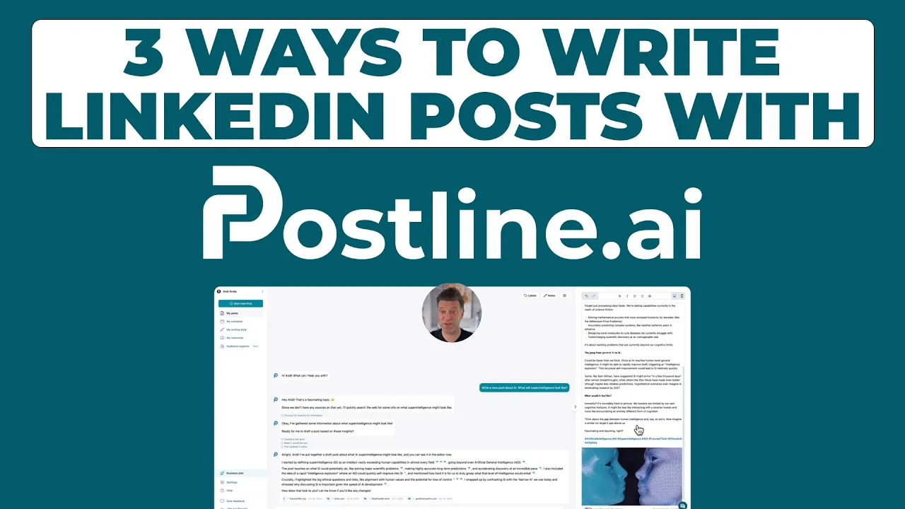
Ready to create perfectly formatted, engaging LinkedIn content in minutes? Postline.ai uses AI to help you write, schedule, and optimise your posts, ensuring your visuals and message always make an impact. Start creating standout posts today.
CREATE YOUR POSTS WITH POSTLINE.AI
More reach. More followers. More business.
👉 Try Postline.ai for free
Author

Christoph Gaschler

Christoph is the CEO of Mind Nexus and Co-Founder of postline.ai. He is a serial entrepreneur, keynote speaker and former Dentsu executive. Christoph worked in marketing for more than 15 years, serving clients such as Disney and Mastercard. Today he is developing AI marketing software for agencies and brands and is involved in several SaaS projects.
Related posts

Every LinkedIn post generator - Full Comparison
You want to grow on LinkedIn and need a little help from AI. There are many tools out there promising quick results. We tested the Top 10 LinkedIn post generators to see which actually can make a difference.

How to Export Data from LinkedIn Analytics to Excel [2025]
Discover how to export data from LinkedIn Analytics to Excel to gain valuable insights, streamline lead generation, and enhance data-driven decision-making. This guide covers step-by-step instructions, tools, and tips to help you analyze LinkedIn data efficiently and grow your business.

How to Message Recruiters to Connect on LinkedIn
In this guide you will learn how to reach out to a recruiter on LinkedIn. This is a step by step guide to prepare you to connect with recruiters and increase to chances of landing that new job. You will also find LinkedIn message examples and valuable insights below.