How to Export Data from LinkedIn Analytics to Excel [2025]
Master the ideal LinkedIn posting size for images, videos, and text. This guide covers dimensions, limits, and pro tips to boost your engagement.
For the best results, your LinkedIn post images should be 1200 x 627 pixels. This is the sweet spot for any images you share in a link preview. If you're going for a square look, which plays nicely on mobile feeds, aim for 1080 x 1080 pixels. Nailing these dimensions from the start means your content looks sharp, professional, and doesn't get butchered by awkward cropping.
Why Your LinkedIn Image Size Matters
Ever seen an image on LinkedIn that's awkwardly cropped or looks blurry? It’s the digital equivalent of a limp handshake. It instantly undermines your credibility before anyone even reads your post. Getting your LinkedIn image sizes right isn't just a technical detail; it's about making a solid first impression.
When your visuals are on point, they scream professionalism and attention to detail. This isn't just about aesthetics, it's about clear communication. People are far more likely to stop scrolling and engage with content that's crisp, clear, and easy to look at.
The Algorithm and How People See You
Let's talk about the LinkedIn algorithm for a second. It's designed to promote content that gives users a good experience. Posts with properly optimised images and videos almost always get better visibility, which translates directly into more engagement. A visually appealing post is a scroll-stopper, and that's what earns you likes, comments, and shares.
This has a direct knock-on effect on your professional brand. When your assets are sized correctly, you're guaranteeing your message gets delivered clearly, every single time. Suddenly, those technical specs aren't just minor details—they're a strategic advantage in a very crowded feed.
A perfectly sized visual is the digital equivalent of dressing for success. It shows you respect your audience's time and your own professional image, making them more likely to listen to what you have to say.
When you master the correct LinkedIn post sizes, you win in three key areas:
Professionalism: You build trust and reinforce your brand's credibility without saying a word.
Engagement: A better user experience naturally encourages more interaction from your network.
Visibility: You're playing by the platform's rules, which helps the algorithm show your content to more people.
Decoding LinkedIn Image Dimensions
Getting your images right for LinkedIn isn't about following a stuffy rulebook. It's about strategy. Think of it like getting a suit tailored—the perfect fit makes a world of difference in how you're perceived. Nailing the dimensions ensures your images look sharp and professional, grabbing attention instead of getting awkwardly cropped into oblivion.
And this is about more than just avoiding blurry pictures. The right LinkedIn posting size has a direct say in how much screen real estate you command, especially on mobile, where most of your audience is scrolling. An image that's too wide (landscape) can look tiny and get lost in the feed, while one optimised for mobile stands out and stops the scroll.
Choosing the Right Aspect Ratio
When it comes to standard image posts, two aspect ratios are your best friends: square (1:1) and vertical (4:5). The 1:1 ratio, usually 1080 x 1080 pixels, is the versatile, safe bet. It looks great on both desktop and mobile feeds without any nasty surprises.
But if you really want to make an impact, the vertical 4:5 ratio (think 1080 x 1350 pixels) is your secret weapon. This taller format hogs more vertical space on a smartphone screen, pushing out other distractions and forcing people to pause on your content. It's a subtle trick, but it works.
To give you a clearer picture of why this all matters, here’s a quick breakdown of what a perfectly sized post does for your professional brand.
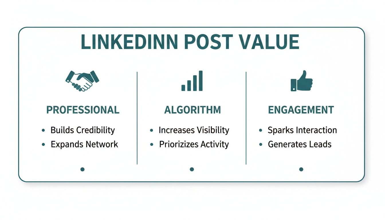
As you can see, a well-crafted post doesn't just look good; it sharpens your professional image, gives the algorithm all the right signals, and gets your audience talking.
Essential Technical Specifications
Beyond the dimensions, a few technical specs are key to keeping your images looking top-notch. Paying attention to these small details ensures your visuals load fast and stay crisp.
File Types: For photos and detailed images, JPG is your go-to. It strikes a great balance between quality and file size. For graphics with clean lines, text, or transparent backgrounds (like your company logo), PNG is the clear winner because it keeps everything sharp.
File Size: Try to keep your image file size under 5 MB. If your file is too beefy, LinkedIn will compress it for you, and that often leads to a noticeable drop in quality. You don't want that.
Getting these details right is the foundation of a strong visual strategy. It shows you’re meticulous and value the quality of the content you share with your professional network.
For those who want to go deeper, we've put together a complete guide on this at https://postline.ai/blog/2/linkedin-post-images-size with more detailed specs. And if you're looking for another great resource, this ultimate guide to LinkedIn post image sizes is an excellent read. Trust me, mastering these simple technical points is a small effort that pays huge dividends in how your content looks and performs.
Quick Reference Guide for LinkedIn Image Sizes
To make things even easier, here’s a quick cheat sheet with the most common image specs. Keep this handy, and you'll never have to second-guess your visuals again.
Image Type | Recommended Dimensions (Pixels) | Aspect Ratio | Max File Size |
|---|---|---|---|
Profile Photo | 400 x 400 | 1:1 | 8 MB |
Profile Banner | 1584 x 396 | 4:1 | 8 MB |
Company Page Logo | 300 x 300 | 1:1 | 4 MB |
Company Cover Photo | 1128 x 191 | 5.9:1 | 4 MB |
Shared Image (Square) | 1080 x 1080 | 1:1 | 5 MB |
Shared Image (Vertical) | 1080 x 1350 | 4:5 | 5 MB |
Link Preview Image | 1200 x 627 | 1.91:1 | 5 MB |
Getting these basics right is a simple win that elevates your entire LinkedIn presence. It's one of those small details that separates the pros from the amateurs.
Mastering LinkedIn Video for Higher Engagement
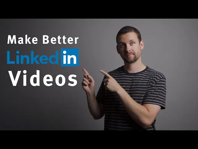
Let's be honest, video isn't just an option on LinkedIn anymore; it's a powerhouse for grabbing attention. When you get it right, a good video can stop the scroll dead in its tracks and deliver your message with a punch that text and static images just can't match. But here's the catch—its power depends entirely on getting the technical details right, especially the size and shape of your video.
Think of your video's aspect ratio as the frame for your story. The wrong frame can chop off vital information or squeeze your masterpiece into a tiny, forgettable box on a mobile screen. And that's where most of your audience is watching. Nailing the dimensions isn't just a technical chore; it's a core part of your strategy.
For the biggest impact, your best friends are square (1:1) and vertical (4:5) videos. These formats are designed for the mobile feed, taking up maximum screen real estate, pushing out distractions, and demanding to be seen. That traditional landscape (16:9) video might look great on a desktop, but in a vertical feed, it just looks small and lost.
Key Video Specifications to Remember
To make sure your video looks crisp and plays without a hitch, you need to keep a few key numbers in your back pocket. These are LinkedIn's official guidelines, designed to give everyone a smooth viewing experience.
File Size: Aim for a file size between 75 KB and 200 MB. This is the sweet spot that balances high quality with quick loading times.
Video Duration: Your video needs to be at least 3 seconds long but can run for up to 10 minutes. Pro tip: shorter, punchier videos almost always perform better.
File Format: Stick with MP4. It's the universal standard and guarantees the best compatibility across every device and browser out there.
Getting these technical specs right is the first step to getting your video published correctly. If you need a more detailed walkthrough of the upload process itself, our guide on how to post a video on LinkedIn breaks it all down for you, step-by-step.
Strategies for Optimising Video Engagement
Beyond just the numbers, a few simple tweaks can make a massive difference in how your video performs. These tips are all about connecting with your audience, even the ones watching in a quiet office or on their commute.
First, you absolutely need a strong visual hook within the first three seconds. That's all the time you have to convince someone to stop scrolling. Make your opening count with something visually compelling or some bold on-screen text that sparks curiosity.
Remember that a huge chunk of LinkedIn users watch videos with the sound off. Adding captions isn't just a nice-to-have for accessibility; it's a fundamental requirement if you want to maximise your reach and make sure your message actually lands.
This is especially true when you're targeting professionals who are actively engaged. For instance, the DACH region boasts over 16 million LinkedIn users, with a massive demographic of 25- to 34-year-olds who are highly receptive to video. To capture their attention, your content has to be optimised for silent viewing from the get-go.
And if you're looking for fresh ways to approach your video strategy, you might find some great ideas in this guide on creating faceless videos for LinkedIn. It’s a fantastic approach for brands or individuals who want the focus to be purely on the message, not the person on camera. Combine the right technical specs with smart engagement tactics, and you'll set your videos up for success every time.
Perfecting Your LinkedIn Text Length
While a killer image or video will stop the scroll, it’s your words that get the conversation started and build real connections. Getting your LinkedIn text length right isn't about following strict rules; it's about making a strategic impact. You're crafting a message that respects your audience's time while making it impossible for them not to engage.
Technically, you have a generous 3,000 characters to play with for a standard LinkedIn post. But the number you really need to burn into your memory is much smaller. On most mobile devices, LinkedIn cuts off your post after about 210 characters, hiding everything else behind that little "…see more" link.
Think of that cutoff as the bouncer for your full message. Your first few lines are everything—your pitch, your hook, your first impression. If they don’t spark instant curiosity, your audience will just keep scrolling, and all the gold you’ve written below will be left unread.
Structuring Your Post for Readability
To beat the dreaded "see more" click and keep people reading, you need to structure your text for pure clarity and impact. It’s like creating a clear path for your reader, guiding them from the initial hook right through to your final point.
A winning post almost always has three parts:
The Hook: Kick things off with a provocative question, a shocking statistic, or a bold statement. Your only job here is to make clicking "see more" feel like an absolute necessity.
The Body: Now that you've got their attention, deliver the goods. This is your core message. Ditch the long paragraphs and use short, punchy sentences instead. Use bullet points or numbered lists to break down anything complex into scannable bites.
The Call-to-Action (CTA): Always end with a clear next step. Ask a question to get comments flowing, invite people to share their own stories, or point them to a helpful resource.
Treat your post's structure like a mini-story. The hook is the intriguing opening scene, the body is where the plot unfolds, and the CTA is the satisfying finale that invites the audience to become part of the story themselves.
This structured approach is non-negotiable, especially when you're trying to reach a big professional audience. In Germany, for example, LinkedIn's user base has swelled to nearly 16 million members, a massive chunk of the country's professionals. To get their attention, your content has to be organised and effortless to read. You can dig into more stats on the German digital scene over on DataReportal.
Nailing your post's structure doesn't have to be a painful, manual process. For a helping hand in crafting perfectly formatted posts every time, check out our guide on using a LinkedIn text formatter. It'll make sure your structure and readability are on point. At the end of the day, the perfect text length is one that delivers value quickly, works with the platform's layout, and makes it easy for your network to jump into the conversation.
Real-World Examples of Perfect LinkedIn Posts
Theory is great, but seeing these principles in action is where it really clicks. Let's step away from the numbers for a moment and look at some real-world posts to see what makes them work. These quick case studies will highlight the massive difference between a post that’s just ‘okay’ and one that’s truly optimised to make an impact.
By breaking these down, you'll get a clear blueprint for crafting your own content that grabs attention and sparks actual conversations.
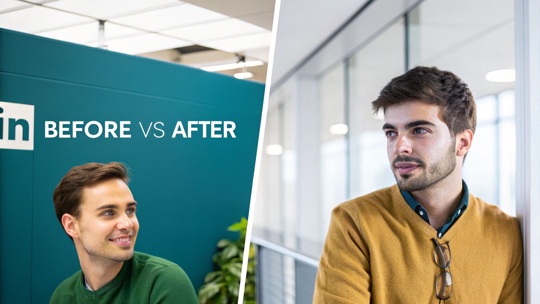
Case Study 1: The Power of a Vertical Image
Picture a business coach sharing a motivational tip. In the "before" scenario, they've used a standard landscape (16:9) photo. On a mobile feed, this thing is tiny, squashed between other posts, and the quote they’ve put on top is almost impossible to read. It's a recipe for being ignored.
Now, for the "after" version. The same coach switches to a vertical 4:5 image (1080 x 1350 pixels). This one small change is a game-changer. The image now completely takes over the mobile screen, making it impossible to scroll past. The text is big and bold, and the whole post just feels more professional and immersive.
The lesson here is simple but incredibly powerful: maximising your screen real estate with a vertical image is one of the easiest wins on LinkedIn. It makes sure your message is seen and felt, not just swiped away.
Case Study 2: From a Wall of Text to Scannable Insights
Let's look at a text-only post. In the "before" version, a marketing expert shares some fantastic industry insights... in one massive, unbroken paragraph of 300 words. The information is gold, but that wall of text is just plain intimidating. Most people will see it, feel overwhelmed, and just keep on scrolling.
In the "after" version, the expert uses some simple formatting tricks:
A Killer Hook: The post kicks off with a single, punchy question under 210 characters.
Whitespace: They've broken that long paragraph into short, easy-to-digest chunks of 1-2 sentences.
Bullet Points: Key stats are pulled out into a bulleted list that you can scan in seconds.
Clear CTA: It all wraps up with a direct question, inviting people to jump into the comments.
The actual content hasn't changed, but the optimised version is inviting, scannable, and way more engaging. The perfect LinkedIn posting size isn't just for images; it’s about making your words easy to consume, too. For more ideas, you can find tons of effective LinkedIn post examples that nail this balance. By getting these simple formatting and sizing details right, you ensure your valuable insights get the attention they deserve.
Your Quick LinkedIn Post Optimisation Checklist
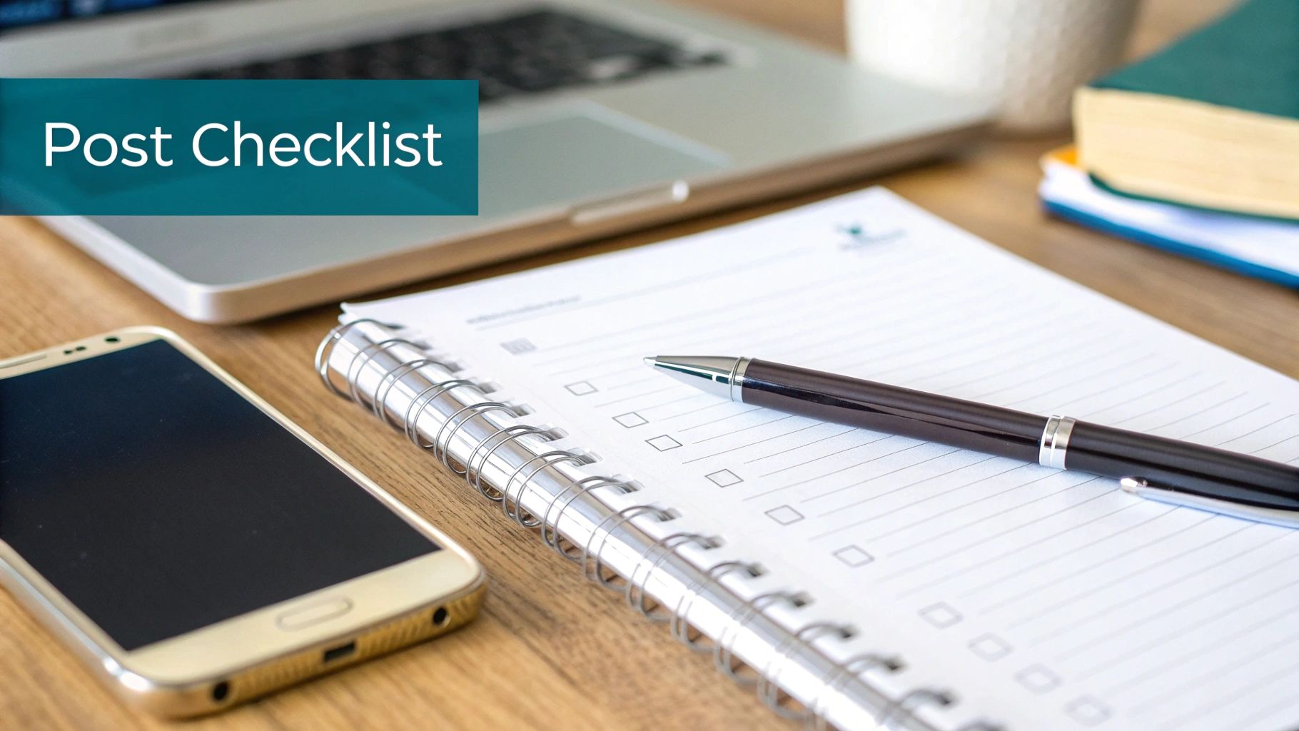
It's easy to get lost in the details, so I find it helps to have a simple, repeatable checklist. Think of this as your final pre-flight check before you hit ‘post’.
Running through these quick steps ensures every piece of content is polished and primed for performance. It's a small habit that saves a ton of time and makes a huge difference. Honestly, getting your LinkedIn posting size and structure right can be the difference between a post that flies and one that flops.
Image and Video Checks
Before you even think about uploading, give your visuals a quick once-over. This is your last chance to make sure they look sharp and professional in the feed.
Aspect Ratio: Is my image or video a 1:1 (square) or 4:5 (vertical)? You want to claim as much mobile screen real estate as you can.
Dimensions: Are my images at least 1080px wide? Anything less risks looking blurry and unprofessional.
File Size: Is my image under 5 MB and my video under 200 MB? This helps avoid LinkedIn's automatic compression, which can butcher the quality.
Captions: Have I added captions to my video? Remember, most people scroll with the sound off, so captions are non-negotiable.
Text and Formatting Checks
The words are what get the conversation started. Let's make sure they're easy to read and structured to pull people in.
Think of your post’s text as the guide that leads your audience to your core message. Clear formatting creates an effortless path for them to follow.
The Hook: Is my opening line punchy and under 210 characters? You have to grab them before they hit that ‘…see more’ button.
Readability: Have I broken up my text? Use short paragraphs, white space, and maybe some bullet points to make it scannable. No one wants to read a wall of text.
Call-to-Action (CTA): Does my post end with a clear question or prompt? You have to give people a reason to comment and interact.
Frequently Asked Questions About LinkedIn Post Sizes
Getting into the nitty-gritty of LinkedIn's content specs can feel a bit like trying to solve a puzzle. But don't worry, once you know the key pieces, it all clicks into place. This section tackles the most common questions I hear about LinkedIn post sizes, so you can create polished, effective content every single time.
Think of these as the quick answers you need to reinforce what you've learned and troubleshoot any issues on the fly.
Key Content Specifications
Getting your specs right is the first, and maybe most important, step to looking professional on the platform. Most of the confusion comes down to images, videos, and text length—the very things that have the biggest impact on how your post performs.
What is the best image size for a LinkedIn post? If you want maximum visibility, especially on mobile phones, you can't go wrong with a square 1:1 ratio (think 1080x1080 pixels). A vertical 4:5 ratio (1080x1350 pixels) is also a fantastic choice. Both formats take up more real estate on the screen, which is exactly what you want to stop the scroll.
Can I post a story-style vertical video (9:16) on LinkedIn? You can, but I wouldn't recommend it for the main feed. While LinkedIn supports a range of aspect ratios, a tall 9:16 video often gets awkwardly cropped. A 4:5 vertical video is a much safer bet to make sure it looks great for everyone, no matter how they're viewing it.
Think of your post’s dimensions as its digital handshake. A well-proportioned image or video is firm and confident, making a great first impression before your audience even reads a single word.
Does text length really affect my post's performance? Absolutely. It's a game-changer. Those first few lines—about 210 characters—are what people see before the "...see more" link. If you can nail a strong, punchy hook in that tiny space, you'll see a huge difference in how many people click to read the rest of your post.
What happens if I upload an image that is too large? If your image file is bigger than LinkedIn's limit (like 5MB for posts), the platform will step in and compress it for you. The problem is, this automatic compression can ruin the quality, leaving you with a blurry mess. It’s always better to optimise your images yourself before you upload.
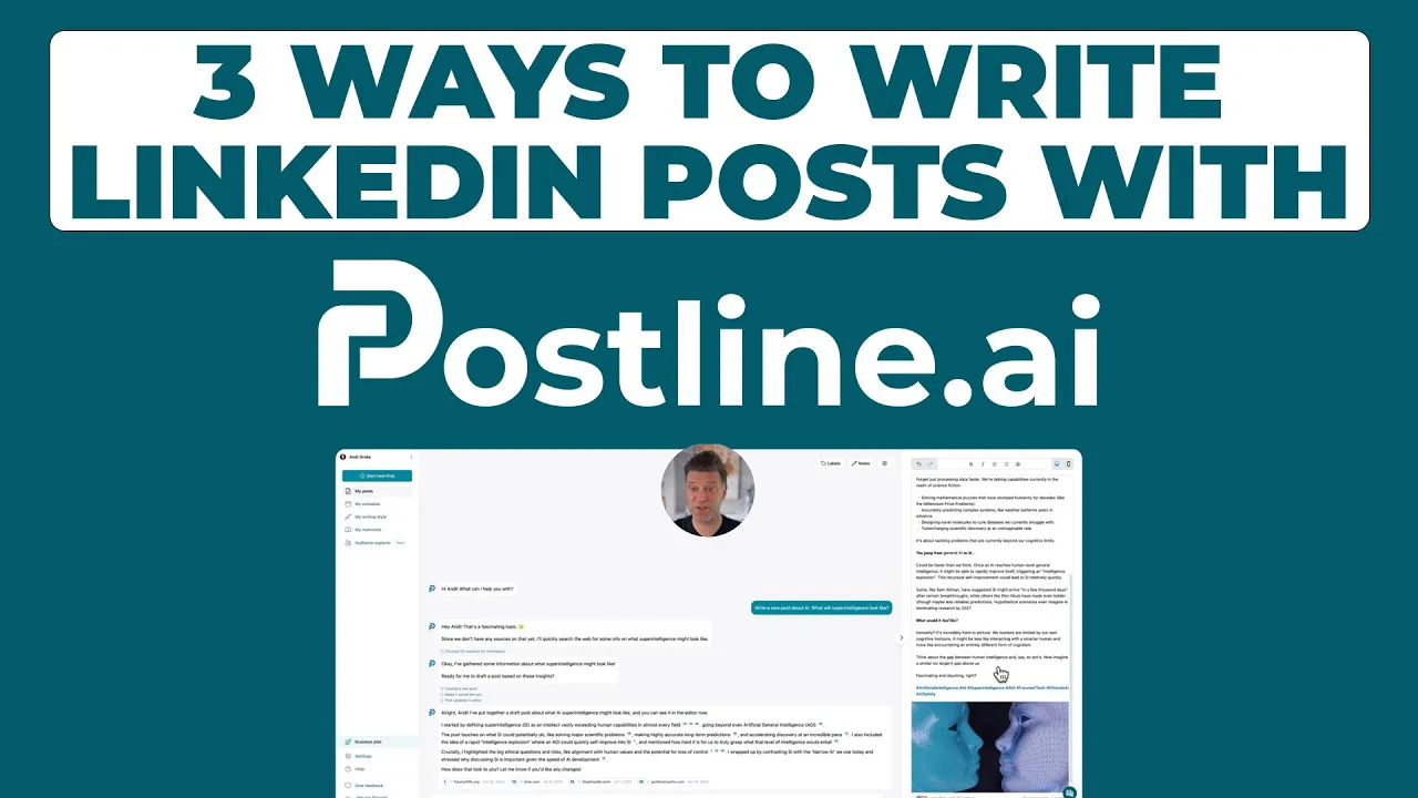
Ready to stop guessing and start posting with confidence? Postline.ai combines powerful AI writing with built-in formatting tools to ensure every post is perfectly structured and sized for maximum impact. Turn your ideas into standout content in minutes at https://postline.ai.
CREATE YOUR POSTS WITH POSTLINE.AI
More reach. More followers. More business.
👉 Try Postline.ai for free
Author

Christoph Gaschler

Christoph is the CEO of Mind Nexus and Co-Founder of postline.ai. He is a serial entrepreneur, keynote speaker and former Dentsu executive. Christoph worked in marketing for more than 15 years, serving clients such as Disney and Mastercard. Today he is developing AI marketing software for agencies and brands and is involved in several SaaS projects.
Related posts

Every LinkedIn post generator - Full Comparison
You want to grow on LinkedIn and need a little help from AI. There are many tools out there promising quick results. We tested the Top 10 LinkedIn post generators to see which actually can make a difference.

How to Export Data from LinkedIn Analytics to Excel [2025]
Discover how to export data from LinkedIn Analytics to Excel to gain valuable insights, streamline lead generation, and enhance data-driven decision-making. This guide covers step-by-step instructions, tools, and tips to help you analyze LinkedIn data efficiently and grow your business.

How to Message Recruiters to Connect on LinkedIn
In this guide you will learn how to reach out to a recruiter on LinkedIn. This is a step by step guide to prepare you to connect with recruiters and increase to chances of landing that new job. You will also find LinkedIn message examples and valuable insights below.