How to Export Data from LinkedIn Analytics to Excel [2025]
Master the correct LinkedIn post photo size with our complete guide. Get the latest specs for profiles, carousels, and ads to make your content stand out.
Getting your LinkedIn post photo size spot-on is a non-negotiable for looking professional. For a classic single image post, you're looking at 1200 x 627 pixels for landscape or a neat 1080 x 1080 pixels for a square. Stick to these, and your images will stay crisp and clear on both desktop and mobile, giving your content the impact it deserves.
Your Quick Reference Guide to LinkedIn Image Sizes
Figuring out the right dimensions for your LinkedIn visuals is the first hurdle in building a polished, professional presence. Different spots on the platform—from your personal profile to a Company Page post—have their own specific size requirements to display properly. Getting it wrong leads to blurry images, awkward crops, or key info getting chopped off, which really undermines your credibility.
Think of this guide as your go-to cheat sheet. It’s built for busy professionals who need the right numbers, fast. It covers all the essential sizes for your profile and posts, so every visual you upload is perfectly optimised.
Key LinkedIn Image Types
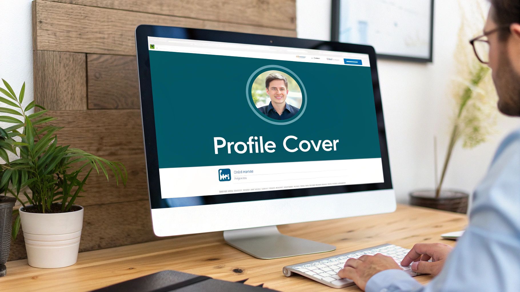
The visual below breaks down the three core image types you'll be dealing with most of the time: your profile picture, cover photo, and feed posts.
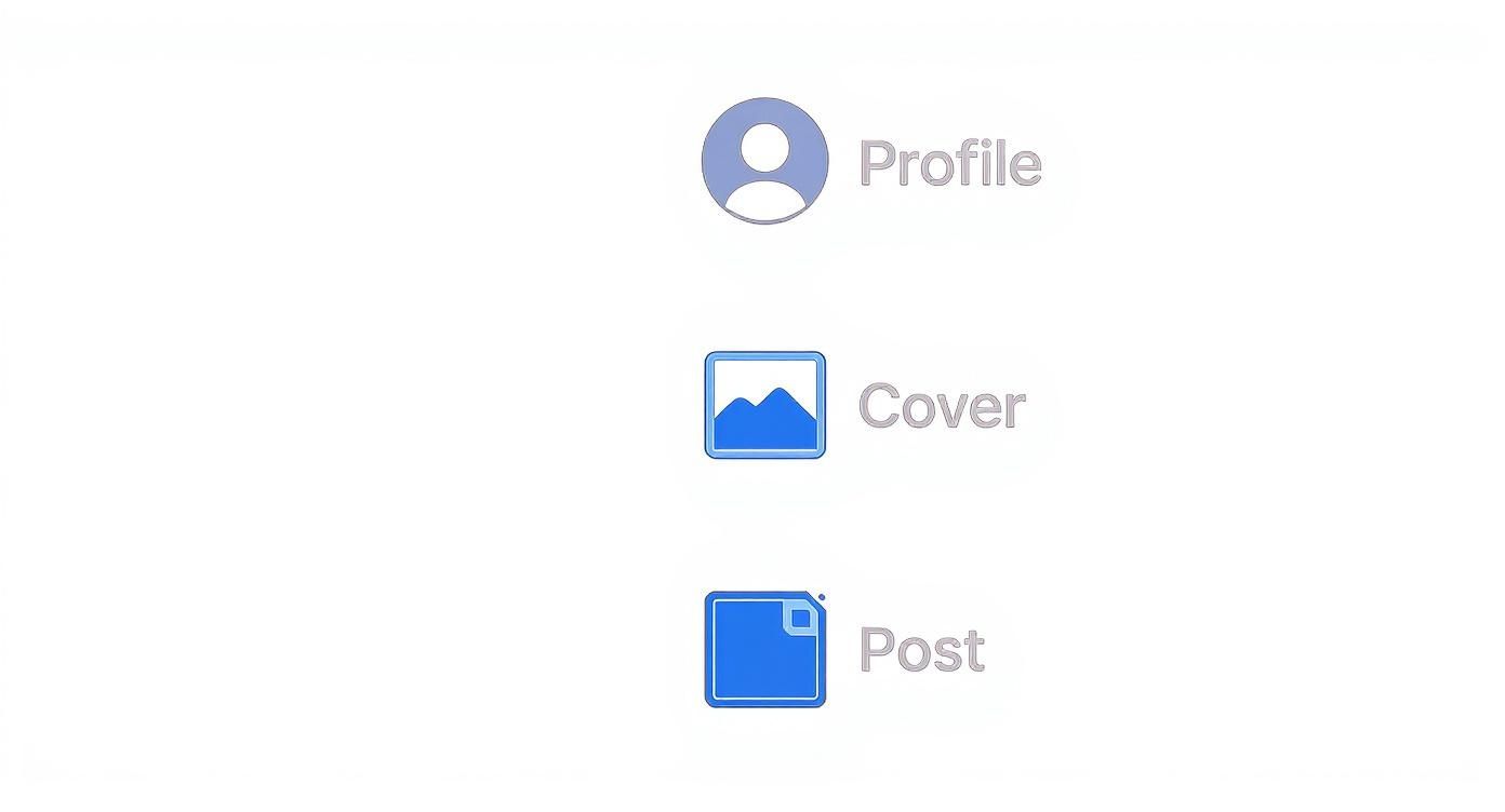
It’s a simple breakdown showing how each element plays a different role, from personal branding to daily content engagement. For the exact specs, the table below has everything you need.
LinkedIn Image Size Cheat Sheet
Here’s a quick-reference table with the most common image dimensions you'll need for your LinkedIn activities. Bookmark this page so you can pull it up whenever you're creating content.
Image Type | Recommended Dimensions (Pixels) | Aspect Ratio |
|---|---|---|
Personal Profile Picture | 400 x 400 | 1:1 |
Personal Cover Photo | 1584 x 396 | 4:1 |
Company Page Logo | 400 x 400 | 1:1 |
Company Cover Photo | 1128 x 191 | 5.9:1 |
Single Image Post (Square) | 1080 x 1080 | 1:1 |
Single Image Post (Landscape) | 1200 x 627 | 1.91:1 |
Link Preview Image | 1200 x 627 | 1.91:1 |
Carousel Post Card | 1080 x 1080 | 1:1 |
Having these numbers handy saves a ton of time and ensures your profile and posts always look their best. A little prep on the image front goes a long way.
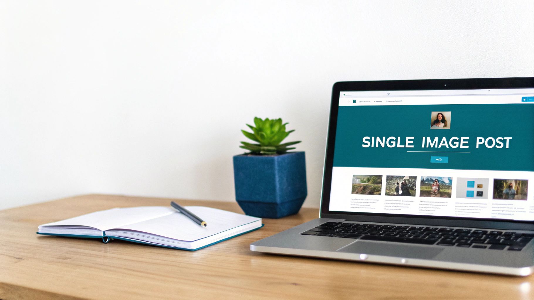
Getting Single Image Posts Right
When you're posting a single image on LinkedIn, the size you choose is more than just a technical detail—it's about making sure your post grabs attention in the feed. Getting it wrong can lead to awkward cropping, but getting it right can seriously boost your visibility. The two main players here are landscape and square images, and each has its own strengths.
For that classic, wide look, you'll want to go with 1200 x 627 pixels. This is the standard linkedin post photo size for a landscape image, giving you a 1.91:1 aspect ratio. It's perfect for showing off detailed graphics, team photos, or anything with a broader perspective. It’s also the same format used for most link previews, which helps create a nice, consistent feel when you’re sharing articles.
Don't just take my word for it; these dimensions are tried and tested. For instance, a German study found that a whopping 68% of users who used the 1200 x 627 format saw better visibility and engagement. We're talking noticeably more likes and comments compared to posts with smaller images. You can dig into more of these findings over at the German Digital Association.
Why Square Posts are Taking Over
On the other hand, you've got the square post: 1080 x 1080 pixels, a clean 1:1 aspect ratio. This format has exploded in popularity, and for good reason—it’s built for mobile. Square images simply take up more real estate on a phone screen, which makes them much harder to just scroll past.
This is your go-to format for putting the spotlight on a single subject, whether that's a professional headshot, a new product, or a graphic with a punchy quote. No matter which format you choose, though, always remember to keep your most important content near the centre. That way, you can be sure your main message won't get cut off, no matter what device someone is using. A well-composed image is just as vital as the pixel count.
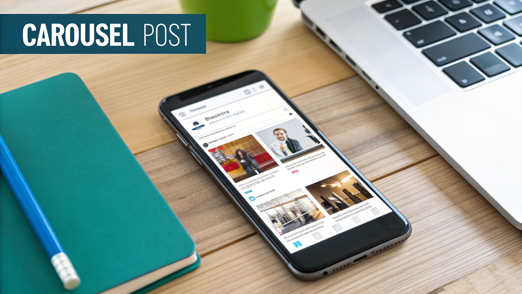
Making Your Carousel and Multi-Image Posts Count
Carousel posts are a brilliant way to walk your audience through a story or unpack a complex idea right in their feed. Letting people swipe through a series of images creates an interactive feel that can really hold their attention—much more than a single, static picture.
This format really shines on mobile, where swiping is second nature. To nail it, you'll want to use dimensions that fill the screen and make the whole experience feel seamless. If you want to go deeper on how to build these out, we've got a full guide on creating an effective LinkedIn carousel post.
Recommended Carousel Dimensions
Getting your carousel images right is all about consistency. Each image—or "card"—in your sequence should have the same dimensions to keep things looking sharp and professional from start to finish.
Here are the two best options to work with:
Square (1:1 Aspect Ratio): The go-to size is 1080 x 1080 pixels. It's the most common for a reason—it looks great on both desktop and mobile and is super versatile.
Vertical (4:5 Aspect Ratio): For a more mobile-centric strategy, aim for 1080 x 1350 pixels. This format takes up more real estate on a phone screen, which can make your post much more impactful as people scroll.
Pro Tip: Whatever size you choose, make sure your design flows across all the slides. A clever trick is to use visual cues like arrows or graphics that bleed from one card to the next. It encourages people to keep swiping and can give your engagement a serious boost.
Don't forget the technical bits. LinkedIn accepts JPG and PNG files for carousel images. Just be sure each file is under 10 MB. This prevents any upload hiccups and ensures your audience isn't left waiting for slow-loading images. A well-executed carousel doesn't just look good; it's a powerful narrative tool.
Perfecting Your Professional Profile and Company Page Images
Think of your LinkedIn profile picture and cover photo as your digital handshake. They’re the very first thing colleagues, recruiters, and potential clients see, forming an immediate impression. Getting these images sized and composed correctly isn't just about looking good; it's about projecting a polished, credible brand identity the second someone lands on your page.
It's the same story for company pages. The logo and cover image are your core branding assets, instantly communicating your company's professionalism and eye for detail.
This isn’t just a hunch, either. A YouGov survey in Germany found that a massive 74% of LinkedIn users feel that image quality and size directly shape their perception of a company’s professionalism. You can dig into more insights on how visuals shape brand perception on yougov.de.
Key Profile and Page Dimensions
To nail that first impression, you'll want to stick to these exact dimensions for your personal and company page visuals. Each one is specifically designed to display perfectly across all devices, from a wide desktop monitor right down to a compact mobile screen.
Here are the numbers you need to know:
Personal Profile Photo: 400 x 400 pixels (a perfect 1:1 ratio). Just remember that LinkedIn crops this into a circle, so keep your face right in the centre.
Personal Cover Photo: 1584 x 396 pixels (a wide 4:1 ratio). A key thing to watch for is your profile picture overlapping on the left-hand side.
Company Page Logo: 400 x 400 pixels (another 1:1 square). This is the logo that shows up in search results and next to all your company's posts.
Company Cover Image: 1128 x 191 pixels. This long, thin banner is your company’s prime piece of visual real estate.
Composition Strategy: For your personal profile, make sure your face is well-lit and clearly visible. It’s a small image, but it's your main identifier across the whole platform. For a really modern take, this comprehensive guide to AI Generated Headshots for LinkedIn is a fantastic resource for creating a sharp, professional look.
When it comes to your cover photo or banner, try to avoid placing crucial text or logos too close to the edges where they might get cropped on different screen sizes. If you need some inspiration for a banner that really tells your story, have a look at our guide on the 10 best LinkedIn banner ideas. While it’s not a typical linkedin post photo size, getting your banner right is absolutely vital for your brand.
Nailing Your Link Preview and Article Banner Images
Sharing external links—like your latest blog post or a great news article—is a brilliant way to provide value. But if the preview image is missing or weirdly cropped, you can kiss your click-through rate goodbye. When you paste a URL, LinkedIn tries its best to pull a thumbnail automatically, but you really want to control how that looks to keep things professional.
To make the biggest impact, your link preview image should be 1200 x 627 pixels. This gives you a clean 1.91:1 aspect ratio. Getting this specific size right means your thumbnail will look sharp and fully visible on both desktop and mobile, without any awkward bits getting chopped off.
This isn't just about looking good; it's about getting results. An analysis from the German Social Media Association found that posts using this exact size hit an average engagement rate of 4.2%. That’s 1.8 times higher than posts with non-standard image sizes. You can dive deeper into the numbers in the German Social Media Association's study on LinkedIn engagement.
Taking Control of Your Thumbnails
So, how do you make sure LinkedIn grabs the right visual every single time? Your website's HTML header needs the right Open Graph (OG) image tag. This little piece of code is what tells social media platforms exactly which image to feature.
If you've ever shared a link and seen an old, incorrect image pop up, that's almost always a caching issue. This is where the official LinkedIn Post Inspector tool becomes your best friend. Just paste your URL into it, and the tool forces LinkedIn to fetch the latest version of your page, clearing the old cache and updating the preview for all future shares. We've got a full walkthrough in our guide on how to fix your LinkedIn link preview card.
Sizing Your LinkedIn Article Banners
Publishing long-form articles directly on LinkedIn? That banner image is your article's headline visual, and it needs to be powerful enough to make people want to click and read.
The sweet spot for a LinkedIn article banner is 1920 x 1080 pixels. Sticking to this 16:9 aspect ratio gives your article a cinematic, high-quality feel. It also gives you plenty of room to play with compelling imagery that truly captures what your article is all about.
Essential Technical Specs and Best Practices
Getting the dimensions right is a massive step, but a few technical details can still trip you up. Nailing these final checks ensures your images load quickly and look sharp on every device, avoiding any last-minute quality issues that could undermine your professional image. After all, a blurry or slow-loading picture isn't doing you any favours.
Beyond just the size in pixels, the file size in megabytes is a critical limit. You need to keep things lean for quick loading times, which is something users definitely appreciate.
For most content, like standard posts and carousels, you need to keep your images under 5 MB. Profile and cover photos give you a little more breathing room, with an 8 MB limit. Sticking to these limits prevents that dreaded lag that can cause people to scroll right past your hard work. For a deeper dive into the principles of sizing images for optimal web performance, that guide is a great resource.
File Size and Format Cheat-Sheet
To make things easy, here’s a quick breakdown of LinkedIn's file requirements. Keeping these numbers in mind will save you a lot of headaches and resizing efforts down the line.
| LinkedIn Image File Requirements |
| :--- | :--- | :--- |
| Image Type | Max File Size | Recommended Format |
| Profile Photo | 8 MB | JPG, PNG, GIF |
| Cover Photo | 8 MB | JPG, PNG, GIF |
| Post Images (Single/Carousel) | 5 MB | JPG, PNG, GIF |
| Link Preview Images | 5 MB | JPG, PNG, GIF |
| Company Page Logo | 4 MB | JPG, PNG, GIF |
Getting these specs right from the start means your images will always upload smoothly and display correctly, maintaining that professional polish you're aiming for.
Choosing Your File Format
The file type you choose also plays a big part in your image's final quality and performance. It's not just a random three-letter extension; it actually matters.
JPG (or JPEG): This is your go-to for most photographs and complex images. It strikes the perfect balance between keeping the file size small and maintaining good visual quality.
PNG: Use this format when you're working with graphics that include text, company logos, or any designs with sharp, clean lines. PNGs are fantastic because they preserve clarity and also support transparent backgrounds.
GIF: LinkedIn does support GIFs, but only for static image uploads, not animations. So, if you have a non-animated GIF, you're good to go.
A pro tip I always share: start with the highest-resolution source image you can get your hands on. It’s a million times easier to scale a large, crisp image down without losing quality than it is to try and salvage a small, pixelated one. You just can't add detail that isn't there.
Finally, don't forget about subtle branding. Weaving your logo or brand colours into your images can significantly boost brand recognition over time without being obnoxious. And if you're looking for a way to create professional-grade images consistently, you might want to explore the best AI LinkedIn photo generators to help streamline your workflow.
LinkedIn Photo Sizes: Your Questions Answered
Even when you follow the rules, images on LinkedIn can sometimes misbehave. Let's tackle some of the most common headaches people run into, so you can get your visuals looking perfect every time.
Why Is My LinkedIn Image Blurry?
Ah, the dreaded blurry photo. This almost always boils down to one of two things: you've either uploaded a low-resolution image to begin with, or it’s been compressed too much. Always, always start with a high-quality photo that meets or exceeds the recommended dimensions for where you're posting it.
When you're ready to export, save your image as a high-quality JPG or PNG. This keeps things crisp and clear while still staying under LinkedIn’s file size limits, which is a must for a professional linkedin post photo size.
What’s the Best Image Size for Mobile?
If you want to stop the scroll on mobile, you can't beat square and vertical images. They simply take up more screen real estate on a phone, making them way more eye-catching and harder to ignore in a fast-moving feed.
Square (1:1 aspect ratio): Go for 1080 x 1080 pixels.
Vertical (4:5 aspect ratio): The sweet spot is 1080 x 1350 pixels.
How Do I Fix an Outdated Link Preview Image?
It's a classic problem: you share a link, and LinkedIn pulls up an old, ugly, or just plain wrong thumbnail image. This is a caching issue. The first step is to dive into your website's HTML header and update the og:image tag with the URL of the correct image you want to show.
Once that's done, you need to tell LinkedIn to look again. Head over to LinkedIn's official Post Inspector tool. Just paste your link in there, and it forces LinkedIn's servers to re-scrape the page, clear out the old cached version, and pull in the shiny new thumbnail you just set. Problem solved for all future shares.
CREATE YOUR POSTS WITH POSTLINE.AI
More reach. More followers. More business.
👉 Try Postline.ai for free
Author

Christoph Gaschler

Christoph is the CEO of Mind Nexus and Co-Founder of postline.ai. He is a serial entrepreneur, keynote speaker and former Dentsu executive. Christoph worked in marketing for more than 15 years, serving clients such as Disney and Mastercard. Today he is developing AI marketing software for agencies and brands and is involved in several SaaS projects.
Related posts

Every LinkedIn post generator - Full Comparison
You want to grow on LinkedIn and need a little help from AI. There are many tools out there promising quick results. We tested the Top 10 LinkedIn post generators to see which actually can make a difference.

How to Export Data from LinkedIn Analytics to Excel [2025]
Discover how to export data from LinkedIn Analytics to Excel to gain valuable insights, streamline lead generation, and enhance data-driven decision-making. This guide covers step-by-step instructions, tools, and tips to help you analyze LinkedIn data efficiently and grow your business.

How to Message Recruiters to Connect on LinkedIn
In this guide you will learn how to reach out to a recruiter on LinkedIn. This is a step by step guide to prepare you to connect with recruiters and increase to chances of landing that new job. You will also find LinkedIn message examples and valuable insights below.