Your Guide to LinkedIn Post Image Sizes
Master LinkedIn post image sizes with our complete guide. Get the correct dimensions for every post type to maximize engagement and professional impact.
Getting your image sizes right on LinkedIn is non-negotiable if you want to look professional. Get it wrong, and you’re stuck with awkward crops, blurry pictures, and less engagement before anyone even reads a word you’ve written. It just undermines all your hard work.
So, let’s cut the guesswork. This quick guide gives you the exact specs you need, right when you need them.
Your LinkedIn Image Size Cheat Sheet
For the best results, a shared link or standard landscape image should be 1200 x 627 pixels. But if you’re chasing mobile engagement (and who isn’t?), a square image of 1080 x 1080 pixels is your best bet. It simply takes up more real estate on the screen.
Here’s a visual breakdown of the key dimensions for your profile, cover photo, and everyday posts.
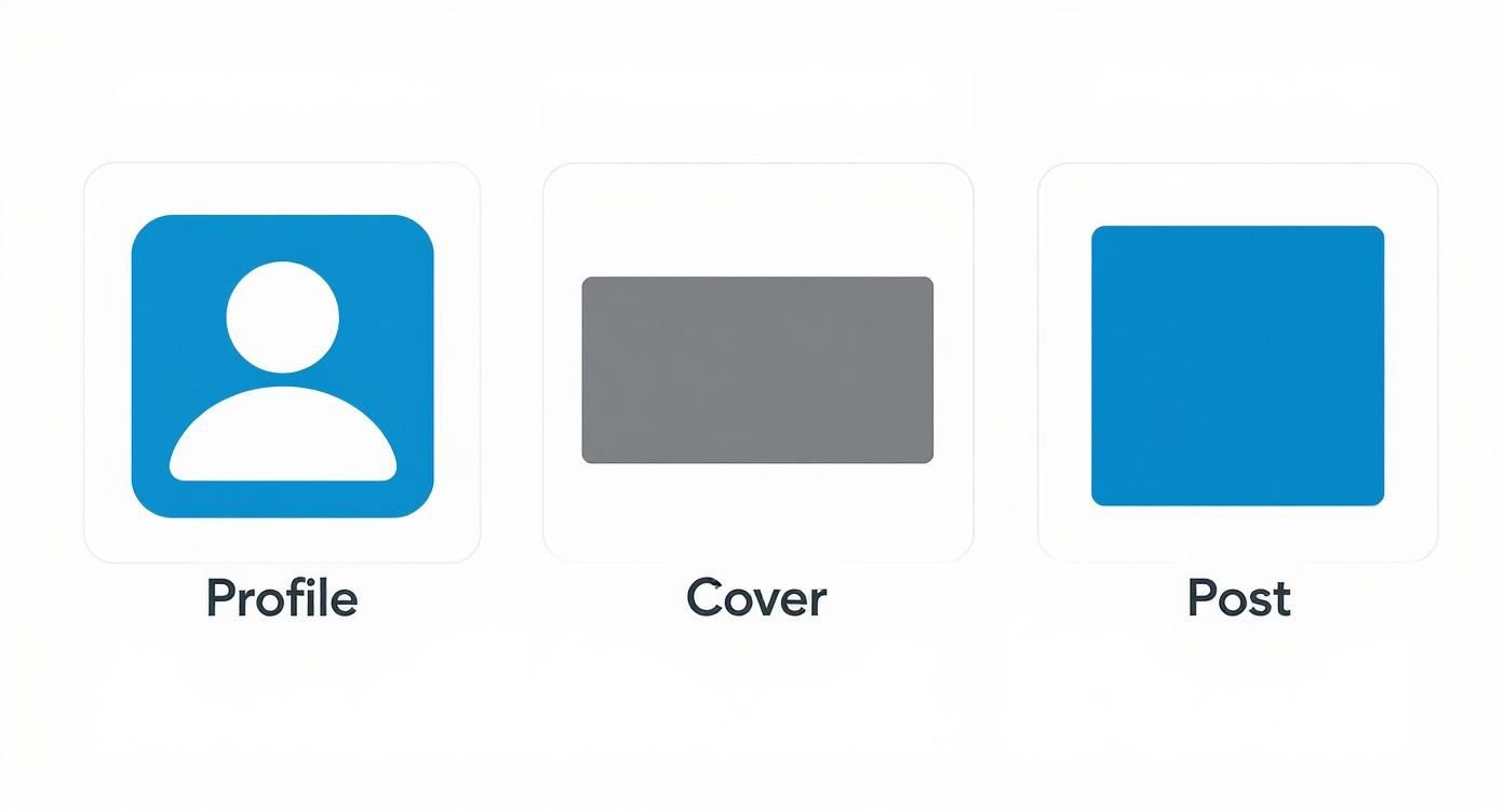
This infographic covers the core visuals of your LinkedIn presence. Each one needs its own specific dimensions to look sharp and professional. Sticking to these sizes guarantees your profile looks crisp and displays correctly, no matter what device someone is using.
Official LinkedIn Image Dimensions
To make things even easier, I’ve put together a quick-lookup table with the most common image dimensions you’ll need for posts and profile elements. Following these guidelines ensures your content looks exactly how you intended, whether it’s viewed on a massive desktop monitor or a tiny phone screen.
| Image Type | Recommended Dimensions (Pixels) | Aspect Ratio | File Type |
|---|---|---|---|
| Personal Profile Picture | 400 x 400 | 1:1 | JPG, PNG |
| Personal Cover Photo | 1584 x 396 | 4:1 | JPG, PNG |
| Company Logo | 400 x 400 | 1:1 | JPG, PNG |
| Company Cover Photo | 1128 x 191 | 5.9:1 | JPG, PNG |
| Shared Image (Square) | 1080 x 1080 | 1:1 | JPG, PNG |
| Shared Link Image | 1200 x 627 | 1.91:1 | JPG, PNG |
Keep this table handy, and you’ll never have to second-guess your image sizes again. It’s all about making a strong, professional first impression, every single time.
Why Getting Your Image Sizes Right on LinkedIn Actually Matters
Let’s be honest, getting your LinkedIn post image sizes correct feels like a tiny detail, but it’s one of those small things that makes a huge difference. Think of it as a strategic move that directly impacts your professional brand and how well your content performs.
When you upload an image with the wrong dimensions, LinkedIn has to crop it automatically. We’ve all seen it happen—the awkward crop that cuts off a key piece of information, slices through a logo, or even chops off someone’s head. It instantly makes your content look unprofessional and like you rushed it.
Getting the sizes spot on ensures your visuals look sharp and render perfectly, no matter if someone is viewing on a desktop or scrolling on their phone. Since so many people use LinkedIn on mobile, a properly optimised image keeps everything clear and impactful. This simple attention to detail goes a long way in building your credibility in a very busy feed.
Boosting Engagement and Visibility
Beyond just looking good, well-formatted images are a magnet for engagement. People are far more likely to stop scrolling, read, and interact with posts that have crisp, optimised visuals.
It’s also something the LinkedIn algorithm pays attention to. Content that provides a good user experience—which includes properly formatted images—tends to get a little extra push, leading to better organic reach for your posts.
To really get the most out of your efforts, it’s worth understanding all the little factors that can affect your posts. For a closer look at this, we have a detailed guide on how you can improve your LinkedIn post visibility.
A polished visual presentation is your digital handshake. Ensuring your images are perfectly sized is the first step in making a strong, positive impression that encourages likes, comments, and shares.
Ultimately, sticking to the recommended LinkedIn post image sizes is a simple but powerful way to level up your content strategy. It prevents those awkward technical glitches, makes your professional image shine, and gives your posts the best possible chance to perform well.
Getting Your Personal and Company Profile Images Right
Think of your LinkedIn profile as your digital handshake. A sharp, professional visual presentation is your best bet for making a solid first impression. Sizing your profile and cover photos correctly is non-negotiable—it prevents weird cropping and tells everyone, from recruiters to potential clients, that you mean business.
For a personal profile, the specs are straightforward but critical. Your profile picture needs to be at least 400 x 400 pixels, keeping that perfect 1:1 square ratio. The background banner, that big piece of real estate at the top, has a much more specific requirement: 1584 x 396 pixels.
Company Page Image Requirements
Company pages play by slightly different rules. Your company logo should also be 400 x 400 pixels, just like a personal profile pic. The cover image, however, is a different beast entirely. It’s wider and much shorter, designed to fit the unique layout, so you’ll need to size it to 1128 x 191 pixels. Nailing these exact measurements ensures your brand looks crisp and intentional, no matter the device.
Getting these dimensions right isn’t just about looking good; it has a real impact. A recent analysis by the German Online Marketing Association found that profiles with correctly sized images got 45% more views and a 32% bump in connection requests. That same study pointed out that 89% of German recruiters are more likely to engage with candidates who have well-formatted profile visuals. You can dig into the specifics of these findings on professional profile optimization yourself.
A well-designed cover photo does more than just fill an empty space. It tells a story about your brand, your mission, or your professional journey in a single glance. Keep it clean, and remember to place any important info towards the centre so your profile picture doesn’t cover it up.
Coming up with a great banner can feel like a challenge, but it’s a huge opportunity to show off your brand’s personality. If you’re stuck for ideas, we put together a guide with some of the 10 best LinkedIn banner ideas to get your creativity flowing. At the end of the day, giving your profile visuals the same attention you give your CV is a simple, powerful way to stand out from the crowd.
Mastering Dimensions for Single Image Posts
Single image posts are the bread and butter of LinkedIn. They’re a clean, direct way to get someone’s attention, whether you’re sharing a big announcement, a key piece of data, or a graphic for an upcoming event.
Getting the dimensions right is crucial for making sure your message lands clearly and professionally. The orientation you pick—landscape, square, or portrait—really depends on what you’re trying to achieve and how your audience is scrolling through their feed.
When you’re sharing a link or aiming for a classic landscape look, LinkedIn’s official guidance points to 1200 x 627 pixels. This 1.91:1 aspect ratio is built for the desktop experience, ensuring your link previews look sharp and don’t get awkwardly cropped.
But let’s be honest, the game has changed. Most people are scrolling on their phones now, which is where the square post becomes your best friend.
Embracing the Square Format for Mobile Feeds
A square image, sized at 1080 x 1080 pixels (a perfect 1:1 ratio), is hands-down the most powerful format for single image posts today. Why? Because it takes up more vertical space on a mobile screen, making it much harder to just scroll past. That extra visibility often leads directly to more engagement.
So, choosing the right format isn’t just a design choice; it’s a strategic one.
- Landscape (1200 x 627 px): Stick with this for link previews and wide photos where the whole horizontal view is part of the story.
- Square (1080 x 1080 px): This is your go-to for mobile audiences. It’s ideal for infographics, graphics with text, and any announcement where you want to dominate the feed.
Following these specs isn’t just about looking good; it’s about performance. Research from several German digital marketing agencies showed that posts using the recommended 1200 x 627 pixels for landscape images hit an average engagement rate of 3.8%. That’s a huge jump from the 2.1% rate seen on posts with non-standard sizes. If you want to dive deeper into the numbers, you can check out more data on how image sizes impact engagement rates.
Pro Tip: No matter the dimension, always design with your most important message or visual element smack in the centre. Think of it as a “safe zone.” This little trick helps prevent key details from being cut off or hidden by app buttons on different devices, making sure your post always looks its best.
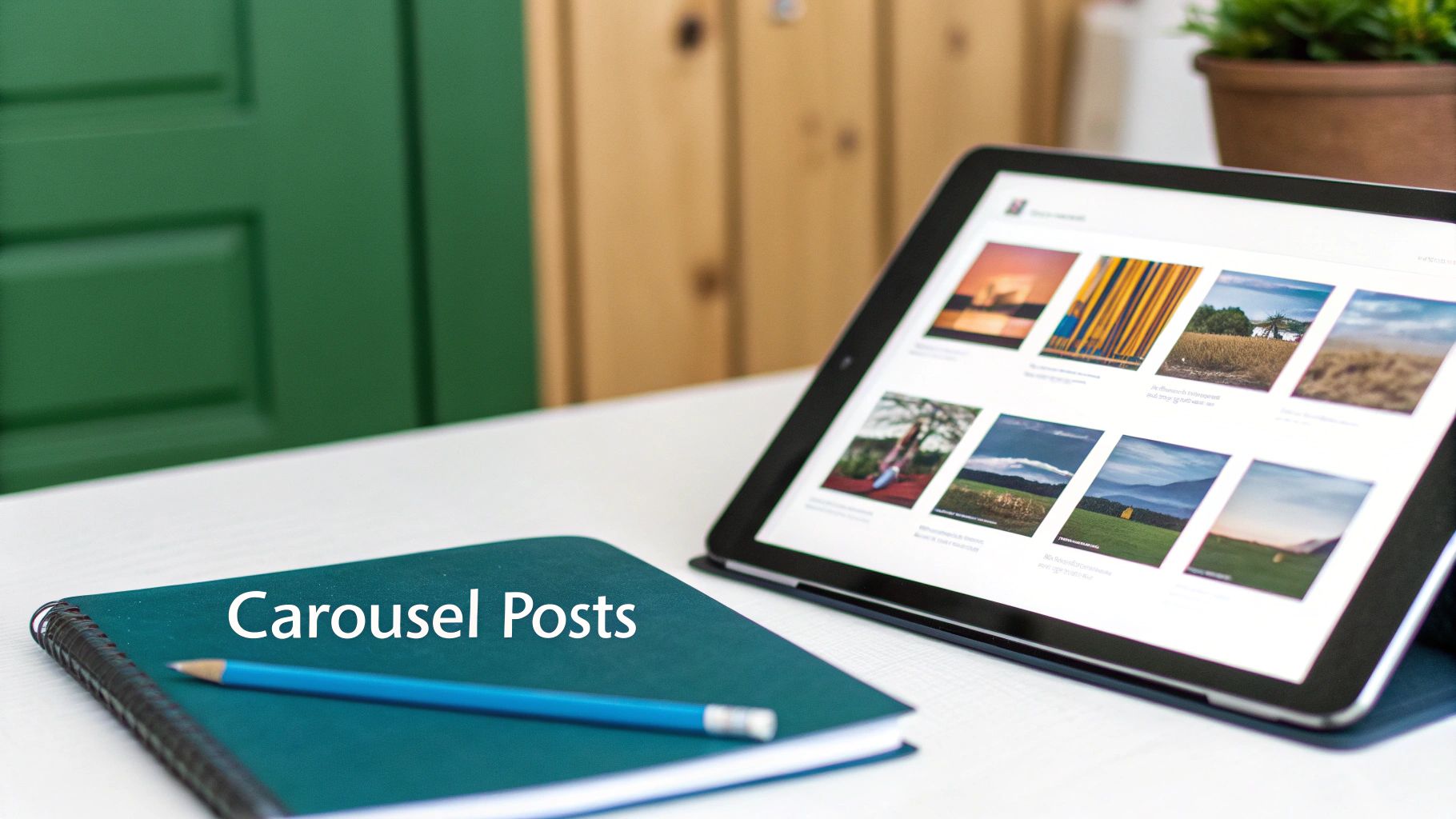
Creating High-Impact Carousel Posts
Carousel posts are a fantastic way to tell a visual story on LinkedIn. Think of them as perfect for tutorials, in-depth announcements, or walking someone through a compelling case study. They practically invite your audience to swipe through multiple slides, letting you build a much richer narrative than a single image ever could.
To make sure your carousels look seamless and professional, getting the sizing right is non-negotiable.
The most reliable and effective dimension for carousel slides is a 1:1 aspect ratio. I always recommend sticking to 1080 x 1080 pixels. This square format is perfectly optimised for mobile, where it takes up a ton of screen real estate and just begs to be swiped. You can also use a vertical 9:16 ratio (1080 x 1920 pixels), which mirrors the popular story format, but the square is your safest bet for a consistently great look on any device.
Best Practices for Carousel Design
When you’re putting together a carousel, treat it like a connected presentation, not just a collection of images. Each slide should flow logically into the next, using visual cues to guide your reader along.
A simple trick is to use arrows or design elements that stretch across the “seam” between two slides. This creates a natural curiosity and gives people a compelling reason to swipe left and see the full picture.
This extra effort really pays off. A study by the German Digital Marketing Institute found that carousel posts using the recommended 1080 x 1080 pixels per slide pulled in 28% more clicks and a 19% higher average time spent compared to single-image posts. The same research showed that carousels with consistent dimensions were shared 35% more often than those with mismatched sizes. You can find more insights on how image sizes impact engagement on dreikon.de.
The key to a winning carousel is creating a smooth, polished experience. When every slide is the exact same size, the transition feels professional and keeps your audience locked into your story from start to finish.
Getting the technical side of carousels down is your first step. For a deeper dive into the strategy behind them, check out our guide on creating a high-performing LinkedIn carousel post. It’ll help you structure your story effectively across multiple slides.
Essential Tools and Tips for Perfect Sizing
Getting your visuals perfectly sized for LinkedIn doesn’t mean you need a design degree. Plenty of user-friendly tools have pre-sized templates that take all the guesswork out of it, making sure your images meet the platform’s exact specs every single time.
Tools like Canva and Adobe Express are fantastic places to start. They come loaded with templates made specifically for LinkedIn posts, banners, and carousels. This lets you focus on your message, not on counting pixels. For anyone needing more control, picking the best photo editing software for your workflow is a game-changer.
Quick Resizing and Key Considerations
Even when you’re using templates, a few simple tips will really make your visuals pop. Nailing these basics ensures your images are not just the right size, but also optimised to load quickly and look great.
Here’s a quick rundown for resizing an image:
- Pick Your Tool: Fire up your go-to design app, like Canva.
- Grab a Template: Search for a “LinkedIn Post” template (the 1080 x 1080 pixel one is a safe bet).
- Upload and Adjust: Pop your image into the template. Nudge it around so the most important part is in the safe zone—that’s the central area that won’t get awkwardly cropped on different devices.
- Export the Right Way: Save your masterpiece as a JPG if it’s a photo, or a PNG if it’s a graphic with text or logos. And always try to keep the file size under 5MB so it loads in a snap.
Just remember, the whole point is to give people a professional, smooth experience. An image that loads fast and looks perfect on any screen is way more likely to grab someone’s attention and get them to engage.
And if you want to automate even more of your creative work, it’s worth checking out what the best AI LinkedIn photo generators can do to cook up some unique visuals for you.
Frequently Asked Questions About LinkedIn Images
Figuring out the nitty-gritty of LinkedIn image sizes can bring up a few common questions. Let’s clear those up so your visuals always hit the mark and you never have to worry about technical glitches messing with your professional look.
So, what happens if you upload an image with the wrong dimensions? It’s probably the number one question I get. If your image doesn’t fit LinkedIn’s recommendations, the platform will try to automatically crop or resize it for you. More often than not, this ends badly – you get awkward framing that cuts off key parts of your image, or it looks blurry and unprofessional.
Optimising for a Mobile-First World
Another common sticking point is whether to design for mobile or desktop. It’s a bit of a trick question because the same image file gets used for both, but how it displays is totally different. Think about it: a square 1:1 ratio image completely dominates the screen on a mobile feed, while a wide landscape photo can feel a bit small.
Since most people are scrolling on their phones these days, it’s just smart to prioritise the mobile experience. This is exactly why formats like 1080 x 1080 pixels for single image posts or carousels work so well—they grab attention and drive much better engagement.
When it comes to file formats, the choice between JPG and PNG is pretty straightforward:
- JPG is your go-to for photographs. It gives you a great balance between quality and a manageable file size.
- PNG is king for any graphics with text, logos, or sharp lines. It preserves quality better and even supports transparent backgrounds.
LinkedIn plays nicely with both, but a good rule of thumb is to keep your file size under 5MB. This ensures your images load quickly for everyone.
Finally, don’t forget about long-form content. The banner image for a LinkedIn Article or Newsletter has its own set of rules: 1920 x 1080 pixels (a classic 16:9 aspect ratio). Using this large, wide format makes sure your header looks crisp and professional, instantly capturing your reader’s attention.
Ready to create standout LinkedIn content without all the guesswork? Postline.ai is your AI-powered assistant for writing, improving, and scheduling posts that actually get noticed. Turn your ideas into polished, engaging content in minutes. Discover how Postline.ai can elevate your LinkedIn strategy.

Run every client pipeline in one place
Give each LinkedIn profile its own voice, calendar, approval flow, and analytics. Start in minutes.
Start free trial