All posts
linkedin image size for posts: Guide to post formats
Discover the linkedin image size for posts, including single images, carousels, and link previews, to optimize appearance and boost engagement.
If you're looking for the ideal **LinkedIn image size for posts**, a good rule of thumb is **1200 x 627 pixels**. This works perfectly for standard landscape images and the previews that show up when you share a link.
For square posts, you'll want to use a 1:1 ratio, and **1200 x 1200 pixels** is the sweet spot. Sticking to these dimensions makes sure your content looks sharp and professional, whether someone is scrolling on their desktop or their phone.
### Quick Reference Guide to LinkedIn Post Image Sizes
Need the right dimensions, fast? This guide is your quick lookup for the most common image formats on LinkedIn. Using the correct sizes is more than just a technical detail—it prevents awkward cropping and ensures your visuals look their best, which is critical for making a strong impression.
Here’s a simple visual guide that breaks down the optimal sizes for landscape, square, and link preview images. These are the formats you'll probably use most often in your professional feed.
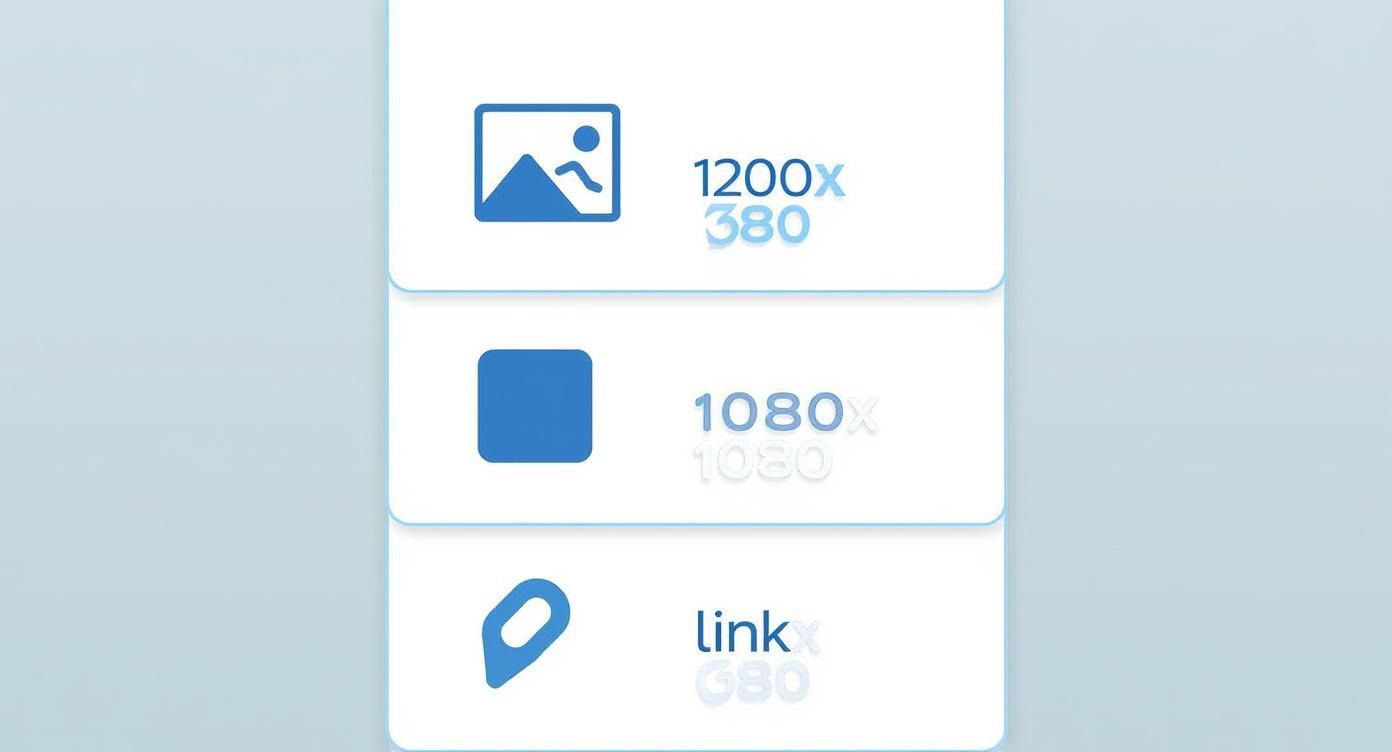
As you can see, while landscape (**1200 x 627 pixels**) is the standard, square images (**1200 x 1200 pixels**) really grab attention by taking up more screen space in the feed, especially on mobile.
### LinkedIn Post Image Dimensions at a Glance
For those who just want the numbers, here's a quick summary table with all the essential specs for different LinkedIn post types.
| Post Type | Recommended Dimensions (Pixels) | Aspect Ratio | Max File Size |
| :--- | :--- | :--- | :--- |
| **Landscape Image** | 1200 x 627 | 1.91:1 | 5 MB |
| **Square Image** | 1200 x 1200 | 1:1 | 5 MB |
| **Portrait Image** | 627 x 1200 | 1:1.91 | 5 MB |
| **Carousel Card** | 1080 x 1080 | 1:1 | 10 MB |
| **Link Preview** | 1200 x 627 | 1.91:1 | 5 MB |
Keep this table handy to ensure every image you upload is perfectly optimised to look its best and support your professional content.
## Why Getting LinkedIn Image Dimensions Right Matters
Let's be honest: getting your LinkedIn image sizes right feels like a technical chore, but it's absolutely fundamental to your professional brand. A perfectly sized image stops the platform from awkwardly cropping, pixelating, or distorting your visuals, which can seriously chip away at your credibility. In a crowded professional feed, first impressions are everything.
Following LinkedIn's guidelines ensures your content looks sharp and polished on any device, whether it's a wide desktop monitor or a vertical mobile screen. When your visuals look good, it sends an immediate signal of professionalism and authority. It’s what makes people stop scrolling and actually pay attention to what you have to say.
### Building Credibility with Every Post
High-quality visuals directly shape how people perceive your personal brand or your company. Think about it: in Germany, where LinkedIn has roughly **21 million members**, professionals have high expectations for the content they see. That's nearly **30%** of the adult population, a massive market where polished visuals are non-negotiable. You can find more stats on LinkedIn's German user base over at datareportal.com.
> Your LinkedIn visuals are a direct reflection of your professional standards. An improperly sized image can suggest a lack of attention to detail, whereas a perfectly optimised one reinforces your expertise and commitment to quality.
Getting the dimensions right is just one piece of the puzzle. Deeper principles, like [mastering color management](https://www.sonidesign.co.nz/blogs/news/color-management-in-printing), also ensure your brand's colours display accurately across different screens. When you combine this visual focus with a solid content strategy, your impact can grow significantly. For a closer look at the bigger picture, check out our guide on essential **[LinkedIn post best practices](https://postline.ai/blog/2/linkedin-post-best-practices)**.
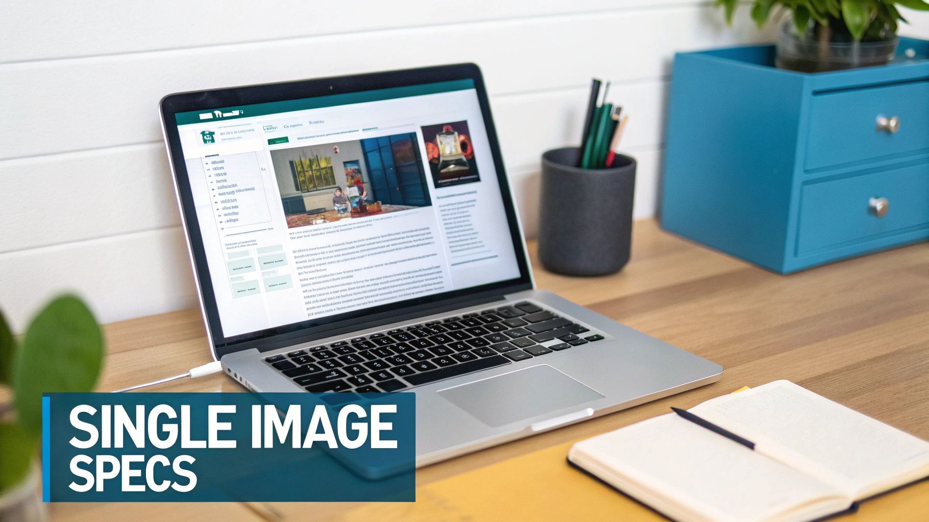
## Specifications for Single Image Posts
The single image post is probably the format you'll see and use most often on LinkedIn. Getting the specs right for this one is the foundation for creating professional-looking content every time.
While LinkedIn gives you some wiggle room, you really need to get to grips with the three main orientations: landscape, square, and portrait. Knowing how each one works lets you pick the best **linkedin image size for posts** depending on what you're trying to achieve with your content.
Each orientation has its own strengths. Landscape is a classic for wide shots and event photos. Square images strike a great balance for both desktop and mobile feeds. But portrait images? They're your secret weapon for grabbing attention on mobile, where they take up a ton of vertical screen space.
### Landscape Images (1.91:1 Ratio)
The good old landscape format is LinkedIn’s standard recommendation, and it's especially reliable for shared links. If you stick to **1200 x 627 pixels**, your image will show up perfectly without any weird cropping, whether someone's viewing it on their desktop or mobile.
* **Best For**: Group photos, event coverage, scenic shots, and any visual that just looks better with a wider view.
* **Example**: Think of sharing a team photo from a recent conference or a wide-angle shot of your new office space.
### Square Images (1:1 Ratio)
Square images have really taken off, and for good reason. They give you a much bigger visual footprint in the feed compared to landscape, which is a huge plus on mobile. The go-to dimension here is **1200 x 1200 pixels**.
This balanced format feels fresh and modern. It’s perfect for things like infographics, quotes, or product shots where you want to pull the viewer's eye right to the centre of the action.
> The real beauty of the square format is its versatility. It just works, performing reliably across every device. That means a consistent, professional look for your brand without you having to stress about how it’s going to get cropped.
### Portrait Images (Vertical Orientation)
If you're all-in on a mobile-first strategy, portrait images are a fantastic choice. LinkedIn might trim them a little in the main feed, but their tall, vertical nature completely dominates the screen once a user stops scrolling to take a look. A solid size to work with is **627 x 1200 pixels**, but other vertical ratios generally work too.
Use this format when your subject is naturally tall, like a person standing up, or when you're creating a bold graphic designed to make people pause their scroll.
## Optimizing Images for LinkedIn Carousel Posts
LinkedIn carousels are an absolute powerhouse for storytelling. They're perfect for showcasing multiple products, walking through a case study, or breaking down a complex topic into easy-to-digest slides. That interactive, swipe-through nature can really get your engagement climbing, but only if you nail the visual specs from the get-go.
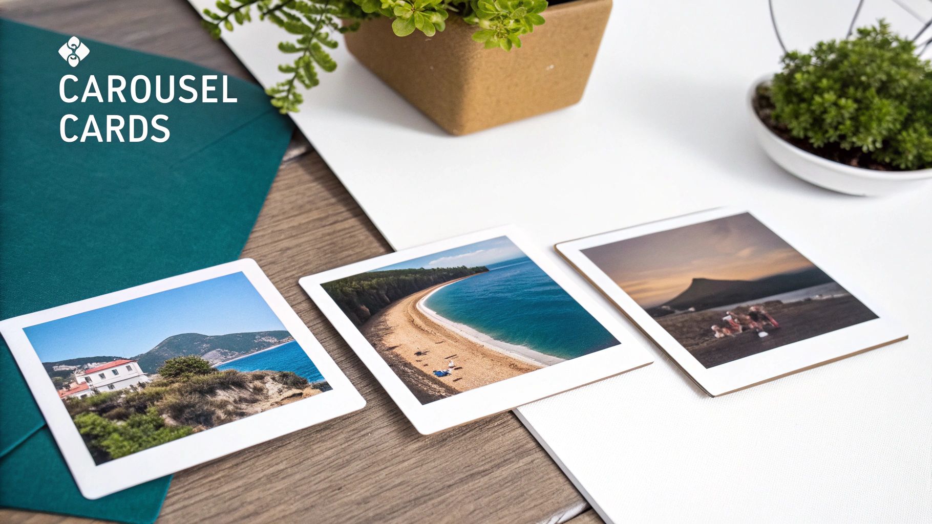
Unlike a simple single-image post, carousels play by their own set of rules. For the best display and a consistent look across all your slides, the square aspect ratio is your best friend. This ensures every slide looks uniform and professional as people swipe through your content.
### Recommended Carousel Card Dimensions
To pull off that seamless, polished carousel look, you really need to stick to a **1:1 aspect ratio** for every single card. Sure, you can upload portrait or landscape images, but LinkedIn will just slap white padding on the sides to force them into a square frame, which frankly looks a bit amateur.
* **Ideal Dimensions:** **1080 x 1080 pixels** is the gold standard. It’s what most experts use and recommend.
* **Alternative High-Resolution:** For extra crispness, **1200 x 1200 pixels** also works beautifully.
* **File Type:** Stick to **JPG**, **PNG**, or a non-animated **GIF**.
* **Maximum File Size:** Each individual slide, whether it's an image or video, needs to be under **10 MB**.
Keeping to these square dimensions is the key to maintaining a sharp, professional vibe and making sure none of your hard work gets awkwardly cropped.
### Strategic Tips for Engaging Carousels
Getting the **LinkedIn image size for posts** right is just the start. The real magic is in how you design the carousel itself. You could create a stunning panoramic effect, where a single, continuous image flows across multiple slides for a massive visual punch. Or, you could build a compelling narrative, with each new slide revealing the next piece of the puzzle.
> Carousels are an invitation to interact. Think of each card as a chapter in a short story. Your first slide needs a killer hook, and your last one should have a clear call-to-action to tell your audience what to do next.
If you're ready to go deeper, we've put together a complete guide that covers everything you need to create a knockout **[LinkedIn carousel post](https://postline.ai/blog/2/linkedin-carousel-post)** that stops the scroll and gets results.
## Getting Link Preview Image Sizes Right
Whenever you share an external link on LinkedIn, the platform automatically cooks up a clickable preview card. The image in that card is your one and only visual hook to get people to click, which makes it one of the most critical parts of your post.
Getting this image right is a big deal. An awkwardly sized or irrelevant thumbnail can make your entire post look unprofessional and tank your click-through rate. When you take control of this visual, you make sure your content shows up exactly how you want it to.
For 2025, the sweet spot for your LinkedIn link preview image is **1200 x 627 pixels**. This gives you an aspect ratio of roughly **1.91:1**. Sticking to these dimensions makes sure your image looks sharp and displays correctly on both desktop and mobile, which is non-negotiable for a platform full of professionals who expect polished visuals.
### How to Control Your Link Preview Image
Here’s the thing: you can't just upload a preview image directly on LinkedIn. Instead, LinkedIn grabs the image from your webpage's **Open Graph (OG) tags**. Think of these as little snippets of code in your website's HTML that tell social media platforms what image, title, and description to feature when someone shares your link.
To get this set up, you need to make sure your website’s `` section has an `og:image` tag pointing to your perfectly sized **1200 x 627 pixel** image. This simple step gives you complete control over the visual that pops up. For a full walkthrough, you might want to check out our guide on the **[LinkedIn link preview card](https://postline.ai/blog/linkedin-link-preview-card)**.
> Ever update an image on your site, but LinkedIn stubbornly shows the old one? That’s almost always a caching issue. LinkedIn saves link data to load things faster, so it doesn't always notice your changes right away.
### Troubleshooting Common Preview Issues
Sometimes LinkedIn might pull the wrong image or show a badly cropped version. If you’ve double-checked your OG tags and you're still seeing an old preview, it's time to clear LinkedIn's cache.
You can do this with **LinkedIn's Post Inspector tool**. Just paste your URL into the inspector, and it will force LinkedIn to fetch the latest information from your webpage. This refreshes its cache and gives you an exact preview of how your link will appear. It’s an essential final check before you hit share.
## Image Guidelines for Your Profile and Company Page
While nailing the perfect **LinkedIn image size for posts** is a big piece of the puzzle, don't forget the fundamentals: your profile and Company Page visuals. These are the very first things people see when they land on your page, so getting them right is non-negotiable for a polished, professional look.
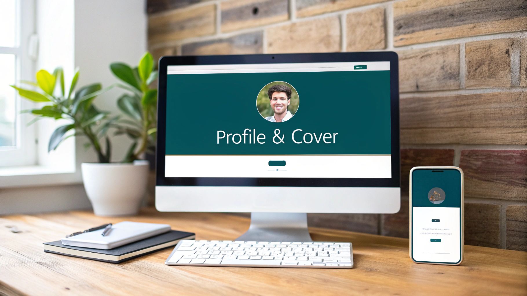
Think of your profile picture and cover photo as a team. Together, they tell your professional story in a single glance. If you ignore their dimensions, you risk blurry images or awkward cropping, which can chip away at your credibility before anyone even reads a word you've written.
### Profile Picture Specifications
Your profile picture is your digital handshake on LinkedIn. It shows up everywhere—from search results to your comments on other people's posts—so it has to be crisp and easily recognisable.
* **Recommended Dimensions:** **400 x 400 pixels** is the sweet spot.
* **Key Consideration:** Remember, LinkedIn will crop your image into a circle. Make sure your face is centred and that the circular frame won’t chop off anything important.
### Company Page and Profile Banners
That banner, or cover photo, is prime real estate for your brand. It’s your opportunity to show off your company's culture, highlight a key value proposition, or communicate your personal professional mission. It's a billboard, so use it wisely.
The profile picture is a standard **400 x 400 pixels** and gets displayed in a circle. The cover photo, however, is a much larger branding canvas and should be **1584 x 396 pixels**. If you need some creative fuel, check out our guide on the **[10 best LinkedIn banner ideas](https://postline.ai/blog/2/10-best-linkedin-banner-ideas)**.
> One thing to always keep in mind: your cover photo looks very different on desktop versus mobile. Always place critical info like logos or text near the centre. This will keep it from getting cut off or hidden on smaller screens.
Once you’ve got the visuals sorted, make sure you're including all the other **[essential elements to include on your LinkedIn profile](https://homerdigitalmarketing.com/what-should-i-include-in-my-linkedin-profile/)**. A great banner is just the start of creating a complete and compelling professional snapshot.
## Common LinkedIn Image Mistakes to Avoid
Knowing the correct **LinkedIn image size for posts** is a great first step, but it's not the whole story. I've seen plenty of posts that technically have the right dimensions but still fall flat because of a few common, easily avoidable mistakes. Getting these details right is what separates a polished, professional post from one that looks amateurish.
One of the biggest culprits is simply uploading low-resolution images. A grainy or pixelated graphic screams a lack of attention to detail. Always, and I mean *always*, start with a high-quality source file. LinkedIn will compress your image no matter what, so giving it a sharp, clean image to begin with is your best defence against a blurry final product.
Another classic slip-up is completely forgetting about mobile. We design on big, beautiful desktop screens, but the vast majority of people will see your post on a phone. What looks perfect on your monitor can become a jumbled, illegible mess on a smaller, vertical screen. Key text or your company logo might get cropped out, rendering your entire visual useless.
### Ignoring Safe Zones and File Size
Forgetting about "safe zones" is another mistake that can trip you up. Think of it as a buffer zone. You need to keep all the important stuff—text, faces, logos—away from the absolute edges of your image. This is because LinkedIn will crop and adjust your visual to fit different feeds and devices, and you don't want your key message getting awkwardly sliced off.
> A beautifully designed graphic is useless if it fails to load. Pay close attention to file size limits—typically under **5 MB** for single images. Oversized files lead to slow load times or upload failures, frustrating both you and your audience.
Finally, and this might be the most common mistake I see, is creating a design that's just too busy. Slapping on too much text, using competing colours, or having a chaotic layout will just overwhelm people scrolling through their feed. Your goal is to stop the scroll, not cause a headache. Keep your message clear and your design clean to actually capture attention.
## Got Questions About LinkedIn Image Sizes? We've Got Answers
Here are some quick-fire answers to the most common questions we get about **LinkedIn image sizes for posts**. Think of this as your go-to cheat sheet for solving those nagging little image issues.
### What Is the Best Image Size for Mobile Viewing?
When it comes to mobile, you've got to think vertical. Portrait-oriented images are the undisputed champions here because they simply take up more screen real estate.
While LinkedIn doesn't enforce one specific size, a **2:3 aspect ratio (think 1080 x 1620 pixels)** is your best bet. This format is designed to fill a smartphone screen, grabbing way more attention as someone scrolls through their feed. Landscape or square images just don't have the same impact on mobile.
### How Can I Fix a Blurry LinkedIn Image?
Ah, the dreaded blurry image. This almost always boils down to one of two culprits: low resolution or bad compression.
To sidestep this, always, and I mean *always*, start with a high-quality source image. A width of at least **1200 pixels** is a good rule of thumb. When you're ready to export, save your final graphic as a high-quality PNG file, not a JPG. PNGs are much better at handling sharp lines and text, which helps keep things crisp even after LinkedIn works its own compression magic on it.
### Can I Use Different Image Sizes in One Carousel?
Technically, you can. But should you? Absolutely not.
For a carousel post to look polished and professional, every single image needs to have the exact same dimensions. The gold standard here is a **1:1 aspect ratio (1080 x 1080 pixels)**. If you mix and match sizes, LinkedIn will slap on some ugly white padding to the non-square images. It completely disrupts the flow and makes your post look amateurish. For carousels, consistency is everything.

Run every client pipeline in one place
Give each LinkedIn profile its own voice, calendar, approval flow, and analytics. Start in minutes.
Start free trial