The Ultimate Guide to LinkedIn Image Dimensions
Master LinkedIn image dimensions with our definitive guide. Get the correct sizes for profiles, posts, banners, and ads to boost your professional presence.
Getting your LinkedIn image dimensions right is the first step to looking professional on the platform. It’s a small detail that makes a huge difference. The key specs to remember are 400 x 400 pixels for your profile photo, 1584 x 396 pixels for a personal background banner, and 1200 x 1200 pixels for a standard square post. Sticking to these numbers ensures your images look sharp and avoids any awkward, unprofessional cropping.
Your Quick Reference for LinkedIn Image Dimensions
To save you from the headache of blurry images and frustrating upload errors, I’ve put together a quick-reference guide. It covers the most up-to-date specifications for every single image type you’ll encounter on LinkedIn. Bookmark this page; it’s your go-to resource for making sure every visual you post is perfectly optimised for clarity and impact. When you follow these guidelines, your profile, posts, and company page will look polished and professional, no matter what device someone is using.
This visual summary is a great starting point, highlighting the three most common image dimensions you’ll need for personal profiles, banners, and posts.
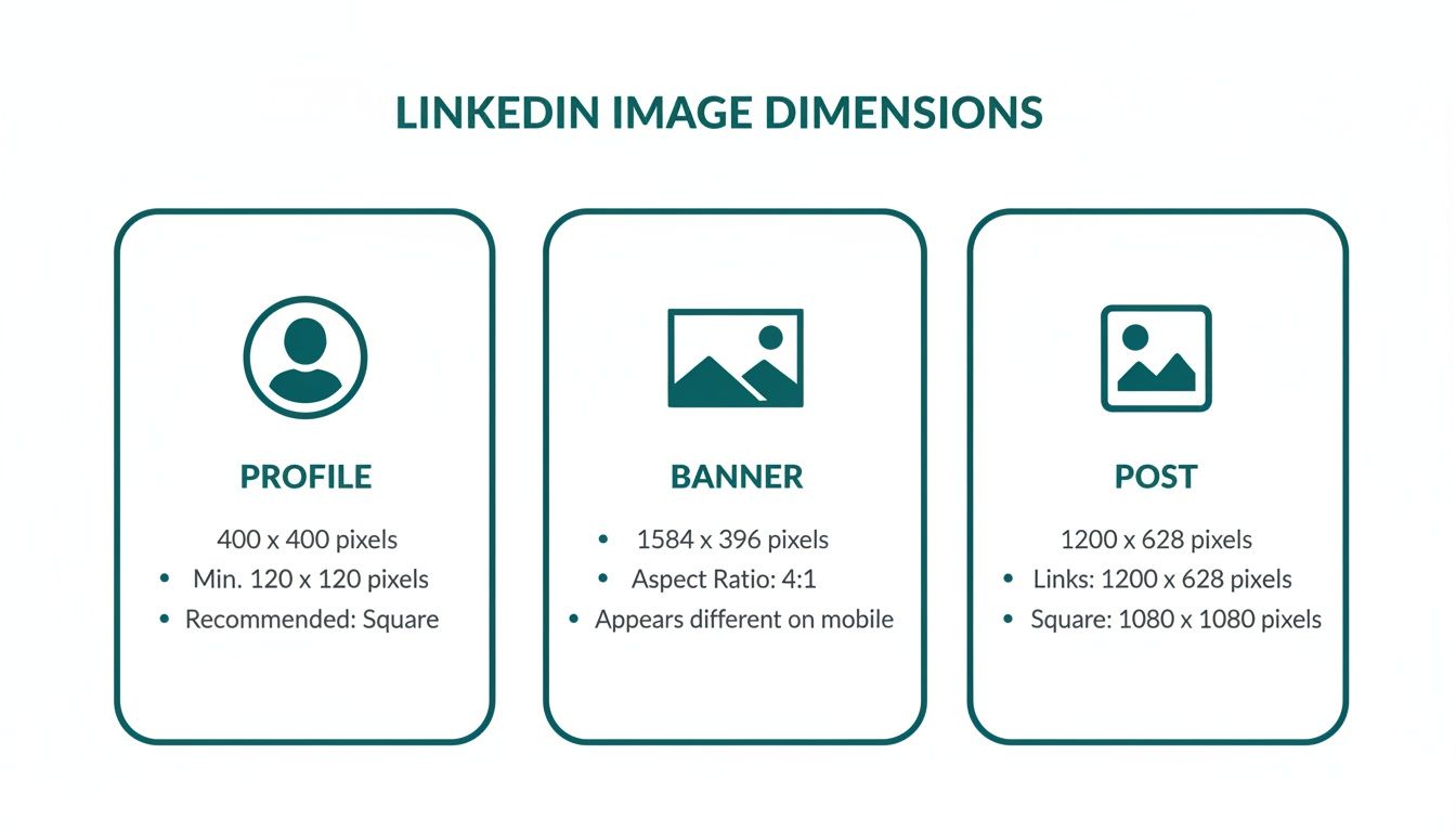
As the graphic shows, you can’t just use a one-size-fits-all approach. Your profile photo is a perfect square, while your banner is a very wide rectangle. If you need a hand getting your visuals to fit LinkedIn’s requirements perfectly, a good an image resizing tool can be a lifesaver.
For a complete breakdown, I’ve created a detailed cheat sheet below. It lists all the recommended pixel dimensions, aspect ratios, file size limits, and supported formats. And if you’re diving deeper into creating engaging feed content, you should check out our dedicated guide on the ideal LinkedIn post images size. Using this chart consistently will help you maintain a polished brand presence and get the most out of every image you share.
LinkedIn Image Dimensions Cheat Sheet
Here’s a comprehensive table that pulls together all the essential specs for every major image type on LinkedIn. Keep this handy to ensure your visuals are always optimised.
| Image Type | Recommended Dimensions (Pixels) | Aspect Ratio | Max File Size | Supported File Types |
|---|---|---|---|---|
| Profile Photo | 400 x 400 | 1:1 | 8 MB | JPG, PNG, GIF |
| Personal Background | 1584 x 396 | 4:1 | 8 MB | JPG, PNG, GIF |
| Company Logo | 300 x 300 | 1:1 | 4 MB | JPG, PNG |
| Company Cover | 1128 x 191 | 5.9:1 | 4 MB | JPG, PNG |
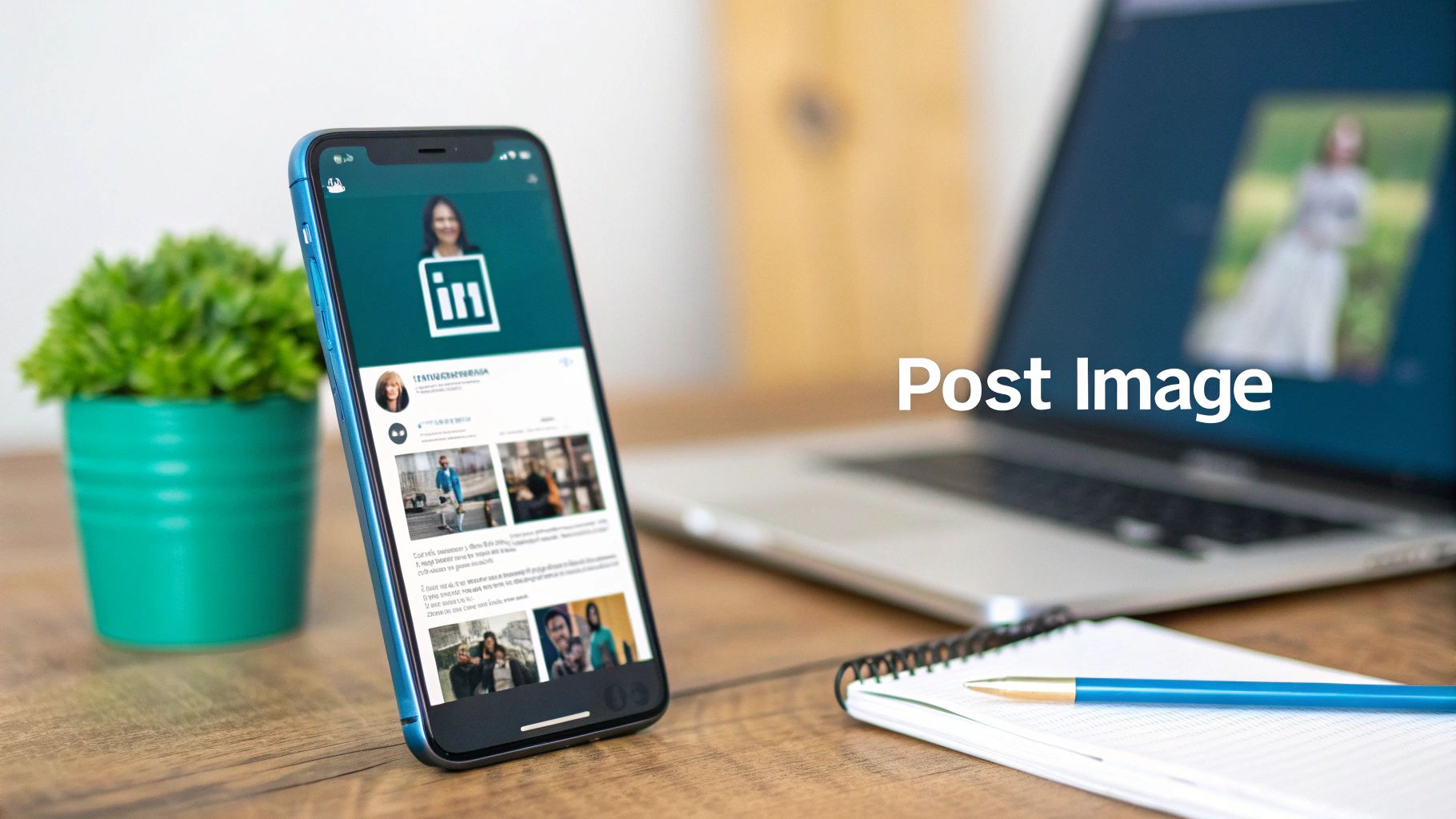
| Post Image (Square) | 1200 x 1200 | 1:1 | 5 MB | JPG, PNG |
| Post Image (Portrait) | 1080 x 1350 | 4:5 | 5 MB | JPG, PNG |
| Link Preview Image | 1200 x 627 | 1.91:1 | 5 MB | JPG, PNG |
| Carousel Card | 1080 x 1080 | 1:1 | 10 MB | JPG, PNG |
| Article Header | 1920 x 1080 | 16:9 | 2 MB | JPG, PNG |
| Video Thumbnail | 1920 x 1080 | 16:9 | 2 MB | JPG, PNG |
Getting these numbers right is a simple way to instantly elevate your presence on LinkedIn. A crisp, well-sized image communicates professionalism and attention to detail before anyone even reads a word of your profile.
Optimising Your Personal Profile Images
Think of your LinkedIn profile as your professional handshake in the digital world. The first thing anyone sees? Your images. Nailing these visuals is absolutely crucial for making a strong, professional first impression. It’s not just about picking a nice photo; it’s about understanding the specific LinkedIn image dimensions for your profile picture and your background banner.
These two images work hand-in-hand to tell your professional story. A crisp, clear profile photo builds immediate trust, while a thoughtfully designed background banner can communicate your unique value proposition in an instant.
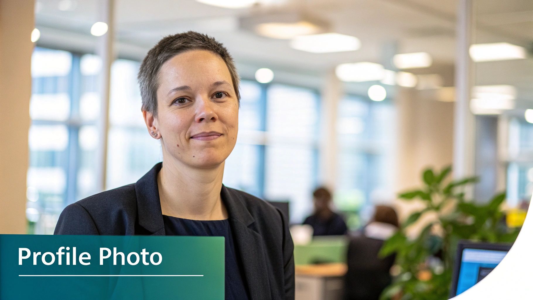
Perfecting Your Profile Picture
Your profile picture is, without a doubt, your most important visual asset on the platform. LinkedIn might say the minimum is 200 x 200 pixels, but from experience, that’s simply not good enough.
To ensure your photo looks sharp and avoids any blurriness, especially on high-resolution screens, you should aim for 400 x 400 pixels. This is a simple but effective way to project professionalism.
Keep in mind that LinkedIn will crop your square photo into a circle. This makes composition critical. You need to centre your face squarely in the frame to prevent any awkward or unprofessional cropping. If you’re struggling to get the perfect shot, our guide on the best AI LinkedIn photo generators can give you some great options.
Designing Your Background Banner
Your background banner (or cover photo) is a fantastic piece of visual real estate. The ideal size here is 1584 x 396 pixels. This wide, panoramic space is your opportunity to showcase your professional brand, highlight a key achievement, or display your company’s mission statement.
Pro Tip: Don’t forget that on a desktop view, your profile picture overlaps the banner on the left-hand side. It’s a common mistake to place important text or logos in that area. Always design with this “safe zone” in mind and double-check how your profile looks on both desktop and mobile to ensure nothing is cut off.
By getting the sizes and composition of these two images right, you create a polished, strategic, and instantly impressive professional identity.
Mastering Your Company Page Image Dimensions
Think of your LinkedIn Company Page as your brand’s digital headquarters. Just like a physical office, its appearance matters. Getting the visual details right—specifically the image dimensions—is crucial for building a professional brand identity that resonates with followers, potential customers, and future employees.
It’s worth noting that company pages use a square logo, unlike the circular profile photos for personal accounts. This square logo is your brand’s calling card; it shows up next to every post and in search results, so it needs to be perfect.
Core Company Page Visuals
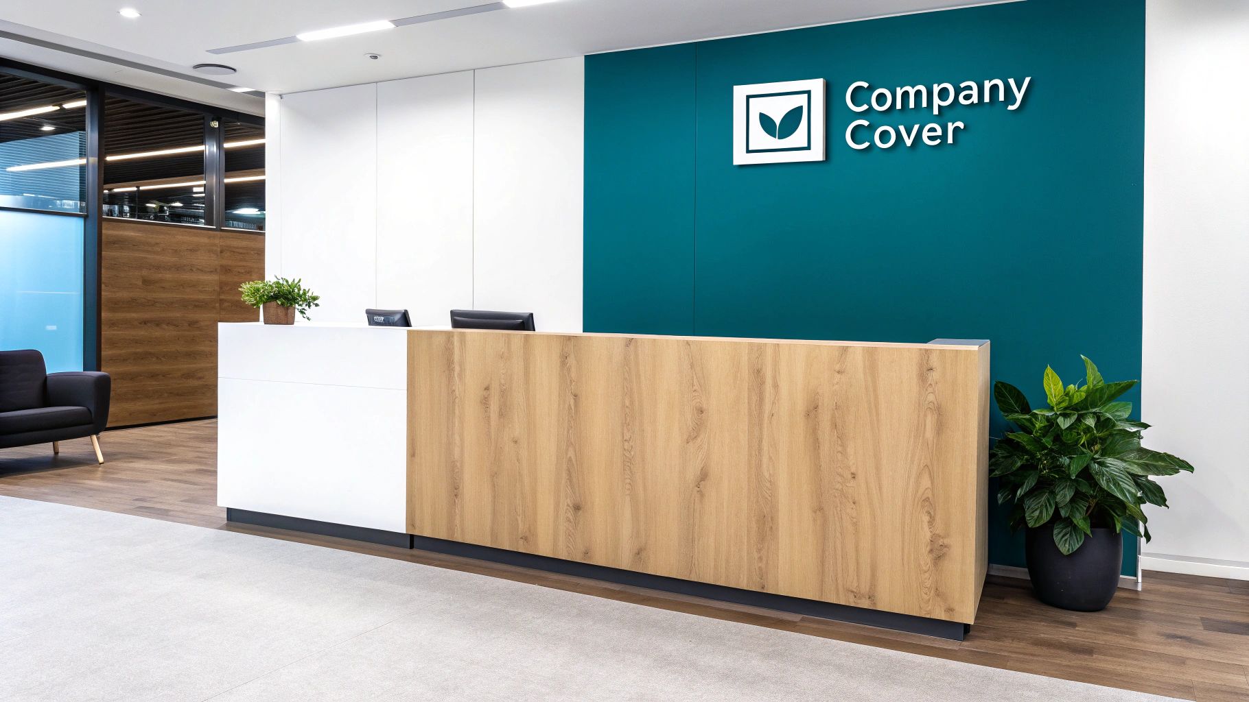
Let’s start with the two most important assets: your company logo and your cover image. These two work in tandem to create that critical first impression. Getting them right sets the tone for your entire page.
- Company Logo: The ideal size here is 300 x 300 pixels. For logos that contain text or have sharp, defined lines, a high-quality PNG file is your best bet to keep everything looking crisp.
- Company Cover Image: This banner needs to be 1128 x 191 pixels. This wide, panoramic space is perfect for showcasing your company’s mission, a new marketing campaign, or a memorable brand slogan.
A quick pro-tip: On desktop, your logo will slightly overlap the cover image on the left-hand side. Be sure to keep any important text or design elements in your banner centred to avoid them being hidden from view.
Enhancing Your Employer Brand with the Life Tab
If you’re using LinkedIn for recruitment and want to show off your company culture, the ‘Life’ tab is an excellent feature. Using properly sized images here helps you attract top talent by offering a genuine glimpse into what it’s like to work at your organisation.
The main image for this section is noticeably larger than the standard cover photo, giving you more canvas to create a compelling visual story.
- Life Tab Main Image: Upload this at 1128 x 376 pixels.
- Life Tab Custom Modules: For these smaller, modular images, use a size of 502 x 282 pixels.
Sticking to these specific LinkedIn image dimensions ensures every part of your Company Page looks polished and presents a cohesive brand story, no matter what device your audience is using.
Crafting Eye-Catching Content for the LinkedIn Feed
Let’s be honest: grabbing someone’s attention in a crowded professional feed is tough. It’s not just about what you write; your visuals need to be on point. Getting your LinkedIn image dimensions right is one of the easiest ways to boost how many people see and interact with your posts, particularly on mobile, where most of us are scrolling anyway.
When you’re posting a single image, you have two main options that work beautifully. The go-to choice has always been the 1:1 square aspect ratio. If you create your image at 1080 x 1080 pixels, you can be confident it will look sharp and professional on both desktop and mobile without any weird cropping. It’s a classic for a reason.
But if you really want to make an impact, especially on mobile, the 4:5 vertical aspect ratio is your best bet. An image sized at 1080 x 1350 pixels literally takes up more screen space as someone scrolls, making them more likely to pause. That bit of extra height gives your content some real presence.
Getting the Most Out of Multi-Image Posts
Single images are great, but sometimes you need more room to tell a story or share information. This is where formats like carousels come in, and getting their dimensions right is crucial for a polished look.
LinkedIn Carousels are fantastic for breaking down complex ideas or showing off a series of products. To make the user experience smooth and seamless, stick to the 1:1 square aspect ratio for every single card in your carousel. A size of 1080 x 1080 pixels for each slide ensures a consistent and professional feel as people swipe through. If you’re looking for help creating visuals that fit perfectly, a tool like Glima’s AI LinkedIn image generator can be a real time-saver.
Taking Control of Your Link Previews
One of the most commonly missed opportunities for branding on LinkedIn is the thumbnail image that shows up when you share a link. A poorly cropped or completely random image can make your post look unprofessional and seriously hurt your click-through rate.
You absolutely need to control this preview image to keep your shared content looking on-brand. The perfect dimension for a link preview thumbnail is 1200 x 627 pixels, which works out to a 1.91:1 aspect ratio.
This isn’t something you fix on LinkedIn itself, but rather on your own website using Open Graph (OG) tags. The og:image tag, in particular, is what tells LinkedIn which picture to grab. If you want to get this sorted once and for all, we have a complete guide on fixing the LinkedIn link preview card that walks you through it. Getting this right means your visual identity stays consistent every single time someone shares a link to your site.
Getting Your Images Right for LinkedIn Articles and Ads
Moving beyond regular posts, you have two other powerful ways to make an impact on LinkedIn: long-form articles and paid advertising. Both come with their own set of rules for visuals, and getting the image dimensions right is crucial. It’s the difference between capturing someone’s attention or being scrolled past.
For anyone publishing in-depth content, like a LinkedIn Article or a newsletter, the hero image is your opening act. It’s the first thing people see in their feed, and a compelling visual can be the single biggest factor in whether they click to read more.
For a LinkedIn Article hero image, the ideal size is 1920 x 1080 pixels. This gives you a perfect 16:9 aspect ratio, ensuring your image looks sharp and professional on every device, from a wide desktop monitor to a small mobile screen.
If you’re diving into long-form content and want to make sure your writing is as strong as your visuals, check out our guide on writing a LinkedIn article. A great article needs both to truly succeed.
Key Dimensions for LinkedIn Ad Creatives
When you’re putting money behind a campaign, there’s no room for error. Using the wrong image size for a LinkedIn ad can get it rejected flat out, or worse, it’ll run poorly and waste your budget. Each ad format is built for a specific purpose and placement, so precision is everything.
Here’s a breakdown of the must-know dimensions for the most common ad types:
- Single Image Ads: This is the workhorse of most campaigns. You’ll want to create these at 1200 x 627 pixels, which works out to a 1.91:1 ratio. It’s a versatile size that looks good in most places on the platform.
- Carousel Ads: These are fantastic for telling a story or showing off different features or products. Each image card in the carousel needs to be a 1080 x 1080 pixel square. Keeping every card the same size is vital for a smooth, uninterrupted swiping experience.
- Vertical Ads (Mobile): To really own the screen on mobile devices, you need to think vertically. Use a 720 x 900 pixel image, which is a 4:5 aspect ratio, to fill up as much of the user’s view as possible.
Stick to these guidelines, and your ad creatives will not only look polished and professional but will also be optimised to perform. This simple step helps you avoid costly rejections and ensures your budget is working as hard as it can.
Getting Your Image Tech Specs Right
Nailing the right dimensions for your LinkedIn images is only half the battle. If your images are slow to load, blurry, or have strange colours, it can instantly make your profile or company page look unprofessional. Getting the technical details right ensures your visuals always look sharp, load quickly, and represent your brand perfectly.
Your first decision is picking the right file format. This is always a trade-off between image quality and file size, and the best choice really depends on what’s in the image itself.
- JPG (or JPEG): This is your go-to for photographs and any complex images with lots of colours and subtle gradients. JPGs use what’s called ‘lossy’ compression, meaning they cleverly discard a tiny bit of data to create much smaller files.
- PNG: Stick with PNGs for any graphics that contain crisp lines, text, or logos. PNGs use ‘lossless’ compression, so they keep every single pixel intact. This is crucial for preventing text from looking fuzzy or logos from gettingartefacted.
Dialling in Your Export Settings
Once you’ve picked your format, you need to fine-tune the export settings. Getting the colour profile and compression level right will save you a lot of headaches with how your images display on LinkedIn.
The entire web pretty much runs on the sRGB colour profile, and LinkedIn is no different. Always make sure you export your images in sRGB. This guarantees that your carefully chosen brand colours look consistent for everyone, no matter what screen they’re using.
A classic mistake is squashing your images too much just to get the file size down. Yes, you have to stay under LinkedIn’s 8 MB limit, but being too aggressive with compression will make your images look blocky and blurred. For a JPG, aim for a quality setting of around 70-80%; it’s usually the sweet spot for reducing file size without a noticeable drop in quality. It’s always better to start with a high-resolution image and compress it carefully, rather than uploading a low-quality file that LinkedIn’s own system will try to compress even more, often with messy results.
LinkedIn Image FAQs
Even with a detailed guide, a few common questions always seem to pop up about LinkedIn images. Let’s tackle them head-on so you can quickly fix any issues and make sure every visual you post is spot on.
Think of this as your go-to troubleshooting list. Running through these points can help you figure out why an image looks off and fix the actual problem, not just the symptom.
Why Do My Images Look Blurry on LinkedIn?
Blurry or pixelated images are almost always down to one of two culprits: you’ve either uploaded a file that’s too small, or you’ve over-compressed it beforehand. LinkedIn compresses every image to keep the platform running smoothly, which is standard practice for any social network.
The problem is, if your original image is already low-resolution, LinkedIn’s compression just makes it worse, leading to that fuzzy, unprofessional look.
The fix is simple: always start with a high-quality, high-resolution file. Aim for the recommended dimensions (like 400 x 400 pixels for a profile photo), not the absolute minimum. This gives LinkedIn’s algorithms more data to work with, resulting in a much crisper image after it’s been processed.
What Is an Aspect Ratio and Why Does It Matter?
An aspect ratio is simply the relationship between an image’s width and its height. For example, a 1:1 aspect ratio is a perfect square, while a 16:9 ratio is the familiar widescreen rectangle you see in video thumbnails.
This matters a great deal because LinkedIn’s layout is designed to fit specific shapes in specific places. If you upload an image with the wrong aspect ratio, LinkedIn will automatically crop it to fit the designated space. This often leads to important details, like logos or text, getting awkwardly chopped off.
Can I Use a Rectangular Image for My Profile Picture?
Technically, yes, but you really shouldn’t. While the uploader will accept a rectangular image, it will immediately force you to crop it into a square. After that, LinkedIn applies a circular mask to display it on your profile.
To keep full control and avoid a weird crop that cuts off part of your head, the best practice is to prepare your image as a 400 x 400 pixel square before you upload it. This guarantees you’re perfectly centred inside that final circular frame.
How Do I Control the Image When I Share a Link?
That preview image that shows up when you share a link? It’s not actually controlled by LinkedIn. It’s pulled from your website’s code using Open Graph (OG) tags, which are little snippets of HTML on your site.
The specific tag, og:image, tells social platforms like LinkedIn exactly which image to use as the preview. To get a professional, branded preview every single time, you need to set this tag on each page of your website, making sure it points to an image sized at 1200 x 627 pixels.
Ready to create perfectly crafted LinkedIn posts that capture attention and drive engagement? Postline.ai uses AI to help you write, schedule, and optimise your content in minutes, complete with formatting, hashtags, and real-time research. Stop guessing and start growing on LinkedIn today.
Run every client pipeline in one place
Give each LinkedIn profile its own voice, calendar, approval flow, and analytics. Start in minutes.
Start free trial