How to Export Data from LinkedIn Analytics to Excel [2025]
Discover the linked in post image size you need for every format, with clear dimensions, ratios, and best practices for profiles, posts, and ads.
When it comes to the best linked in post image size, a 1.91:1 aspect ratio is your safest bet. Think 1200 x 627 pixels for those shared links and landscape shots. If you’re targeting the mobile feed, and you should be, a square post at 1080 x 1080 pixels is pure gold.
Your LinkedIn Image Size Cheat Sheet
Getting your LinkedIn image dimensions right is the first, and arguably most important, step towards carving out a professional and engaging presence. We’ve all seen it: visuals that are pixelated, awkwardly cropped, or just plain wrong. It instantly undermines your message and makes your content look amateurish.
This guide is your quick reference for the most current, officially recommended sizes for every format that matters. Stick to these, and your visuals will always look sharp and polished.
Let's start with a simple visualisation of the key image types you'll be dealing with on the platform every day.
This graphic breaks down the three core areas where your images define your presence: your personal profile, those big cover banners, and of course, your individual posts. If you want an even deeper dive, The Definitive Guide to Image Size for LinkedIn Posts is an excellent, comprehensive resource. Mastering these dimensions is all about maintaining a slick brand image, no matter what device your audience is using.
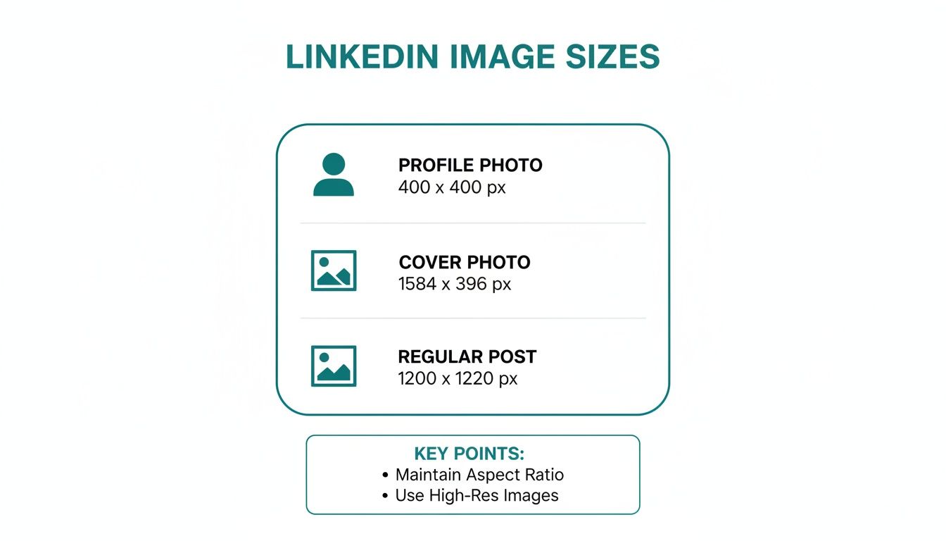
LinkedIn Image Size Quick Reference Table
I’ve put together this simple table to act as your go-to reference for all the major LinkedIn image types. Bookmark this page, and you’ll never have to guess again.
And for anyone looking to make their content workflow a bit smoother, it’s worth exploring some of the great social media content creation tools out there. They can be a massive time-saver.
Image Type | Recommended Pixel Dimensions | Aspect Ratio |
|---|---|---|
Personal Profile | 400 x 400 pixels | 1:1 |
Personal Banner | 1584 x 396 pixels | 4:1 |
Company Logo | 300 x 300 pixels | 1:1 |
Company Banner | 1128 x 191 pixels | 5.9:1 |
Single Image Post | 1080 x 1080 pixels (Square) | 1:1 |
Link Preview Image | 1200 x 627 pixels | 1.91:1 |
Carousel Card | 1080 x 1080 pixels | 1:1 |
Keep these numbers handy. Getting them right is a small detail that makes a huge difference in how professionally your content is perceived on the platform.
Why Bother With The Right LinkedIn Image Size?
Let's be blunt: on LinkedIn, people judge you in a heartbeat. Often, the very first thing they see is your visual content. Getting the linked in post image size right isn't just some technical box-ticking exercise; it's ground zero for making a solid first impression and making sure your message actually lands.
A poorly sized image can torpedo your credibility before anyone even reads your post. When LinkedIn’s algorithm has to aggressively stretch or squash a photo to make it fit, you end up with a blurry, pixelated mess. It screams a lack of attention to detail, which is the last thing you want when you're trying to build trust with clients, recruiters, or partners.
Avoid The Dreaded Awkward Crop
Beyond just looking fuzzy, the wrong dimensions will get your images butchered by unpredictable cropping. Picture this: you’ve spent ages crafting a killer graphic with a brilliant headline, only for LinkedIn to chop that headline clean off on mobile view. Your entire effort is wasted, and your message is dead on arrival.
You lose information: Key text, your logo, or the best part of a product shot can simply disappear, leaving your audience confused.
The impact is gone: The composition you worked so hard on is destroyed, and its power to stop the scroll is severely weakened.
It’s a bad experience: Your post just looks broken or amateurish, giving people a reason to ignore you and keep scrolling.
Nailing the image size means what you see is what they get. It ensures your entire visual is displayed exactly as you intended, preserving the integrity and punch of your post. It tells your audience you're a pro who respects their time.
Maximise Your Engagement And Performance
At the end of the day, optimising your visuals has a direct line to your post's performance. Posts with clean, correctly sized images are simply more appealing and easier to digest, which naturally leads to better engagement. The data doesn't lie: LinkedIn posts with images get a staggering 98% more comments than those without.
By making sure those images are perfectly formatted, you're giving yourself the best possible shot at earning those clicks, comments, and shares. It’s a simple step that drives the success of your entire professional branding strategy on the platform.
Perfecting Your Personal Profile And Cover Photos
Think of your personal profile and cover photos as your digital handshake on LinkedIn. They're the very first visual cues people get, and they instantly form an impression of you and your professional brand. Nailing the dimensions isn't just a technical box to tick; it's about building trust from the first glance.
These two images don't exist in a vacuum—they work together to tell a cohesive story. Your profile photo should be a sharp, professional headshot, while the cover photo (or banner) offers a wider canvas to show who you are or what you're passionate about.
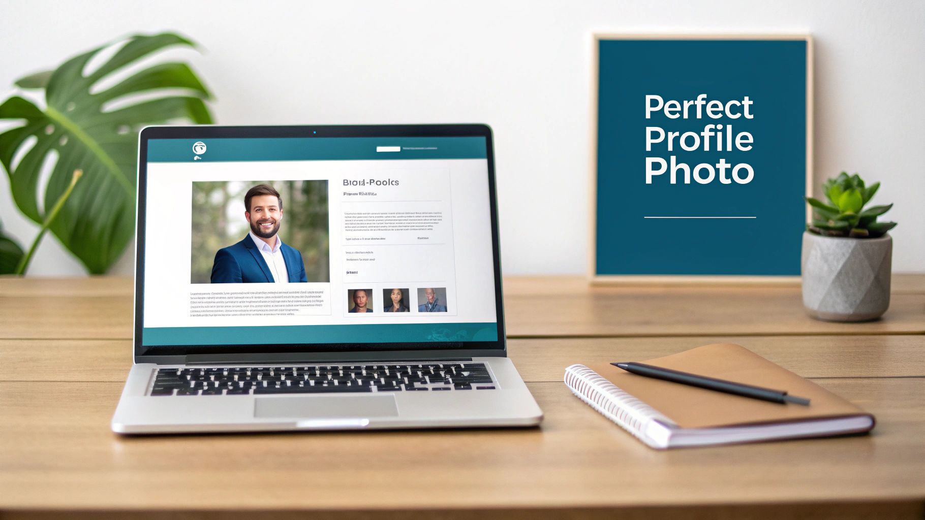
LinkedIn Profile Picture Size
Your profile picture is your face across the entire platform. It shows up next to your comments, in search results, and when you send a connection request, so it needs to be crystal clear and instantly recognisable.
Recommended Dimensions: 400 x 400 pixels
Minimum Dimensions: 200 x 200 pixels
Aspect Ratio: 1:1 (a perfect square)
Maximum File Size: 8MB
Accepted File Types: JPG, PNG
A crucial thing to remember: LinkedIn crops your photo into a circle. Make sure your face is smack-bang in the centre, with nothing important in the corners, because they will get cut off.
If you're looking to get that professional look without hiring a photographer, there are some great guides on how to take your own headshots. Getting these specs right is especially vital in markets like Germany, where professionals place a huge emphasis on profile imagery to assess credibility. Considering LinkedIn's ad reach in Germany covers 26.0% of the eligible population, that's millions of professionals scrutinising these images every day. It's no surprise that German-focused business guides consistently stress using at least 400 x 400 pixels to ensure a sharp image everywhere it appears.
LinkedIn Cover Photo Size
Your cover photo is some seriously valuable digital real estate. It's your billboard—a chance to inject some personality, showcase your company, or highlight a key message that defines your personal brand.
Recommended Dimensions: 1584 x 396 pixels
Aspect Ratio: 4:1
Maximum File Size: 8MB
Accepted File Types: JPG, PNG
This image is a very wide banner, so you have to be clever about the layout. On desktop, your circular profile picture will overlap the cover photo on the left-hand side. It's a classic mistake to put important text or logos right there, only to have them hidden. For some inspiration on how to use this space effectively, have a look at our guide on the 10 best LinkedIn banner ideas—it’s packed with ideas to make your profile pop.
Getting Your Company Page Logos And Banners Just Right
Think of your LinkedIn Company Page as your digital storefront. How it looks is the first thing potential clients, partners, and future hires see, and it speaks volumes about your brand. Nailing the logo and banner dimensions isn't just a technical detail; it’s about crafting a professional, polished first impression.
These two visuals are your one-two punch for brand identity. Your logo is the consistent, recognisable face of your company everywhere it appears on LinkedIn. The cover banner, on the other hand, is your big, bold canvas to broadcast your value proposition, a new campaign, or simply your brand's personality. Get them right, and you've got a compelling visual hook.
Company Logo Specifications
Your company logo pops up next to your name in posts, comments, and search results. It absolutely must be sharp and legible, even when it's tiny. A blurry or awkwardly cropped logo is an instant credibility killer.
Here are the specs to follow:
Recommended Dimensions: 300 x 300 pixels is the sweet spot for clarity.
Aspect Ratio: It has to be a perfect 1:1 square. No exceptions.
Maximum File Size: Keep it light and fast-loading, under 8MB.
File Types: JPG or PNG are your go-to formats.
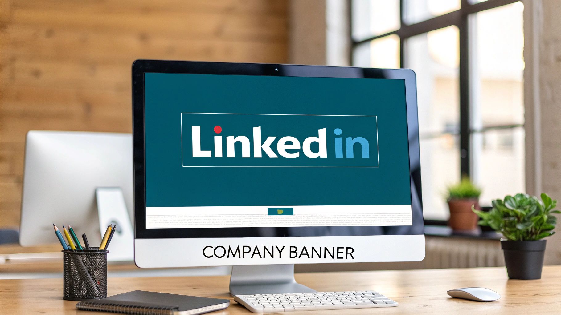
Company Cover Banner Size
This is that big, panoramic image stretching across the top of your page. Its super-wide format is a bit of a design puzzle because if you're not careful, important info can get chopped off on different screens.
Lock in these numbers:
Recommended Dimensions: The official size is 1128 x 191 pixels.
Aspect Ratio: This works out to a very wide 5.9:1 aspect ratio.
Maximum File Size: Again, the limit is a firm 8MB.
File Types: Stick with JPG or PNG.
Pro Tip: Play it safe and keep all your critical text, logos, and taglines smack in the centre of your banner design. The edges are a danger zone—they’re the first things to get cropped on different screen sizes, especially on mobile phones.
Getting these visuals perfected is a crucial step right after you've set up your page. For a full step-by-step process, check out our guide on how to create a business profile on LinkedIn. A crisp logo and a well-thought-out banner signal that you care about the details, encouraging visitors to stick around and see what your company is all about.
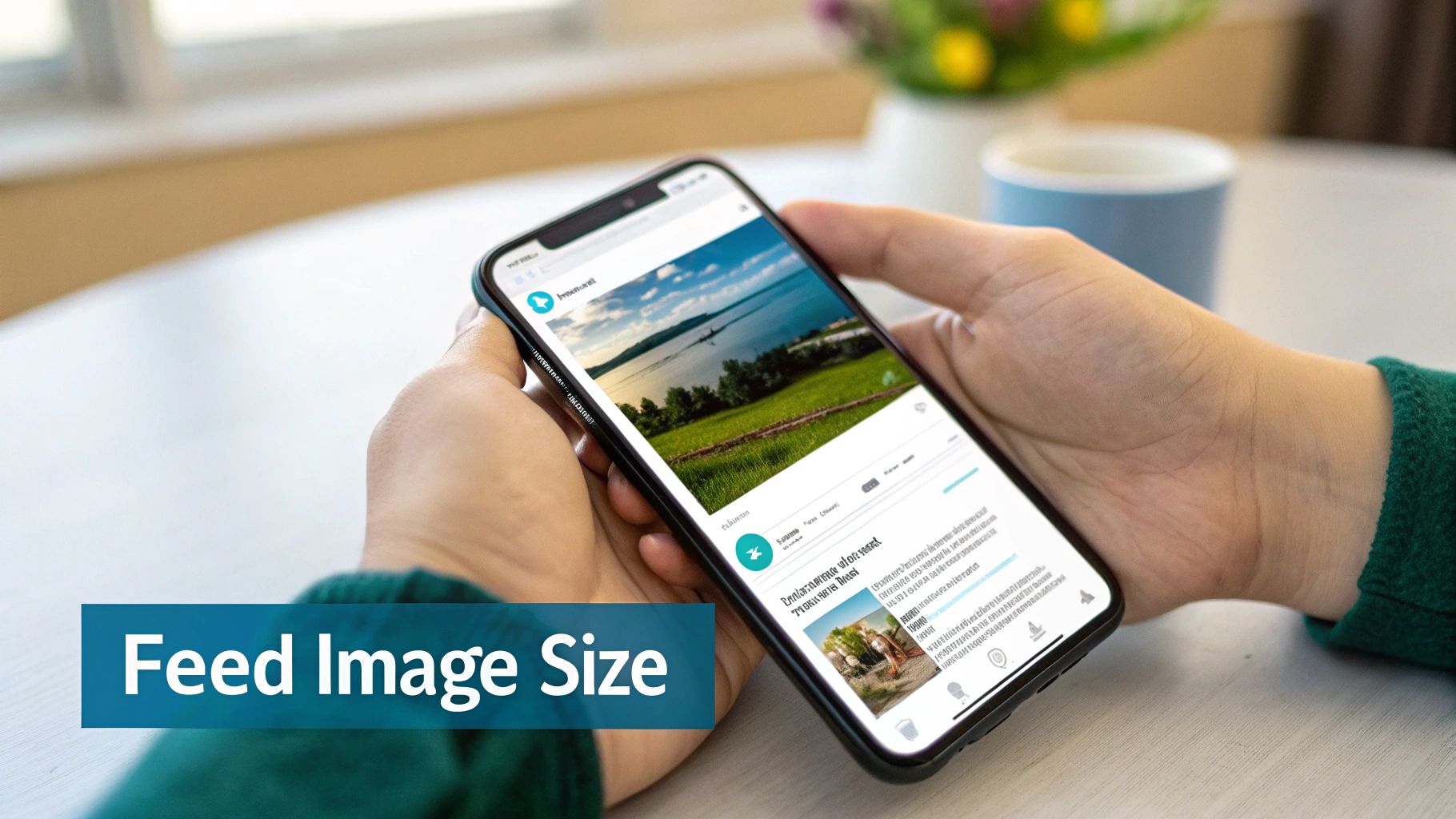
Creating Engaging Images For The LinkedIn Feed
The LinkedIn feed is where your content has to fight for every last bit of attention. Getting your linked in post image size right isn't just about ticking a technical box—it's a strategic move to make sure your visuals actually stop the scroll and get your message across with real impact. Get it wrong, and you're looking at awkward cropping that just screams unprofessional.
This battle for visibility is getting fiercer all the time, especially in growing professional markets. For marketers in Germany, for example, feed post image size has become a massive performance factor. LinkedIn’s potential ad reach there shot up by 20.0% in just one year, adding 3.0 million new users to the platform.
In a competitive space like that, every detail counts. That’s why you'll see most experts agree that landscape images for links and posts perform best at 1200 x 627 pixels (that’s a 1.91:1 ratio).
Recommended Sizes For Single Image Posts
When you upload an image directly into a post, you’ve got a couple of solid options. Two formats, in particular, have proven to be the most effective for grabbing your audience's attention.
Landscape (Horizontal) Images: This is the classic choice, perfect for wide shots or graphics. Stick to the recommended 1200 x 627 pixels with a 1.91:1 aspect ratio. This ensures your image looks great and displays consistently on both desktop and mobile without any weird cropping.
Square Images: These have become incredibly popular for a good reason—they work, especially on mobile. An image at 1080 x 1080 pixels (1:1 aspect ratio) simply takes up more vertical screen real estate on a phone, making it more prominent and a lot harder to just scroll past.
Optimising Link Preview Images
Ever share a link only to see LinkedIn pull a weird, tiny, or completely irrelevant image? You can—and should—control this. The key is setting the correct Open Graph (OG) image tag on your website.
The optimal size for a link preview image is 1200 x 627 pixels (a 1.91:1 ratio). If the image LinkedIn finds is smaller than 200 pixels wide, it'll get demoted to a tiny thumbnail on the left, which absolutely kills its visual appeal and your click-through rate.
Making sure your shared links always pull a compelling, correctly-sized image is non-negotiable for driving traffic. And if you're ever stuck for inspiration, exploring our collection of LinkedIn post templates can be a fantastic starting point for creating posts that consistently look sharp. Paying close attention to these feed image dimensions is what guarantees your content looks polished and professional, capturing the attention it truly deserves.
Designing High-Impact Carousels And Videos
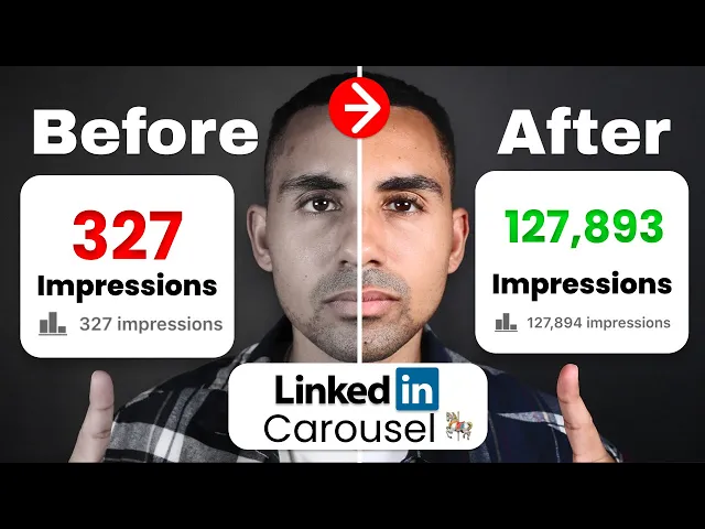
Single images are great, but sometimes you need more space to tell a story or break down a complex idea. That's where carousels and videos come in. They’re brilliant for tutorials, case studies, or sharing a series of tips, but getting the technical details right is crucial for them to look professional and perform well.
Think of a carousel as a mini-presentation right in the feed. It’s a fantastic way to get people swiping through a sequence of cards, making it perfect for turning big topics into bite-sized, digestible pieces. Nail the dimensions, and you guarantee a smooth, seamless experience for your audience.
Crafting The Perfect LinkedIn Carousel
With carousels, the name of the game is consistency. Every single card in your sequence needs to have the same dimensions. If they don't, you'll get jarring transitions and awkward crops as people swipe through, which just looks sloppy.
Recommended Dimensions: Stick to 1080 x 1080 pixels for each individual carousel card. This is the gold standard.
Aspect Ratio: This gives you a perfect 1:1 square, which looks fantastic and takes up maximum screen space on mobile phones.
File Types: You’ve got options here. JPG and PNG work perfectly. You can even upload a PDF, and LinkedIn will automatically convert it into a carousel for you.
Number of Cards: You can have anywhere from 2 to 10 cards in one post.
A quick pro tip: design your carousel with a cohesive narrative. Keep the visual style consistent, and maybe add a little "swipe left" cue on the first few cards. It's a small touch that really encourages people to see what else you have to share.
Optimising Videos For The Feed
Video is a totally different beast. It grabs attention in its own way and comes with its own set of technical specs. LinkedIn is surprisingly flexible with video aspect ratios, but let's be honest, some formats just work better than others, especially in the mobile feed where vertical video is king.
Here’s what you need to know to get your videos looking sharp:
Supported Aspect Ratios: You can go from 1:2.4 (very tall) all the way to 2.4:1 (super wide).
Recommended Formats: For the best mobile experience, a 1:1 square or a 4:5 vertical video is your best bet. They fill the screen without forcing people to turn their phones.
File Size: You've got a lot of room to play with here, up to a maximum of 5GB.
Video Length: Videos can be as short as 3 seconds or as long as 10 minutes. From my experience, though, shorter and punchier videos (under two minutes) almost always get higher completion rates.
Following these guidelines for the linked in post image size for carousels and videos will make sure your more dynamic content is delivered clearly and professionally, keeping your audience hooked from the first slide to the final frame.
Right, let's move past just pixel dimensions. If you want your visuals to really work on LinkedIn, you have to get your head around aspect ratios and file types. It might sound a bit technical, but these two things are the difference between a sharp, professional post and one that looks sloppy. They control how your images are framed and how fast they load—both huge factors in how people see your content.
An aspect ratio is just a fancy way of describing the shape of your image—its width in relation to its height. A perfect square is 1:1, meaning the width and height are the same. Nailing the aspect ratio is crucial for avoiding that awkward, unexpected cropping LinkedIn sometimes does.
Getting to Grips with LinkedIn's Aspect Ratios
You’ll see three main ratios popping up all over LinkedIn. Each one is tailored for a specific type of post or placement, so knowing which to use is key.
1.91:1 (Landscape): Think of this as your classic widescreen or horizontal format. It's the go-to for shared link previews and traditional landscape photos. It gives you that wide, cinematic feel.
1:1 (Square): This is your workhorse. It’s perfect for single image posts and carousel cards because it's so versatile. Square images also take up a good chunk of vertical space on mobile, making them that much harder to just scroll past.
4:5 (Vertical): This taller format is your secret weapon for grabbing attention on mobile. It fills up more of the screen than any other ratio. While it's not as common as the square, it’s incredibly effective when you need your image to make an impact.
Understanding this stuff is more important than ever, especially in crowded professional scenes. Take Germany, for instance, where LinkedIn’s potential ad reach shot up by 20.0% between early 2023 and 2024. That’s an extra 3.0 million professionals on the platform. In a market growing that fast, sticking to the recommended 1200 × 627 pixels with the right aspect ratio ensures your image looks sharp and isn't butchered by cropping. You can dig deeper into Germany's digital scene in DataReportal’s 2024 report.
Picking the Right File Type
The file type you choose is all about balancing image quality with file size. A smaller file loads faster, but you don't want to sacrifice too much quality.
JPG (or JPEG): This is your best bet for photos and any complex images with lots of colours. JPGs use compression to keep file sizes small, which is great for loading speed, though you can sometimes see a tiny dip in quality if you look closely. PNG: If your image has text, logos, or sharp, clean lines, go with PNG. They also support transparency, which is a must-have if you need to place your logo over a coloured background without a clunky white box around it. GIF: Mostly for simple, short animations. LinkedIn supports them, but you don't see them used much for static, professional posts.
It might seem like a minor detail, but choosing between a JPG and a PNG can seriously affect how professional your post looks and how well it performs.
Got Questions About LinkedIn Image Sizes? We've Got Answers.
Even with a detailed guide, you're bound to run into some specific head-scratchers when you're in the middle of creating content. That's totally normal. This section is here to tackle the most common questions we get about LinkedIn post image sizes, giving you quick fixes so you can get back to what matters.
Think of this as your rapid-fire troubleshooting guide for all those "what if" moments.
What Happens If My Image Is The Wrong Size?
If you upload an image that doesn't fit LinkedIn's preferred dimensions, the platform will try to "help" by automatically adjusting it. The results are rarely good. Your image will get stretched, squashed, or cropped, leading to a couple of major headaches:
Pixelation and Blurriness: When a smaller image gets stretched to fill a bigger space, it loses quality fast and ends up looking blurry. It’s an instant way to make your content look unprofessional.
Awkward Cropping: The automatic crop might chop off the most important part of your image—your headline, your logo, or the main subject. This can completely derail your message, leaving it confusing or just plain broken.
What's The Best Image Size For Mobile Viewing?
For mobile, your best friend is the square 1:1 aspect ratio. An image sized at 1080 x 1080 pixels is a powerhouse on a phone screen. It takes up a ton of vertical real estate, making it much harder for someone to just scroll past. It really dominates the feed.
While the old-school 1200 x 627 pixels (1.91:1) landscape format is a safe choice that works everywhere, the square format is consistently better at grabbing attention where most people are looking: on their phones.
Does LinkedIn Compress My Images?
Yes, absolutely. LinkedIn compresses every image you upload to make sure the platform loads quickly for everyone. To fight back against the quality loss that comes with compression, your best defence is to start with a high-quality file.
Always export your images at their recommended dimensions (like 1080 x 1080 pixels) and save them as a high-quality JPG or PNG. When you give LinkedIn's algorithm a crisp, clear image to start with, the final compressed version will look much cleaner.
Can I Just Use The Same Image For LinkedIn And Instagram?
It's tempting to save time this way, but it's not a great idea. Instagram's world revolves around square (1:1) and vertical (4:5) images. LinkedIn, on the other hand, uses a much wider variety of shapes, from wide company banners (4:1) and landscape link previews (1.91:1) to the square posts in the feed.
If you try to use a vertical image optimised for Instagram on LinkedIn, it’s almost guaranteed to get cropped into an awkward, unreadable mess. It's always worth the extra minute to create or resize images specifically for each platform. That's how you maintain a polished, professional look across the board.
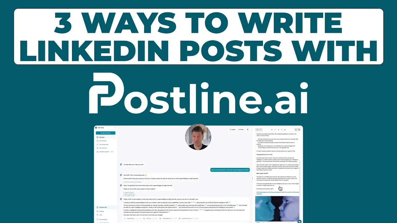
Ready to create perfectly optimised LinkedIn posts in minutes? Postline.ai uses AI to help you write, format, and schedule content that sounds just like you, complete with real-time research and audience insights. Stop guessing and start growing at https://postline.ai.
CREATE YOUR POSTS WITH POSTLINE.AI
More reach. More followers. More business.
👉 Try Postline.ai for free
Author

Christoph Gaschler

Christoph is the CEO of Mind Nexus and Co-Founder of postline.ai. He is a serial entrepreneur, keynote speaker and former Dentsu executive. Christoph worked in marketing for more than 15 years, serving clients such as Disney and Mastercard. Today he is developing AI marketing software for agencies and brands and is involved in several SaaS projects.
Related posts

Every LinkedIn post generator - Full Comparison
You want to grow on LinkedIn and need a little help from AI. There are many tools out there promising quick results. We tested the Top 10 LinkedIn post generators to see which actually can make a difference.

How to Export Data from LinkedIn Analytics to Excel [2025]
Discover how to export data from LinkedIn Analytics to Excel to gain valuable insights, streamline lead generation, and enhance data-driven decision-making. This guide covers step-by-step instructions, tools, and tips to help you analyze LinkedIn data efficiently and grow your business.

How to Message Recruiters to Connect on LinkedIn
In this guide you will learn how to reach out to a recruiter on LinkedIn. This is a step by step guide to prepare you to connect with recruiters and increase to chances of landing that new job. You will also find LinkedIn message examples and valuable insights below.