Your Guide to Image Size for LinkedIn Post Success
Master the perfect image size for LinkedIn post formats. Our complete guide covers dimensions and best practices to boost your professional engagement.
Getting the image size right for your LinkedIn posts isn’t just about aesthetics; it’s fundamental to making a professional impression. For a standard image you share in the feed, aim for 1200 x 627 pixels. This gives you that perfect 1.91:1 aspect ratio that looks sharp and clean on any device, avoiding any awkward or unintentional cropping.
Quick Reference for LinkedIn Image Sizes
Figuring out LinkedIn’s various image requirements can feel like a moving target. But getting the dimensions right is a surprisingly simple way to make your content work harder for you. From your profile picture to the articles you share, every visual has an ideal size that ensures it looks crisp and professional.
Take that standard feed post image, for example. At 1200 x 627 pixels, it’s optimised for clarity on both desktop and mobile. I’ve seen firsthand how using the right dimensions can boost visibility and interaction—some studies even suggest it can bump engagement by 20-30%. It just goes to show that a little bit of prep goes a long way.
To give you a clearer picture, this infographic pulls together the three most common image sizes you’ll be dealing with on LinkedIn.
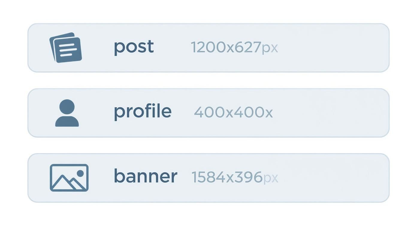
As you can see, each placement has its own unique aspect ratio, from the wide landscape of a banner to the perfect square of a profile photo.
LinkedIn Image Size Cheat Sheet
To make things even easier, I’ve put together a quick-reference table. This is your go-to guide for all the key image specs on LinkedIn, so you can get it right every single time.
| Placement Type | Recommended Dimensions (Pixels) | Aspect Ratio | Supported File Types |
|---|---|---|---|
| Profile Picture | 400 x 400 | 1:1 | JPG, PNG, GIF |
| Profile Banner | 1584 x 396 | 4:1 | JPG, PNG, GIF |
| Company Logo | 300 x 300 | 1:1 | JPG, PNG, GIF |
| Company Cover | 1128 x 191 | 5.9:1 | JPG, PNG, GIF |
| Shared Image/Link | 1200 x 627 | 1.91:1 | JPG, PNG, GIF |
| Carousel Post (Single) | 1080 x 1080 | 1:1 | JPG, PNG |
Keep this table handy, and you’ll never have to second-guess your image uploads again.
Key Dimensions at a Glance
If you just need the absolute essentials, keep these three sizes memorised:
- Profile Picture: 400 x 400 pixels (1:1 ratio)
- Profile Banner: 1584 x 396 pixels (4:1 ratio)
- Shared Image/Link Post: 1200 x 627 pixels (1.91:1 ratio)
Of course, nailing the dimensions is just step one. Building a truly effective content strategy involves much more, which you can explore in our comprehensive guide on LinkedIn post best practices.
Optimising Your Personal and Company Profile Images
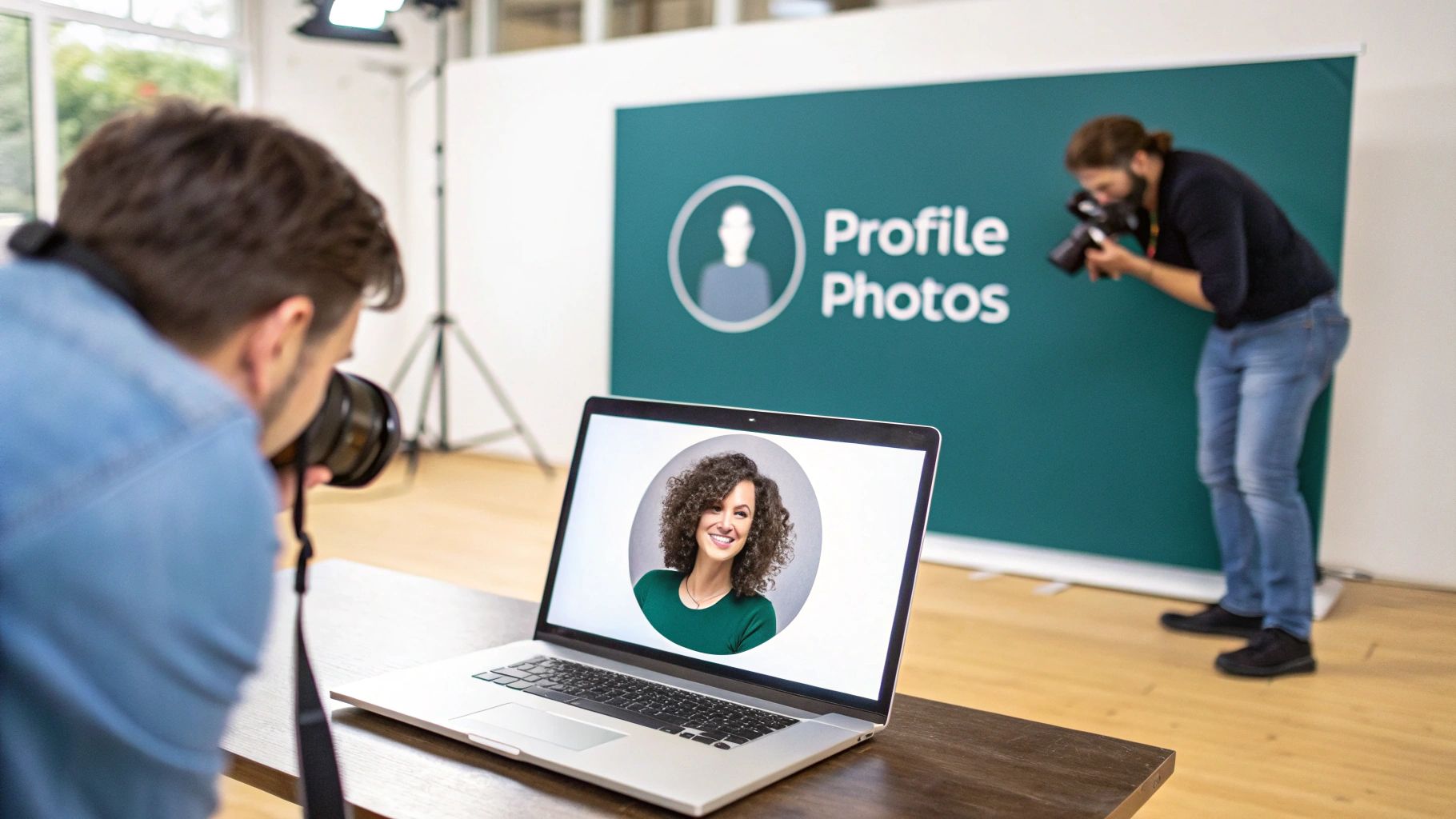
Think of your profile and company page images as the digital handshake you offer on LinkedIn. They’re often the very first thing people see, so getting them right is crucial for making a strong, professional impression. If the dimensions are off, you risk awkward cropping or blurry images, which can instantly undermine your credibility.
For a personal profile, your profile picture should be at least 400 x 400 pixels. Remember, LinkedIn will crop this into a circle, so make sure your face is centred and nothing important gets cut off. The banner behind it is a different beast altogether; it needs to be 1584 x 396 pixels, a wide 4:1 aspect ratio. It’s a small detail, but in B2B circles, poor-quality images can slash perceived professionalism by as much as 25%—a steep price to pay for a simple fix.
Company Page Visuals
When it comes to your company page, the numbers change slightly, but the need for consistency and brand recognition is just as high.
- Company Logo: Aim for 300 x 300 pixels. This is the small square image that follows your brand everywhere—in search results, on your employees’ profiles, and next to every post you make. Keep it sharp.
- Company Cover Photo: The recommended size here is 1128 x 191 pixels. This is prime real estate to show off your brand’s personality, highlight a key product, or give a glimpse into your company culture.
Your banner isn’t just a background image; it’s a powerful branding tool that tells a story. It should work hand-in-hand with your profile picture to give visitors immediate context about you or your company. If you’re looking for some creative fuel, check out our guide on the 10 best LinkedIn banner ideas. A great banner reinforces your professional identity or corporate mission before anyone reads a single word.
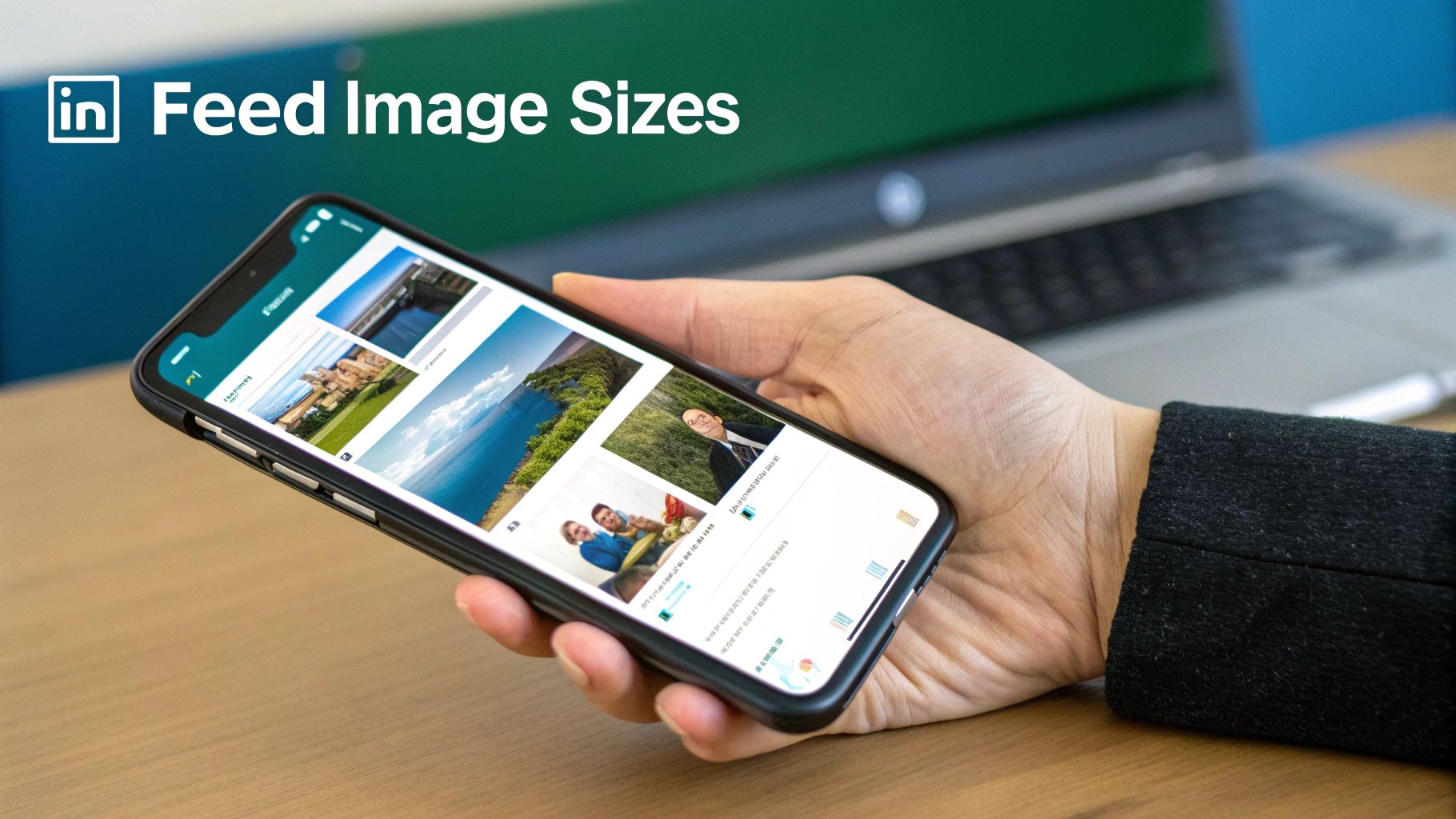
Mastering Image Posts in the LinkedIn Feed
The LinkedIn feed is where your content strategy really comes to life, and getting your image sizes right can make or break a post’s performance. While many people stick to the standard landscape format, playing with different aspect ratios is a savvy move that can seriously boost engagement.
The classic landscape image is still a reliable choice, and for that, you’ll want to aim for 1200 x 627 pixels. This gives you that clean 1.91:1 ratio which looks good on both desktop and mobile. But honestly, that’s just scratching the surface.
Strategic Aspect Ratios for Higher Engagement
If you want to stop people from scrolling past your content, you need to take up more screen space, especially on mobile. That’s where square and portrait images come in. They dominate the vertical real estate of a phone screen and are much harder to ignore.
- Square (1:1): An image sized at 1080 x 1080 pixels is my go-to for most single-image posts. It looks fantastic on mobile, feels balanced, and just fills the feed so much more effectively than a wide, narrow landscape image.
- Portrait (Custom): LinkedIn doesn’t have an officially mandated portrait ratio, but a vertical image around 627 x 1200 pixels can be incredibly effective. This format really stretches down the feed, forcing people to pause and take notice.
Don’t just take my word for it; the numbers back this up. Square posts regularly see a 15% higher engagement rate than their landscape counterparts. On top of that, LinkedIn’s algorithm has been known to give native uploads in these more ‘mobile-friendly’ sizes a visibility boost of up to 22%.
Optimising Multi-Image and Carousel Posts
When you’re posting a gallery of images or a carousel, consistency is everything. A messy, mismatched set of images looks unprofessional and can stop people from swiping.
For both multi-image posts and carousels, sticking to a square (1:1) format at 1080 x 1080 pixels for every single slide is the best practice. This creates a clean, uniform look that encourages people to swipe through all your content. If you want to really nail this format, our guide on the perfect https://postline.ai/blog/2/linkedin-carousel-post is a great next step.
Finally, remember that on a professional network like LinkedIn, the credibility of your visuals is just as important as their dimensions. In an age of AI-generated content, ensuring your images are authentic is crucial for building trust. It’s worth learning how to check if a photo is real to maintain your professional integrity.
Image Sizing for Articles and Newsletters
When you’re writing long-form content on LinkedIn, like an Article or a Newsletter, your visuals play a massive role in pulling readers in and keeping them engaged. Think of your main banner image as the cover of a book; it’s the first thing people see and it sets the tone.
For that all-important banner, you’ll want to use an image that’s 1920 x 1080 pixels. This sticks to a standard 16:9 aspect ratio, guaranteeing your header looks crisp and professional, whether it’s viewed on a desktop or a mobile phone.
Images Within Your Content
Of course, the banner isn’t the only visual you’ll use. Images placed within the body of your article are perfect for breaking up long blocks of text and illustrating your points. While LinkedIn doesn’t enforce strict dimensions for these in-body images, it’s a good idea to maintain a consistent width to give your article a clean, organised feel. Just be mindful of the file size to keep your article’s load time snappy.
Choosing the Right File Format
Getting the file format right is a balancing act between image quality and performance. A slow-loading article is a surefire way to lose a reader’s attention.
- JPG: This is your go-to for photographs and any images with complex colours. JPGs compress well, leading to smaller file sizes and quicker loading times, which is a huge win for reader experience.
- PNG: Use this format for graphics that need sharp lines, such as logos, charts, or any image containing text. It’s also the only choice if you need a transparent background, though the file sizes tend to be larger than JPGs.
Ultimately, by compressing your images and picking the right format, you directly improve the reader’s experience and increase the odds they’ll stick around to read what you’ve written.
If you’re serious about building a following with this format, our guide on LinkedIn Newsletter best practices offers a deeper dive to complement your visual strategy.
Image Specifications for LinkedIn Ads and Events
When you’re putting money behind your content, getting the visual details right is non-negotiable. LinkedIn Ads and Events have their own specific image requirements, and sticking to them is crucial if you want to see a good return on your investment. An ad that looks stretched or cropped isn’t just unprofessional—it can seriously hurt your click-through rates.
For Sponsored Content that uses a single image, you’ll want to stick to 1200 x 627 pixels. This creates the standard 1.91:1 aspect ratio that users are accustomed to seeing with shared links, helping your ad feel more native and less disruptive in the feed. Just be sure to keep the file size under 5 MB so it loads nice and fast for everyone.
Things change a bit when you’re working with multi-image Carousel Ads. For these, each image card needs to be a perfect square at 1080 x 1080 pixels, which gives you a 1:1 aspect ratio. Keeping every card consistent creates a much cleaner and more professional swiping experience for the user.
Optimising for LinkedIn Events
When you’re promoting a LinkedIn Event, you have two key images to work with. Each one serves a different purpose and has its own dimensions designed to grab attention and quickly convey what your event is all about.
- Event Banner: Think of this as the main header for your event page. The ideal size is 1584 x 396 pixels (a 4:1 ratio). This wide format gives you plenty of space to feature your branding, key speakers, or other must-know details.
- Event Logo: This is the small, square image that shows up next to your event name in the feed and notifications. A 400 x 400 pixel (1:1) image is perfect for ensuring your logo looks sharp and is easily recognisable.
To make things easier, here’s a quick checklist you can refer to anytime you’re setting up a campaign or event.
LinkedIn Ad and Event Image Dimension Checklist
This table breaks down the essential image specs you’ll need for the most common LinkedIn advertising and event formats.
| Ad/Event Format | Required Dimensions (Pixels) | Aspect Ratio | Key Considerations |
|---|---|---|---|
| Sponsored Content (Single Image) | 1200 x 627 | 1.91:1 | Keep the file size under 5 MB for optimal loading speed. |
| Carousel Ad (Each Image Card) | 1080 x 1080 | 1:1 | All cards must be the same size to ensure a smooth user experience. |
| Event Banner | 1584 x 396 | 4:1 | Use this wide space for key branding and event information. |
| Event Logo | 400 x 400 | 1:1 | Your logo will appear in various small sizes; ensure it’s clear and simple. |
Getting these dimensions right from the start saves you headaches later and ensures your paid content always looks its best.
Pro Tip: With any ad or event visual, always keep your most important text and logos near the centre. This “safe zone” ensures nothing critical gets cropped out when LinkedIn adjusts the display for different devices, guaranteeing your message always gets across.
Common Image Sizing Mistakes to Avoid
Even if you know the right dimensions, a few common slip-ups can easily trip you up and make your profile look unprofessional. It’s one thing to know the numbers, but it’s another to avoid the classic mistakes that lead to a sloppy presentation on your LinkedIn posts.
One of the biggest culprits is unintentional cropping. You see this all the time with banners. Someone designs a beautiful banner on their desktop, but then key text or their logo gets chopped off on mobile. LinkedIn displays banners differently across devices, so always design with a central “safe zone” in mind for your most critical elements.
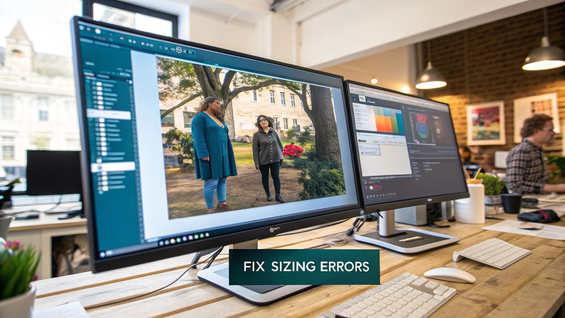
Pixelation and Distortion
Next up is pixelation. This happens when you upload a small, low-resolution image and LinkedIn is forced to stretch it to fill the required space, resulting in that dreaded blocky, blurry look. The rule of thumb is simple: always start with a high-quality source image that meets or exceeds the recommended dimensions.
On a similar note, aspect ratio distortion can make your visuals look squashed or stretched. This is what happens when you try to force an image into a shape it wasn’t meant for—like trying to fit a square photo into a wide rectangular banner slot without cropping it properly. The result is always awkward and unprofessional.
Key Takeaway: Start with a high-resolution image and always respect the specific aspect ratio for each placement. A 1:1 image just won’t work in a 4:1 space without some serious (and often ugly) cropping or distortion.
Getting sizing right is crucial for conversions far beyond LinkedIn. You can see how this same principle applies elsewhere by checking out this guide on Mastering App Store Screenshot Sizes.
Your LinkedIn Image Questions, Answered
Nailing the right image size for your LinkedIn posts can feel a bit tricky, but don’t worry. I’ve gathered answers to the questions I hear most often, from the best free tools to the classic “why is my picture blurry?” problem.
Getting these details right is the key to making sure your content looks sharp and professional, no matter if someone’s viewing it on a massive desktop monitor or their phone on the go.
What Are the Best Free Tools for Resizing Images?
You definitely don’t need to splash out on expensive software just to get your image dimensions right. There are some brilliant free tools out there that make resizing a breeze.
- Canva: This is a go-to for many social media managers. It’s packed with pre-made templates for just about every social media format you can think of, including all the specific LinkedIn image sizes.
- Adobe Express: The free version of this tool is surprisingly powerful. It’s got a super user-friendly resizer that lets you quickly tweak your visuals without any fuss.
Both of these platforms take the guesswork out of the process, so you can be confident your images are perfectly sized every time.
A Quick Heads-Up: LinkedIn does occasionally update its image requirements as the platform changes. It doesn’t happen often, but I always recommend a quick check of the latest specs at least once a year. It’s a simple way to keep your content looking its best.
Why Does My Image Still Look Blurry?
This is a common frustration. You’ve double-checked the dimensions, uploaded your image, and it still looks a bit pixelated. More often than not, the problem isn’t the final size, but the quality of your original file.
If you take a small, low-resolution photo and try to stretch it to fit a larger space, it’s always going to end up looking blurry. The best way to avoid this is to start with a high-resolution source image that’s actually bigger than the recommended dimensions. That way, you’re scaling it down, which keeps everything looking crisp and clear.
Ready to create perfectly crafted LinkedIn content in minutes? Postline.ai uses AI to help you write, schedule, and optimise posts that sound just like you. Stop staring at a blank page and start building your brand today. Check out Postline.ai to get started for free.
Run every client pipeline in one place
Give each LinkedIn profile its own voice, calendar, approval flow, and analytics. Start in minutes.
Start free trial