How to Post a Carousel on LinkedIn From Start to Finish
Learn how to post a carousel on LinkedIn with this complete guide. Boost engagement with practical tips on design, uploading, and optimization.

Before you even think about the “how” of posting a LinkedIn carousel, we need to talk about the “why.” It’s easy to get caught up in the technical steps, but understanding the power behind this format is what separates a good post from a great one. Carousels aren’t just a gimmick; they’re a seriously effective way to grab and hold your audience’s attention.
Why Carousels Are an Engagement Powerhouse on LinkedIn

Think of a carousel as a mini-presentation or a visual story. Its multi-slide design is inherently interactive. People have to physically swipe to see the next piece of information, which is a much bigger commitment than a quick glance at a single image.
This simple act of swiping increases “dwell time”—the amount of time someone spends interacting with your post. That’s a huge signal to the LinkedIn algorithm that your content is valuable, which can lead to a significant boost in your post’s reach.
Bringing Your Story to Life
Instead of just stating a fact, you can build a complete narrative that guides your reader from a problem to a solution. I’ve seen this work wonders for so many clients. For instance, a marketing agency could use a carousel to walk through a client success story:
- Slide 1: Hook them with a bold headline about the client’s biggest challenge.
- Slides 2-4: Break down the exact strategy you used, step-by-step.
- Slide 5: Hit them with a powerful, easy-to-read graph showing the impressive results.
- Slide 6: End with a clear call-to-action, inviting them to learn more.
This approach does more than just share information; it establishes your authority and provides real, tangible value. It’s perfect for educating your network, sharing key takeaways from an event, or breaking down complex industry insights into digestible chunks.
The real magic of the carousel is how it transforms passive scrolling into an active experience. It encourages clicks, comments, and shares because you’ve taken your audience on a journey.
The data backs this up, too. LinkedIn’s own research has shown that carousel ads consistently produce a higher click-through rate than their single-image counterparts. That’s proof they excel at keeping a professional audience engaged.
Of course, a great carousel is part of a larger picture. To get the most out of them, it helps to be familiar with broader strategies to increase social media engagement.
Ultimately, knowing how to create the post is just the first step. Mastering why it works is the key to creating content that truly connects and delivers results. If you want to dive deeper into platform-specific tactics, our guide on https://postline.ai/blog/2/how-to-increase-linkedin-engagement is the perfect next step.
Designing a Carousel That Captures Attention
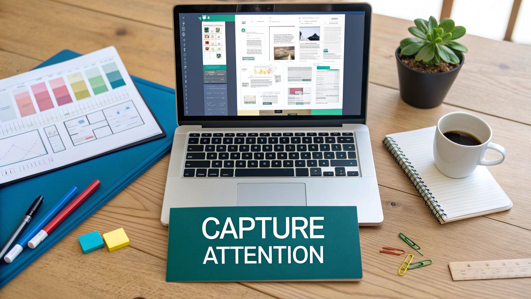
A killer carousel doesn’t just happen when you hit “post.” The best ones are carefully planned mini-stories, designed to pull your audience from one slide to the next. Think of it as a narrative with a clear beginning, middle, and end.
Before you even open a design tool, map out your core message. What’s the one thing you absolutely need your reader to remember? Every single slide should support that main point, building a story that feels cohesive and makes perfect sense. Your first slide is your hook—it has to be strong enough to make someone stop scrolling through their feed.
Just as crucial is your final slide. This is where you put your call-to-action (CTA). Do you want people to share their own experiences in the comments, check out a link, or save the post for later? Be direct and tell them exactly what to do next.
Crafting Your Slides With Purpose
Every slide between that initial hook and the final CTA needs to do some heavy lifting. Tools like Canva or Figma are perfect for this, letting you create a look that’s consistent from start to finish. This isn’t just about looking professional; it’s about reinforcing your brand. If you want to dive deeper, learning about social media brand guidelines for consistent visuals is a great place to start.
Here are a few things I’ve learned from creating dozens of carousels:
- Less is More: Stick to one core idea per slide. Use big, clear fonts and embrace white space—it helps your message stand out.
- Visuals Reinforce, Not Distract: Use icons, simple charts, or relevant images that add to your point. Clutter is the enemy of a good carousel.
- Encourage the Swipe: Don’t be shy about adding visual cues. A simple arrow or a “swipe for more” text can make a huge difference in getting people to the end.
Getting the technical side right is just as important. Carousels are essentially documents (usually PDFs) that you upload, which allows for that multi-slide experience. To ensure your carousel looks sharp on both desktop and mobile, LinkedIn’s sweet spot is a square 1:1 aspect ratio.
Carousel Design and Technical Specifications
Here’s a quick reference table to get the technical details just right before you export your document. Following these recommendations helps avoid any frustrating upload errors or display issues.
| Specification | Recommendation | Why It Matters |
|---|---|---|
| File Format | This is the required format that enables the multi-slide carousel functionality on LinkedIn. | |
| File Size | Under 100 MB | Larger files can fail to upload or take too long, frustrating both you and your audience. |
| Page/Slide Count | Up to 300 pages | While you can go this high, the sweet spot for engagement is typically 5-10 slides. |
| Aspect Ratio | 1:1 (square) is best | A square format displays consistently and beautifully across all devices, from desktop to mobile. |
| Resolution | 1080x1080 pixels | This ensures your text and visuals are crisp and professional, avoiding any pixelation. |
Nailing these specs ensures your content has the best chance to perform well and look exactly how you designed it.
Pro Tip: I always try to end my carousels with an open-ended question on the final slide. It’s a simple trick that gets the conversation started right away in the comments.
At the end of the day, a well-designed carousel respects your audience’s time by delivering real value in a polished, easy-to-read format. It’s also a good idea to get familiar with how images work across the platform; for a more detailed breakdown, have a look at our guide on the correct LinkedIn post images size.
How to Upload Your Carousel to LinkedIn
Alright, you’ve designed a brilliant carousel and saved it as a PDF. Now for the fun part: getting it live on LinkedIn. The trick is to remember you’re not uploading a bunch of images, but a single document. It’s a simple distinction, but it makes all the difference.
Let’s walk through it.
Start on your LinkedIn homepage, right where you always do. Click inside the ‘Start a post’ box at the top of your feed. This will bring up the familiar pop-up window for creating your content.
Now, instead of just typing or hitting the photo icon, scan the options at the bottom. You’re looking for a small icon that says ‘Add a document’. This is the secret handshake for posting a carousel. Click it.
Selecting and Titling Your Document
After you click to add a document, a file browser will open. Just find the PDF you so carefully prepared and select it. Once it’s chosen, LinkedIn will ask you to give your document a title.
This infographic lays out the straightforward upload process.
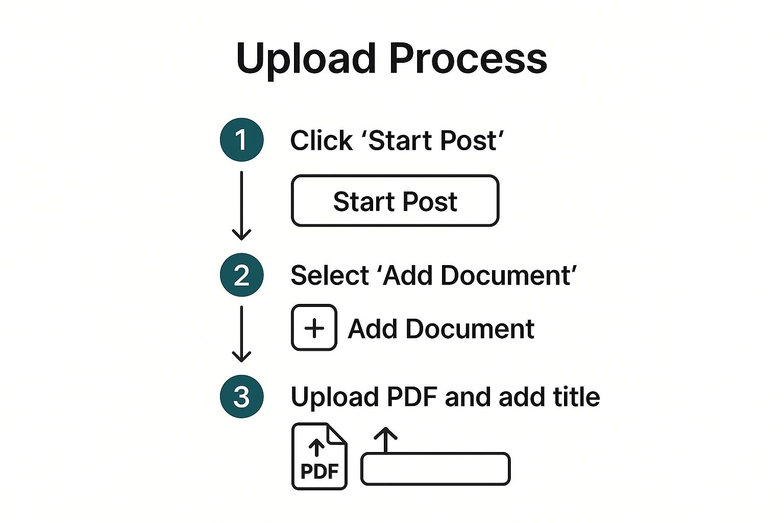
As you can see, it really is just a few quick clicks to get your file into the post.
Pay attention to that title—it’s more important than you might think. This title appears at the bottom of the carousel viewer as people swipe, giving them crucial context. Don’t just leave it as your filename, like “Carousel_Final_v3.pdf”. Give it a proper, descriptive title that hooks the reader, something like “5 Common Mistakes in B2B Marketing.” It looks far more professional.
Pro Tip: Using the ‘Add a document’ feature is the only way to create that smooth, native swiping experience on LinkedIn. If you just attach a PDF to a post in some other way, it won’t display correctly.
Once your document is uploaded and titled, you’re back to the main post window. This is where you’ll write your introductory text, add your hashtags, and tag anyone relevant. Don’t skip these steps; they’re essential for getting eyes on your content. For a deeper dive into the platform’s nuances, our complete guide on posting on LinkedIn has a ton of extra tips.
Optimising Your Post for Maximum Reach

Getting your document uploaded is a great milestone, but don’t hit “post” just yet. The text that goes along with your carousel is every bit as crucial as the slides you spent time creating. It’s your chance to grab someone’s attention and convince them your content is worth a closer look.
Think of your first line as a hook. You need to spark immediate curiosity to get that all-important first swipe. Try asking a provocative question or sharing a startling statistic that your carousel will explain.
Use Hashtags and Tags to Broaden Your Audience
With your introduction sorted, the next step is to make sure people actually see your post. This is where a smart hashtag strategy comes into play. You’ll want to use a healthy mix of broad and more specific tags to cast a wide yet targeted net.
-
Broad Tags: Think
#Marketing,#Leadership, or#BusinessStrategyto show up in general feeds. -
Niche Tags: Get more specific with things like
#B2BContent,#SaaSMarketing, or#LeadGenerationTipsto attract a more focused audience.
Don’t forget to tag any relevant companies or people you’ve mentioned. If your carousel pulls data from a recent industry report, for instance, be sure to tag the organisation that published it. It’s a great way to give credit, and if they share your post, your reach can explode overnight.
Remember who you’re talking to. The largest user group on LinkedIn is aged 25 to 34, an audience that genuinely appreciates well-structured, educational content. Carousels are an ideal format for breaking down complex topics into easy-to-digest pieces, which is exactly what this demographic is looking for.
Your call-to-action is what turns a passive viewer into an active participant. Never just let your post fizzle out. Guide your audience by asking something like, “Which of these tips resonated most with you?” or “Drop your own experiences in the comments below!”
Finally, timing is everything. Posting when your audience is scrolling gives your content the best possible start. For a deeper dive, our guide on the best time to post on LinkedIn has all the data you need. Once your carousel is out there, make a point to reply to every comment. This keeps the conversation alive and tells the LinkedIn algorithm that your post is sparking valuable discussion.
Common Carousel Mistakes to Avoid
https://www.youtube.com/embed/odZaSNtqizg
Knowing how to upload a carousel to LinkedIn is only half the battle. The real challenge is making something that people actually want to engage with. I’ve seen countless promising carousels fall completely flat because of a few simple, avoidable mistakes that kill engagement right out of the gate.
Let’s make sure your hard work doesn’t go to waste by sidestepping these common traps.
One of the biggest culprits? Overloading each slide with text. Your audience is scrolling through their feed, not settling in to read a novel. Think of each slide as a billboard—it needs to get one clear idea across in just a few seconds.
Another thing that immediately signals “amateur hour” is using low-quality or mismatched visuals. If your images are pixelated or the colours clash from one slide to the next, it makes your entire post look unprofessional. You want a design that’s clean, on-brand, and easy on the eyes.
Forgetting the Fundamentals
Beyond the visuals, a lot of creators stumble on the strategic side of things. A classic mistake is creating a brilliant carousel and then just… ending it. A carousel without a clear call-to-action (CTA) on the final slide is a massive missed opportunity. You’ve walked your reader all this way; now tell them what you want them to do next!
Just as bad is coming across as too ‘salesy’. LinkedIn is all about professional networking and value exchange, not a hard pitch. Your carousel should aim to educate, inform, or inspire your audience. Being overly promotional is the fastest way to get them to scroll right past.
The whole point is to start a conversation, not just broadcast a message. A carousel that offers genuine value naturally invites comments and shares. One that only sells just encourages people to keep on scrolling.
So, to wrap it up, here are the big things to steer clear of:
- Text-heavy slides: Keep your copy short, sharp, and scannable.
- Poor visual quality: Always use high-resolution images and stick to your brand guidelines.
- No clear CTA: Every carousel needs to guide your audience towards a next step.
- An overly promotional tone: Focus on giving value first, selling second (if at all).
Just by avoiding these few missteps, you’ll be miles ahead of the competition and on your way to creating carousels that truly connect with people.
Got Questions About LinkedIn Carousels? I’ve Got Answers.
Even with the best instructions, trying a new format like carousels can leave you with a few nagging questions. I’ve seen these same queries pop up time and time again, so let’s clear them up right now. Think of this as your go-to FAQ for getting carousels right.
One of the biggest hang-ups I see people have is getting the length just right. It’s a real balancing act.
How Many Slides Should I Actually Use?
LinkedIn gives you a massive canvas—up to 300 pages in a single document—but please, don’t use it all. That’s a surefire way to lose your audience’s attention.
From my experience, the magic number for engagement sits somewhere between 5 and 10 slides. This gives you enough space to tell a compelling story or share a detailed tip without making your audience feel like they’re reading a novel.
Your structure should be simple:
- Slide 1: A killer hook that stops the scroll.
- Slides 2-9: The core value, broken down into easy-to-digest points.
- Final Slide: A clear, strong call-to-action. What do you want them to do next?
Remember, it’s about making every slide count, not just filling up space.
Can I Fix a Mistake After I’ve Posted?
This is a big one, and it’s caught a few people out. Once your carousel is live, you can go back and edit the accompanying text—your intro, your hashtags, any @mentions—as much as you like.
However, the actual PDF or document you uploaded is set in stone.
Once you hit that ‘post’ button, the document file is locked. You can’t edit it, you can’t swap a slide, and you can’t replace the file. If you spot a typo on slide four, your only move is to delete the entire post and start over.
This is why I always tell people to proofread their slides three times before uploading. It’ll save you a lot of frustration.
What’s the Best File Type to Use? PDF, PPT, or Something Else?
While LinkedIn accepts a few different file types like PowerPoint (PPT) and Word (DOC), I always, always recommend using a PDF.
It’s all about control. A PDF preserves your design exactly as you intended. Your carefully chosen fonts, your precise layouts, and your sharp images will look the same on a desktop in London as they do on a mobile in Lisbon. Other formats can sometimes get a bit wonky during the upload process.
So, whether you design in Canva, PowerPoint, or Keynote, your final step should always be exporting to PDF for a flawless, professional finish.
Ready to create standout LinkedIn content without the guesswork? Postline.ai uses powerful AI to help you brainstorm ideas, write engaging posts in your unique voice, and schedule everything in minutes. Stop staring at a blank screen and start building your brand. Discover how Postline.ai can transform your LinkedIn strategy.

Run every client pipeline in one place
Give each LinkedIn profile its own voice, calendar, approval flow, and analytics. Start in minutes.
Start free trial