How to Export Data from LinkedIn Analytics to Excel [2025]
Master the correct LinkedIn image sizes for posts, profiles, and banners. Our guide provides exact dimensions to boost engagement and create perfect visuals.
Nailing your LinkedIn image sizes is one of those small details that makes a huge difference. Get it right, and you look sharp and professional. Get it wrong, and your carefully crafted content can look sloppy, with awkward crops that ruin the message. For a standard, single-image post, your go-to dimension should be 1200 x 627 pixels.
Sticking to the official specs isn’t just about looking good; it ensures your visuals are crisp and clear on any device, from a massive desktop monitor to a smartphone screen.
Your Quick Reference Guide to LinkedIn Image Sizes
Think of image dimensions as the foundation of your visual content on LinkedIn. If the foundation is off, the whole structure looks wobbly. Blurry images, vital information getting chopped off—it all chips away at your credibility. Using the correct sizes means what you see in your editor is exactly what your audience sees in their feed. It’s a simple way to signal quality and professionalism.
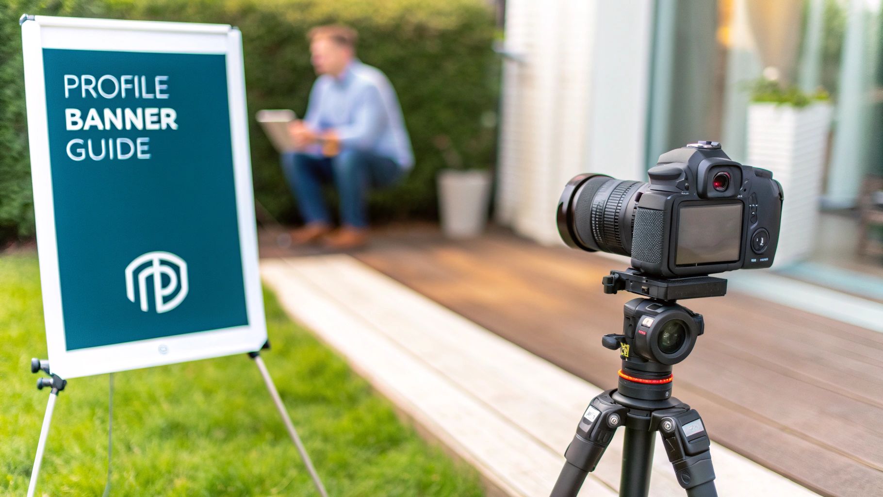
This infographic breaks down the most important dimensions you'll need for your profile, banner, and posts. It’s a great visual cheat sheet.
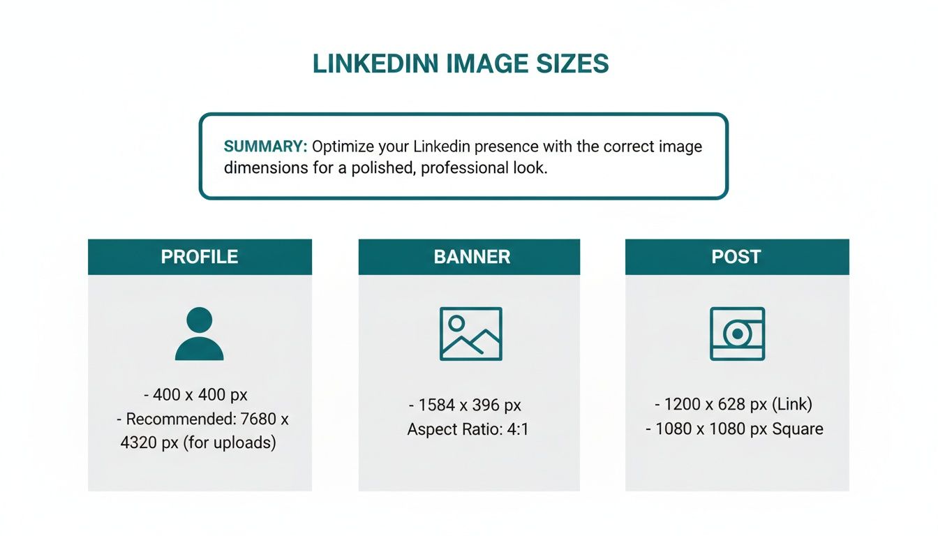
As you can see, there’s a clear distinction between the assets for your personal brand (like your profile photo and banner) and the images you use in your day-to-day posts. Each has its own purpose and, therefore, its own set of rules.
LinkedIn Image Dimensions Cheat Sheet
To make things even easier, here’s a quick-reference table with the most common LinkedIn image sizes you’ll ever need. Keep this handy, and you'll never have to second-guess your visuals again.
And if you want to take the guesswork out of your entire content process, checking out some well-designed https://postline.ai/blog/2/linkedin-post-templates can be a real time-saver, helping you maintain a consistent, professional look.
Image Type | Recommended Dimensions (Pixels) | Aspect Ratio | Supported File Types |
|---|---|---|---|
Profile Photo | 400 x 400 | 1:1 | JPG, PNG, GIF |
Personal Banner | 1584 x 396 | 4:1 | JPG, PNG, GIF |
Company Logo | 400 x 400 | 1:1 | JPG, PNG |
Company Banner | 1128 x 191 | 5.9:1 | JPG, PNG, GIF |
Single Image Post | 1200 x 627 (Landscape) | 1.91:1 | JPG, PNG, GIF |
Square Image Post | 1080 x 1080 | 1:1 | JPG, PNG, GIF |
Article Header | 1200 x 644 | 1.86:1 | JPG, PNG |
This focus on precise dimensions isn't just a LinkedIn thing, by the way. It's a universal principle of good digital design. For another perspective on why exact specs are so crucial, this complete guide to app store screenshot dimensions offers some great insights that apply to any platform where visuals are key to making an impact.
Why Getting Your LinkedIn Image Sizes Right Actually Matters
Let's be honest, fiddling with image dimensions can feel like a chore. But on LinkedIn, getting your image sizes spot on is less about ticking a technical box and more about shaping your professional reputation. Think of it this way: a perfectly sized, crisp visual sends a clear signal that you’re meticulous and you care about quality. It builds trust before anyone even reads a word of your post.
On the flip side, we’ve all seen posts with blurry, pixelated, or awkwardly cropped images. It immediately cheapens the message. When key text gets chopped off on a mobile screen, or the main focus of your graphic is missing, it just looks careless. That small detail can undermine your entire point and make your brand seem unprofessional.
Boost Your Engagement and Reach
Here’s something many people overlook: the LinkedIn algorithm rewards a good user experience. A huge part of that is how your content looks. Properly optimised images load faster and display correctly on every device, whether it's a wide desktop monitor or a narrow mobile feed. That seamless experience is exactly what encourages more likes, comments, and shares.
When people engage with your content, LinkedIn takes notice and shows it to more people. So, nailing your image dimensions isn't just about looking good; it's a genuine factor in how far your post travels. You're essentially removing any friction that might stop someone from consuming and sharing your ideas.
"A polished visual on LinkedIn isn’t just decoration. It’s the handshake before the conversation, setting the tone for your professionalism and ensuring your message is received exactly as you intended."
Build a Strong, Recognisable Brand
Every single post you publish is a building block for your brand identity. Using consistently sized, high-quality images creates a cohesive and memorable presence in what is an incredibly crowded feed. Over time, your audience will start to associate your content with the quality and reliability you stand for.
This consistency pays off in tangible ways:
Higher Click-Through Rates: Let's face it, professional-looking visuals are just more appealing and get more clicks on your links and calls to action.
Better Brand Recall: A steady, recognisable visual style helps your posts stand out, making your brand stick in people's minds.
Greater Professional Authority: Every high-quality post reinforces your position as a credible expert in your field.
Ultimately, getting your image sizing right is one of the foundational pieces of a solid LinkedIn strategy. It’s a simple way to show your commitment to quality with every single thing you publish.
Getting Single Image Posts Right for Maximum Impact
The single image post is your workhorse on LinkedIn. It's a classic for a reason: it's direct, powerful, and a fantastic way to grab someone's attention as they scroll. To really make your message hit home, you need to get comfortable with the two main formats—landscape and square. Each has its own job to do, and picking the right one can make a huge difference in how people react to your content.
For that traditional, widescreen feel, the go-to dimension for a landscape image is 1200 x 627 pixels. This gives you a clean 1.91:1 aspect ratio. This format is brilliant for showing off detailed visuals, like infographics or charts, or any scene where you need that wider context. On a desktop feed, it fills the space horizontally, giving your post a classic, almost cinematic feel.
The Big Debate: Landscape vs. Square
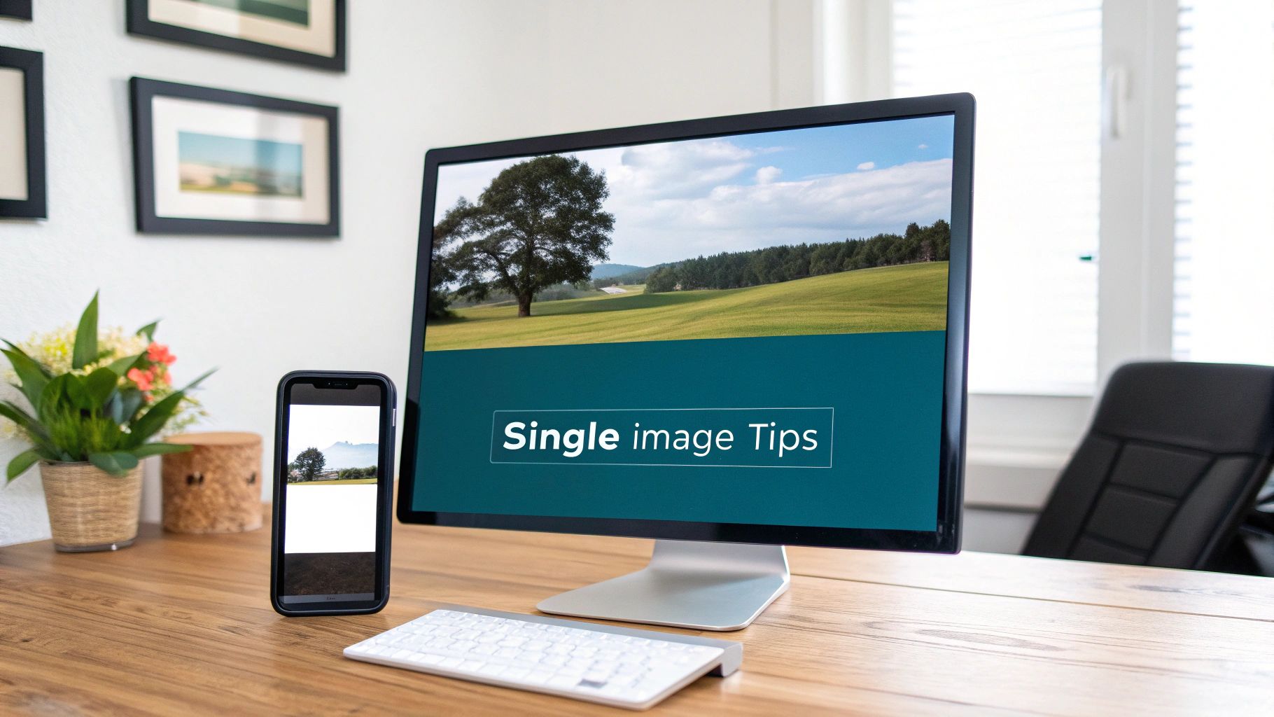
On the flip side, the square format—at 1080 x 1080 pixels (a 1:1 aspect ratio)—has absolutely exploded in popularity. Why? It’s all about mobile. Square images simply take up more vertical space on a phone screen, which makes them feel more substantial and much harder to just flick past. This format is perfect for portraits, product shots, or any graphic where you want the main subject to be the undeniable hero.
Here’s a simple way to think about it:
Go with Landscape (1200 x 627 px) for things like group photos from an event, detailed charts, or those nice panoramic-style shots.
Opt for Square (1080 x 1080 px) for bold announcements, text-based quotes, professional headshots, or anything where you need to maximise that punch on mobile feeds.
This isn’t just about making things look pretty; it’s about optimising for how people actually use the platform. Nailing these little details is a core part of any good strategy and ties directly into these LinkedIn post best practices that drive real engagement.
The Nitty-Gritty: Tech Specs for a Perfect Upload
Beyond just the dimensions, you've got to pay attention to the technical details to keep your images looking sharp. LinkedIn has some clear guidelines to help you avoid nasty compression issues or slow load times that can make people scroll right on by.
Try to keep your file size under 8MB. The platform might accept bigger files, but a smaller size is your best bet for making sure your post loads in a snap for everyone, no matter their internet speed. As for file formats, you've got two main choices:
JPG (or JPEG) is your best friend for photographs and any complex images with lots of colours and gradients. Its compression is fantastic for keeping file sizes down.
PNG is the way to go for graphics with sharp lines, text overlays, and logos—especially if you need a transparent background. It keeps everything looking crisp without any compression blur.
A perfectly sized image sends a signal of professionalism. It tells your audience you’re serious about quality and you sweat the details, which builds trust before they even read a single word of your caption.
This focus on optimisation is especially critical in competitive professional markets. Take Germany, for instance. As of March 2025, there were 22 million LinkedIn users there, with a massive 7.8 million in that key 25-34 age group. That’s a huge, career-focused audience. In an environment that crowded, you have to make sure your images load fast and look flawless. You can dig into the demographics and user statistics in Germany to get a better sense of the landscape.
Finally, remember that getting the dimensions right is only half the battle. Making sure the file itself is optimised for the web is just as important for a great user experience. While this section focuses on images, the same logic applies to video; this guide on reducing MP4 file size without losing quality has some great tips that are worth a read. When you get all these technical details right, you give your single image posts the best possible chance to make a real impact.
Nailing Your Personal and Company Profile Images
Think of your profile visuals as your digital handshake. They’re the first thing people see, and getting them right is non-negotiable for building a credible, professional brand on LinkedIn. A fuzzy profile picture or a clumsily cropped banner can instantly make you look amateurish.
For your personal profile, your photo is everything. It needs to be a sharp, professional headshot that lets people know exactly who you are. While LinkedIn has a minimum size requirement, you'll always want to upload a higher-quality image to avoid pixelation.
That banner image stretching behind your photo? That’s your personal billboard. It’s the perfect spot to show off your professional brand, highlight your expertise, or even drop in a call to action.
Key Dimensions for Personal Profiles
Getting these two core images spot-on is critical. It’s what makes your profile stick in people's minds. Here are the exact specs you’ll need to follow:
Personal Profile Photo: The sweet spot is 400 x 400 pixels. This perfect 1:1 aspect ratio guarantees your photo looks crisp and fits perfectly within that circular frame everywhere on the platform. No weird cropping, no surprises.
Personal Cover Photo (Banner): Aim for 1584 x 396 pixels. This wide 4:1 aspect ratio gives you plenty of canvas to work with to create a visually compelling backdrop for your profile.
One crucial tip: always check how your banner looks on mobile. Your profile picture will cover up the bottom-left portion, so keep any important text or logos shifted towards the centre and right. If you're looking for some creative ways to use that space, check out our guide on the 10 best LinkedIn banner ideas.
Optimising Your Company Page Visuals
For a company page, your logo and banner serve the same vital function—they establish your brand’s identity for clients, partners, and potential hires. Quality and consistency here are absolute musts. Your logo should be unmistakable, and the banner ought to reflect your company’s culture or a current campaign.
The stakes are higher than ever, especially in a competitive professional market. In Germany, for instance, where LinkedIn's user base is rapidly expanding, pixel-perfect visuals are essential to cut through the noise. To be clear, personal covers should be 1584 x 396 pixels, but company page covers have a different dimension: 1128 x 191 pixels.
Your company page is your digital storefront. High-quality, correctly sized visuals signal professionalism and build trust, encouraging visitors to stick around and learn more about what you do.
Here are the precise dimensions to give your company page that polished, professional look:
Company Logo: The standard size to upload is 300 x 300 pixels. You can go smaller, but this size ensures your logo stays sharp everywhere it appears, from search results to mentions in the feed.
Company Cover Banner: Stick to 1128 x 191 pixels. This is a much thinner, more panoramic aspect ratio than the personal banner, so you'll need to design for this specific space.
By sticking to these LinkedIn image sizes for your posts and profiles, you ensure every visual element is optimised to make a fantastic first impression. No guesswork, just sharp, professional results every time.
Getting Your Image Sizes Right for Articles and Newsletters
Moving beyond standard posts, LinkedIn Articles and Newsletters are fantastic formats for showcasing your expertise with long-form content. But to really draw readers in, you have to get the visuals right, and these formats have their own unique specs. The banner image is especially important—it’s the thumbnail people see whenever your article gets shared, making it a make-or-break element for earning clicks.
For any article or newsletter banner, the recommended LinkedIn image size is 1200 x 644 pixels. Sticking to these dimensions makes your header look polished and professional, preventing any weird cropping issues across different devices. Just think of this banner as your book cover; it has to be compelling enough to make someone stop scrolling and start reading.
Key Specifications for Article Banners
To make sure your long-form content makes a killer first impression, stick to these technical guidelines for your banner. Following these specs will also help with fast loading times and keep your image looking sharp.
Optimal Dimensions: 1200 x 644 pixels
Aspect Ratio: Roughly 1.86:1
Supported File Types: Stick with JPG and PNG. They're your best bet.
Maximum File Size: Keep it under 10MB to avoid slowing down the page load.
Nailing these details is particularly crucial in a packed professional feed. To give you some context, LinkedIn had 21.0 million members in Germany in early 2025, a huge 16.7% jump from the start of 2024. For anyone trying to stand out in such a competitive market, getting image sizing spot-on is non-negotiable. You can find more stats on Germany's booming digital landscape on DataReportal.
Best Practices for Inline Article Images
While the banner is your hook, the images inside your article are what keep people reading. They break up massive walls of text, help explain complex ideas, and just make your content much easier to scan and digest.
An article without internal visuals is like a presentation without slides. It might have great information, but it’s far less likely to hold your audience's attention from beginning to end.
Unlike the banner, there isn't a rigid size requirement for inline images. Still, it’s a good idea to stay consistent. I always aim for a maximum width of 700-800 pixels. This ensures they fit neatly within the article body on both desktop and mobile without looking oversized or messing up the text flow. By optimising both your banner and your inline graphics, you create a polished, professional reading experience that reinforces your credibility and keeps your audience locked in.
Troubleshooting Common LinkedIn Image Problems
We’ve all been there. You follow the LinkedIn image sizes for posts to the letter, upload what you think is a perfect graphic, and then… it looks awful. Suddenly, your crisp image is blurry, cropped weirdly, or the colours look off. It's frustrating, but figuring out why these glitches happen is the first step to preventing them and keeping your profile looking sharp.
One of the most common complaints I hear is about blurry images. More often than not, this is a compression problem. It can happen on your end before you even upload, or it can be LinkedIn’s own system being a bit too aggressive with file sizes. If your image looks fuzzy, the usual suspect is an over-compressed JPEG that has sacrificed quality for a smaller file.
Solving Blurriness and Compression Issues
To sidestep the blurriness trap, always start with a high-resolution image and export it with minimal compression. When you’re saving a JPEG, keep an eye out for a quality setting and set it to 80% or higher. This is the sweet spot that balances file size with visual clarity, making sure your image stays sharp when it goes live.
However, if your graphic is heavy on text, contains your logo, or has any sharp lines, just use a PNG. Seriously. PNGs use a different type of compression that’s much better at preserving crisp details, making them the only real choice for anything that isn't a photograph.
A crisp, clear image signals professionalism and attention to detail. Blurriness, even if slight, can subconsciously devalue your content and make your brand seem less credible in a competitive feed.
Fixing Incorrect Link Previews
Another classic headache is sharing a link and watching LinkedIn pull the wrong thumbnail image—or even no image at all. This can absolutely kill your click-through rate, since that preview image does a lot of the heavy lifting to grab attention. This problem usually has nothing to do with LinkedIn and everything to do with your website's metadata.
Thankfully, LinkedIn gives you a tool to sort this out. Here's how to use it:
Head over to the Post Inspector: This is LinkedIn’s free diagnostic tool that shows you how their platform "reads" any URL.
Pop in your URL: Paste the link you want to share into the field and hit the "Inspect" button.
Check the results: The Inspector will show you exactly what image, title, and description it's pulling. If it's wrong, this is where you'll see it.
Force a refresh: Sometimes, all you need to do is run the URL through the Inspector. This forces LinkedIn to clear its old, cached version and grab the latest info from your page.
With these simple troubleshooting steps, you can diagnose and fix most of the visual hiccups you'll encounter. Paying attention to these little details is what makes the difference between content that looks amateur and content that makes a powerful impression.
Tools and Templates for Creating Perfect LinkedIn Images
Nailing the exact dimensions for every single LinkedIn image size for posts doesn't have to be a headache. Forget about manually cropping and resizing everything. The right tools can slide right into your workflow, take out all the guesswork, and make sure every visual you publish looks sharp and professional.
Most designers I know have a go-to platform for this. Tools like Canva and VistaCreate are brilliant because they’re built for speed and simplicity. They’re packed with pre-sized templates for just about every LinkedIn format you can think of—from company page banners to multi-image carousels. Just pick a template, add your own branding, and you're good to go.
Streamlining Your Design Workflow
If you need a bit more control or you're working with a team that needs to stay on-brand, creating your own reusable templates is the way to go. It’s a total game-changer for maintaining consistency.
Adobe Photoshop or Illustrator: These are the industry workhorses for a reason. Perfect for building high-quality, custom templates you can share across your team. You can even set up files with the exact dimensions and safe zones already marked out.
Figma: A fantastic, collaborative option. Figma lets your whole team work from a central library of approved templates, which means everyone is always using the correct dimensions and brand assets. No more rogue logos or off-brand fonts.
Seriously, systemising your design process with templates doesn't just save you hours of busywork. It builds a cohesive, instantly recognisable brand identity with every single post. It’s a small step that makes a huge difference in how your brand is perceived.
A quick look at some popular options shows there's a tool for just about every need and budget.
Comparison of LinkedIn Image Creation Tools
Tool Name | Key Features | Best For | Pricing Model |
|---|---|---|---|
Canva | Drag-and-drop editor, massive template library, brand kits, team collaboration. | Beginners to pros needing quick, professional-looking graphics without a steep learning curve. | Freemium (Free, Pro, Teams) |
Figma | Vector-based, real-time collaboration, reusable components and styles. | Design teams needing a centralised, scalable system for brand assets and templates. | Freemium (Free, Professional, Organisation) |
Adobe Express | AI-powered features, integration with Adobe Creative Cloud, video editing. | Individuals and small businesses already in the Adobe ecosystem. | Freemium (Free, Premium) |
VistaCreate | Large library of animated templates, static visuals, and brand kits. | Marketers looking for a strong Canva alternative with a focus on animations and video. | Freemium (Free, Pro) |
Ultimately, the best tool is the one that fits your team's skill set and workflow. Each of these can help you consistently produce high-quality, perfectly sized images for LinkedIn.
The Rise of AI-Powered Visuals
And it doesn't stop with traditional design platforms. A whole new class of tools is cropping up that can help with both the ideas and the actual creation of your visuals. If you're looking to whip up something truly unique without hiring a photographer, it’s worth exploring some of the best AI LinkedIn photo generators on the market. These can help you generate anything from professional headshots to abstract images that perfectly match your content.
At the end of the day, the goal is simple: make creating correctly sized images as painless as possible. By building these tools and templates into your content strategy, you free yourself up to focus on the stuff that really moves the needle—crafting a message that connects with your audience.
LinkedIn Image Size FAQs
Got questions? We've got answers. Getting your LinkedIn images just right can feel like a moving target, especially with all the different formats and devices out there. Here are some of the most common questions that come up, answered directly to help you nail your visual strategy.
What's the Best All-Around Image Size for a LinkedIn Post?
If you want a safe bet that looks good everywhere, go with 1200 x 627 pixels. This is LinkedIn’s own recommendation, a classic landscape format (1.91:1 aspect ratio) that plays nicely on both desktop and mobile feeds without any surprise cropping.
But here’s a pro tip: for content that really pops on mobile, a square 1080 x 1080 pixel image (1:1 ratio) is often the winner. It simply takes up more screen real estate on a phone, grabbing a user’s attention as they scroll.
Why Does My LinkedIn Banner Look Weird on Mobile?
That's responsive design at work. Your banner gets automatically adjusted and cropped to fit different screen sizes, which is why it looks great on your desktop but might have bits cut off on your phone. The most common culprit is your profile picture, which overlaps the bottom-left corner of the banner on mobile.
To dodge any design disasters:
Stick to the recommended 1584 x 396 pixels for personal banners.
Keep your name, logo, or any other crucial info well away from that bottom-left area.
Centre your main visual elements. This ensures the most important part of your banner is always front and centre, no matter the device.
What’s the Maximum File Size for LinkedIn Images?
The limits vary a bit, but the golden rule is to keep your images optimised. A slow-loading picture is a scroll-past picture. You don't want your audience to move on before your amazing visual even materialises on their screen.
As a general guide:
Standard Posts & Profile Photos: Keep it under 8MB.
Company Logos & Banners: Try to stay under 3MB.
Carousel Ad Cards: You get a bit more room here, with a 10MB limit per card.
I always tell people to export with the web in mind. A high-quality JPEG saved at 80% quality, or a well-compressed PNG, usually hits that sweet spot between sharp visuals and a small file size. It makes for a much better user experience.
Can I Use GIFs in My LinkedIn Posts?
Absolutely! Animated GIFs are a fantastic way to inject some personality into your posts and stop the scroll. Just keep a couple of technical details in mind before you upload.
For regular posts, the usual 8MB file size limit applies. If you're using a GIF in a single-image ad, LinkedIn has a specific rule: it must be 250 frames or shorter. This is to make sure it loops smoothly and doesn't bog down the feed for other users.
Tired of second-guessing formats and just want to create amazing content? Postline.ai uses AI to help you write, polish, and schedule incredible LinkedIn posts in minutes. It gets to know your personal style, researches topics on the fly, and makes sure every post is perfectly structured to capture attention. https://postline.ai
CREATE YOUR POSTS WITH POSTLINE.AI
More reach. More followers. More business.
👉 Try Postline.ai for free
Author

Christoph Gaschler

Christoph is the CEO of Mind Nexus and Co-Founder of postline.ai. He is a serial entrepreneur, keynote speaker and former Dentsu executive. Christoph worked in marketing for more than 15 years, serving clients such as Disney and Mastercard. Today he is developing AI marketing software for agencies and brands and is involved in several SaaS projects.
Related posts

Every LinkedIn post generator - Full Comparison
You want to grow on LinkedIn and need a little help from AI. There are many tools out there promising quick results. We tested the Top 10 LinkedIn post generators to see which actually can make a difference.

How to Export Data from LinkedIn Analytics to Excel [2025]
Discover how to export data from LinkedIn Analytics to Excel to gain valuable insights, streamline lead generation, and enhance data-driven decision-making. This guide covers step-by-step instructions, tools, and tips to help you analyze LinkedIn data efficiently and grow your business.

How to Message Recruiters to Connect on LinkedIn
In this guide you will learn how to reach out to a recruiter on LinkedIn. This is a step by step guide to prepare you to connect with recruiters and increase to chances of landing that new job. You will also find LinkedIn message examples and valuable insights below.