A Guide to LinkedIn Format Text That Grabs Attention
Master LinkedIn format text to create posts that stand out. This guide covers bold, italics, and lists to help you boost engagement and readability.

Formatting your LinkedIn text isn’t just a nice-to-have; it’s a strategic move to stop the scroll and actually get your message read. When you use things like bold text, italics, and bullet points, you transform a boring wall of text into something scannable, engaging, and much more likely to be acted upon.
Why Formatting Your LinkedIn Text Is a Game Changer

Think about your own experience scrolling through the feed. Unformatted text is just… easy to ignore. It all blends together. Strategic formatting, on the other hand, acts like a visual guide, pulling your reader’s eyes directly to the most important parts of your message.
It’s the difference between a dense academic paper and a well-designed magazine article. Which one are you more likely to pick up?
This isn’t just about making things look pretty. It’s about psychology and effective communication. A well-structured post is instantly perceived as more professional and credible. It sends a clear signal that you’ve put thought and effort into your content, which is a subtle but powerful way to build trust.
The Growing Importance of Standing Out
The professional world is more active online than ever before. To put it into perspective, LinkedIn now has approximately 21 million registered members in Germany alone, adding around 3 million users between early 2024 and early 2025. This massive growth means you’re competing for attention in an increasingly crowded space.
With more professionals creating and sharing content, mastering how to format text on LinkedIn has become essential for a few key reasons:
- Improving Readability: Short paragraphs, bullet points, and bold headlines make your content digestible. This is especially true on mobile devices, which is where most users are scrolling from.
- Boosting Engagement: It’s a simple fact that visually appealing posts attract more likes, comments, and shares. This activity signals to the algorithm that your content is valuable, giving it an extra push.
- Strengthening Your Brand: Clean, consistent formatting shows an attention to detail that reflects well on your personal or company brand.
The core goal is to make your key message unmissable. Formatting ensures that even a quick scanner walks away with your main point.
Ultimately, taking a few extra moments to format your posts can dramatically increase their impact. It’s a simple skill with a surprisingly high return on investment. For more tips on crafting content that gets results, check out our guide on LinkedIn post best practices.
Your Toolkit for Essential LinkedIn Text Formatting
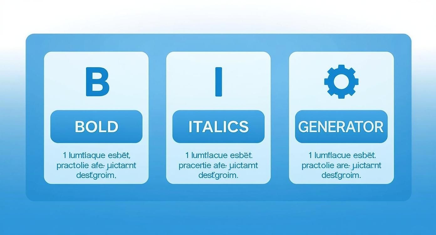
To really get your posts looking sharp, you need the right tools. LinkedIn doesn’t give you a handy toolbar for bolding or italicising your text, which can feel a bit limiting. The secret workaround? It’s all about Unicode.
Unicode is a universal character standard, and it includes special characters that look like bold or italicised letters. When you use a “LinkedIn text formatter,” you’re not actually applying formatting in the traditional sense. You’re simply swapping out standard letters for these lookalike Unicode characters. It’s a clever copy-and-paste trick that makes your content pop right in the feed.
How to Use Unicode for Bold and Italics
Getting these styles into your post is surprisingly simple. You just type what you want to say into an external generator, pick the style you’re after, and then copy the newly styled text back into your LinkedIn post editor. Easy as that.
This approach lets you apply some of the same principles used for mastering page layout design for enhanced readability, but on a smaller scale. Your goal is to guide the reader’s eye and make your main points impossible to miss.
Here’s how I typically use these basic styles to make a real impact:
- Bold Text: This is your go-to for headlines and key takeaways. Think of it as the title for the most important part of your post—the bit you absolutely need people to read.
- Italic Text: I find this works perfectly for adding a touch of emphasis to a single word, sharing a powerful quote, or just signalling a slight change in tone.
A classic mistake I see all the time is people going overboard. The aim is to create emphasis, not visual chaos. Use formatting to make your core message stand out, not get lost in a jungle of styled text.
Let’s look at a quick before-and-after to see what a difference a little strategic formatting can make.
Before Formatting: Our team’s new project launch was a huge success, increasing Q3 leads by 40%. This was a major win for us.
After Strategic Formatting: Our New Project Launch Was a Huge Success
We’re thrilled to share that our team’s hard work paid off, increasing Q3 leads by 40%. This was a major win for us.
See how the second version is instantly more scannable and punchy? It just pulls you in.
To make this whole process a breeze, I’ve put together a quick comparison of some of the best tools out there. These Unicode converters are all user-friendly and get the job done fast.
Go-To Unicode Text Formatting Tools
A quick comparison of user-friendly Unicode converters to format your LinkedIn posts.
| Tool Name | Supported Formats | Ease of Use | Best For |
|---|---|---|---|
| postline.ai | Bold, Italic, Strikethrough, Underline, Special Fonts | Excellent | Quick, all-in-one formatting for posts and articles. |
| YayText | Dozens of fonts, including bold, italic, and decorative | Very Good | Finding unique and creative font styles beyond the basics. |
| Fancy Text Generator | Wide variety of “fancy” and artistic fonts | Good | Highly stylized or decorative text for grabbing immediate attention. |
| Unicode Text Converter | Simple conversion for bold, italic, and script fonts | Excellent | No-frills, straightforward text conversion without extra options. |
Of course, if you want a tool that does it all seamlessly, our very own LinkedIn text formatter is built to help you apply these styles and more in seconds. It’s designed to be fast, simple, and effective.
Advanced Formatting to Drive Deeper Engagement
Once you’ve got the hang of basic bold and italics, it’s time to level up. Advanced formatting isn’t just about making your posts look pretty; it’s about strategically shaping how your audience reads and digests your message. You’re essentially guiding their eyes and controlling the pace, making your content feel more intuitive and impactful.
Think of it as visual storytelling. A smart mix of emojis, custom bullets, and plenty of white space can do wonders. It sets the tone, adds structure, and stops your reader from scrolling past what looks like a daunting wall of text.
Creating Scannable and Eye-Catching Lists
Sure, standard bullet points do the job, but using custom symbols can really make your lists pop. They act like little visual signposts, drawing immediate attention to your key points and making the whole post much easier to scan.
Instead of the default dot, try mixing it up with symbols that match your message:
- For action-oriented points: Use arrows like ➤ or ► to lead readers towards a conclusion or a call to action.
- To highlight the good stuff: Symbols like ✓ or ★ are perfect for listing benefits, wins, or successful outcomes.
- For a clean, professional look: A simple bullet like • keeps your lists looking organised and sharp.
The idea is to break the visual monotony of plain text. These small tweaks make your information much easier to process, especially for people speed-scrolling on their phones.
The image below breaks down the core formatting options you can get from external tools.
It really comes down to this: mastering bold, italics, and using a good text generator are the foundational skills you need for creating posts that people actually want to read.
The Strategic Power of White Space
Never, ever underestimate the power of an empty line. White space is genuinely one of the most effective tools for boosting readability on LinkedIn. Adding line breaks between short paragraphs creates essential breathing room, making your content feel way less intimidating and much more inviting.
This is especially true if you’re trying to reach younger professionals. In Germany, for example, the biggest chunk of LinkedIn users is the 25 to 34 age group, which numbers around 7.8 million people as of early 2025. This is a generation that grew up with scannable, mobile-first content, so white space isn’t just nice to have—it’s a necessity. You can discover the full breakdown of LinkedIn’s user base in Germany to see just how mobile-centric this audience is.
Pro Tip: When you’re writing a longer post, get all your paragraphs down first. Then, go back through and intentionally add line breaks. Just ask yourself, “Where can I give the reader a quick visual pause?” It’s a tiny step that makes a massive difference.
A well-placed emoji can also add a splash of personality, convey emotion, or highlight an important point without cluttering your post. The key is moderation—use them to enhance your message, not distract from it. To get more ideas on crafting posts that truly connect, check out our guide on how to increase LinkedIn engagement.
Putting It All Together: The Perfectly Formatted LinkedIn Post
Knowing the formatting tools is one thing, but using them strategically is what separates a good post from a great one. Think of LinkedIn format text as your way of guiding the reader’s eye, making sure your key points land exactly where you want them to. Let’s look at how to pull all these elements together for different real-world scenarios.
You wouldn’t structure a project launch the same way you’d share a personal reflection. The secret is to tailor the formatting to the message itself, making your post incredibly easy for your audience to scan and understand.
Example Project Launch Post
So, you’re ready to announce a big product launch. You need to build hype, share the big wins, and get people excited. This calls for a structure that’s punchy and crystal clear.
Here’s a blueprint I’ve seen work time and time again:
-
The Hook: Kick things off with a bold headline that stops the scroll. Something that makes people say, “I need to know more.”
- Example: We Just Launched Our New AI Platform!
- The Context: In just one or two short sentences, explain what you did and why it’s a big deal.
-
The Results: This is where you bring out the bullet points. Use custom emojis or symbols to make the stats pop, and always bold the numbers.
- ➤ Smashed our Q1 target with 150% growth in early sign-ups.
- ✓ Featured in three major industry publications.
- The Shout-Out: Don’t forget to tag the team who made it happen. It’s great for morale and boosts visibility.
- The Ask: End with a clear call to action. Ask a question or drop a link to drive that all-important engagement.
This approach tells a compelling story that’s quick to absorb, perfect for the fast-paced LinkedIn feed.
Example Personal Milestone Post
Now, let’s switch gears. Sharing something like a work anniversary or a promotion is more personal. You want to sound proud and professional, but also relatable.
The best personal posts balance professional achievement with genuine reflection. Use formatting to create pauses that allow your personality to shine through. This makes your content more relatable and engaging.
Try starting with a more reflective opening line. Use italics to emphasize a key lesson you’ve learned or a feeling you want to convey. A well-placed emoji can add a touch of warmth and personality. And if you’re looking to consistently hit the right note, some people find success using tools for AI generated social media posts to help brainstorm ideas.
Once you get the hang of these frameworks, you’ll have a solid starting point for just about any post you want to create. For a little extra help, feel free to check out our LinkedIn post templates for more inspiration.
Common Formatting Mistakes You Need to Avoid

It’s easy to get carried away with formatting, but the wrong choices can do more harm than good. Overdo it, and you risk undermining your own credibility. The whole point is to make your message clearer, not to bury it under a mountain of chaotic styling.
One of the biggest traps I see people fall into is what I call “format fatigue.” This is when a post is just overloaded with too many different styles all at once—you’ve got bold, italics, a jumble of emojis, and maybe even a few different bullet points all fighting for attention. It looks messy and, frankly, makes the content incredibly difficult to read.
The Accessibility Issue
Here’s something a lot of people overlook: those special Unicode characters that create fancy fonts. They might look cool to most of us, but they can be a nightmare for accessibility. Screen readers, which visually impaired professionals rely on, often can’t interpret these characters correctly. They might read them out as gibberish or just skip them entirely, leaving a huge chunk of your audience completely in the dark.
Your formatting should always be inclusive. Prioritise clarity and accessibility over purely decorative styles to ensure your message reaches everyone in your audience.
Keeping Your Formatting Clean
Effective LinkedIn format text is all about being strategic and clean. It’s not just about looking good, either; it has a real impact on performance. For instance, in Europe, sponsored updates can hit a 4.05% conversion rate, and well-structured, localised content has been shown to get up to a 33% bump in visibility. The way you format your text plays a direct role in those numbers. You can dig deeper into how regional engagement is influenced by content strategy if you’re interested.
To keep yourself on the right track, just remember these simple guidelines:
- Use one style for one purpose: Dedicate bolding to your main points or key data. Don’t mix and match without a clear reason.
- Limit your emojis: A few well-placed emojis can add personality. A dozen is just a distraction.
- Prioritise white space: You’d be surprised how powerful clean breaks can be. They’re often more effective than any special character.
Got Questions About LinkedIn Formatting? Let’s Answer Them
Even with the best tools in your corner, you might still wonder about the nitty-gritty of formatting your LinkedIn posts. Let’s tackle some of the most common questions I hear, so you can post with total confidence.
Can I Just Format Text Directly in the LinkedIn Post Editor?
In short, no. LinkedIn’s own editor is pretty basic and doesn’t have the familiar bold or italics buttons you might see elsewhere.
The standard way around this is to use an external Unicode text generator. You just pop your text into one of these tools, pick the style you want, and then copy-paste the finished product straight into your LinkedIn post. It’s a quick extra step that makes a huge difference.
Will Using Formatted Text Hurt My Post’s Reach?
This is a big one, and the answer is nuanced. LinkedIn has never officially said that using Unicode characters will tank your reach. In fact, from what I’ve seen, the opposite is often true.
When you use linkedin format text strategically, you make your post easier to read and more eye-catching. This almost always leads to better engagement—more likes, more comments, more shares. Those are all powerful signals to the algorithm that your content is valuable, which can actually boost your visibility.
The real thing to watch out for is accessibility. Some screen readers, which are used by people with visual impairments, can struggle with certain Unicode characters. They might read them out as strange symbols or just skip them. That’s why it’s best to use formatting for emphasis on key phrases, not for entire paragraphs.
It’s also worth noting that a handful of ancient browsers or devices might not show every character perfectly, but this is becoming less and less of an issue. The golden rule is simple: use formatting to support your message, not to be the message itself.
Ready to create perfectly formatted LinkedIn posts in seconds? With Postline.ai, you get an AI-powered assistant that not only writes engaging content but also handles all the formatting for you. Start creating standout posts today.

Run every client pipeline in one place
Give each LinkedIn profile its own voice, calendar, approval flow, and analytics. Start in minutes.
Start free trial