All posts
image sizes for linkedin posts: A quick guide
Discover the ideal image sizes for linkedin posts to boost engagement, with simple dimensions, tips, and best practices.
Getting your **image sizes for LinkedIn posts** right is a game-changer. For a standard landscape image, you'll want to aim for **1200 x 627 pixels**. If you prefer a square format, which often performs well on mobile, **1080 x 1080 pixels** is your go-to. Using these specific dimensions ensures your content looks crisp and professional, avoiding any weird cropping when viewed on different devices.
## Your Quick Reference for LinkedIn Image Sizes
Let's be honest, correctly sized images are essential for building a strong professional presence on LinkedIn. When your visuals are properly optimised, they don't just look better; they genuinely help boost your engagement. A well-formatted image can be the very thing that stops someone from scrolling past and encourages them to pay attention to your message.
This guide is built for quick lookups. Whether you're in the middle of updating your profile or scheduling a new campaign, you can find the exact dimensions you need without any fuss.
### Key Image Sizes at a Glance
For a quick visual overview, this graphic breaks down the most common image types you'll be dealing with.
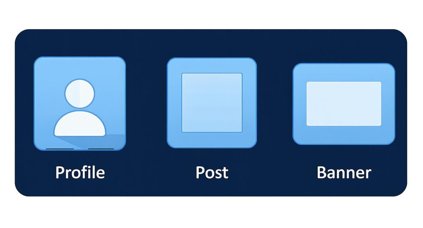
As you can see, your profile photo, feed posts, and company banners all have their own unique requirements to display perfectly.
To keep your profile looking polished, LinkedIn has some specific recommendations. For instance, your profile picture should be at least **400 x 400 pixels**, while shared images in the feed look best at **1200 x 627 pixels**. Sticking to these guidelines helps maintain visual quality across both desktop and mobile, preventing the blurriness or distortion that can undermine your professional image. You can find more detailed statistics about the [digital landscape in Germany](https://datareportal.com/reports/digital-2024-germany) on datareportal.com.
### LinkedIn Image Size Cheat Sheet
For a quick lookup, this table summarises the most common image specifications you'll need. Bookmark it for easy access!
| Image Type | Recommended Dimensions (Pixels) | Aspect Ratio |
| :--- | :--- | :--- |
| Profile Picture | 400 x 400 | 1:1 |
| Company Page Logo | 300 x 300 | 1:1 |
| Personal Background Photo | 1584 x 396 | 4:1 |
| Company Cover Photo | 1128 x 191 | 5.9:1 |
| Shared Image (Feed) | 1200 x 627 | 1.91:1 |
| Shared Link Image | 1200 x 627 | 1.91:1 |
| Carousel Post (Square) | 1080 x 1080 | 1:1 |
| Carousel Post (Vertical) | 1080 x 1350 | 4:5 |
Keeping these numbers handy will save you a ton of time and make sure your content always looks its best.
## Getting Your Personal Profile Images Right
Your personal profile is your digital handshake on LinkedIn, and the two main visuals—your profile picture and background banner—say a lot about you before anyone reads a single word. Nailing these is crucial, as they form that critical first impression. For a sharp, professional look, your profile picture should be **400 x 400 pixels**, and the banner needs to be **1584 x 396 pixels**.
Sticking to these exact dimensions is non-negotiable if you want your profile to look polished on any device, from a wide desktop monitor to a small smartphone screen. It’s the difference between a crisp, professional image and a blurry, awkwardly cropped one.
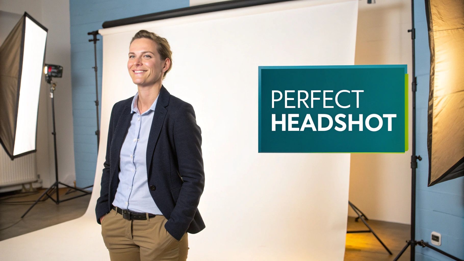
### Your Professional Headshot
Think of your profile picture as your personal logo. It’s how people will recognise you across the platform, showing up next to every comment you leave, post you share, and connection request you send. It’s a small image, but it has a huge impact.
* **Optimal Dimensions:** **400 x 400 pixels**, which is a perfect **1:1** square aspect ratio.
* **File Format:** Stick with **JPG** or **PNG** for the best balance of quality and compatibility.
* **File Size:** Keep your file under the **8MB** limit to avoid LinkedIn’s automatic (and often unflattering) compression.
A great headshot should be clear, well-lit, and focus primarily on your face. Try to avoid busy backgrounds that might distract from you. If getting a professional photographer isn't an option, some of the [best AI LinkedIn photo generators](https://postline.ai/blog/2/best-ai-linked-in-photo-generators) can be surprisingly effective at creating a polished and professional look.
### Crafting a Compelling Background Banner
Your background banner, often called a cover photo, is prime real estate. It's a fantastic opportunity to showcase your professional brand, hint at your personality, or highlight what you do.
> Use this space to tell a quick visual story about your expertise, your company's mission, or a project you’re proud of. It adds a layer of context that your headshot alone just can't provide.
The ideal size is **1584 x 396 pixels**, which gives you a wide **4:1** aspect ratio to work with. The most important thing to remember is that your profile picture will cover up the bottom-left corner of the banner on desktop views. Be sure to place any critical information, like text or logos, away from that zone to make sure it’s always visible.
## Getting Your Company Page Visuals Right
Think of your company page as your brand's home base on LinkedIn. The first thing anyone sees is your visuals, so getting them spot-on is crucial for making a strong, credible first impression. The two main players here are your company logo and your cover image, and both have their own rules.
Your company logo needs to be **300 x 300 pixels**. This is the small square image that shows up next to every post and comment you make, acting as your brand's signature across the platform. To keep it looking sharp and recognisable, especially if it has text, a high-quality PNG is usually your best bet.
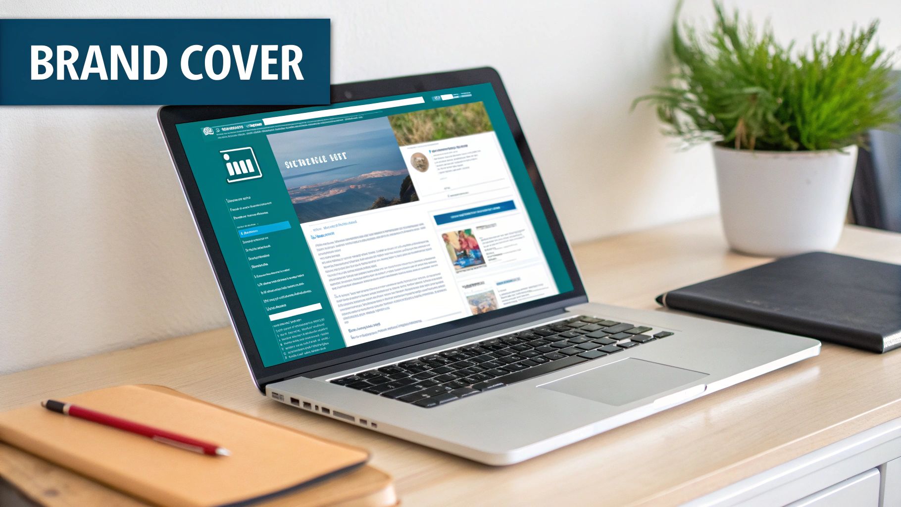
### Making Your Company Cover Image Work for You
The cover image, often called the banner, is that big, wide space at the top of your page. It’s a prime piece of real estate for storytelling. The recommended size is **1128 x 191 pixels**. This panoramic format is ideal for showing off what your company is all about, whether that's your mission, a new campaign, or just a powerful visual that reinforces your brand's identity.
Here are a few pointers to get it right:
* **Be purposeful:** This isn't just a placeholder. Use it to announce a product launch, plug an upcoming webinar, or display your company motto.
* **Stay consistent:** Your banner should feel like it belongs to your brand. Stick to your brand's established colours, fonts, and general style.
* **Don't overdo it:** Clutter is the enemy. A simple, clean design with a single, clear message will always have more impact than a busy one.
Many successful businesses treat this space with real care, meticulously designing their cover photos to ensure important information isn't obscured by the profile picture overlay. For some great examples, check out these [10 best LinkedIn banner ideas](https://postline.ai/blog/2/10-best-linkedin-banner-ideas) to get your own creative juices flowing.
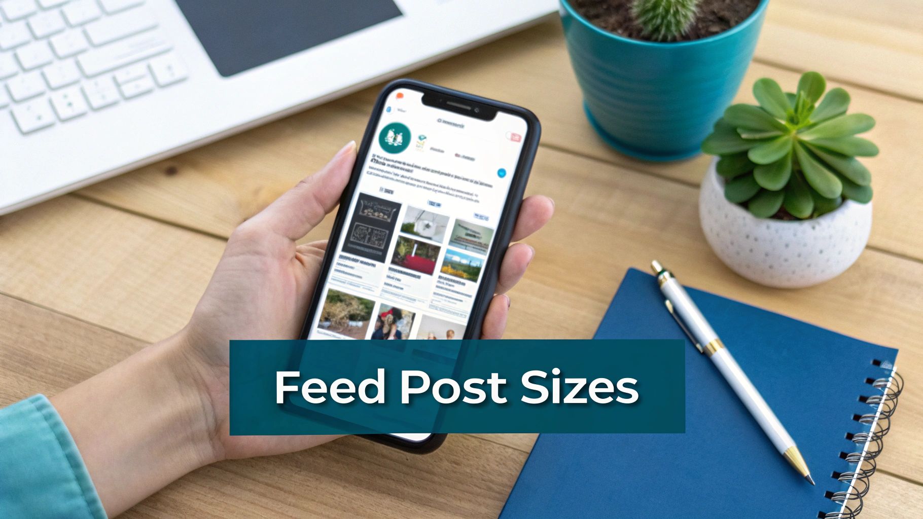
## Getting Your Image Sizes Right for Feed Posts
The LinkedIn feed is a crowded place. To make your content stand out, getting the image dimensions spot-on is non-negotiable. If you get it wrong, you risk awkward cropping that can completely ruin your message and make your post look unprofessional.
Whether you're posting a single image, a multi-image carousel, or sharing a link with a preview, each one has its own set of rules for looking its best.
### Best Dimensions for Single Images
For a single image post, you've got a few options. While the traditional landscape format is still around, it's often the square and portrait sizes that grab the most attention, especially on mobile where they take up more screen space.
Here’s what I recommend based on years of optimising profiles:
* **Square (1:1 Aspect Ratio):** Stick to **1080 x 1080 pixels**. It's a classic for a reason. This format looks great everywhere—desktop, mobile, you name it—making it a reliable and effective choice.
* **Portrait (4:5 Aspect Ratio):** For maximum mobile impact, go with **1080 x 1350 pixels**. This vertical layout is a real scroll-stopper because it fills a user's phone screen, making your content harder to ignore.
### Sizes for Carousels, Links, and Videos
Carousel posts are fantastic for telling a story or breaking down complex information. To keep the experience seamless as people swipe through, make every card a consistent **1080 x 1080 pixels**. It just looks cleaner and more professional.
When you share a link, LinkedIn pulls in a preview image automatically. To make sure that preview is crisp and enticing, the ideal size is **1200 x 627 pixels**. For a deep dive, you can learn more about how to get the most out of your [LinkedIn link preview card](https://postline.ai/blog/linkedin-link-preview-card).
And don't forget your videos! While the video itself might have a different aspect ratio, you should always upload a custom thumbnail. Use the same **1200 x 627 pixels** dimension to give your video a strong, clickable first impression before anyone even hits play.
## A Guide to LinkedIn Ad Image Dimensions
When you're running paid campaigns on LinkedIn, getting the image specs right is non-negotiable. It's the difference between a high-performing ad and a waste of your budget. Unlike organic content, ad visuals have to meet specific guidelines to look sharp and grab attention across all the different sponsored placements.
From a simple single image ad in the feed to a more complex carousel, every format has its own optimal size. Following these recommendations isn't just about ticking a box; it prevents your carefully designed creative from getting awkwardly cropped and makes sure your brand looks polished and professional.
### Key Ad Format Specifications
To make your campaign setup a bit easier, here are the go-to dimensions for the most popular LinkedIn ad formats. A good rule of thumb is to keep your file sizes small—under **5 MB** for single images and **10 MB** for carousels—to make sure they load quickly for everyone.
* **Single Image Ads:** Your workhorse ad format. Go with **1200 x 627 pixels**, which gives you a **1.91:1 aspect ratio**. This size is optimised to look great in the LinkedIn feed, whether someone is scrolling on their desktop or their phone.
* **Carousel Image Ads:** Perfect for storytelling or showcasing multiple products. Each card in the carousel needs to be **1080 x 1080 pixels**. This **1:1 square ratio** ensures a clean, consistent look as users swipe through your cards.
* **Video Ad Thumbnails:** That first impression really counts. Your video's cover image can make or break whether someone hits play, so use the same dimensions as a single image ad—**1200 x 627 pixels**—to get the best results.
For a quick reference, this table breaks down the essentials for the main ad types you'll likely be using.
### LinkedIn Ad Format Image Specifications
A detailed breakdown of image size and format requirements for various LinkedIn ad types to ensure campaign compliance and effectiveness.
| Ad Format | Recommended Dimensions (Pixels) | Supported File Types |
| :--- | :--- | :--- |
| Single Image Ad | **1200 x 627** | **JPG**, **PNG** |
| Carousel Image Ad | **1080 x 1080** (per card) | **JPG**, **PNG** |
| Video Ad Thumbnail | **1200 x 627** | **JPG**, **PNG** |
Having these specifications handy will save you time and help you create ads that are properly optimised from the get-go.
## Common Image Mistakes and How to Avoid Them
Getting the image dimensions right for your LinkedIn posts is a great first step, but it's not the whole story. A few common slip-ups can still make your content look unprofessional, even if the size is technically correct. Let's walk through these pitfalls so you can make sure your visuals always look sharp and polished.
One of the most frequent errors is uploading a low-resolution photo. When LinkedIn compresses it, the result is a blurry, pixelated mess that undermines your credibility. Always start with the highest-quality original you have. If you're stuck with a smaller visual, looking into [image upscaling techniques](https://legacistudios.com/what-is-upscaling/) can be a lifesaver, helping you meet LinkedIn's standards without losing clarity.
### Choosing the Right File Format
The file format you select makes a huge difference. For photos and complex images, **JPG is usually your best bet**. It strikes a good balance between maintaining quality and keeping the file size manageable.
However, when you're working with graphics that include text, logos, or any designs with sharp lines, **PNG is the superior choice**. A PNG will prevent the compression artefacts that often make text in a JPG look fuzzy and difficult to read.
> A good rule of thumb to remember: JPG for photos, PNG for graphics. This simple distinction ensures every visual you share is as clear as possible.
### Respecting the Safe Zones
Ignoring the "safe zones" is another critical mistake, particularly with your profile and company page banners. Your profile picture and various other interface elements will inevitably cover parts of your banner, and their position changes depending on whether someone is viewing on a desktop or a mobile device.
To be safe, always keep essential information like text or logos away from the bottom and centre-left areas. This ensures your key message remains visible to everyone, no matter how they're viewing your profile. For more guidance on creating visuals that pop, check out these [best practices for LinkedIn posts](https://postline.ai/blog/2/best-practices-for-linkedin-posts).
## Your Top LinkedIn Image Questions, Answered
Getting your images to look right on LinkedIn can sometimes be a real headache. You’ve got the perfect photo or graphic, but when you upload it, things just look… off. To help you fix these common problems fast, I’ve put together answers to the most frequent questions I get.
Think of this as your quick-reference cheat sheet. Whether you're fighting blurry photos or a cover image that keeps getting cropped weirdly, the right fix is usually simple once you know what to look for.
### What's the Best Image Size for a LinkedIn Post on Both Mobile and Desktop?
For a reliable, all-purpose image that looks great everywhere, stick with a square format of **1080 x 1080 pixels**. It’s a safe bet that guarantees your image won’t be awkwardly cropped, no matter what device someone is using.
That said, if you really want to grab attention on mobile, a vertical image of **1080 x 1350 pixels** is the way to go. This portrait orientation takes up more valuable screen real estate in the feed, making your post harder to scroll past. Both work well, but the vertical format gives you a slight edge on mobile.
### How Do I Stop My LinkedIn Images from Looking Blurry?
Blurry images can make your whole profile look unprofessional, but thankfully, this is an easy one to solve. First and foremost, always start with a high-resolution image. If you upload a tiny photo, LinkedIn’s attempts to stretch it out will almost always result in a pixelated mess.
The file type you choose makes a huge difference, too. Here’s my simple rule of thumb:
* **Use PNG for graphics** that have any text, logos, or sharp, defined lines. PNGs keep those edges crisp and clean.
* **Use a high-quality JPG for photographs**. This format is perfect for balancing rich detail with a reasonable file size.
And finally, stick to the recommended dimensions. LinkedIn's compression can be aggressive, and it tends to handle images best when they’re already sized correctly, rather than being too large or too small.
### Can I Use GIFs on LinkedIn?
Yes, you certainly can! Using GIFs in your feed posts is a great way to show a bit of personality or add some motion to catch people’s eyes. They can make your content feel much more dynamic.
Just keep in mind there are some restrictions. You can't use GIFs for your main branding assets, like your profile picture, background banner, or Company Page logo. For posts, make sure your GIF is under the file size limit (it's generally around **5MB**) so it loads properly for everyone.
### Why Is My Cover Photo Getting Cut Off?
This is probably one of the most common frustrations on LinkedIn. You spend time creating a brilliant cover photo, but when you upload it, key parts are hidden. This happens because your profile picture and other page elements sit on top of the banner, and their placement shifts between desktop and mobile.
> To fix this, you have to design within the "safe zones." Keep all your important stuff—like text, logos, or contact details—away from the bottom and the centre-left portion of the image.
By leaving that space clear, you can be sure your critical information will always be visible, no matter how someone is viewing your profile. It's a small adjustment that makes a huge difference in creating a banner that looks polished and professional on every screen.
---
Ready to create standout LinkedIn content without the guesswork? **Postline.ai** is your AI-powered assistant for writing, improving, and scheduling posts that get noticed. Learn more and start creating better content faster at [https://postline.ai](https://postline.ai).
Run every client pipeline in one place
Give each LinkedIn profile its own voice, calendar, approval flow, and analytics. Start in minutes.
Start free trial